Tag: UI Design

School of Wizardry

I've been listening to Jeremy Parish's interview with Robert Woodhead, the co-creator of Wizardry. It's a great interview and recommended.

I think about Wizardry sometimes. I first played it on the Mac.

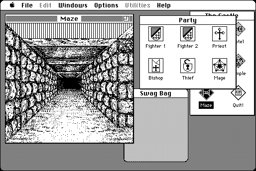
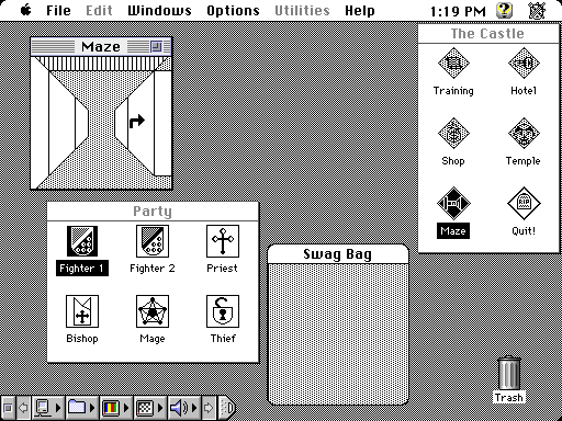
If you pull up the original Wizardry on archive.org, or if you go looking for screenshots, here's the kind of thing you can expect to see:

Wizardry for Mac with lineart dungeon graphics
Via Hardcore Gaming 101, which has a great comparison of the various editions of the game.

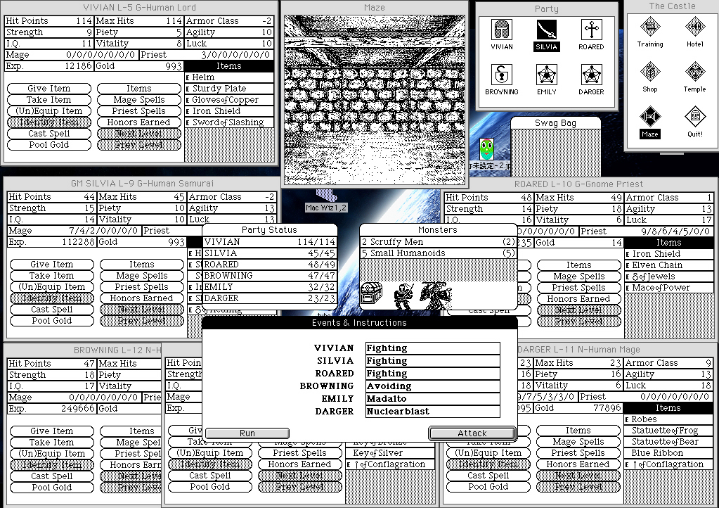
You can get more detailed maze graphics by maximizing the window, but at 512x342 that comes at the cost of having to move other windows on top of each other to fit:

Wizardry for Mac with detailed dungeon graphics
I took this screenshot myself.

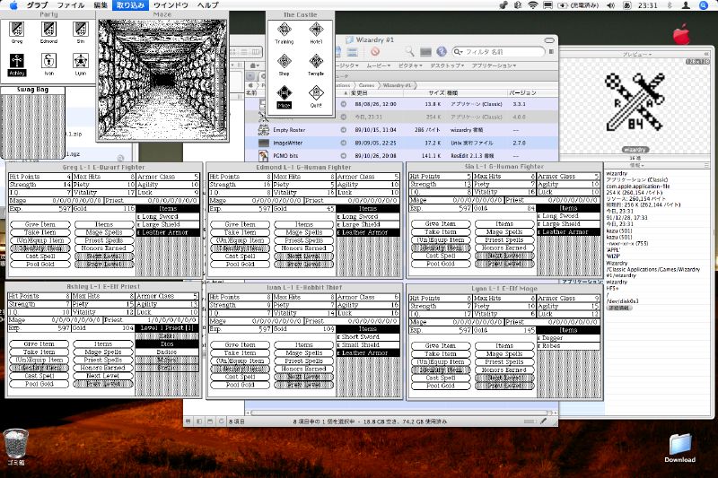
Of course, if you want to get fancy, you can try emulating a later version of MacOS with a higher resolution, and then you'll have plenty of room. Like these madmen here:

At any rate, I've gone back and tried some of the other versions of Wizardry, but I still think the Mac version is the best, with its GUI and its more detailed graphics. It's not perfect -- look how small the maze window is, even at its larger size; and why does the Castle window need to be visible when you're in the maze? -- but the game is well-suited for a point-and-click, drag-and-drop interface.

The first five Wizardry games aren't currently sold for modern systems, but GOG and Steam both sell Wizardry 6 bundled with DOSbox. So why not sell the Mac versions of the earlier games and bundle them with Mini vMac? I guess I'm not sure what the legality is of distributing old versions of the MacOS; they might need a license from Apple in addition to getting one from whatever company owns Wizardry these days.

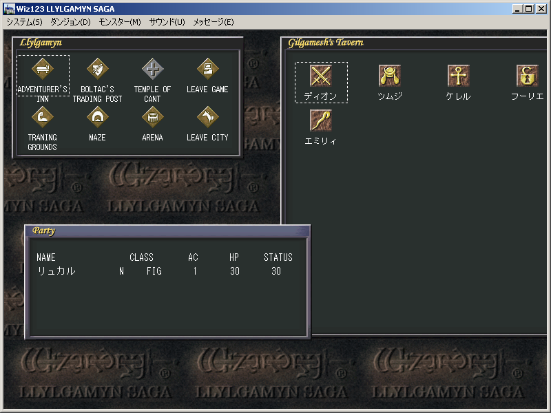
I've also often wondered why nobody's ever remade the original Wizardry for modern computers, taking the Mac version as a base and adding quality-of-life improvements. The closest thing I've ever seen is a Japanese remake of the first three games called Wizardry: Llylgamyn Saga that was released for Windows (as well as PlayStation and Saturn) in 1998.

Wizardry: Llylgamyn Saga for Windows
Via Hardcore Gaming 101

Llylgamyn Saga is not quite what I'm talking about; I tried it a few years back and my impression was that it was a Windows port of a console game and its interface felt like it. It simply didn't handle as smoothly with a mouse as the Mac version.

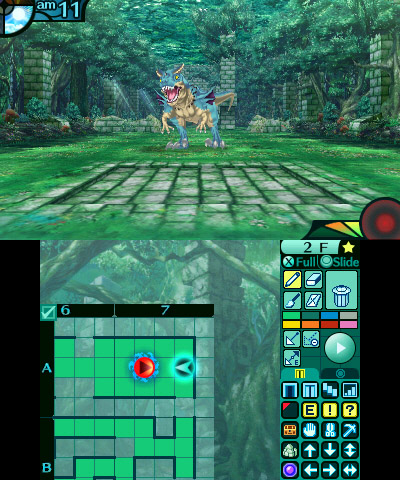
What I'd like to see? Remake the original game. Use touchscreen devices as the primary platform. Copy Etrian Odyssey's mechanic of using the touchscreen to map the dungeon as you go, the way we had to use graph paper in the old days.

Etrian Odyssey Untold 2
Via Jeremy Parish -- him again! -- at USgamer

Using half a phone screen wouldn't be so different from EO using the DS/3DS touchscreen. The biggest immediate hurdle I can think of is fat fingers: Etrian Odyssey is designed for a stylus; drawing with a finger would mean the grid squares would have to be larger. Pinch-to-zoom would be a good idea, or just a toggle to zoom the map in or out. Build to accommodate different resolutions; there's no reason a tablet user should be stuck with a map that's sized for a phone. Of course you could hide the map during combat, menu navigation, in town -- anywhere where it's not necessary. Use a point-and-click, drag-and-drop interface similar to the Mac version; when you go into town, you can drag-and-drop characters between the active party and the reserves.

Add some modern quality-of-life improvements, too. Obviously the weapons shop should behave like it would in a modern RPG: compare a highlighted weapon to the weapon a character currently has equipped. (If it'll fit onscreen, show how it compares to the weapons every character has equipped.)

And allow users to toggle the oldschool rules. Let them play with original inscrutable spell names, or with simple, plain-English ones. Allow them to disable characters aging on a class change, or the possibility of a teleport spell going wrong and permakilling the entire party. Hell, allow a mode where players can navigate through the maps they've made and point to the square they want to teleport to, or even set waypoints so they don't have to do that every time. Maybe even allow them the option of seeing monsters, treasure chests, and other points of interest before walking into them.

Once you've rebuilt the first game in this new engine, it wouldn't be hard to do the second and third. 4-7 would require more work but would be possible. Probably not 8, as it abandons the grid format in favor of free movement.

Hell, open it up. Since I'm dreaming anyway, I might as well say open-source the whole thing -- but failing that, at least release a level editor.

Maybe the best way to go about this would be for a fan group to start by creating a game that's Wizardry-like but noninfringing -- similar D&D-style rules, similar generic fantasy races, classes, and monsters, but different maps, spells, enemy behaviors, etc. -- and then, once they've released a finished game, make an offer to whoever it is who owns the Wizardry copyrights these days to port the original games to the new engine.

A man can dream.

HyperCard

I was looking for something to post about, and then Jeremy Parish posted a mail call for HyperCard comments over on Retronauts.

And I've got a few things to say about HyperCard, because there's a straight line between HyperCard and what I do for a living (and for a hobby) today.

HyperCard was my first development environment. I was 7 or 8 years old and I wanted to make games. Today we've got Kodu and Super Mario Maker. In 1990, we had HyperCard.

HyperCard's interface bore a certain resemblance to PowerPoint, with drawing tools that looked a lot like MacPaint. You could show slides -- or "cards" -- in order, as in PowerPoint, but you could also use buttons to link to cards out of order. So it was a useful language for making Choose Your Own Adventure-style games. "If you want to examine the sound coming from the next room, turn to page 38. If you want to see what's going on outside, turn to page 44." That kind of thing, but with buttons to click.

My game, SEKR's Awesome Adventures, was mostly that sort of thing. (It's pronounced "Seeker", and it was my grandpa's dog's name.) There were a few roundabout ways to get to where you were going, some of which would result in your untimely death. The most complex sequence involved selecting two tools from a list that you'd be allowed to use later on -- and keeping track of your selection required just a bit of actual programming.

I mostly built SEKR through the simple point-and-click frontend, but HyperCard also came with its own programming language, HyperTalk. I used HyperTalk to track what weapons/tools the user selected, and the endgame would adjust accordingly: you're in a pit; did you bring the grappling hook? It's pitch-black; did you bring the night-vision goggles? Store a variable and test a conditional; this is absolutely as simple as programming gets. It was a pretty good place to start.

And that's more or less how the Web works: fundamentally, it's a set of pages, and users navigate between them using hyperlinks. For more complicated stuff than just moving between pages, your browser has built-in support for a scripting language.

The similarities aren't coincidental. The HyperCard Wikipedia entry says:

Through its influence on Robert Cailliau (who assisted in developing Tim Berners-Lee's first Web browser), HyperCard influenced the development of the Web in late 1990. Javascript was inspired by Hypertalk.

HyperCard is where I started programming. And while I never did make a career of game development, I'm still programming, and there's a more-than-passing resemblance between developing for HyperCard and developing for the Web.

My grandmother's been cleaning old stuff out of her house, and a few weeks ago she gave me a bunch of old 3.5" floppies. SEKR's Awesome Adventures is probably in there somewhere -- the original graphical HyperCard version, the text-only remake I put together in QBasic a few years later, and maybe even the unfinished Turbo Pascal port with PC speaker music (which played fine on the 286 I wrote it on but way too fast on a 486; you had to turn off Turbo to slow it down. Remember Turbo buttons?).

I really should buy a USB floppy drive and see if I can get any data off those disks.

Where Will the PC Go? -- Part 2: Possible Solutions

In my previous post, I established that, despite strides made in screen keyboards and text-to-speech programs, a hardware keyboard is still the best way to write text documents.

In this one, I'll look at how phones and tablets work as replacements for PC's.

Problem 3: Phones Are Still Phones

Of course, you can connect a phone to a computer monitor, and to a keyboard. Or to a game controller.

Awhile back I hooked my phone up to my TV, and paired it to my DualShock 4, and fired up Sonic 4.

The game ran fine -- I didn't like it very much but it ran fine.

And then my mom called me.

The game stopped, and my TV screen filled up with a message that I was getting a phone call. So I walked across the room, picked up my phone, disconnected it from my TV, and answered it.

This is not optimal behavior for a computer.

Now, there are possible ways to fix this.

Headsets and speakerphone are two ways to answer the phone without having it in your hand, but neither one is optimal. Speakerphone is often hard to hear and can have that awful echo. And as for headsets, well, do I carry one in my pocket? Do I keep one in every room where I might dock my phone and use it as a computer?

A better solution would be to "connect" your phone to a monitor and speakers wirelessly, maybe using a device like a Chromecast. That way you could keep it next to you, or in your pocket, while still editing documents, or playing Sonic 4, or whatever. And if it rang, you could answer it, and not lose whatever was on your screen -- say I get a call where I want to take notes with my keyboard (as frequently happens); there could be a way to do that.

But the easier solution is probably to have the device that's connected to your keyboard and monitor(s) not be your phone. Especially if people continue to buy other devices, such as laptops or tablets.

Problem 4: Phone Interfaces Don't Make Good Desktop Interfaces

Windows 8. Do I even need to elaborate?

Microsoft tried to design an interface that would work on phones and on desktops. It was a huge failure.

This was entirely foreseeable. A 4" touchscreen is completely different from a pair of 1080p monitors with a keyboard and mouse attached to them. An interface designed for the former is a lousy fit for the latter, and vice-versa.

So, with Windows 10, Microsoft tried something else, and something altogether more sensible: the OS was designed with a phone/tablet interface and a desktop computer interface, with the ability to switch between the two. If you connect your phone to a dock that's hooked up to a monitor, a keyboard, and a mouse, then the interface changes to desktop mode.

Which is a good idea (and one that Canonical has been moving toward for years), but Windows Phone hasn't exactly set the world on fire (and Ubuntu Phone isn't a thing that anybody seems to want). Windows tablets, on the other hand, including Lenovo's Yoga series and MS's own Surface line, have fared much better.

Google's moving toward this sort of convergence too; it hasn't gotten as far as MS or Canonical yet, but there have been hints of future compatibility between Android and ChromeOS.

Ah yes, ChromeOS -- and the return to dumb terminals running server-side programs.

I think that's going to be key to bringing a few of the major special-case users on board with the transition to lower-powered systems: gamers and media designers.

We'll get to them soon. But in the next post, I'll be looking at the market that's really going to continue driving PC sales: business.

Where Will the PC Go? -- Part 1: Identifying the Problem

The other day, Ars Technica posted an article called Cringe-worthy “PC Does What?” campaign wants you to upgrade, about a new ad campaign the PC industry is pushing to try and convince users to buy new computers.

The PC industry is in trouble. It's built around a pattern of regular upgrades that customers just aren't buying anymore. And it's trying whatever it can to stop the bleeding.

On the other hand, rumors of its demise have been greatly exaggerated. In the comments thread on the Ars article, someone named erikbc said:

Well, if anyone believes PC is dead they need to get their head checked.
And understand some numbers:

https://en.wikipedia.org/wiki/Usage_share_of_operating_systems#Desktop_and_laptop_computers

A user named has responded:

…said every horse-and-buggy salesman in 1900 ever.

Which, okay, doesn't actually make a whole lot of sense. (In fact I am fairly confident that very few horse-and-buggy salesmen in 1900 ever said "If anyone believes PC is dead they need to get their head checked" and then linked to Wikipedia.) But, like many shitty analogies do, it got me thinking about why it was a shitty analogy.

Mainly, I don't think the PC will go away to the extent that horse-drawn carriages have. I think it's possible that tablets could completely replace desktop and laptop computers, but I don't think that can happen until they effectively duplicate the functionality of PC's -- in effect not actually replacing PC's but becoming them.

General Case: Typical End Users

While it's easy to point to the rise of the smartphone as the reason for declining PC sales, it's only one of the reasons. There's another one: the last processor most end users will ever need was released in 2006.

A typical end user only needs a few things in a PC: a web browser, an office suite, music, and videos. (And those last three are, increasingly, integrated into the first one; I'll circle back to that in a later post.)

In 2006, Intel released the Core 2 Duo, which, paired with even a low-end onboard graphics chip, could handle HD video and drive two 1920x1080 monitors. And it's 64-bit, so it can handle more than the 3GB of RAM that 32-bit processors max out at.

There have been plenty more, and plenty better, processors in the 9 years since. But they're not better for people who only use their computer for browsing, Office, listening to music, and watching videos. The Core 2 Duo was good enough for them.

There are people who greatly benefit from newer and better processors -- gamers and people who produce media rather than just consuming it. But they're special cases; I'll get to them later. For the average user, the difference between a Core 2 Duo and a Core i7 isn't even noticeable.

The computer industry grew up in the 1990's around the expectation that people would upgrade their computer every few years to handle new software. And people just don't do that anymore. They buy a new PC when the old one quits working; not before.

But, at least at this point, they still need a PC. People may be buying more phones than PC's, but, at least in America, a phone is not a replacement for a PC.

Problem 1: Screen Keyboards

Screen keyboards are a pain in the ass.

They're fine for short communication -- text messages and tweets -- but they're just too slow and imprecise for long-form writing. (I thought of writing this post entirely on a screen keyboard -- like last week's handwritten post -- but I think that would make me want to gouge my eyes out.)

There are still plenty of requirements for longform writing in day-to-day life -- reports for school and reports for work, for starters. And that's even in professions where you don't have to write for a living, never mind ones where you do. People who write articles, and especially people who write books, are best served with a keyboard to type on.

And maybe that won't always be the case. Maybe kids growing up with screen keyboards aren't learning to type on traditional keyboards; maybe they're faster with screen keyboards than they are with hardware ones. Maybe, within a generation, we will see essays, reports, articles, even books, all written with screen keyboards. I suspect that if we do, they'll look a whole lot different than they do today.

Or maybe screen keyboards will get better. Maybe predictions and autocorrect will improve. Maybe a faster paradigm than qwerty + swipe will catch on. There's a lot that can happen in this space.

Or maybe we won't be using keyboards at all.

Problem 2: Text-to-Speech

Speech recognition software has grown by leaps and bounds. Terry Pratchett used Dragon Dictate and TalkingPoint to write his last few novels.

But being good enough for a first draft, for a user who is no longer physically capable of using a keyboard, isn't the same thing as being able to recognize a full range of standard and nonstandard grammars and sentence structures, pick correct homonyms, and understand slang and regional dialects. (Pratchett liked to tell the story of how he had to train his text-to-speech software to recognize the word "arsehole".)

Text-to-speech software might be good enough for simple, clear documents, such as manuals, lists, daily work logs, AP-style newsbriefs, and technical writing (provided you're writing on a subject that doesn't have a lot of jargon words that don't appear in a simple dictionary). But for writing that's meant to convey personality -- editorials, reviews, fiction, even this blog post -- text-to-speech algorithms have a long way to go.

So, for now at least, a good old hardware keyboard remains the best way to input large blocks of text into a computer. In my next post, I'll examine why a dedicated PC is still the best thing to connect to that keyboard, and how phone and tablet OS's are (or aren't) working to bridge that gap.

Actually, It's About How Games Journalism is a Pain in the Ass

Or, Why I Won't Be Doing That Again Any Time Soon: A Postmortem

So the last three posts comparing and contrasting five different Mega Man games required rather a lot of screenshots. It took a long time to get them all, for a number of reasons I'll get into in a moment. It wound up taking a lot longer to get those posts done and posted than planned, and it really wasn't a whole lot of fun.

The other day on Brontoforumus, I described it as taking two things I enjoy doing -- playing video games and talking about video games -- and turning them into work. More specifically, work I don't get paid for.

I like how the whole thing turned out, but it took hours and hours to put together, and playing a game to farm for screenshots is a pretty different and altogether less fun experience than playing it just to play it.

Some of it may be down to the tools I'm using, or just my lack of proficiency with them.

I opted to grab all the screenshots myself, rather than try and find a resource that already had them (or close enough). I think this was probably the right call; VG Museum has a perfectly good shot of the floating platforms in Ice Man's stage that I could have used, but it doesn't really have any other grabs of the Mega Man screens I needed, and it's got next to nothing from Mega Man X and nothing at all from the other three games I was capping.

So I could have poked around the Internet trying to find the screens I was looking for, either as static images on websites or as caps from Let's Play videos on YouTube. But I think that would have taken just as long as getting the damn things myself.

The next decision I made that made my life more difficult was to try and grab all the images at each device's native resolution, with graphical filters turned off.

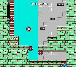
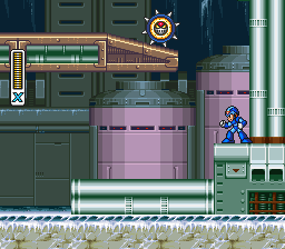
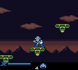
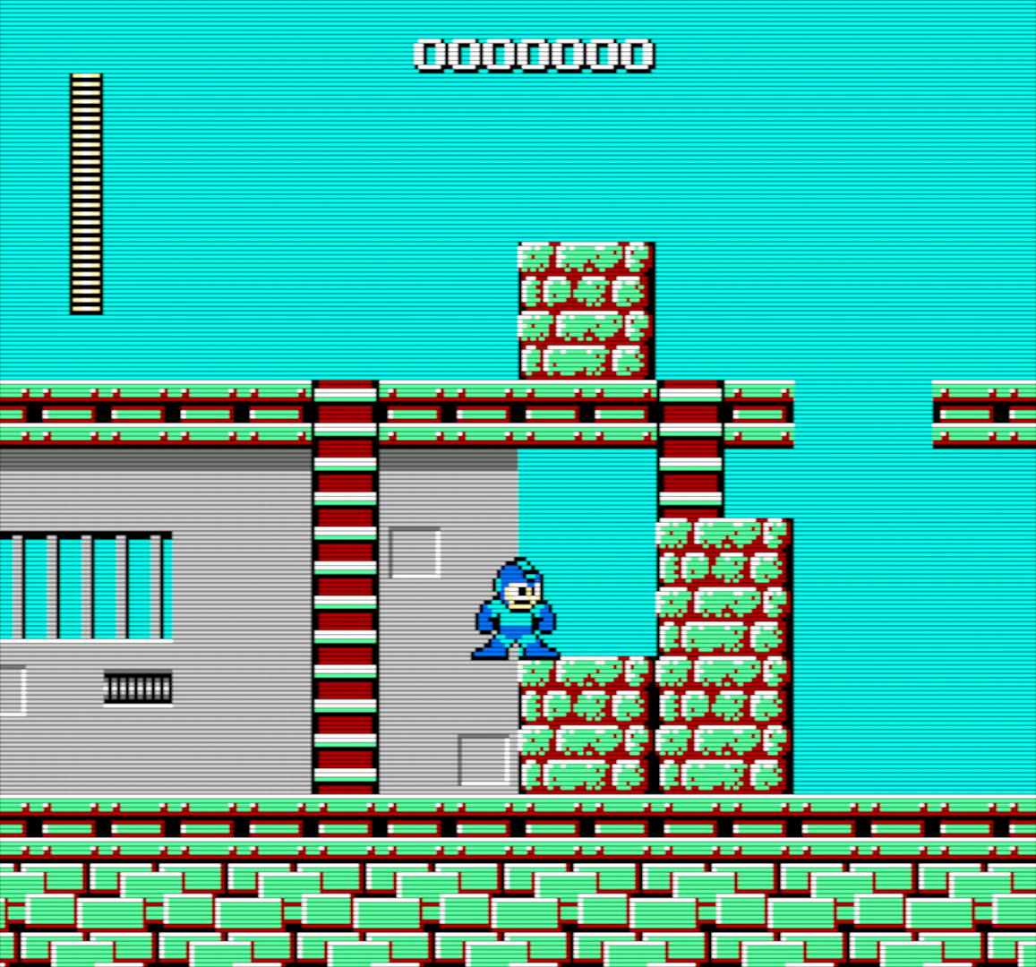
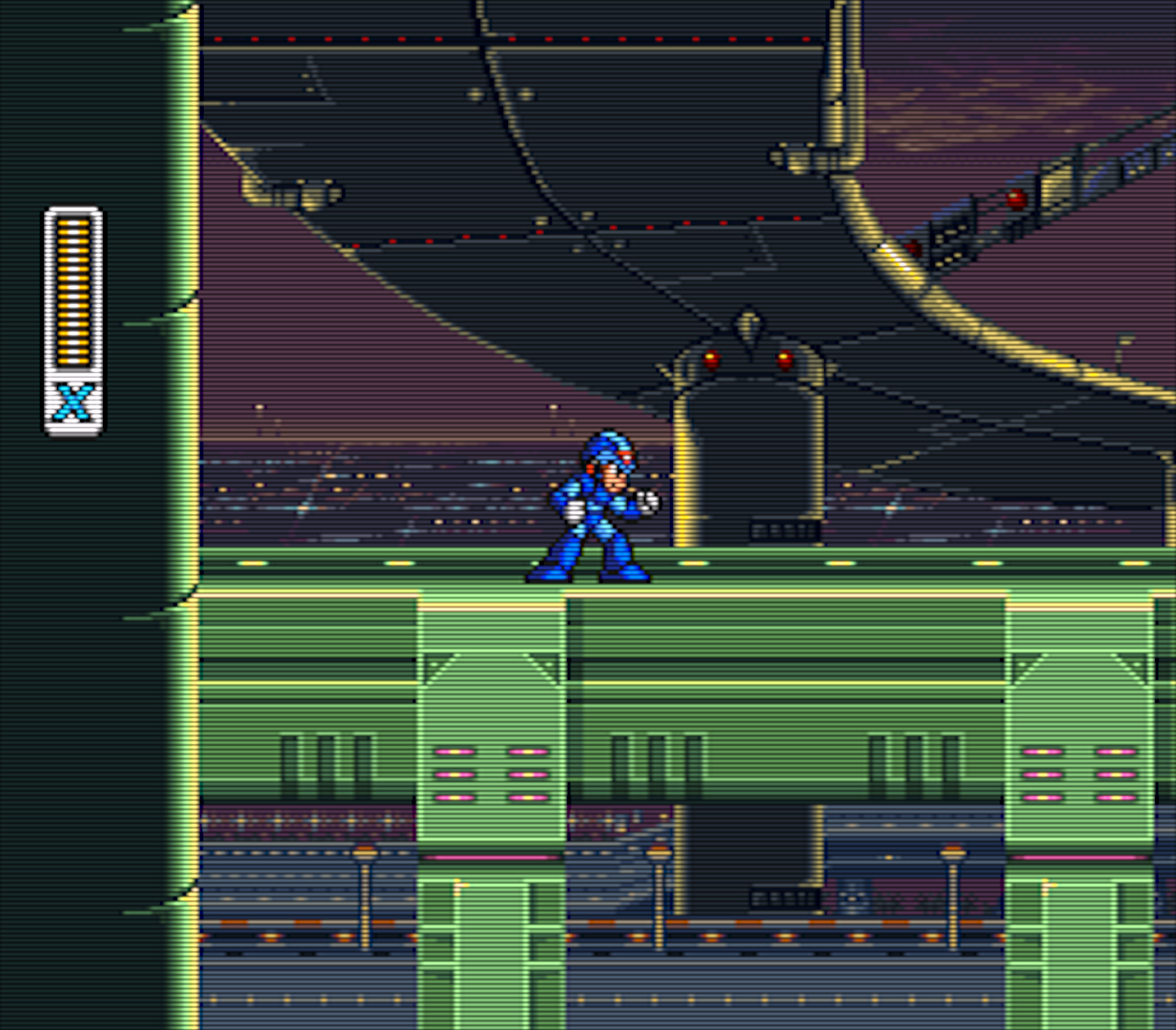
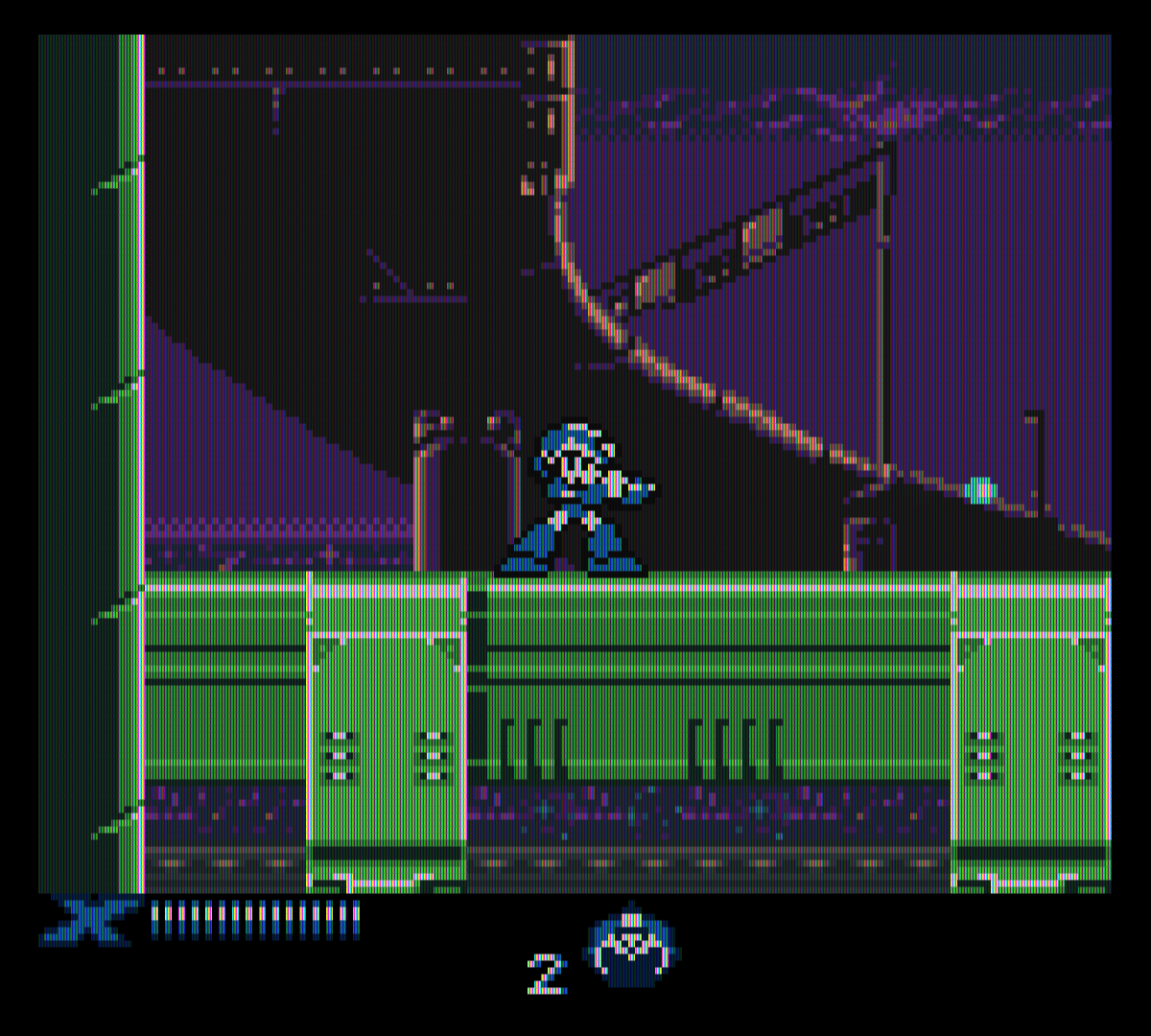
Here are some of the screenshots I used in the last three posts:

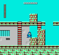
  • Cut Man Stage -- Mega Man
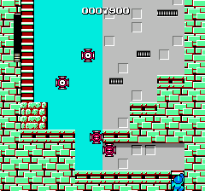
  • Chill Penguin Stage -- Mega Man X
  • Sigma's Fortress -- Mega Man Xtreme
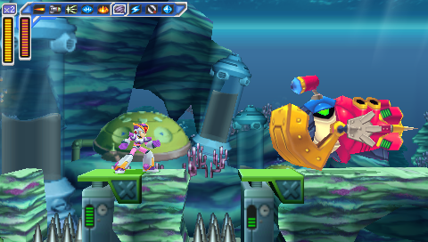
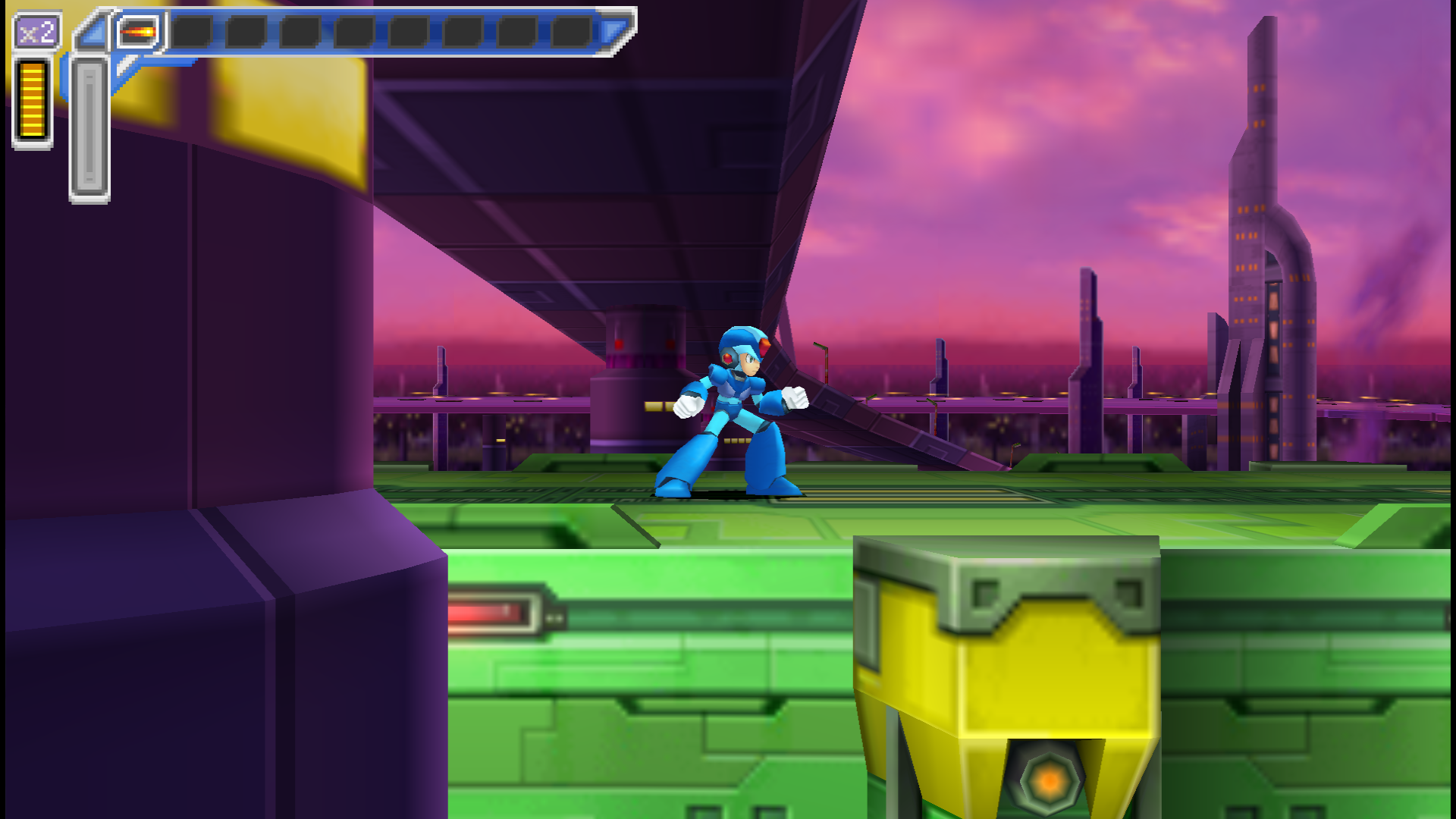
  • Launch Octopus Stage -- Mega Man: Maverick Hunter X

And here are what those games look like when I play the game scaled up for a 1080p screen and with a graphics filter turned on:

  • Cut Man Stage -- Mega Man
  • Highway Stage -- Mega Man X
  • Highway Stage -- Mega Man Xtreme
  • Highway Stage -- Mega Man: Maverick Hunter X

Now, first of all, those images are pretty big. In fact, unless you've zoomed this page in, you're not even looking at them at full size right now, because they've been scaled to fit the content area of this post. That's 892px wide (unless you're viewing it on a mobile device, in which case it's less), whereas the images are between 1157 and 1920px wide.

And they're PNG's, which means they're also pretty big in terms of filesize (except the Mega Man Xtreme one). Unnecessarily big; you just loaded a 1920px-wide image just to display a scaled-down 892px version. Or less. If you're reading this on a 3G connection, then I probably owe you an apology.

Now, there are things I could do differently. I could set my emulators to output as JPEG instead of PNG, but that would result in a visible decrease in quality. I could resize the images manually, but that would be more work for me. I could set up a script to scale them automatically, but we'd still end up with a bunch of images all scaled to the same width. Which isn't really ideal; it doesn't make a lot of sense for the Game Boy screenshots to be the same size as the PSP ones, and 892px is just too damn big to get multiple images onscreen and get a good comparison anyway.

So, instead of that, what I did was turn off the filters and, when I was ready to take a screenshot, toggle fullscreen off to take it.

This is a pain in the ass, not just because it interrupts the flow of the game but because it's fucking difficult to set up a good screenshot in a tiny 160x144 window on a 1080p TV when you're sitting on the couch across the room.

And that's before you get into weird shit like this:

  • Cut Man Stage -- Mega Man
  • Cut Man Stage -- Mega Man

I don't know why the fuck RetroArch did this. I told it to size the window to native NES resolution, and it gave me these monstrosities instead. That is not native NES resolution. And it's not a problem with the core I was using, because I tried it with two different cores. (I thought it might be some weird leftover setting from when I'd done the Game Boy screen grabs, but that doesn't make sense; the Game Boy screen grabs were 160x144, while these are 205x191.)

And I took a bunch of screenshots before realizing what it had done. I had to go back and replay fucking Ice Man's stage and do it all over again.

So I think the best solution would be to use emulators that output screenshots at native resolution and without filters, regardless of what scaling and filters are applied as I'm playing them. I know I've used emulators like that before, but I can't remember which ones they were offhand.

And there's another requirement: I want to be able to take a screenshot without having to use the damn keyboard. I want to be able to use one of the buttons on my controller to take the screenshot. Because having to stage a shot and then quickly take my hands off the controller to hit F12 on a keyboard doesn't just interrupt the flow of the game, it's a good way to get yourself killed if you're trying to grab a screenshot of a particularly difficult section of game.

Snes9x let me map the screenshot button to my controller, and I think FCEUX did too, but I couldn't find any feature like that in PPSSPP or RetroArch.

So I guess what I'm looking for is an emulator that lets you output screenshots with no scaling or filters applied, and lets you map that function to a button on your controller.

That would make the whole exercise a lot quicker and easier, but it wouldn't fix a number of other problems -- I'd still have to wade through a bunch of files with names like ULUS10068_00017.png and RetroArch-1011-165734.png and find the ones I wanted, and then realize "Fuck, I forgot to take a screenshot of Spark Mandrill's stage" and have to go back and replay that section, and seriously, you have no idea how many times I did that.

And that's without even getting into the editing portion.

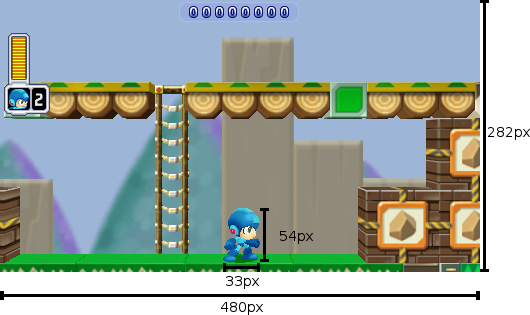
Remember this guy from the first post, with the measurements?

Mega Man is 33x54px

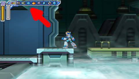
I added those rulers and numbers myself, manually, in Gimp (and it probably shows). And it wound up being way more fiddly and time-consuming than it should have. I guess I probably should have gone looking for plugins to see if somebody had already coded up a tool to draw a shape like that automatically so I wouldn't have to do it myself; that is what I ended up doing for this graphic, with the arrow in it:

Flame Mammoth Stage -- Mega Man: Maverick Hunter X, with Giant Red Arrow

So, I dunno. Like I said, I'm pretty pleased with how the feature turned out (and it's gotten a positive response from the Brontos, which is nice), but it just took so long to put together, and it was not very fun. I might try it again sometime -- especially if somebody can steer me in the right direction and help make it easier next time -- but for now I'll probably go on back to my usual Wall of Text posts.

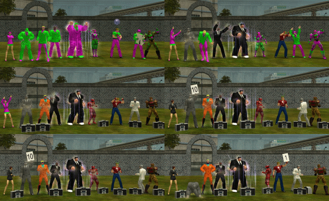
Course, in the old days I used to enjoy doing shit like this:

City of Heroes time-lapse

But there's a pretty important difference: we were already just fuckin' around and essentially posing for photos anyway; it's not like I was taking screenshots in the middle of a difficult mission. (And even if I were, it was pretty easy just to reach over and hit PrtScn without breaking stride in the game.) I wasn't trying to get a grab of any specific gameplay element -- let alone compare and contrast across five different games.

Maybe if I do this again I'll just pick an easier topic.

In the meantime, I think I'll go back to just playing games. Maybe I'll replay some more Mega Man X games. I never did get around to finishing X8. Fucking vehicle levels.


Mega Man ® 1989 and © 1987 Capcom Co, Ltd
Mega Man X ™ and © 1993 Capcom Co, Ltd
Mega Man Xtreme © 2001 Capcom Co, Ltd
Mega Man Powered Up and Mega Man: Maverick Hunter X © 2006 Capcom Co, Ltd
City of Heroes © 2004 NCsoft

I took all the screenshots myself.
I used the following emulators:
NES: FCEUX and Libretro with the FCEUmm and Nestopia cores
SNES: Snes9x and Libretro with the Snes9x Next core
Game Boy Color: Libretro with the Gambatte core
PSP: PPSSPP

Web Design Got Complicated

It's probably not surprising that rebuilding my website has gotten me thinking about web development.

The first six years I ran this site, I did it all by hand -- my own HTML, my own CSS, no scripting languages. I thought that CMS software was for pussies.

But ultimately, plain old HTML just doesn't scale. I conceded that when I started using b2evolution for my blog back in '06, and it's truer now than it was then.

You can poke around some of the old sections of the site a bit, the ones that haven't been updated significantly since the turn of the century -- KateStory's a good one, or the Features page (though I'd like to get at least the Features page up to date sooner than later, and maybe the KateStory one too, so maybe there'll be people reading this post well after those pages shed their 1990's style) -- and they get the job done. Breadcrumb navigation at the bottom of every section, leading you back to either the parent page or the main index.

But Jesus, you can only manually copy and paste "Back to Features / Back to Index" so many times.

And maintaining a years-long blog archive without a CMS to automate it for you? It gets old.

So, you want some automation? You're going to need a scripting language. That usually means PHP for server-side, and JavaScript for client-side.

I got to thinking the other day -- man, it's weird that you need extra toolsets to perform such common tasks as, say, reusing a navigation bar. It's weird that there's not some way just to write up a navigation bar and then write code, in HTML, no scripting required, to embed that common HTML block on the current page.

I thought this was a pretty smart observation.

For about three seconds.

At which point I realized I had just described fucking frames.

Course, the biggest problem with frames is that they weren't exactly what I'm describing. I'm talking about just an HTML snippet in some secondary file that you call from a primary file -- like an include in PHP.

That's not what frames were. Frames were complete fucking HTML pages -- <html>, <head>, <body> (or, more likely, <HTML>, <HEAD>, <BODY>, because in the old days we wrote HTML tags in all-caps) -- which is, most times, downright stupid and wasteful, and was much moreso in the days of 14.4 dialup. Even worse than the load time was the logistics -- if you used frames to build a website with a header, a footer, and a sidebar, you'd have a total of five separate web pages -- a content area, the three other sections, and some kind of main page that all of them were embedded into. This was a fucking nightmare for linking, both for the developer (who had to remember to set the target attribute on every single link, lest the page load in the navigation bar instead of the content area) and the end user (because the URL in the location bar would be the container page that called all the other pages, not the content page the user was currently looking at).

In a way, it's kinda weird that nobody's gone back to that well and tried to do it again, but do it right this time. Update the HTML spec to allow an HTML file to call a reusable snippet of HTML from another file, one that isn't a complete page.

Given all the concessions HTML5 has made to the modern Web, it's surprising that hasn't happened, even given how slowly it takes for a spec to be approved. We've got a <nav> tag, which is nice and all, but who the hell uses a <nav> tag without calling some kind of scripting language that automates code reuse? There really aren't that damn many reasons to use the <nav> tag for code that isn't going to be reused on multiple pages throughout a site.

And I dunno, I'm sure somebody's brought this up, maybe it's on the itinerary as a consideration for HTML6.

Which is another thing, really: the people making the decisions on the specs do not want the same things I want.

I liked XHTML. (In fact, lest this whole thing come off as a curmudgeonly damn-kids-get-off-my-lawn diatribe against new technologies and standards, I'd like to note that I was using XHTML Strict back when you pretty much had to be using a beta version of Phoenix -- before it was Firebird, before it was Firefox -- for it to render correctly.) I thought it was the future. I wish XHTML2 had taken off. HTML5 feels ugly and inconsistent by comparison, and, as legitimately goddamn useful as it is to be able to put something like data-reveal aria-hidden="true" in the middle of a tag's attributes, it always feels dirty somehow.

But I digress.

Point is, in 2006, I switched the blog from just plain old HTML and CSS, and added two more elements: a MySQL database to actually store all the shit, and a PHP CMS (originally b2evolution, later switched to WordPress).

And then came smartphones.

We live in a world now where every website has to be designed for multiple layouts at multiple resolutions. You wanna try doing that without using an existing library as a base? Try it for a few days. I guarantee you will no longer want that.

I think my resistance to picking up new libraries is that every time you do it, you cede a measure of control for the sake of convenience. I don't like ceding control. I like my website to do what the fuck I tell it to, not what some piece of software thinks I want it to.

I've spent the last decade arguing with blogging software to get it to quit doing stupid shit like turn my straight quotes into "smart" quotes and my double-hyphens into dashes. Just the other day, I built a page in WordPress and discovered that it replaced all my HTML comments with fucking empty paragraphs. Why would I want that? Why would anyone want that?! And that's after I put all the remove_filter code in my functions.php.

And that's the thing: WordPress isn't built for guys like me. Guys like me use it, extensively (it is the world's most popular CMS), because it automates a bunch of shit that we'd rather not have to deal with ourselves and because when we're done we can hand it off to end users so they can update their own site.

But I still write these posts in HTML. I want to define my own paragraph breaks, my own code tags, the difference between an <em> and a <cite> even though they look the same to an end user.

(And okay, I still use <em> and <strong> over <i> and <b>; there's really no explaining that except as a ridiculous affectation. I recently learned Markdown and used it to write a short story -- I'll come back to that at a later date -- and I could see switching to that. HTML really is too damn verbose.)

...and that was another lengthy digression.

So. Mobile design.

Bootstrap is the most commonly used toolkit for responsive websites. I've used it, it works well, but it's not my favorite idiom, and I've decided I prefer Zurb Foundation. So that's what I used to build the new site layout.

Except, of course, then you've got to get two dueling design kits to play nice to each other. Square the circle between WordPress and Foundation.

I started to build the new theme from scratch, and I'm glad I was only a few hours into that project when I discovered JointsWP, because that would have been one hell of a project.

JointsWP is poorly documented but has proven pretty easy to pick up anyway.

So. I've gone from HTML and CSS to HTML, CSS, and WordPress (HTML/CSS/PHP/MySQL), to HTML, CSS, WordPress, Foundation (HTML/SCSS/JavaScript, importing libraries including jQuery), and JointsWP (ditto plus PHP). And on top of that I'm using Git for version tracking, Gulp to process the SCSS, and Bower to download all the other scripts and toolkits I need and keep them updated.

So, going with Foundation (or Bootstrap, or whatever) as a standard toolkit, you get somebody else's codebase to start from. That comes with some elements that are a necessary evil (I hate fucking CSS resets, and think writing p { margin: 0; } is an abomination in the sight of God and Nature -- but if it means I can assume my site will look more or less correct in Mobile Safari without having to go out and buy an iPhone, then I guess I'll take it), and others that are actually pretty great -- I find SCSS to be really exciting, a huge saver of time and tedium, and it's hard to go back to vanilla CSS now that I've used it.

Course, with increasing complexity, you still hit those things that don't quite work right. One example I've found is that Foundation sets your placeholder text (the gray letters that appear in an "empty" input field) too light to be legible, and does not have a simple definition in _settings.scss to let you adjust it to darker. I've found a mixin that allows you to create such a definition pretty simply, but for some reason JointsWP doesn't like it (or maybe Gulp doesn't). So until I get around to finding a fix, the text stays light, and I'll just have to trust that you the user will be able to determine that the input field under the phrase "Search for:" and to the left of the big blue button that says "Search" is a search box.

I've also got loads of optimization still to do; part of that's going to mean figuring out what parts of Foundation's CSS and JS I'm not actually using and cutting them out of the calls, and part of it's probably going to mean minification.

Minification is one of those things I resisted for awhile but have come around on. It can be a real hassle for debugging, not being able to view a stylesheet or script in full, and it may not be practical just to save a few kilobytes (or a few dozen, rarely a few hundred) -- but on the other hand, well, it's not so different from compiling source code to binary; the end result is still that you take something human-readable and turn it into something much less human-readable.

And of course now that I'm using a preprocessor, my CSS file isn't my real source code anyway; it's already the result of taking my code, feeding it through an interpreter, and outputting something that is not my code. If you want to look at the stylesheet for this site, you want to look at the SCSS file anyway (it's on Github), not the CSS file. And if I'm already telling people "Look at the SCSS file, not the CSS file," then what's the harm in minifying the CSS file and making it harder for people to read?

For now -- prior to removing unnecessary code calls and minifying everything -- I feel like the site design's a lot more bloated than it needs to be. And even once I slim it down, there are going to be some compromises that go against my sensibilities -- for example, when you loaded this page, you loaded two separate navigation systems, the desktop version (top navigation and sidebar) and the mobile version (just a sidebar, which contains many of the same elements as the topnav and sidebar from the desktop version but is not exactly the same), even though you can only see one of them. That redundancy makes me wince a little bit, but ultimately I think it's the best and simplest way of doing it. Sometimes, good design does require some redundancy.

All that to say -- man, there have been a lot of changes to web design in the last twenty years. And while there are trends I really don't like (if I never have to build another slideshow it'll be too soon; gradients are usually dumb and pointless; and the trend of making visited links the same color as unvisited ones feels like a step backward into 1995), there are also a lot that I've eventually warmed up to, or at least accepted as something I've gotta deal with.

Anyway. Welcome to the new corporate-sellout.com.

And one more thing about the site before I go: it's probably worth noting that this site is different from the other sites I build, because it's mine. Its primary audience is me. I like having an audience, but frankly I'm always a little (pleasantly) surprised whenever anyone actually tells me they enjoyed something I put on this site.

Because this site isn't one of my professional sites. I didn't build it for a client. It's not my portfolio site, which I built to attract clients. This one? It's for me. As should be clear from this rambling, 2200-word stream-of-consciousness post about the technical ins and outs of web design, as it applies specifically to me and to this site.

Frankly I'm always surprised when anyone actually reads anything like this.
Getting Rid of Firefox Error Beeps in OpenSUSE

This is, more than anything, a Note to Self for the next time I do a clean install of OpenSUSE and can't figure out how to make Firefox stop making incredibly loud error beeps every single time I type Ctrl-F and type a search term that it can't find.

Disabling audio notifications in KDE's Configure Desktop has no effect on Firefox, because it uses GNOME's audio event system, not KDE's. (Not sure why it also completely ignores current system volume and always blasts the error beep so friggin' loudly; I'm sure there's a configuration setting for that somewhere.)

The program for controlling GNOME/GTK audio events is called pavucontrol (for Pulse Audio Volume Control).

Run that, go to the Playback tab, and click the Mute icon next to System Sounds.

This is really the sort of thing OpenSUSE should fix, seeing as its default configuration is a KDE desktop with Firefox as the default browser. It would be nice for YaST to have some kind of integrated audio notifications configuration tool, or, at the very list, to document pavucontrol better.

Handholding

I was in Target earlier this evening. The display 3DS had the new Mario and Luigi in it and I decided to give it a spin.

I got as far as the first screen, which displays a message that says "Use the circle pad to move Mario and Luigi."

Fuck you. I'm not going to play a game that starts out by immediately insulting my intelligence.

Excellent Games with Lazy, Halfassed Interface Design

So Arkham City was on sale on Steam last weekend. Between that and the recent removal of GFWL and SecuROM, and my Xbox (and my copy of the game) being recently stolen, I went ahead and bought it.

Compared to the Xbox version of the game, well, it's got all the same benefits and drawbacks as every PC game does compared to the console version.

Including controller support.

It recognized my outdated Cordless Rumblepad 2 just fine -- I'm not sure if that's internal to the game itself or due to the compatibility layer Steam's added in Big Picture -- but either way, well, it recognized the controller but didn't actually work right with it.

All the button pairs were switched. A and B, X and Y, the bumpers and the triggers.

All of which I suppose I could have eventually reprogrammed my muscle memory to work around (hell, the Xbox's button layout is already backwards for a kid who grew up with a SNES). But the fact that the Y-axis was backwards on the left stick? Not so much. Try playing a game where up is literally down and see how far it gets you.

And here's my gripe:

There's no menu to reconfigure your controller in the game.

There could have been. There's a menu option to look at the controls. You just can't modify them in any way. (Well, you can invert the axes on camera and flight, I suppose. But not on regular movement, the thing where I actually needed to invert an axis. And no button remapping whatsoever.)

There's a configuration utility -- outside the game -- which lets you remap controls...for keyboard and mouse. If there's a way to change the button layout on a gamepad, I sure didn't see it.

Now, the good news about this being 2013 is I could type "arkham city" inverted controls into a search engine and find a trivial fix -- as it turns out, there's a config file in BmGame\Config\DefaultInput.ini that has straightforward, cleartext entries with names like XboxTypeS_LeftY and XboxTypeS_A. Simply swap the names of the axes and buttons, and that's all it takes.

Which is great!

But the bad news about this being 2013 is I can't help asking why the fuck I had to look this up on the Internet and edit a fucking text file instead of just configuring my controls from a menu.

The last time I had a problem like this, with The Walking Dead, I found a forum post by a Telltale staffer who had this to say:

Unfortunately we do not have access to all the various versions of controllers that logitech and other companies make.

Which sounds perfectly sensible, and also completely misses the fucking point.

Now, in Batman's case, there are a couple simple reasons that's a bad argument: first, this issue occurs with the authentic Xbox controllers that the game is specifically designed for. Second, this is not a new bug -- see the link to the fix a few paragraphs up? Take a closer look at the URL -- it's for Arkham Asylum, not City. This is a bug from the original game that was not fixed in the sequel.

But even leaving aside those two points (which is only fair, of course, given that I'm quoting a guy from a different company talking about a completely different game), the central issue remains: this is the twenty-first goddamn century and people are making games -- PC games! -- where they don't give you the option to remap your buttons.

Yes, I know that hardware inconsistency is the single most difficult thing about PC development. No, I don't expect you to design your game to work with every single controller ever made.

But I do goddamn-well expect you to let me map my fucking buttons however I want.

Mega Man X did that shit twenty years ago. What the fuck is your excuse?

World of Balance

So my current replay of FF6 has sparked some discussion over on the forums, as you might expect.

My previous post, asserting that the Auction House is the worst thing in the game, met with some debate from TA and Brent, who contend that the Veldt is the worst thing in the game. From there, discussion ensued about Gau's utility, and I mentioned that I'm going out of my way to use characters on this playthrough who I don't normally use and how putting Strago, Relm, and Locke in my party made the Floating Continent a much more defensive affair.

Brent interjected that strategy is not a subject he associates with FF6 ("I always thought the RPG bits were just the glue holding together a pretty good steampunk fantasy novel"); Ocksi and I got to talking about the unlikely prospect of a remake in the style of 3 and 4 for DS -- and I bridged the two points, noting that while the best we're likely to get is a prettied-up-but-primitive port like on the PSP (and even that's not looking likely right now), FF6 is a game that could really use the sort of serious rebalancing that the DS remakes got. Brent suggested the following:

If I were redoing the game I'd just do away with the Fight command completely and let everyone have their own wholly unique attack mechanic. That'd mean a lot of new minigames and some changes to existing specials (Cyan shouldn't hold up the entire damn fight, Setzer shouldn't randomly end the game), but I don't think many people would complain.

and we went from there.

Most of this was originally posted on Brontoforumus, 2013-08-11, but I'm making some notes and revisions here as I go.


That'd be pretty tempting, yeah. Make Terra and Strago pure magic, say? And give them an FF12-style Charge move in case they run out of MP.

Further thoughts:

Give monsters AI. Make them only heal as needed, and not re-cast offensive/debuff/negative status spells on characters they have no effect on. Obviously you'd need to rebalance their attacks, because there would be absolutely no reason for a Stray Cat ever to use its standard attack instead of Cat Scratch. (Which I guess is the same problem with Edgar, Sabin, Cyan, and the Fight command.) Maybe add charge time to the more powerful attacks? I'll get back to charge time in a minute.

Either give Gau, Mog, and Umaro AI much like what I described above, or make them controllable. (Or, ooh, here's a thought: have them initially fight based on AI, but introduce a relic in the second half of the game that allows you to control them, like the FakeMustache turns randomized Sketch into Control.) Make your character controllable in the Coliseum, too.

(Mothra interjected that he liked not controlling his character in the Coliseum. I don't, at all, but if they were to keep it that way they'd definitely need to give it the same kind of AI upgrade that I suggested above -- Sabin should never, ever use Spiraler; if you know Firaga you shouldn't be casting Fire; and if you cast Scan I'd better see you using your next turn to exploit any elemental weaknesses it pulled up.)

Gau/Veldt: Make Gau automatically learn rages from every monster he defeats, whether he's on the Veldt or not.
Veldt can still serve a purpose as the place where you can re-fight monsters from earlier in the game -- but needs a few tweaks.
First of all, get rid of the current arrangement of monsters (where you fight a random group from an ordered list). Split the Veldt up by region -- maybe arrange it so that it resembles the world map in miniature. Go to an area on the miniature map and you'll fight monsters from that part of the world map. (Obviously this would be a little trickier to implement in the WoR -- do you have a mix of WoB and WoR monsters in each region, or find some way to split it up into two miniature world maps?)
And no more missable Veldt monsters. If you've been to a region, monsters from that region will show up on the Veldt, whether you've encountered them or not. (The exceptions would be the two bosses, provided you even keep them as Veldt monsters; that was always kinda weird.)

Oh, and no missable dances, either. Create some persistent location where you can learn the Water Dance in the WoR. Maybe make the Serpent Trench, Ebot's Rock, anywhere else that was underwater in the WoB into a marshland that counts as water.

Celes: While Terra and Strago make sense as pure mages from a plot perspective, Celes doesn't. She's been raised as a warrior from infancy; you'd have to expect she'd at least know how to handle a sword when MP runs out. I say make her an FF5-style Mage Knight; give her the ability to enchant weapons with elements or effects. You could keep Runic, but if so you'd want to make it useful late in the game by, for example, making it only draw enemy magic (maybe have this be another ability that gets upgraded by a Relic), or you could drop it entirely in favor of Magic Sword.

Magic: The four natural mages (Terra, Celes, Strago, Relm) should have visibly better magical aptitude than everybody else. I think everybody else's magic stats (Magic, MP, M Evade, M Def) should be nerfed -- not to the point where magic is useless, but to the point where it's noticeably less effective than when the natural mages do it. (Gogo's actually a pretty good example of a character who can still use any ability in the game but is visibly worse at it than its natural practitioner.) I'm thinking you could also add charge times for the non-natural magic users to cast their spells.

And speaking of charge times, that's what you do with Cyan. Have him pick his attack from a menu and then initiate the counter; if you want to do, say, #7, it'll still take just as long to prepare, but everybody else in the party can keep doing their thing while he's preparing it.
Also, either eliminate his intermediate attacks or make them useful.

Similar goes for Edgar -- there's not really much reason to use any of his tools except Autocrossbow and Chainsaw.
I say nerf Chainsaw a bit. (Make the difference between it and Drill more striking -- make it useless against monsters with high def, for example, so that Drill is clearly a better choice there.) Make monsters more susceptible to Bioblaster and Noiseblaster (and maybe add some more tools that cause different status ailments) -- here's a thought, maybe even make monsters that would normally repel a Bio or Confuse spell susceptible to the Tool version.
Introduce Debilitator way earlier in the game -- say, before the Magitek Research Facility. (Technically it's possible to steal one from the crane boss, but it's rare and that still means you get it immediately after the part of the game where it would be most useful.)

Auction House: Easily fixable. FF9 had an Auction House that actually behaved like an auction house; do it like that. Make players bid; place them up against simple AI behavior from townspeople; reward good betting strategies while keeping the results somewhat unpredictable. Maybe even have an online component to it, let players trade items -- you can put restrictions on it (like one purchase a day) if you really want to, but I wouldn't worry that much about people gaming it, really.

The joke events could still happen I guess, but limit them to once each.

And keep a high probability that the important items -- the two Espers and, provided we keep Gilgamesh, Excalipoor as well, shouldn't be too hard to get ahold of. It's okay to have some rare stuff in there -- maybe a very low probability of super-powerful, super-rare items like Economizers and Offerings showing up -- but I don't think any unique items should be such a bastard to get.

And while we're talking about rare items, having the Excalibur and other high-end equipment not show up until the very end of the game is dumb. It should be obtainable earlier.

(Making the player choose between Ragnarok the Esper and Ragnarok the Sword, while still allowing you to steal the sword from one of the Goddesses, is okay by me, though. ...but maybe make it not such a pain in the ass to get rare steals. Maybe do like the more recent games have done and allow monsters to carry multiple items so if you keep stealing for long enough you'll eventually get the rare one?)

I think Celes's theme should actually play for more than three seconds of the game, too. Like, for starters, why not play it when she's introduced, like nearly every other playable character?