I don't much care for Apple's phone ecosystem or Google's.
I've got an old Nexus 5, and it's running LineageOS, an alternative version of Android that doesn't include proprietary Google code. Wherever possible, I use open-source software from F-Droid; where I still need the occasional proprietary app, I use Amazon's app store or Yalp Store, a program which can pull binaries from the Play Store without requiring the Play Store to be installed.
It works pretty well, for the most part, but my phone's showing its age. It doesn't support LineageOS 15, and the regular updates to 14 have slowed to monthly security patches. On top of that, I recently had an issue with the power button and had to take it in for repairs.
But I don't want to get a new Android phone. The reason I fixed my Nexus 5 instead of replacing it is that there are some alternatives coming later this year that are neither Android nor iOS, and I want to wait and see what happens with those.
Before I go any farther, I'm going to get into a note about nomenclature.
There's an operating system that most people call Linux. More precisely, it uses a kernel called Linux and a collection of userland programs called GNU. The makers of GNU ask that people call the operating system GNU/Linux; here are a few links that explain their reasoning:
GNU founder Richard Stallman's reasons for calling the OS "GNU/Linux" are primarily ideological, but there is a practical reason to call it that, too: Google has released two operating systems that use the Linux kernel but not the GNU userland. Those operating systems are Android and ChromeOS.
So if I say "a Linux phone," that includes Android. But if I say "a GNU/Linux phone," I'm explicitly talking about a phone that doesn't run Android.
With that explanation out of the way, I want to talk about GNU/Linux phones.
The most mature GNU/Linux phone OS is Sailfish, a descendant of Nokia and Intel's now-defunct MeeGo developed by a Finnish company called Jolla. I've looked into Sailfish OS, but its device support is very limited, and the OS has proprietary components. Given that I'm trying to get away from proprietary software as much as I can, I don't see Sailfish as an improvement over LineageOS.
I tried Ubuntu Touch on my Nexus 5 back in 2017. I was impressed by how mature it was and how much I could do with it -- but I couldn't get it to work with Sprint service. I posted a help request on the forums; nobody ever responded. It's been some time and it's possible that whatever issue I was having does not exist in the current version -- but I'm not in a hurry to try again.
I did recently buy a OnePlus One which I'm testing UT out on, and it's really coming along. There are definitely some pain points (the keyboard is terrible), but if I had to use it as a daily driver, I could. Provided I could get it to work with my wireless network.
Course, if I want Ubuntu Touch to get better, that's something I can help out with myself. It's an open-source project, and I'm a computer programmer. I can contribute code myself, and the only thing stopping me from doing it is sitting down and taking the time to do it. I gotta figure at least some of the keyboard design problems are things I could figure out how to fix.
But there are other alternatives besides Ubuntu Touch, too.
But perhaps most interestingly, there are phones coming out later this year that will run GNU/Linux distros out of the box.
The Purism Librem 5 is an upcoming GNU/Linux phone focused on free/open-source software, privacy, and security; it's built on PureOS, which uses the GNOME desktop environment, but also plans to support Plasma and Ubuntu Touch. It's currently scheduled for release in Q3 2019, though it's been delayed twice already, so that date could slip again.
The biggest barrier is the price. Freedom, as they say, isn't free; the Librem 5 doesn't have the most impressive specs, but it costs $650 for a preorder and will cost $700 after launch. And I'm sure not going to preorder a phone with an untested operating system before any of the reviews are in.
While I greatly appreciate what Purism is doing, $700 is a lot to ask.
That's why I'm more interested in the PinePhone, another forthcoming GNU/Linux phone (this one based on Plasma) expected to sell for $150.
For that price, I don't expect a high-end phone. PINE64 makes low-end single-board computers; think Raspberry Pi -- so I expect this will be pretty close to a Raspberry Pi with a screen attached to it. And for $150, I don't expect it to be a particularly good screen.
But for that price, it's sure tempting to try it out; I'm not expecting a great phone, but I'd be very impressed if it's even an adequate phone. I'll be keeping an eye on this one.
There are a few other entrants here. Necunos Solutions has a mobile device coming that's based on GNU/Linux and Plasma Mobile -- but I wouldn't call it a phone, because it doesn't have a cellular modem. At 1200 euros, it seems more like an expensive boondoggle than a real contender -- but every open-source project helps upstream, and at minimum, the Necunos Mobile should contribute some useful code that other projects can use.
There's also last year's Gemini, an oldschool-style clamshell phone with a full hardware keyboard that's designed for Android but also supports a GNU/Linux dualboot. That said, it looks like it's still pretty early days for GNU/Linux support, and Xfce and LXQT sure don't look like desktops I want to use with a touchscreen.
Ultimately, I think this is a pretty exciting time. With the Librem 5 and the PinePhone hopefully coming this year, UBports getting better all the time, and postmarketOS, er, approaching the point where you should be able to make a phone call and hear the person on the other end, I'm hoping this may be the year that GNU/Linux becomes usable as a daily driver. Not for end users; it's certainly not going to be as fully-featured or easy-to-use as desktop Linux has become (my grandpa uses Linux Mint). But for the sort of power users who were running GNU/Linux on their desktop 15 or 20 years ago. Guys like me.
Fingers crossed. Especially for the PinePhone. Hope my Nexus 5 holds out until then.
It's disappointing that the smartphone market has turned into a choice between two OS's: iOS's walled-garden approach where Apple decides what software you're allowed to run on the phone that you ostensibly own, and Android's spyware panopticon security nightmare.
There are a few alternatives, none of them very good.
A few months ago, I tried switching from Android to Ubuntu Touch. Canonical abandoned Ubuntu Touch a few months back, but it's still under development by a small community-based group called UBports.
Here's what I wrote at the time (originally posted on Brontoforumus, 2017-07-03):
It's a pretty different idiom from Android (no ubiquitous three buttons at the bottom of the screen, though their functionality is there; swipe from the left edge of the screen to get a dock, from the right edge to get a Windows 7-style list of open programs, and the Back button is handled at the app level), but I could get used to it, and the list of available apps seemed sufficient for my day-to-day use.
The only real problem was that the phone didn't work.
I fucked around with the settings for awhile but all I managed to accomplish was to change what it said under "carrier" from "Sprint" to "none".
So I decided to give LineageOS another shot. (Well, technically my first time using it as LineageOS, but I used it plenty when it was Cyanogenmod.) It appears that I've mostly fixed the Sprint issues I had with it before.
But I thought Ubuntu was pretty impressive, and I intend to give it another shot someday. Maybe once they finish updating it to a 16.04 base.
I should probably update my post about getting Sprint to work on LineageOS (then CyanogenMod); I need to update the title and the links, and add the last step that finally got it (mostly) working.
I've managed to do okay without Gapps, too -- but maybe I'll get to that another time.
I was looking for something to post about, and then Jeremy Parish posted a mail call for HyperCard comments over on Retronauts.
And I've got a few things to say about HyperCard, because there's a straight line between HyperCard and what I do for a living (and for a hobby) today.
HyperCard was my first development environment. I was 7 or 8 years old and I wanted to make games. Today we've got Kodu and Super Mario Maker. In 1990, we had HyperCard.
HyperCard's interface bore a certain resemblance to PowerPoint, with drawing tools that looked a lot like MacPaint. You could show slides -- or "cards" -- in order, as in PowerPoint, but you could also use buttons to link to cards out of order. So it was a useful language for making Choose Your Own Adventure-style games. "If you want to examine the sound coming from the next room, turn to page 38. If you want to see what's going on outside, turn to page 44." That kind of thing, but with buttons to click.
My game, SEKR's Awesome Adventures, was mostly that sort of thing. (It's pronounced "Seeker", and it was my grandpa's dog's name.) There were a few roundabout ways to get to where you were going, some of which would result in your untimely death. The most complex sequence involved selecting two tools from a list that you'd be allowed to use later on -- and keeping track of your selection required just a bit of actual programming.
I mostly built SEKR through the simple point-and-click frontend, but HyperCard also came with its own programming language, HyperTalk. I used HyperTalk to track what weapons/tools the user selected, and the endgame would adjust accordingly: you're in a pit; did you bring the grappling hook? It's pitch-black; did you bring the night-vision goggles? Store a variable and test a conditional; this is absolutely as simple as programming gets. It was a pretty good place to start.
And that's more or less how the Web works: fundamentally, it's a set of pages, and users navigate between them using hyperlinks. For more complicated stuff than just moving between pages, your browser has built-in support for a scripting language.
Through its influence on Robert Cailliau (who assisted in developing Tim Berners-Lee's first Web browser), HyperCard influenced the development of the Web in late 1990. Javascript was inspired by Hypertalk.
HyperCard is where I started programming. And while I never did make a career of game development, I'm still programming, and there's a more-than-passing resemblance between developing for HyperCard and developing for the Web.
My grandmother's been cleaning old stuff out of her house, and a few weeks ago she gave me a bunch of old 3.5" floppies. SEKR's Awesome Adventures is probably in there somewhere -- the original graphical HyperCard version, the text-only remake I put together in QBasic a few years later, and maybe even the unfinished Turbo Pascal port with PC speaker music (which played fine on the 286 I wrote it on but way too fast on a 486; you had to turn off Turbo to slow it down. Remember Turbo buttons?).
I really should buy a USB floppy drive and see if I can get any data off those disks.
This one is probably obvious, but just in case it isn't: I started with a short story because when you want to learn a new skill, you want to start small. I didn't want to write something novel-length and then run into a bunch of problems.
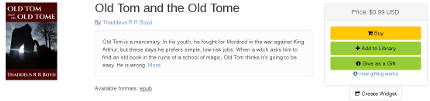
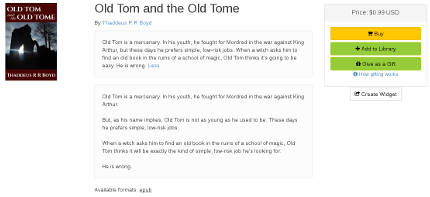
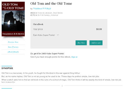
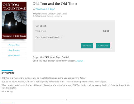
A short story's the perfect length to start with. Old Tom and the Old Tome clocks in around 3,000 words, split up into 4 separate sections (cover, copyright, story, About the Author). It has a great structure for learning the ropes.
Of course, you don't have to go the fiction route. In fact, it occurs to me that this blog post would actually convert quite nicely into a short eBook. Hm, food for thought.
Scrivener
I checked out Scrivener because Charles Stross swears by it. It's basically an IDE for writing books; it's quite simply the most advanced and mature piece of software there is for the purpose.
There's a Linux version, but it's abandonware. For a GNU/Linux user such as myself, this is something of a double-edged sword: on the plus side, I get Scrivener for free, where Mac and Windows users have to pay $40 for it; on the minus side, if a system upgrade ever causes it to stop working, I'm SOL. If Scrivener stops working on my system, there's not going to be a fix, I'll be locked into a platform I can no longer use. I could try and see if the Windows version will run under WINE, but there's no guarantee of that.
The good news is that Scrivener saves its files in standard formats, so if it ever stops working I'll still be able to access my content in other programs. The bad news is that it saves its individual files with names like 3.rtf and 3_synopsis.txt.
So Scrivener's pretty great, and I'll probably stick with it for a little while even though there are no more updates on the horizon for my OS -- but there's a definite downside to using the Linux version. (And if they decided the Linux version wasn't going to bring in enough profit to justify maintaining it, what happens if they decide the same thing for the Windows version someday, maybe leave it as a Mac-only product?)
Getting Started
Scrivener's got a great tutorial to run through its functionality; start there.
When you're done with the tutorial and ready to get to work on your book, I recommend using the Novel template, even if you're not writing a novel, because it automatically includes Front Matter and Back Matter sections; the Short Story template does not.
Scrivener's got your standard MS-word-style tools for formatting your work. I didn't use them. Since I was targeting a digital-only release and no print version, I wrote my story in Markdown, which converts trivially to HTML but isn't as verbose as HTML.
Output Formats
Since I went the Markdown route, I found that the best option for output at compile time was Plain Text (.txt). The most vexing thing I found about the output was the limited options under the "Text Separator" option -- the thing that goes between different sections. What I wanted was a linebreak, followed by ***, followed by another linebreak. Scrivener doesn't have any option for that -- your options are Single Return, Empty Line, Page Break, and Custom. Under Custom you can put ***, but there doesn't seem to be any way to put a linebreak on either side of it. So I found the best option was to just do that, and then manually edit the text file it put out and add a linebreak on either side of each one.
If you plan on making an EPUB file, you'll probably want to keep all the "smart quotes" and other symbols that Scrivener adds to your text file. However, if you want to distribute the Markdown file in plain text and want it to be readable in Chrome, you'll need to remove all the pretty-print characters, because Chrome won't render them correctly in a plain-text file (though it'll do it just fine in a properly-formatted HTML file). You'll also want to use the .txt extension rather than .md or .markdown if you want the file to display in Firefox (instead of prompting a download).
You've got different options for converting from Markdown to HTML. Pandoc is a versatile command-line tool for converting between all sorts of different formats, but I don't like the way it converts from Markdown to HTML; not enough linebreaks or tabs for my tastes. There are probably command-line flags to customize those output settings, but I didn't find them when I glanced through the man page.
I thought Scrivener's Multimarkdown to Web Page (.html) compile option worked pretty well, although the version I used (1.9 for Linux) has a bug that none of the checkboxes to remove fancy characters work correctly: you're getting smartquotes whether you want them or not. You also don't want to use *** as your section separator, because Scrivener reads it as an italicized asterisk (an asterisk in-between two other asterisks, get it?) instead of an HR. Similarly, it reads --- as an indicator that the previous line of text is an h2.
So your best bet for a section break is something like
</p><hr/><p>
or
<div class="break">*</div>
(Actually, you don't want to use HR's at all in an EPUB, for reasons I'll get to later, but if you want to distribute an HTML version of your book, it's fine to use them in that version.)
Sigil
Sigil is an excellent, very straightforward tool for editing the EPUB format. I recommend you grab the Sigil User Guide, go through the Tutorial section, and do what it tells you -- even the stuff that generates seemingly ugly code. For example, if you use Sigil's Add Cover tool, you wind up with code that looks like this:
If you're like me, looking at that makes you wince. And your instinct will be to replace it with something simple, like this:
<img src="../Images/cover.jpg" alt="Cover" />
But don't do that. Removing the <svg> tag, or even removing those ugly-ass inline styling attributes, will prevent the cover from displaying correctly as a thumbnail in readers.
(If there is a way to clean up that ugly <svg> tag and still have the thumbnail display correctly, please let me know; I'd love to hear it.)
Now, Sigil is for the EPUB2 format. It doesn't support any of the newfangled fancy features of EPUB3, and neither do most readers at this point. You're going to want to keep your styles simple. In fact, here's the entire CSS file from Old Tom and the Old Tome:
Oh, and that last class, .break? That's there because some readers ignore <hr/> tags. FBReader on Android, for example, will not display an HR. No matter how I tried formatting it, it wouldn't render. Not as a thin line, not even as a margin. If you use an <hr/> tag in your EPUB file, FBReader will act as if it isn't there.
So I wound up cribbing a style I saw in Tor's EPUB version of The Bloodline Feud by Charles Stross:
<div class="break">*</div>
where, as noted in the above CSS, the .break class centers the text and puts a 1em margin above and below it.
(Some readers won't respect even that sort of simple styling, either; Okular parses the margin above and below the * but ignores the text-align: center style. Keep this in mind when you're building an EPUB file: keep the styles simple, and remember that some readers will straight-up ignore them anyway.)
(Also: this should go without saying, but while it's okay to look through other eBooks for formatting suggestions and lifting a few lines' worth of obvious styling is no problem, you don't want to go and do anything foolish like grab an entire CSS file, unless it's from a source that explicitly allows it. Even then, it might not be a good idea; formatting that works in somebody else's book may not be a good idea in yours.)
Testing
Once my EPUB was done, I tested it in a number of different readers for a number of different platforms at a number of different resolutions. There are a lot of e-readers out there, and their standards compliance is inconsistent -- much moreso than the browser market, where there are essentially only three families of rendering engines.
If you're used to using an exhaustive, precise set of CSS resets for cross-browser consistency, you probably expect to use something similar for e-readers. Put that thought out of your head; you're not going to find them. The best you're going to get are a few loose guidelines.
Consistency across different e-readers just isn't attainable in the way that it is across different web browsers. Don't make that a goal, and don't expect it to happen. You're not looking for your eBook to display perfectly in every reader; you're just looking for it to be good enough in a few of the most-used readers.
For example, I found that the margins the Nook reader put around my story were fine on a tablet, but I thought they were too much on a phone. If I'd wanted, I could have futzed around with media queries and seen if that was possible to fix -- but I decided no, it was Good Enough; it wasn't worth the effort of trying to fix it just for that one use-case.
If you already know HTML, here's what I can tell you about the Smashwords Style Guide: read the FAQ at the beginning, then skip to Step 21: Front Matter. Because it turns out that Steps 1-20 are about how to try and make Microsoft Word output clean HTML and CSS. If you already know how to write HTML and CSS yourself, there is of course absolutely no fucking reason why you would ever want to use Word to write your HTML and CSS for you.
It's probably a good idea to read the rest of the guide from Step 21 through the end, but most of it's pretty simple stuff. To tell the truth, there are exactly two modifications I made to the EPUB for the Smashwords edition: I added the phrase "Smashwords edition" to the copyright page, and I put ### at the end of the story (before the back matter). That's it.
For all the time the guide spends telling you how easy it is to fuck up and submit a file that will fail validation, I experienced none of that. My EPUB validated immediately, and it was approved for Smashwords Premium the next day (though Smashwords says it usually takes 1-2 weeks; the quick turnaround may have been a function of how short my short story is).
Description
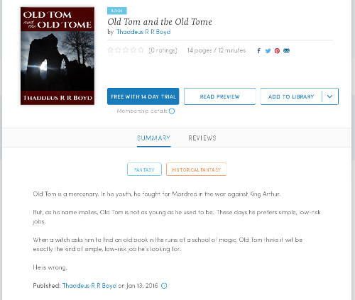
Most of the forms you fill out on the Smashwords Publish page are well-documented and/or self-explanatory. The Long Description and Short Description fields are exceptions; it's probably not entirely clear, at a glance, where your listing will show the short description and where it will show the short one. So here's how they work:
On Smashwords, your book's listing shows the short description, followed by a link that says "More". When you click "More", the long description appears underneath the short description.
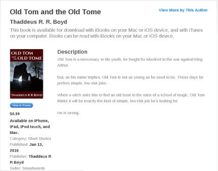
Smashwords
Kobo and iBooks don't appear to use the short description at all. Your book's listing will show the first few lines of your long description, followed by an arrow (on Kobo) or a "More..." link (on iBooks), which you can click to expand to show the entire description.
Kobo
iBooks
Aside: Why the fuck does it do this?
Look at all that whitespace. What's the point of hiding the text?
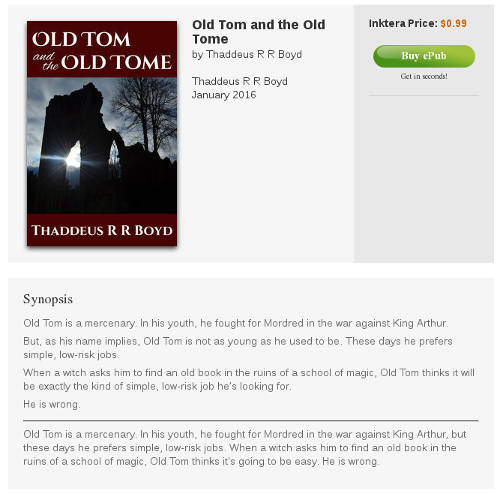
Inktera shows the long description, followed by an HR, followed by the short description.
Lastly, Blio doesn't show either description of my book. Clearly this is a problem and I should probably talk to tech support about it.
As you might expect, the various different ways the different sites use the two descriptions create a bit of a conundrum: how can you write a short description that is the primary description on one site and a long description that is the primary description on four other sites, and write the two descriptions so that they don't look pointless and redundant when you put them side-by-side?
I haven't come up with a good solution for this in the case of Old Tom yet.
Amazon
It turns out the Amazon conversion is really easy. I just set up an account at kdp.amazon.com, filled out the forms, uploaded the cover and the EPUB file, and Amazon's automatic conversion software switched it over to Kindle format with no trouble at all. Amazon's even got a really nice online reader that lets you check how your file will look in the Kindle Reader on various devices (Kindle Fire HD, iPhone, iPad, Android phone, Android tablet, etc.).
I only hit one speed bump when I submitted to Amazon: after a few hours, I got an E-Mail back saying that the book was freely available online (because of course it is; I've posted it in multiple places, including this site). Amazon required me to go back through and reaffirm that I am the copyright holder of the book -- which meant just going through the exact same forms I'd already filled out and clicking the Submit button again. It was a little bit annoying, but not time-consuming and mostly painless, and the book appeared for download on Amazon shortly after.
And that's it.
The hardest part of self-publishing an eBook was finding the time, figuring out what resources to use, and learning the EPUB format. And now that I know what resources to use and understand the EPUB format, it doesn't take nearly as much time. For my next book, I'll be able to spend a lot more time writing and a lot less time formatting. Hopefully this blog post has helped you so that you can do the same.
In honor of Banned Books Week, the latest Humble Books Bundle is made up of banned and challenged comic books.
It's not just a good theme, it is, in terms of quality content for your money, the single best collection of comics I have ever seen. I've got a couple caveats about the presentation, which I'll get to in a minute, but it's well worth the price of admission, whatever tier you choose to donate at.
Pay more than the average and you get Heartbreak Soup.
Heartbreak Soup is my all-time favorite comic. Your mileage may vary, but as far as I'm concerned, the list of Greatest Comics of All Time goes Heartbreak Soup, then Maus, then that Spider-Man arc where he has to lift the rubble off him as Doc Ock's underwater base collapses. (No, Watchmen is not in my top three.)
The bundle also has the first volume of Bone. Bone is phenomenal; it's an all-ages adventure story in the classic mold, with influences from Walt Kelly to Carl Barks to Don Martin; it's funny and it's gorgeously drawn. You should definitely get it if you haven't read it yet; it's at the first tier so it can be yours for a penny.
The bottom tier's also got Maggie the Mechanic, which is the other Love and Rockets vol 1. (Heartbreak Soup is the first volume of Gilbert Hernandez's Palomar stories; Maggie the Mechanic is the first volume of Jaime Hernandez's Locas stories.) Maggie the Mechanic is great too, but for my money it's not as great as Heartbreak Soup, or as the other Locas stories that followed. (The Death of Speedy is widely regarded as the best Love and Rockets story; it's in vol 2 of Locas, which is not included in this bundle.)
Bottom tier also has The Frank Book. Jim Woodring's work is beautiful, surreal, wordless, and incredibly detailed. I have six pieces of comic book art hanging on my walls. One is a Quantum and Woody poster signed by Christopher Priest; one is an Uncle Scrooge print signed by Don Rosa. The other four are Jim Woodring prints that my uncle gave me for my birthday after using them in a museum exhibit.
There's some other stuff in there that I don't know as much about. I like Chester Brown but I haven't read The Little Man; I like Jeff Lemire but I haven't read Essex County. I suppose they're probably both pretty great based on their respective cartoonists' other work, but I don't know them.
And The Boys is in there. The Boys is not for me; I'm not a Garth Ennis fan. But if you like the sound of a bunch of asshole superheroes being taken down by a group of regular guys led by somebody who looks exactly like Simon Pegg, you'll probably dig it.
To summarize: it's a great bundle. It's worth buying for Heartbreak Soup, Bone, and Frank alone; I bought it mostly because I'd been wanting to pick up Frank, Essex County, and Information Doesn't Want to be Free by Cory Doctorow (available as an audiobook in this bundle; the only item that isn't a comic book).
So. Great bundle. But. As I said, there are some caveats with the format.
The first of which is, you're probably going to be reading these on a tablet. And some of these comics just don't look as good on a 10" screen.
I was especially worried about The Frank Book given the detail of Woodring's work; this stuff's meant to be read at 8.5"x11" size. But I was surprised to find it actually looks great on my tablet. The full-size book would be better, but it also costs $35 and weighs 3 pounds. And that's the paperback version.
Bone looks fantastic on my screen too.
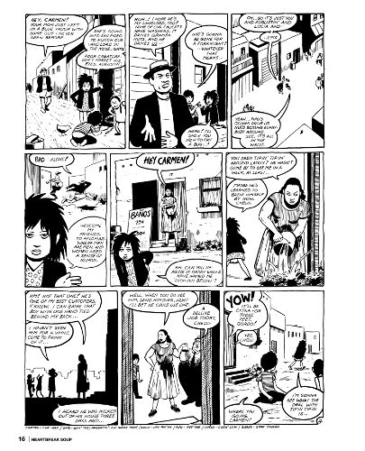
Surprisingly, of the books I've thumbed through, the one that suffered most was Heartbreak Soup.
Part of that's to do with the ratio. The pages of Love and Rockets are shorter and wider than standard comic book pages.
Bone Scaled to 325x500
Heartbreak Soup Scaled to 405x500
So on a 6:10 screen like my tablet's, you're left with some major letterboxing and a picture that is uncomfortably small and looks a little jaggy, and text that can be hard to read. (If, on the other hand, you have a tablet with a 4:3 screen, like an iPad, I imagine the Love and Rockets -- and the other more square-ish comics in the collection -- will look a lot better, and you'll have the opposite problem with the more traditionally-sized comics in the set.)
Perfect Viewer also seemed to choke on the file a bit; after the first few pages, it started pausing for long periods of time on each page turn. At first I thought it was due to the file size (the CBZ version is 675MB), but The Frank Book is even bigger and Perfect Viewer didn't give me any trouble with it. So I don't know why it doesn't like Heartbreak Soup, but it doesn't.
In short, Heartbreak Soup is my favorite comic, but my 10" tablet is most definitely not the best way to read it. Again, your mileage may vary; you may have better luck on an iPad, as noted, or if you're cool with just reading it on a desktop computer monitor, it looks great on my 27" 2560x1440 screen. But if you're looking for comics to read on a widescreen tablet, well, there are still a lot of great books in this set that totally justify the purchase, but don't buy it just for Heartbreak Soup. All that said, though? It's still a great damn comic, it doesn't look that bad on my tablet, and if you don't want to look for it at your local library or pay full price for the paperback version, well, it's still worth a read.
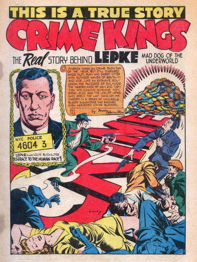
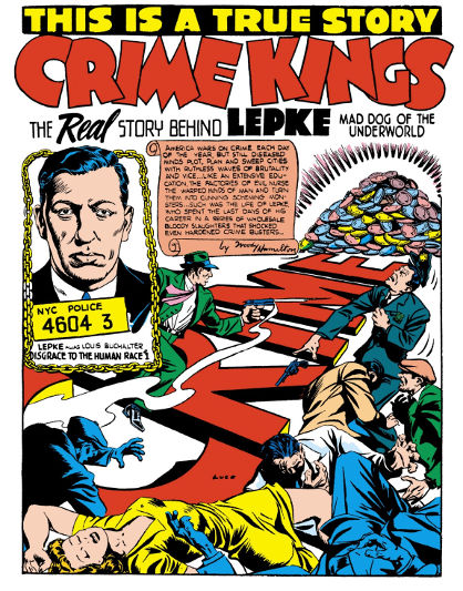
There's another one I looked through that I have a visual complaint about, and unfortunately, it's an important one and the granddaddy of all challenged comics: Crime Does Not Pay.
Crime Does Not Pay is a classic. It's the first and most successful of the 1940's-'50's-era crime comics that led to Senate hearings and, eventually, the Comics Code and most of the industry going out of business. But, aside from simply being popular, controversial, and lurid, it's just plain good, with superlative work from the likes of Charles Biro, Bob Montana, and George Tuska.
It's also public domain. You can find most of the series for free on Digital Comic Museum (though if you can spare a donation to keep the site up and running, that would be swell too).
Given that, it's damned disappointing that Dark Horse did such a shoddy job on the colors.
Digital Comic Museum
Dark Horse
The first image is a scan from one of the original 1950's printings of the comic. It's not pristine; the colors bleed, and if you look closely you can see right through the page to the panel grid from the opposite side. And there are marks on the left side of the page where the staples were.
But despite those flaws, it looks better than the second image, from Dark Horse's restoration. The colors in Dark Horse's version look garish.
And it's down to the paper stock. The scan looks the way it's supposed to, because those colors are supposed to be printed on newsprint. The background is supposed to look a little gray or tan, and the colors are supposed to soak in and blend together.
Dark Horse's version looks garish because they kept the original four-color printing process but put it on high-quality, glossy paper (or the digital equivalent of same). The colors look wrong.
But, in Dark Horse's defense, it could have been worse -- at least they didn't re-color it. Have you seen what they've done to their Conan reprints? Photoshop gradients everywhere. The horror. The horror.
"It could have been worse" isn't a great defense, though. When it comes right down to it, I'd rather read the Digital Comic Museum version, even if I can see the grid lines from the other side of the page.
The only problem is, the Dark Horse collection contains issues #22-#25 (don't let the numbering fool you; #22 is the first issue -- in those days it was common, when a publisher canceled a comic and started a new one, for the new series to continue the old series' numbering with a new title), and Digital Comic Museum doesn't have #23-#25. So while you can download DCM's superior version of issue #22 (and #26, and #27, and lots more, on up through #147), if you want to read #23-25 then you're stuck with the Dark Horse version, and you'd better be prepared for a hell of a lot of eye-searing bright yellow.
There are plenty of instances of publishers doing reprints of old comics right -- either by using newsprint or by scanning or photographing the original printed pages -- but this isn't one of 'em, and that's a shame.
But, all that grousing aside, this bundle? If you have never read a comic book in your life, this has three that I would rank as Absolute Must-Read, in Heartbreak Soup, Bone, and Frank. It's got one of the legitimate most important comics of all time in Crime Does Not Pay, even if I've got some gripes about the presentation and you might be better off grabbing a scanned version from Digital Comic Museum. And aside from those, it's got several more that may not be quite so high on the must-read list but still rank as Great.
If you like good comics, you should get it. And if you don't like good comics, you should get it anyway, because maybe you just haven't ready any comics this good yet.
It's probably not surprising that rebuilding my website has gotten me thinking about web development.
The first six years I ran this site, I did it all by hand -- my own HTML, my own CSS, no scripting languages. I thought that CMS software was for pussies.
But ultimately, plain old HTML just doesn't scale. I conceded that when I started using b2evolution for my blog back in '06, and it's truer now than it was then.
You can poke around some of the old sections of the site a bit, the ones that haven't been updated significantly since the turn of the century -- KateStory's a good one, or the Features page (though I'd like to get at least the Features page up to date sooner than later, and maybe the KateStory one too, so maybe there'll be people reading this post well after those pages shed their 1990's style) -- and they get the job done. Breadcrumb navigation at the bottom of every section, leading you back to either the parent page or the main index.
But Jesus, you can only manually copy and paste "Back to Features / Back to Index" so many times.
And maintaining a years-long blog archive without a CMS to automate it for you? It gets old.
So, you want some automation? You're going to need a scripting language. That usually means PHP for server-side, and JavaScript for client-side.
I got to thinking the other day -- man, it's weird that you need extra toolsets to perform such common tasks as, say, reusing a navigation bar. It's weird that there's not some way just to write up a navigation bar and then write code, in HTML, no scripting required, to embed that common HTML block on the current page.
I thought this was a pretty smart observation.
For about three seconds.
At which point I realized I had just described fucking frames.
Course, the biggest problem with frames is that they weren't exactly what I'm describing. I'm talking about just an HTML snippet in some secondary file that you call from a primary file -- like an include in PHP.
That's not what frames were. Frames were complete fucking HTML pages -- <html>, <head>, <body> (or, more likely, <HTML>, <HEAD>, <BODY>, because in the old days we wrote HTML tags in all-caps) -- which is, most times, downright stupid and wasteful, and was much moreso in the days of 14.4 dialup. Even worse than the load time was the logistics -- if you used frames to build a website with a header, a footer, and a sidebar, you'd have a total of five separate web pages -- a content area, the three other sections, and some kind of main page that all of them were embedded into. This was a fucking nightmare for linking, both for the developer (who had to remember to set the target attribute on every single link, lest the page load in the navigation bar instead of the content area) and the end user (because the URL in the location bar would be the container page that called all the other pages, not the content page the user was currently looking at).
In a way, it's kinda weird that nobody's gone back to that well and tried to do it again, but do it right this time. Update the HTML spec to allow an HTML file to call a reusable snippet of HTML from another file, one that isn't a complete page.
Given all the concessions HTML5 has made to the modern Web, it's surprising that hasn't happened, even given how slowly it takes for a spec to be approved. We've got a <nav> tag, which is nice and all, but who the hell uses a <nav> tag without calling some kind of scripting language that automates code reuse? There really aren't that damn many reasons to use the <nav> tag for code that isn't going to be reused on multiple pages throughout a site.
And I dunno, I'm sure somebody's brought this up, maybe it's on the itinerary as a consideration for HTML6.
Which is another thing, really: the people making the decisions on the specs do not want the same things I want.
I liked XHTML. (In fact, lest this whole thing come off as a curmudgeonly damn-kids-get-off-my-lawn diatribe against new technologies and standards, I'd like to note that I was using XHTML Strict back when you pretty much had to be using a beta version of Phoenix -- before it was Firebird, before it was Firefox -- for it to render correctly.) I thought it was the future. I wish XHTML2 had taken off. HTML5 feels ugly and inconsistent by comparison, and, as legitimately goddamn useful as it is to be able to put something like data-reveal aria-hidden="true" in the middle of a tag's attributes, it always feels dirty somehow.
But I digress.
Point is, in 2006, I switched the blog from just plain old HTML and CSS, and added two more elements: a MySQL database to actually store all the shit, and a PHP CMS (originally b2evolution, later switched to WordPress).
And then came smartphones.
We live in a world now where every website has to be designed for multiple layouts at multiple resolutions. You wanna try doing that without using an existing library as a base? Try it for a few days. I guarantee you will no longer want that.
I think my resistance to picking up new libraries is that every time you do it, you cede a measure of control for the sake of convenience. I don't like ceding control. I like my website to do what the fuck I tell it to, not what some piece of software thinks I want it to.
I've spent the last decade arguing with blogging software to get it to quit doing stupid shit like turn my straight quotes into "smart" quotes and my double-hyphens into dashes. Just the other day, I built a page in WordPress and discovered that it replaced all my HTML comments with fucking empty paragraphs. Why would I want that? Why would anyone want that?! And that's after I put all the remove_filter code in my functions.php.
And that's the thing: WordPress isn't built for guys like me. Guys like me use it, extensively (it is the world's most popular CMS), because it automates a bunch of shit that we'd rather not have to deal with ourselves and because when we're done we can hand it off to end users so they can update their own site.
But I still write these posts in HTML. I want to define my own paragraph breaks, my own code tags, the difference between an <em> and a <cite> even though they look the same to an end user.
(And okay, I still use <em> and <strong> over <i> and <b>; there's really no explaining that except as a ridiculous affectation. I recently learned Markdown and used it to write a short story -- I'll come back to that at a later date -- and I could see switching to that. HTML really is too damn verbose.)
...and that was another lengthy digression.
So. Mobile design.
Bootstrap is the most commonly used toolkit for responsive websites. I've used it, it works well, but it's not my favorite idiom, and I've decided I prefer Zurb Foundation. So that's what I used to build the new site layout.
Except, of course, then you've got to get two dueling design kits to play nice to each other. Square the circle between WordPress and Foundation.
I started to build the new theme from scratch, and I'm glad I was only a few hours into that project when I discovered JointsWP, because that would have been one hell of a project.
JointsWP is poorly documented but has proven pretty easy to pick up anyway.
So. I've gone from HTML and CSS to HTML, CSS, and WordPress (HTML/CSS/PHP/MySQL), to HTML, CSS, WordPress, Foundation (HTML/SCSS/JavaScript, importing libraries including jQuery), and JointsWP (ditto plus PHP). And on top of that I'm using Git for version tracking, Gulp to process the SCSS, and Bower to download all the other scripts and toolkits I need and keep them updated.
So, going with Foundation (or Bootstrap, or whatever) as a standard toolkit, you get somebody else's codebase to start from. That comes with some elements that are a necessary evil (I hate fucking CSS resets, and think writing p { margin: 0; } is an abomination in the sight of God and Nature -- but if it means I can assume my site will look more or less correct in Mobile Safari without having to go out and buy an iPhone, then I guess I'll take it), and others that are actually pretty great -- I find SCSS to be really exciting, a huge saver of time and tedium, and it's hard to go back to vanilla CSS now that I've used it.
Course, with increasing complexity, you still hit those things that don't quite work right. One example I've found is that Foundation sets your placeholder text (the gray letters that appear in an "empty" input field) too light to be legible, and does not have a simple definition in _settings.scss to let you adjust it to darker. I've found a mixin that allows you to create such a definition pretty simply, but for some reason JointsWP doesn't like it (or maybe Gulp doesn't). So until I get around to finding a fix, the text stays light, and I'll just have to trust that you the user will be able to determine that the input field under the phrase "Search for:" and to the left of the big blue button that says "Search" is a search box.
I've also got loads of optimization still to do; part of that's going to mean figuring out what parts of Foundation's CSS and JS I'm not actually using and cutting them out of the calls, and part of it's probably going to mean minification.
Minification is one of those things I resisted for awhile but have come around on. It can be a real hassle for debugging, not being able to view a stylesheet or script in full, and it may not be practical just to save a few kilobytes (or a few dozen, rarely a few hundred) -- but on the other hand, well, it's not so different from compiling source code to binary; the end result is still that you take something human-readable and turn it into something much less human-readable.
And of course now that I'm using a preprocessor, my CSS file isn't my real source code anyway; it's already the result of taking my code, feeding it through an interpreter, and outputting something that is not my code. If you want to look at the stylesheet for this site, you want to look at the SCSS file anyway (it's on Github), not the CSS file. And if I'm already telling people "Look at the SCSS file, not the CSS file," then what's the harm in minifying the CSS file and making it harder for people to read?
For now -- prior to removing unnecessary code calls and minifying everything -- I feel like the site design's a lot more bloated than it needs to be. And even once I slim it down, there are going to be some compromises that go against my sensibilities -- for example, when you loaded this page, you loaded two separate navigation systems, the desktop version (top navigation and sidebar) and the mobile version (just a sidebar, which contains many of the same elements as the topnav and sidebar from the desktop version but is not exactly the same), even though you can only see one of them. That redundancy makes me wince a little bit, but ultimately I think it's the best and simplest way of doing it. Sometimes, good design does require some redundancy.
All that to say -- man, there have been a lot of changes to web design in the last twenty years. And while there are trends I really don't like (if I never have to build another slideshow it'll be too soon; gradients are usually dumb and pointless; and the trend of making visited links the same color as unvisited ones feels like a step backward into 1995), there are also a lot that I've eventually warmed up to, or at least accepted as something I've gotta deal with.
Anyway. Welcome to the new corporate-sellout.com.
And one more thing about the site before I go: it's probably worth noting that this site is different from the other sites I build, because it's mine. Its primary audience is me. I like having an audience, but frankly I'm always a little (pleasantly) surprised whenever anyone actually tells me they enjoyed something I put on this site.
Because this site isn't one of my professional sites. I didn't build it for a client. It's not my portfolio site, which I built to attract clients. This one? It's for me. As should be clear from this rambling, 2200-word stream-of-consciousness post about the technical ins and outs of web design, as it applies specifically to me and to this site.
Frankly I'm always surprised when anyone actually reads anything like this.
So I spent the past few days trying to get Ubuntu Studio installed on my 2006-era Mac Pro 1,1. I can't speak for other Macs specifically, but here are some details you're going to want to know if you engage in that undertaking:
The Mac Pro 1,1 won't boot Linux from a USB stick.
It also won't boot it from a dual-layer DVD. Double-check and make sure you're not using dual-layer.
The LTS releases of Ubuntu (such as 14.04) have images that are specifically labeled "amd64+mac". Use those. Otherwise you might wind up stuck on an unresponsive "Select CD-ROM Boot Type" prompt.
You may or may not need to install rEFInd to help you boot from a Linux disc. If your disc isn't showing up when you hold the Option key at boot, give rEFInd a shot.
There's a useful guide at Ubuntu Community Help called Installing on a Mac Pro - Cylinder (Late 2013). As the title implies, it's not written for the older-model Mac Pros, but most of what it says is still applicable. (But it tells you not to use the Mac-specific ISO files. Don't listen to that part; you should use those on the 1,1 model.)
Well, I was all set to write a post filled with righteous indignation at Apple's nannying and censoring ways when I read that Saga #12 was banned from being sold through the iOS version of the Comixology app.
But then when I sat down to write it I found that Comixology is now claiming Apple never actually refused it, Comixology chose not to submit it on the assumption that Apple would reject it.
That makes for a bit of a different post.
But a lot of the major points remain.
First of all, the disproportionate market share enjoyed by both Apple and Comixology in the comics market is cause for concern. Monoculture is a bad thing, and when there's only one distribution point for a product -- or two, or three --, that puts the producer and the consumer at the middleman's advantage. And it can amount to censorship. Or price-fixing, or any number of other ills.
Additionally, even if this is Comixology's fuckup, it's the result of Apple's notoriously vague content restrictions. Even if Comixology played it too cautious on this one, there's still the story of what allegedly happened to French publisher Izneo just two weeks ago:
Two weeks ago -- on the eve of the long Easter week-end, the site IDBOOX notes -- the Izneo folks got an order from Apple to remove the "pornographic" content from their app. With no clue as to what Apple would judge to be pornographic, the Izneo folks immediately took down 2,800 of the 4,000 comics in their app, cautiously removing anything that could hint of adult content, including Blake and Mortimer and XIII, both of which are published in print in the U.S. without any fuss. Then they reviewed those comics and put about half of them back, but that still leaves 1,500 titles that aren’t in the app any more. Izneo took quite a financial hit on this; turns out comics featuring "Les jolies filles un peu sexy" are their top sellers. (This story, it should be said, came from an anonymous source.)
And even though that story seems to be apocryphal, stories of Apple's arbitrary app rejection and inconsistent treatment of adult content are legion. The first time I ever browsed the iTunes store, the title of Bitches Brew was censored. In the years since, many developers and publishers have expressed frustration that Apple rejected their submissions and didn't tell them why. And then of course there's Jobs's famous Orwellian "freedom from porn" stance.
Ultimately, I'm an Android user because I don't want a single company to be in charge of content distribution. It's not that I trust Google -- I really don't. I have plenty of complaints about Google; they're invasive, monopolistic, and generally evil and scary. But the bottom line, for me, is that they make it much easier to run whatever software you want on their devices -- and as far as I'm concerned, the choice between Android and iOS doesn't take any choosing at all.
Well, as mentioned, after several years and many a misadventure, I've given up on RAIDZ for Mac and decided on good ol' dependable RAID 10. Today I finally got around to building the array...and realized I'd forgotten how to do it.
Fortunately, it's well-documented on Apple's site. The trick is that you build all 3 RAID sets (two RAID 1/mirrored, one RAID 0/striped) at once; you can't build the two RAID 1 sets and then add them both to a RAID 0 set afterward.
Course, the next step is to copy all the files off her old drives onto the new array, and that is going to take a lot longer -- especially since I don't have a spare FireWire 800 (or even 400) enclosure and I have to use USB 2. It'll be at that copy all night, and that's just the first drive. Which means no rebooting to play The Walking Dead like I'd hoped.
So it goes -- my wedding's in three weeks and I need to get this done so Gran can put a video together for it.
My grandmother makes home movies on her MacBook Pro.
About three years back she was low on space and got a stack of 500GB LaCie drives. I wanted to arrange them as a software RAID 10 array for a bit of redundancy, but I realized that 4 500GB drives arranged in RAID 10 comes out to only 1TB -- not that much in the scheme of things.
So we ordered 4 2TB drives to swap out.
About this time, I read about software in development by an organization called Ten's Complement. See, Apple had been planning to switch to ZFS as its primary filesystem a few OS releases ago, but the project fell through; its former FS head left and started his own company and was still working on bringing ZFS to Mac. So I figured I'd wait for the imminent release of the product so I could use RAIDZ instead of RAID 10, and not have to give up so much space.
There was delay after delay. Finally the software was released as ZEVO Silver Edition; Gold and Platinum releases were slated for the future. (I guess calling your software Silver, Gold, Platinum is kinda like those pizza places that have Medium, Large, and Extra Large pies.)
But the forecast release dates came and went, with no Gold or Platinum and no word from Ten's Complement.
Months later, there was finally an explanation -- ZEVO had been bought out by Greenbytes -- but still no Gold or Platinum (or even Silver anymore). There was a free-as-in-beer command-line-only Community Edition, and...that was it.
Now, I don't want my grandmother stuck using the command line, but I figured I could use the Community Edition to set up the array on my computer and after that it should run fine on hers.
The problem? The documentation says ZEVO only runs on Macs with 64-bit kernels.
Now, I've got a Mac Pro 1,1. It has 32-bit EFI. To run a 64-bit kernel requires a third-party bootloader.
And I've chronicled my experience with 64-bit OSX already, in October and again a couple weeks ago. tl;dr it boots but it's so unstable as to be useless.
Only this week did it occur to me to check whether my grandmother's computer can run a 64-bit kernel.
It doesn't. So ZEVO looks like a moot point anyway, because God knows I'm not going to subject her to the kind of hoops I've had to jump through to try to get 64-bit Darwin working.
I figure I'll still try it, just in case it works despite being unsupported -- but I'm not holding my breath. Guess it's back to RAID 10 after all. I guess on the plus side, 2TB hard drives haven't gotten any cheaper in the 2 or 3 years these have been sitting unopened waiting for use.
So I went to take a crack at setting up RAID 10 today, and it looks like one of the LaCie power supplies has gone and died on me -- this is not the first time this has happened. So, one more setback while I order a replacement and wait for it to come in.
Too bad the RAIDZ thing hasn't panned out so well. And of course it's a double-edged sword that Apple's as aggressive as it is in discontinuing support for old hardware.
But hopefully I'll finally be able to wrap this thing up sometime next week.