I like the Humble Bundle. I've bought rather a lot of games, comics, and books there.
Usually the comics and books have been DRM-free, but recently they've had a couple of bundles, including a Discworld bundle and a TMNT bundle (still available as of this post), that, instead of being straight DRM-free file downloads, required that buyers redeem DRM-encumbered files from Kobo.
Fortunately, it's not difficult to strip DRM from Kobo downloads, so that you can read your books on whatever device and in whatever app you choose. Here's how:
Download DeDRM tools (make sure you get it from the noDRM repository, not the original apprenticeharper one; the latter is no longer maintained).
Extract the zip file.
In Calibre, go to Preferences → Advanced → Plugins. Click "Load plugin from file", browse to the directory you just unzipped into, and install both _plugin.zip files. Restart Calibre after both are installed.
Install Kobo Desktop (direct link to kobosetup.exe). Run it, log into your Kobo account, and download the books you want. Once they're finished downloading, quit out of the Kobo app.
In Calibre, click the "Obok DeDRM" link in the top bar. From there it's pretty self-explanatory; whatever books you select will be added to your Calibre library and you can find the epub files in your file browser.
That's it for stripping the DRM, but there's one more thing I noticed: it turns out that my comics reader app of choice, Perfect Viewer, doesn't really work very well with epub files; for some reason it doesn't support the same features for epub as it does for cbz/cbr/pdf files (eg automatically showing two pages when rotated). Fortunately, there's a dead-simple workaround: change the file extension from .epub to .cbz. (A CBZ is just a zip file of images; an EPUB is basically a zipped website. Change the extension from EPUB to CBZ and PerfectViewer just ignores the HTML files and looks for the images.) YMMV depending on your reader of choice; some will show side-by-side pages without issue (like Calibre's built-in reader) and the file extension trick may not work in others (since the images aren't at the root of the zip file; in that case you may need to extract the EPUB and then re-zip just the images into a CBZ file).
I made it to my mid-thirties without ever reading a Stephen King book.
It wasn't some kind of hipster thing; I wasn't consciously avoiding him because he's popular. And it wasn't that I don't generally read horror novels, either, because of course he's got plenty of output in other genres. No, I just never got around to it, even though I've enjoyed movie adaptations of his work for years.
I read On Writing a year or two back, and a few months back I picked up the first three Dark Tower books at Bookmans and I've been working through those. And you know what? I think this guy's pretty good.
He's certainly got a gift for storytelling. And for words. And symbolism, and character, and he's got a real sense for how to juxtapose images in interesting ways. I've never read Ready Player One, or seen the movie, but from what I've read about it I have the impression that Ernest Cline was trying to mix together familiar iconography in the kind of evocative way that King does in Dark Tower, but simply doesn't have King's chops.
But more than anything, I think the reason King's so damn appealing and resonates with so many people is that it's so obvious he's having fun.
Mark Evanier told a story about Harlan Ellison shouting, "I have just written the greatest fuckin' sentence I have ever written!" before running out his front door and dancing naked on his front porch. Evanier mused that this was why Ellison's writing was so good: because he was the sort of person who was so enthusiastic about what he was writing that he'd dance naked on his front porch, and because that enthusiasm was clear in the final product.
I'm not aware of Stephen King ever dancing naked on his front porch. But he's got the same kind of enthusiasm for his work that Ellison did, and it's infectious.
The first three Dark Tower books are all I've got. I finished those and I'm going to take a break from the series before I pick up the rest. I've got plenty else to read -- I just started Good Omens, and I'm also chest-deep into a Valiant Comics bundle, which I'll probably have a lot to say about when I get to the end of it. But I'm glad I finally took the time to read some King. The guy's good, and his popularity is well-earned.
I'm going to include some Amazon links here. As always, support your local comic shop or independent bookseller if at all possible, but if for some reason you can't (you don't have a local comic shop, your local bookstore can't order these books, etc.), please feel free to use these Amazon links; as always, they're Amazon Associates links and if you buy through them I'll get a small kickback.
While most of Kurtzman's work is in print, some of his earliest work, sadly, isn't; Hey Look! goes for big bucks used. But his EC work is available in a couple of different forms. Dark Horse has its hardback EC Archives series including Two-Fisted Tales, Frontline Combat, and other titles that feature earlier Kurtzman work such as The Haunt of Fear, Crime SuspenStories, and Weird Science. Fantagraphics has black-and-white collections sorted by artist. Corpse on the Imjin contains some stories that Kurtzman wrote and drew himself, and others that he wrote and laid out but other artists finished. (I think I'll have more to say about Kurtzman's layouts in a later post.) Other books with with Kurtzman's layouts and other artists' finishes include Bomb Run (finishes by John Severin), Aces High (George Evans), and Death Stand (Jack Davis). Some of these books are also available in digital versions. Dark Horse books have DRM, but Fantagraphics books don't.
Unfortunately, neither format is ideal. The Dark Horse books are massive hardcovers, fit for a coffee table but not to be thrown in a backpack and taken with you. And I don't care much for the new coloring job. The Fantagraphics books, on the other hand, shrink the art down, and while the black-and-white presentation brings out more detail in the art, I think the stories lose something without their color. Plus, I prefer seeing the stories presented in their original anthology format to seeing them split up by artist. Still, while neither choice is perfect, both choices are good.
Which brings us to Mad. It's available in DC Archives collections, which is the best format you're going to get it in. The original comic book run (and issue #24, the first magazine issue) is collected in a 4-volume DC Archives hardcover set. DC Archives books use original coloring on newsprint. I'm kind of a snob about reprint coloring, and this is my favorite way of doing it: keep the original colors and print on newsprint; that's the way those old comics are meant to be seen.
But a $240 hardcover set is expensive -- even if you could get it for that price, which you can't, because the last two volumes are out of print. They are available digitally, but the digital versions have DRM, and unless you're rocking a 12.9" iPad Pro, you won't be seeing the pages at full size on a tablet. I'm also not sure how the colors look if you put them on a screen instead of newsprint -- and anyway, even the digital versions will set you back a total of $160.
I think Mad's Original Idiots is an acceptable compromise. It's three paperbacks, one each for Jack Davis, Will Elder, and Wally Wood; each book collects its respective artist's work from those first 23 issues of Mad; they go for $15 a pop. It uses the original colors and, while the paper isn't newsprint, it's not glossy, either; the colors look okay.
Again, the format's not ideal. You lose the letters and other editorial content. You also don't get any of the work by anybody but Davis, Wood, and Elder -- and that's a cryin' shame; John Severin is a particularly notable omission, but there were a few features by Basil Wolverton, Bernie Krigstein, Russ Heath, and Kurtzman himself in Mad's comic book period too.
But, nonetheless, I think the Mad's Original Idiots paperbacks are a decent way to go. I've bought all three and have been quite enjoying the Davis one so far. Even with the dated references, even not recognizing what half the parodies are making fun of, they're still great damn comics -- but hell, even when I was reading Mad as a kid in the '90s, I hadn't seen half the movies they were parodying, and I loved them anyway.
After Kurtzman quit Mad, he wrote and drew The Jungle Book, which, contrary to its title, is not based on the Kipling book. It's one of the earliest examples of what came to be known as a graphic novel, and it's all Kurtzman's work. It was reprinted in hardcover in 2014 and was nominated for Eisners for Best Domestic Reprint and Excellence in Presentation.
After The Jungle Book came Trump, Kurtzman's followup to Mad, which featured work by his Mad collaborators (including Elder, Davis, Wood, Severin, and Al Jaffee) as well as humorists including Mel Brooks. It was recently collected and is easy to come by.
After Trump came Humbug, another magazine by the original Mad artists.
Kurtzman's last magazine was Help! There's no complete Help! collection, but there is a collection of the Kurtzman/Elder Goodman Beaver cartoons that were published in it. It's out of print, but doesn't cost too much used.
Kurtzman and Elder's longest-term collaboration was Little Annie Fanny, which was published in Playboy, so that link may be NSFW.
Kurtzman's story, alas, is familiar to anyone who's studied comics history: he created an American institution but never achieved financial success from it.
And what tremendous influence he had, and continues to have. Not only did his work inspire the later Underground Comix artists (he counted Crumb, Spiegelman, and Kitchen in particular as friends), but Schelly's not overstating things with that "revolutionized humor in America" line. Mad's influence can be seen everywhere in American comedy, from Airplane! to The Onion to The Simpsons to The Daily Show to "Weird Al" Yankovic, to name a few examples off the top of my head. Hell, did I say "American"? Because that's too limiting. There's Kurtzman influence in Monty Python, too; John Cleese once did a photo shoot for Help! magazine, and that's where he met Terry Gilliam, who was Kurtzman's assistant at the time.
And yet, after Mad, Kurtzman never really had financial stability; he hustled for work for the rest of his life, and died with $35,000 in savings. That's not bad -- it's more money than I've ever had in my bank account, even before adjusting for inflation -- but I'm 35 years old and didn't create Mad.
Of course, part of Harvey's misfortune was self-inflicted. There's little doubt that if he hadn't quit Mad, he would have died a much richer man. His successor, Al Feldstein, went on to retire in comfort, and spent his final years on a 270-acre ranch. If Kurtzman hadn't quit Mad, it certainly would have become a different magazine that it did under Feldstein, but it's reasonable to assume it would have been just as successful.
Schelly notes that, of course, hindsight is 20/20. Kurtzman quit Mad because Hugh Hefner had offered him an unlimited budget and total creative control on a new magazine, glossy and in full color. Let's put it this way: if this were 1956 and you didn't know what you know now, and you heard that the entire creative team of Mad had left to start a new magazine, backed by Hugh Hefner, and Mad was being handed over to the editor of Panic and a bunch of new artists, which of the two magazines would you bet on?
In 2009, Warren Ellis remarked that the late Alex Toth "never drew a story worthy of his talent". Similarly, Kurtzman, in a career that spanned half a century, only ever produced one magazine that was up to his own high standards. It was called Trump, and it got cancelled after two issues.
Schelly posits two major reasons for Trump's cancellation, and neither one was related to sales.
One of the reasons Trump was cancelled was due to external circumstances entirely beyond Kurtzman's control: Collier's unexpectedly ceased publication, and it sent shockwaves through the entire magazine industry. Hefner suddenly had trouble getting investors; something had to give, and it wasn't going to be Playboy.
The other reason was Kurtzman's fault: his perfectionism kept him from meeting deadlines. Gaines had been effective at riding herd on him at EC and making sure Mad (and Kurtzman's previous comics, Two-Fisted Tales and Frontline Combat) shipped on time, but Hefner didn't have similar success keeping Trump on schedule (Hefner was in Chicago and Kurtzman was in New York; this no doubt played a role). Schelly quotes Hef as saying, "I gave Harvey Kurtzman an unlimited budget, and he exceeded it."
And that's what frustrates me the most about Kurtzman's work: I think he got in his own way. I think he was a micromanager who needlessly restricted his incredibly talented collaborators, and his own output suffered from it. Spectacular as Kurtzman's work is, I can't help but wonder how much more he could have done if he'd been able to take a step back and give greater autonomy to guys like Jack Davis and Wally Wood.
And I suspect I'll have more to say about that in a later post.
It lasted five days and five posts, at which point I started experiencing some debilitating thumb pain (carpal tunnel?). The thumb pain's not gone but it's under better control, so maybe I'll take another crack at it.
As I noted at the time, there were a couple things that inspired me to give another shot at regular blogging. One was an angry Sonic the Hedgehog fan who was so incensed by a years-old series of blog posts about Ken Penders that he just had to tell me about it when he came across my name in an entirely unrelated conversation. (Since then I've actually toyed with the idea of reposting my old, 1997-era Sonic the Hedgehog comic reviews here, but unfortunately I haven't been able to find them. They were on the same hard drive as KateStory Book IX, which I went to all that trouble to recover nine years ago; I suspect the files are still somewhere in my giant stack of hard drives but I haven't been able to find them.)
I first became a fan of Nathan Rabin about a decade ago, when he was the head writer of The AV Club and writing a column then called My Year of Flops. Every week for a year, Rabin reviewed a movie that was a commercial failure and evaluated whether it was really as bad as its reputation suggests.
I love bad movies. I love good movies. I love movies that other people don't love. My Year of Flops was right smack-dab in my wheelhouse.
My Year of Flops was eventually completed and released as a book. But the column continued after that first year, under the title My World of Flops; it expanded beyond failed films to include failed books, albums, and recently even a failed presidential campaign.
The AV Club is no longer the kind of site that does features like My World of Flops. So Rabin has started his own, Patreon-supported blog, Nathan Rabin's Happy Place. He's still writing My World of Flops, and other, similar features where he examines lesser-loved media (like Cannon Films). He also talks about other stuff, from politics to brutally honest discussions of his life experiences, including financial hardships and struggles with depression.
But my favorite of his features right now is The Weird Accordion to Al. Rabin literally wrote the book on "Weird Al" Yankovic (it's called Weird Al: The Book), and now he's taking a song-by-song look at Al's entire discography. (As of this writing he's up to Talk Soup from Alapalooza.)
I love Weird Al. I've loved Weird Al for over 25 years. Hell, all this talk about Weird Al has me thinking maybe I'll write some posts about Weird Al. (They won't be as good as Rabin's. But they'll have the added benefit of being about me.)
If you're a "Weird Al" Yankovic fan, you owe it to yourself to read The Weird Accordion to Al. And hey, if you like what you see and can spare a little money for it, kick in on Nathan's Patreon.
It's not just that Nathan's work is enjoyable, insightful, and frequently funny. It's also that his enthusiasm for his blog is infectious. I read a post where he talked about how easy it's turned out to be to write blog posts every day, and I got to thinking, shit, I used to do that for free, I enjoyed it so much. And I thought, y'know, maybe I should start doing that again. I'm going to be writing about whatever the hell's on my mind anyway, whether it's here or on Brontoforumus or The Avocado or the Techdirt comments -- so what the hell, why not here?
So thanks, Nathan Rabin, for giving me the bug again. I don't think I'll manage the same pace I did back in '11-'13 (seven posts a week about Frank Zappa, five posts a week about other stuff), but I'm still going to try and post more often.
And I'm sure those Sonic the Hedgehog comic book reviews are around here somewhere.
This one is probably obvious, but just in case it isn't: I started with a short story because when you want to learn a new skill, you want to start small. I didn't want to write something novel-length and then run into a bunch of problems.
A short story's the perfect length to start with. Old Tom and the Old Tome clocks in around 3,000 words, split up into 4 separate sections (cover, copyright, story, About the Author). It has a great structure for learning the ropes.
Of course, you don't have to go the fiction route. In fact, it occurs to me that this blog post would actually convert quite nicely into a short eBook. Hm, food for thought.
Scrivener
I checked out Scrivener because Charles Stross swears by it. It's basically an IDE for writing books; it's quite simply the most advanced and mature piece of software there is for the purpose.
There's a Linux version, but it's abandonware. For a GNU/Linux user such as myself, this is something of a double-edged sword: on the plus side, I get Scrivener for free, where Mac and Windows users have to pay $40 for it; on the minus side, if a system upgrade ever causes it to stop working, I'm SOL. If Scrivener stops working on my system, there's not going to be a fix, I'll be locked into a platform I can no longer use. I could try and see if the Windows version will run under WINE, but there's no guarantee of that.
The good news is that Scrivener saves its files in standard formats, so if it ever stops working I'll still be able to access my content in other programs. The bad news is that it saves its individual files with names like 3.rtf and 3_synopsis.txt.
So Scrivener's pretty great, and I'll probably stick with it for a little while even though there are no more updates on the horizon for my OS -- but there's a definite downside to using the Linux version. (And if they decided the Linux version wasn't going to bring in enough profit to justify maintaining it, what happens if they decide the same thing for the Windows version someday, maybe leave it as a Mac-only product?)
Getting Started
Scrivener's got a great tutorial to run through its functionality; start there.
When you're done with the tutorial and ready to get to work on your book, I recommend using the Novel template, even if you're not writing a novel, because it automatically includes Front Matter and Back Matter sections; the Short Story template does not.
Scrivener's got your standard MS-word-style tools for formatting your work. I didn't use them. Since I was targeting a digital-only release and no print version, I wrote my story in Markdown, which converts trivially to HTML but isn't as verbose as HTML.
Output Formats
Since I went the Markdown route, I found that the best option for output at compile time was Plain Text (.txt). The most vexing thing I found about the output was the limited options under the "Text Separator" option -- the thing that goes between different sections. What I wanted was a linebreak, followed by ***, followed by another linebreak. Scrivener doesn't have any option for that -- your options are Single Return, Empty Line, Page Break, and Custom. Under Custom you can put ***, but there doesn't seem to be any way to put a linebreak on either side of it. So I found the best option was to just do that, and then manually edit the text file it put out and add a linebreak on either side of each one.
If you plan on making an EPUB file, you'll probably want to keep all the "smart quotes" and other symbols that Scrivener adds to your text file. However, if you want to distribute the Markdown file in plain text and want it to be readable in Chrome, you'll need to remove all the pretty-print characters, because Chrome won't render them correctly in a plain-text file (though it'll do it just fine in a properly-formatted HTML file). You'll also want to use the .txt extension rather than .md or .markdown if you want the file to display in Firefox (instead of prompting a download).
You've got different options for converting from Markdown to HTML. Pandoc is a versatile command-line tool for converting between all sorts of different formats, but I don't like the way it converts from Markdown to HTML; not enough linebreaks or tabs for my tastes. There are probably command-line flags to customize those output settings, but I didn't find them when I glanced through the man page.
I thought Scrivener's Multimarkdown to Web Page (.html) compile option worked pretty well, although the version I used (1.9 for Linux) has a bug that none of the checkboxes to remove fancy characters work correctly: you're getting smartquotes whether you want them or not. You also don't want to use *** as your section separator, because Scrivener reads it as an italicized asterisk (an asterisk in-between two other asterisks, get it?) instead of an HR. Similarly, it reads --- as an indicator that the previous line of text is an h2.
So your best bet for a section break is something like
</p><hr/><p>
or
<div class="break">*</div>
(Actually, you don't want to use HR's at all in an EPUB, for reasons I'll get to later, but if you want to distribute an HTML version of your book, it's fine to use them in that version.)
Sigil
Sigil is an excellent, very straightforward tool for editing the EPUB format. I recommend you grab the Sigil User Guide, go through the Tutorial section, and do what it tells you -- even the stuff that generates seemingly ugly code. For example, if you use Sigil's Add Cover tool, you wind up with code that looks like this:
If you're like me, looking at that makes you wince. And your instinct will be to replace it with something simple, like this:
<img src="../Images/cover.jpg" alt="Cover" />
But don't do that. Removing the <svg> tag, or even removing those ugly-ass inline styling attributes, will prevent the cover from displaying correctly as a thumbnail in readers.
(If there is a way to clean up that ugly <svg> tag and still have the thumbnail display correctly, please let me know; I'd love to hear it.)
Now, Sigil is for the EPUB2 format. It doesn't support any of the newfangled fancy features of EPUB3, and neither do most readers at this point. You're going to want to keep your styles simple. In fact, here's the entire CSS file from Old Tom and the Old Tome:
Oh, and that last class, .break? That's there because some readers ignore <hr/> tags. FBReader on Android, for example, will not display an HR. No matter how I tried formatting it, it wouldn't render. Not as a thin line, not even as a margin. If you use an <hr/> tag in your EPUB file, FBReader will act as if it isn't there.
So I wound up cribbing a style I saw in Tor's EPUB version of The Bloodline Feud by Charles Stross:
<div class="break">*</div>
where, as noted in the above CSS, the .break class centers the text and puts a 1em margin above and below it.
(Some readers won't respect even that sort of simple styling, either; Okular parses the margin above and below the * but ignores the text-align: center style. Keep this in mind when you're building an EPUB file: keep the styles simple, and remember that some readers will straight-up ignore them anyway.)
(Also: this should go without saying, but while it's okay to look through other eBooks for formatting suggestions and lifting a few lines' worth of obvious styling is no problem, you don't want to go and do anything foolish like grab an entire CSS file, unless it's from a source that explicitly allows it. Even then, it might not be a good idea; formatting that works in somebody else's book may not be a good idea in yours.)
Testing
Once my EPUB was done, I tested it in a number of different readers for a number of different platforms at a number of different resolutions. There are a lot of e-readers out there, and their standards compliance is inconsistent -- much moreso than the browser market, where there are essentially only three families of rendering engines.
If you're used to using an exhaustive, precise set of CSS resets for cross-browser consistency, you probably expect to use something similar for e-readers. Put that thought out of your head; you're not going to find them. The best you're going to get are a few loose guidelines.
Consistency across different e-readers just isn't attainable in the way that it is across different web browsers. Don't make that a goal, and don't expect it to happen. You're not looking for your eBook to display perfectly in every reader; you're just looking for it to be good enough in a few of the most-used readers.
For example, I found that the margins the Nook reader put around my story were fine on a tablet, but I thought they were too much on a phone. If I'd wanted, I could have futzed around with media queries and seen if that was possible to fix -- but I decided no, it was Good Enough; it wasn't worth the effort of trying to fix it just for that one use-case.
If you already know HTML, here's what I can tell you about the Smashwords Style Guide: read the FAQ at the beginning, then skip to Step 21: Front Matter. Because it turns out that Steps 1-20 are about how to try and make Microsoft Word output clean HTML and CSS. If you already know how to write HTML and CSS yourself, there is of course absolutely no fucking reason why you would ever want to use Word to write your HTML and CSS for you.
It's probably a good idea to read the rest of the guide from Step 21 through the end, but most of it's pretty simple stuff. To tell the truth, there are exactly two modifications I made to the EPUB for the Smashwords edition: I added the phrase "Smashwords edition" to the copyright page, and I put ### at the end of the story (before the back matter). That's it.
For all the time the guide spends telling you how easy it is to fuck up and submit a file that will fail validation, I experienced none of that. My EPUB validated immediately, and it was approved for Smashwords Premium the next day (though Smashwords says it usually takes 1-2 weeks; the quick turnaround may have been a function of how short my short story is).
Description
Most of the forms you fill out on the Smashwords Publish page are well-documented and/or self-explanatory. The Long Description and Short Description fields are exceptions; it's probably not entirely clear, at a glance, where your listing will show the short description and where it will show the short one. So here's how they work:
On Smashwords, your book's listing shows the short description, followed by a link that says "More". When you click "More", the long description appears underneath the short description.
Smashwords
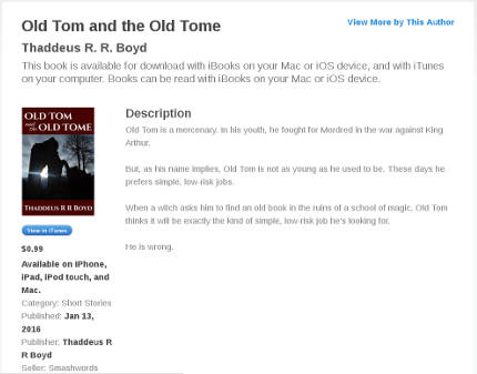
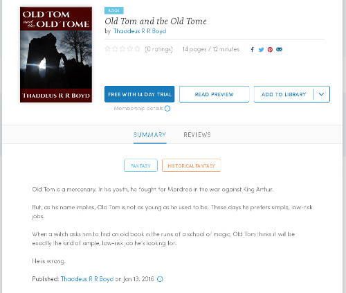
Kobo and iBooks don't appear to use the short description at all. Your book's listing will show the first few lines of your long description, followed by an arrow (on Kobo) or a "More..." link (on iBooks), which you can click to expand to show the entire description.
Kobo
iBooks
Aside: Why the fuck does it do this?
Look at all that whitespace. What's the point of hiding the text?
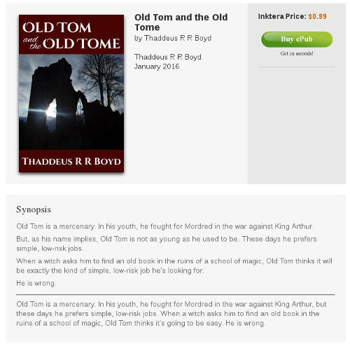
Inktera shows the long description, followed by an HR, followed by the short description.
Lastly, Blio doesn't show either description of my book. Clearly this is a problem and I should probably talk to tech support about it.
As you might expect, the various different ways the different sites use the two descriptions create a bit of a conundrum: how can you write a short description that is the primary description on one site and a long description that is the primary description on four other sites, and write the two descriptions so that they don't look pointless and redundant when you put them side-by-side?
I haven't come up with a good solution for this in the case of Old Tom yet.
Amazon
It turns out the Amazon conversion is really easy. I just set up an account at kdp.amazon.com, filled out the forms, uploaded the cover and the EPUB file, and Amazon's automatic conversion software switched it over to Kindle format with no trouble at all. Amazon's even got a really nice online reader that lets you check how your file will look in the Kindle Reader on various devices (Kindle Fire HD, iPhone, iPad, Android phone, Android tablet, etc.).
I only hit one speed bump when I submitted to Amazon: after a few hours, I got an E-Mail back saying that the book was freely available online (because of course it is; I've posted it in multiple places, including this site). Amazon required me to go back through and reaffirm that I am the copyright holder of the book -- which meant just going through the exact same forms I'd already filled out and clicking the Submit button again. It was a little bit annoying, but not time-consuming and mostly painless, and the book appeared for download on Amazon shortly after.
And that's it.
The hardest part of self-publishing an eBook was finding the time, figuring out what resources to use, and learning the EPUB format. And now that I know what resources to use and understand the EPUB format, it doesn't take nearly as much time. For my next book, I'll be able to spend a lot more time writing and a lot less time formatting. Hopefully this blog post has helped you so that you can do the same.
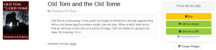
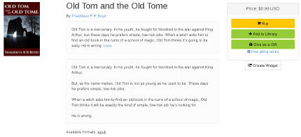
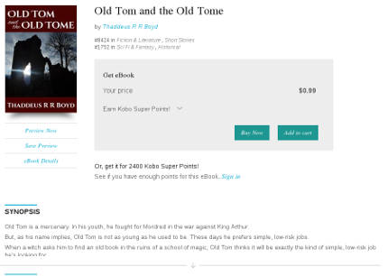
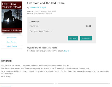
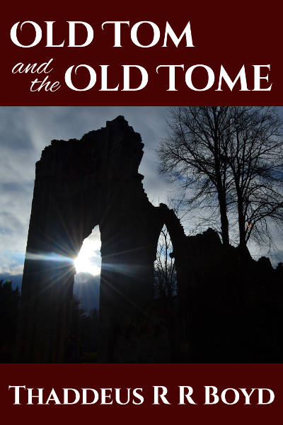
I've just released my first eBook. It's a short story called Old Tom and the Old Tome. Here's a plot synopsis:
Old Tom is a mercenary. In his youth, he fought for Mordred in the war against King Arthur.
But, as his name implies, Old Tom is not as young as he used to be. These days he prefers simple, low-risk jobs.
When a witch asks him to find an old book in the ruins of a school of magic, Old Tom thinks it will be exactly the kind of simple, low-risk job he’s looking for.
He is wrong.
I've released the book under a Creative Commons license; you can download it for free right here on good old corporate-sellout.com in the following formats:
This was an interesting project, and I hope it will be the first of many. In the coming days I expect to share some of the Making-Of information -- what tools I used to make it, the learning curve, etc.
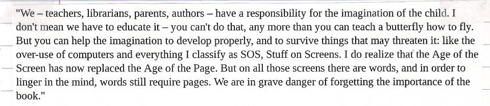
Yesterday I ran across two 2013 articles about books, literacy, and libraries in the Guardian, one by Neil Gaiman and the other by Susan Cooper. The Gaiman one is excellent, but I was disappointed by Cooper's, partly because it digresses substantially from its point, but mostly because of a couple of paragraphs I can't stop thinking about. She starts off quoting a talk she gave in 1990:
"We – teachers, librarians, parents, authors – have a responsibility for the imagination of the child. I don't mean we have to educate it – you can't do that, any more than you can teach a butterfly how to fly. But you can help the imagination to develop properly, and to survive things that may threaten it: like the over-use of computers and everything I classify as SOS, Stuff on Screens. I do realize that the Age of the Screen has now replaced the Age of the Page. But on all those screens there are words, and in order to linger in the mind, words still require pages. We are in grave danger of forgetting the importance of the book."
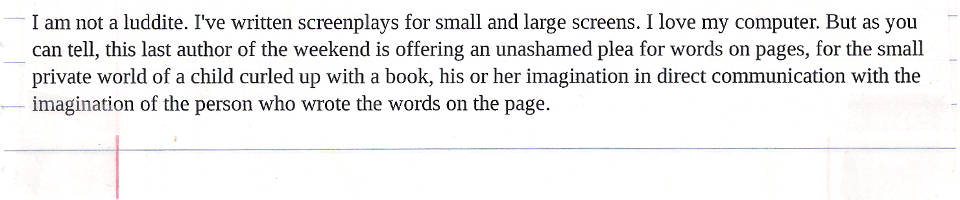
All that was 23 years ago and it's all still true. The screens have just grown smaller, and multiplied. In America, there are already a few digital schools, which have no books, not even in the library. And in schools across America, so many children now work on laptops or tablet computers that cursive handwriting is no longer being taught. Maybe that's also happening here. I suppose that's not the end of the world; lots of authors write their first drafts on a computer, though I'm certainly not one of them. But there's something emblematic about handwriting, with its direct organic link between the imagining brain and the writing fingers. Words aren't damaged by technology. But what about the imagination?
I am not a luddite. I've written screenplays for small and large screens. I love my computer. But as you can tell, this last author of the weekend is offering an unashamed plea for words on pages, for the small private world of a child curled up with a book, his or her imagination in direct communication with the imagination of the person who wrote the words on the page.
I have a great deal of respect for Ms. Cooper. The Dark is Rising Sequence meant a lot to me when I was a kid. And I absolutely agree with her premise that books and libraries are vital and that we must continue to treasure, support, and protect them, even in an increasingly digital world.
But her handwringing about Kids Today and their Screens just strikes me as a bunch of Old Person Nonsense.
At least she acknowledges that the decline of cursive is no big deal.
I heard my aunt bemoan the lack of cursive education in schools recently. My response was, "What the hell do kids need to know cursive for?" It's harder to read than print, it's (at least for me) harder and slower to write than print, and in the twenty-first century it's about as essential a communication skill as Latin. It may be an interesting subject to study, but it's hardly a necessary one.
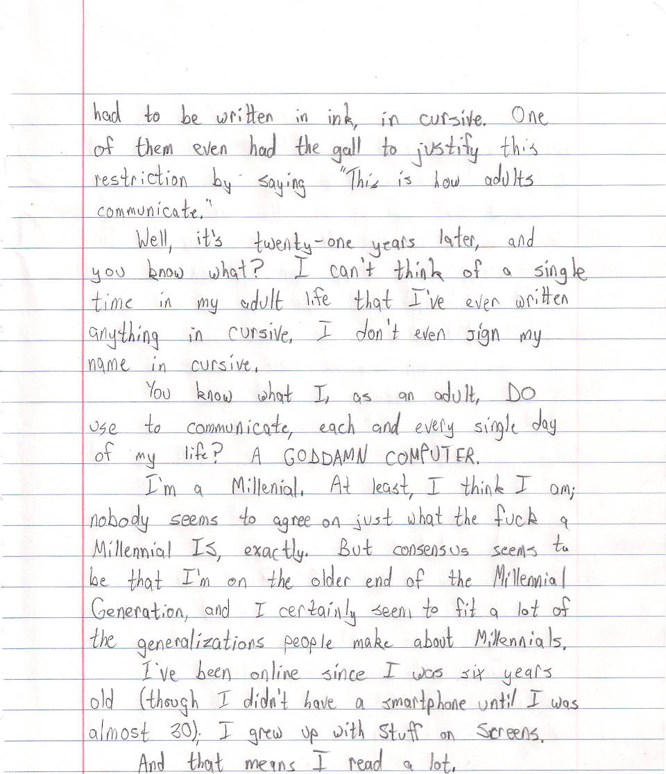
In sixth grade, I had two teachers who wouldn't let us submit typed papers. Everything had to be written in ink, in cursive. One of them even had the gall to justify this restriction by saying "This is how adults communicate."
Well, it's twenty-one years later, and you know what? I can't think of a single time in my adult life that I've ever written anything in cursive. I don't even sign my name in cursive.
You know what I, as an adult, do use to communicate, each and every single day of my life? A goddamn computer.
I'm a Millennial. At least, I think I am; nobody seems to agree on just what the fuck a Millennial is, exactly. But consensus seems to be that I'm on the older end of the Millennial Generation, and I certainly seem to fit a lot of the generalizations people make about Millennials.
I've been online since I was six years old (though I didn't have a smartphone until I was almost 30); I grew up with Stuff on Screens.
And that means I read a lot.
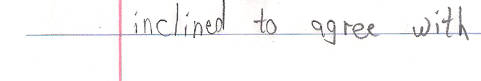
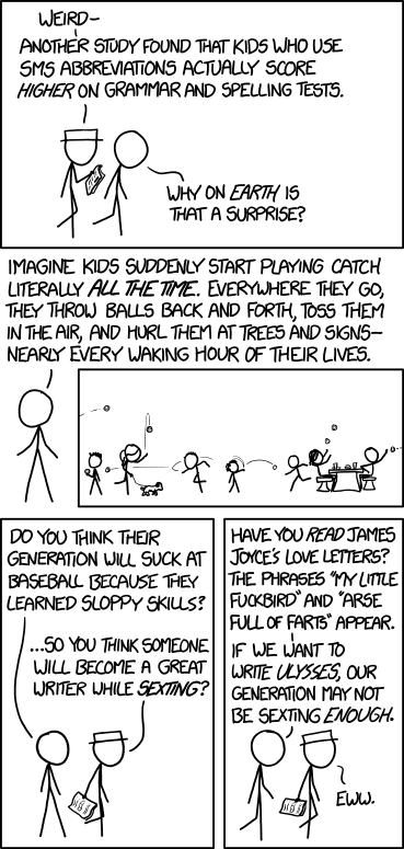
As far as Stuff on Screens and literacy, I'm inclined to agree with Randall Munroe:
I'd like to find a corpus of writing from children in a non-self-selected sample (e.g. handwritten letters to the president from everyone in the same teacher's 7th grade class every year)--and score the kids today versus the kids 20 years ago on various objective measures of writing quality. I've heard the idea that exposure to all this amateur peer practice is hurting us, but I'd bet on the generation that conducts the bulk of their social lives via the written word over the generation that occasionally wrote book reports and letters to grandma once a year, any day.
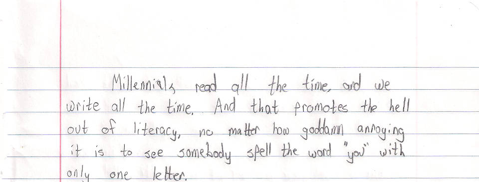
Millennials read all the time, and we write all the time. And that promotes the hell out of literacy, no matter how goddamn annoying it is to see somebody spell the word "you" with only one letter.
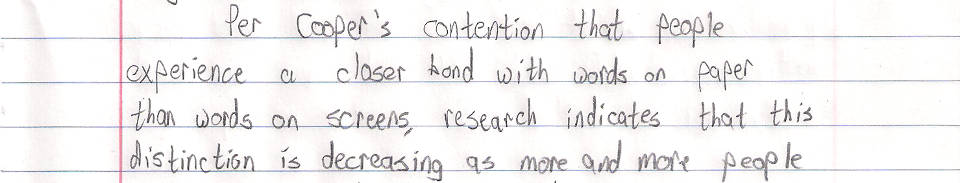
Per Cooper's contention that people experience a closer kind of bond with words on paper than words on screens, research indicates that this distinction is decreasing as more and more people become accustomed to screens. Via Scientific American:
Since at least the 1980s researchers in many different fields—including psychology, computer engineering, and library and information science—have investigated such questions in more than one hundred published studies. The matter is by no means settled. Before 1992 most studies concluded that people read slower, less accurately and less comprehensively on screens than on paper. Studies published since the early 1990s, however, have produced more inconsistent results: a slight majority has confirmed earlier conclusions, but almost as many have found few significant differences in reading speed or comprehension between paper and screens. And recent surveys suggest that although most people still prefer paper—especially when reading intensively—attitudes are changing as tablets and e-reading technology improve and reading digital books for facts and fun becomes more common. In the U.S., e-books currently make up between 15 and 20 percent of all trade book sales.
Now, there are ways in which physical books are superior to digital ones. One is DRM. DRM is a blight; it is a threat to libraries, to academia, to preservation, and to the very concept of ownership.
But it's also optional. Its not an inherent part of ebooks; it's bullshit added to them by assholes. And I suspect that, within a generation, it will be gone, just as music DRM has been gone for about a decade now.
There's one more case where paper books are superior to digital ones: pictures. I've already spoken at length about comic books shrunk to fit a 10" screen, as well as the color problems that can arise when they're not printed on the same paper stock they were designed for. The same goes for picture books, art books, photo books; for magazines whose layouts are designed for the printed page. When you put these things on a small screen, you do lose something tangible (and if you put them on a large screen, you lose portability).
On the other hand, I've currently got some 173 books and 362 comics on a 10" rectangle that fits in my backpack, and that is amazing.
People carry libraries in their pockets now. That's not a threat to literacy, it's a boon -- so long as voters and politicians understand that these portable libraries are not meant to replace the traditional kind, but to supplement them.
But for people who love books -- at least, people of my generation who love books -- it's not an either-or question. It's not "Should I read paper books, or digital ones?" It's "Holy shit, look at all the books I have access to, and all the different ways I can read them!"
The first iPhone was released in 2007. It's too early to gauge what long-term effects, nationally or internationally, the smartphone revolution will have on literacy and reading habits.
But I'm more inclined to agree with Munroe than Cooper: a generation that's reading and writing all the time is going to be better at reading and writing than one that isn't. Even if you think they're doing it wrong.
An angry hat tip to Scott Sharkey, who used to handwrite blog posts, which gave me the utterly terrible idea for this time-consuming pain-in-the-ass of a post. (Granted, I'm pretty sure he had the good sense never to do it with a six-page essay with working links.)
Also, the part where I printed an image and then re-scanned it is kind of like something this one angry lady on a My Little Pony fan site did once.
(And yes, I'm aware that I forgot to use blue pencil for the Scientific American link. I am not going back and redoing it. That's the thing about writing stuff out on paper: it's kinda tough to add formatting to something after you've already written it.)
I enjoyed your courageous Senate speech on the importance of Senator Ted Cruz. I was particularly interested in the part where you read Green Eggs and Ham, and stated that it was analogous to the healthcare debate, saying Americans "did not like Obamacare in a box, with a fox, in a house, with a mouse."
Senator, I have two questions.
The first is, is your copy of Green Eggs and Ham missing the last few pages, or did you legitimately miss the point of a book that is easily understood by a typical four-year-old?
And, as a followup: do you next intend to quote 1984 in support of the NSA's domestic surveillance program, or are you more interested in citing Soylent Green as a great agribusiness innovation that will create jobs and feed the hungry?
The last time I saw Starship Troopers was on VHS. I'd have been about 15, so you can forgive me if what I remember most about it is Denise Richards's titties. Which should give you some idea of just how well I remember it, because Denise Richards's titties are not actually in the movie. (Denise Richards's titties are actually important to the theme of the movie. I will be getting back to them in a moment.)
I also remember the film getting pretty mixed reviews on release -- it's quite clearly a big dumb action movie, with extra big and extra dumb, but there was also a vocal contingent of critics lauding it as a brilliantly subersive piece of satire of wartime propaganda. In the years since, it's become a cult hit among people who enjoy it for both -- because it manages a pretty interesting tightrope walk of playing itself totally straight while also being a wicked piece of satire.
More specifically, Starship Troopers the movie is a parody of Starship Troopers the book.
Well, maybe "parody" is a little strong -- again, it plays itself far too seriously to be considered a comedy per se. But it's certainly a movie about crazy, over-the-top wartime propaganda -- and the novel is crazy wartime propaganda (or, almost -- it was too late for Korea and too early for Vietnam).
Heinlein's an interesting dude, and Starship Troopers fills an interesting place in his oeuvre. For a guy who's typically identified as a libertarian, he sure has some weird ideas about only allowing soldiers to vote, and how public floggings are the best tool for disciplining them. With an extra bonus chapter where he really goes off the rails with that public flogging thing and rants about how anyone who doesn't spank their children is stupid.
Starship Troopers the movie gets how ridiculous the book is, ratchets its ridiculousness up to 11, and plays it completely straight.
And while the homages to WWII-vintage propaganda films are great, what it gets most about the nature of wartime propaganda is the dehumanization. Not only Heinlein's choice to very literally dehumanize the enemy by making them giant bugs, but the heroes are dehumanized, too -- and here's where I get back to Denise Richards's titties.
Because the coed shower scene is disquieting.
It goes beyond the obvious ideas of discipline and respect in a coed military and straight on into having a bunch of men fail to even notice Denise Richards as female. And when the Main Guy finally does go for a perfunctory roll in the hay with her, it's all just rote, mechanical "this is happening because it's a movie and the leads have to hook up" stuff.
All in all? Well, to make another Spinal Tap reference, there's a fine line between stupid and clever, and Starship Troopers walks it. It's a winking, biting homage to the source material, that looks and feels like it's a dumb movie made by people who just don't get it. (And it could be both -- there are a whole lot of people involved in making a movie.)
Its cult status is well-deserved -- and even if its comedy is intentional, it seems unintentional enough that it's perfect fodder for Rifftrax.
Which is what I'm headed to see right now, as I write this, though by the time you read it I should already be home. Maybe I'll share more tomorrow!