Tag: Graphics

Actually, It's About How Games Journalism is a Pain in the Ass

Or, Why I Won't Be Doing That Again Any Time Soon: A Postmortem

So the last three posts comparing and contrasting five different Mega Man games required rather a lot of screenshots. It took a long time to get them all, for a number of reasons I'll get into in a moment. It wound up taking a lot longer to get those posts done and posted than planned, and it really wasn't a whole lot of fun.

The other day on Brontoforumus, I described it as taking two things I enjoy doing -- playing video games and talking about video games -- and turning them into work. More specifically, work I don't get paid for.

I like how the whole thing turned out, but it took hours and hours to put together, and playing a game to farm for screenshots is a pretty different and altogether less fun experience than playing it just to play it.

Some of it may be down to the tools I'm using, or just my lack of proficiency with them.

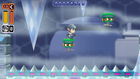
I opted to grab all the screenshots myself, rather than try and find a resource that already had them (or close enough). I think this was probably the right call; VG Museum has a perfectly good shot of the floating platforms in Ice Man's stage that I could have used, but it doesn't really have any other grabs of the Mega Man screens I needed, and it's got next to nothing from Mega Man X and nothing at all from the other three games I was capping.

So I could have poked around the Internet trying to find the screens I was looking for, either as static images on websites or as caps from Let's Play videos on YouTube. But I think that would have taken just as long as getting the damn things myself.

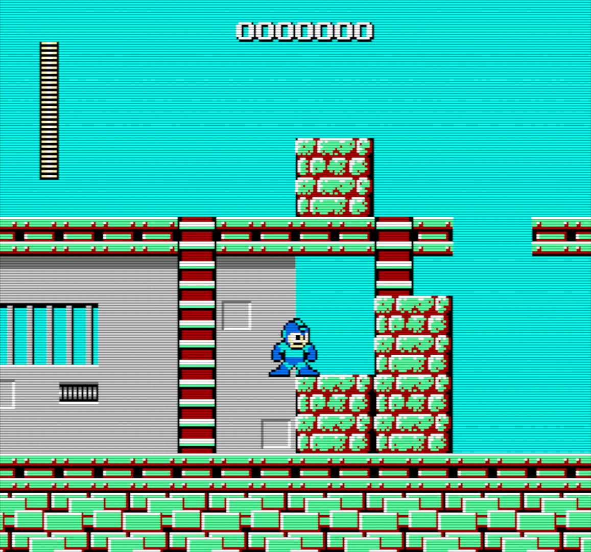
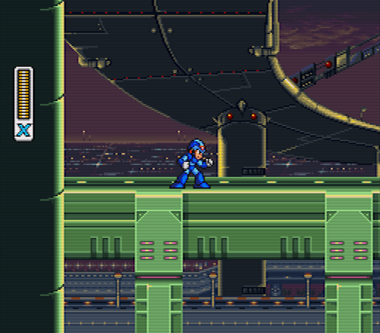
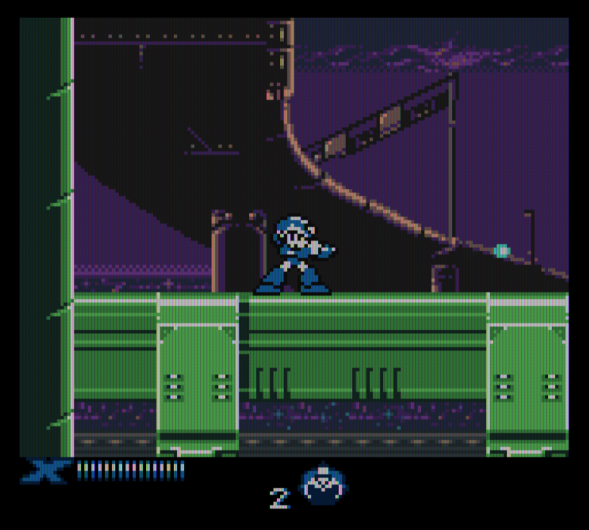
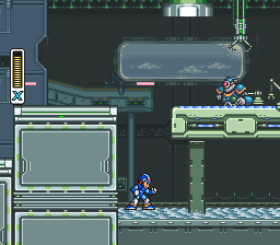
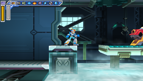
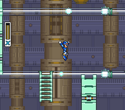
The next decision I made that made my life more difficult was to try and grab all the images at each device's native resolution, with graphical filters turned off.

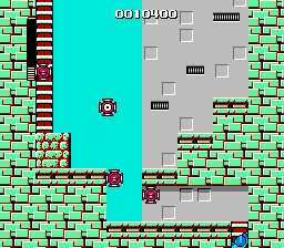
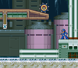
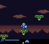
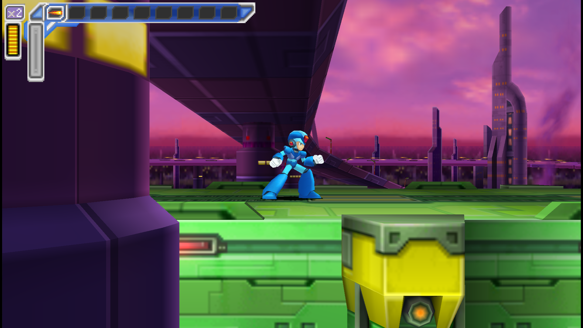
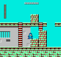
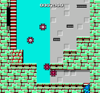
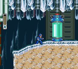
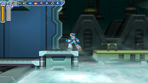
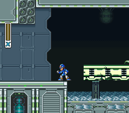
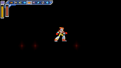
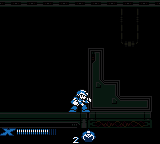
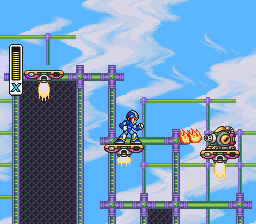
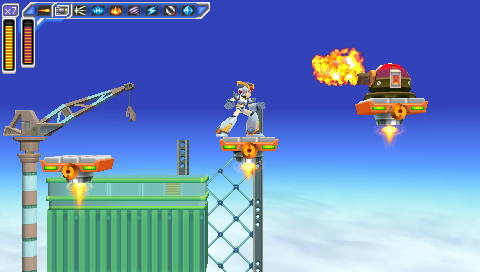
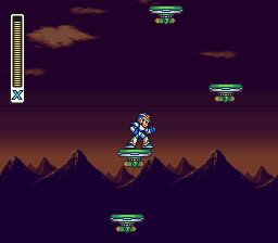
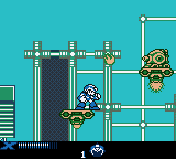
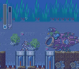
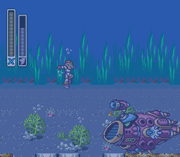
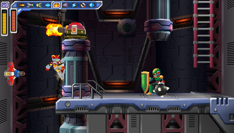
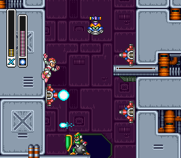
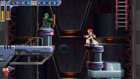
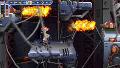
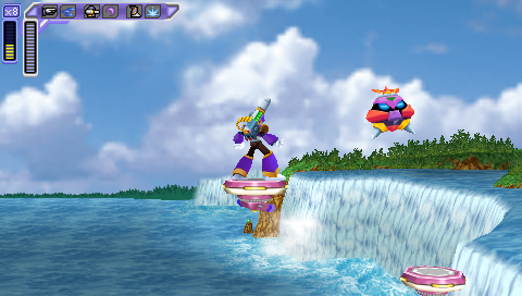
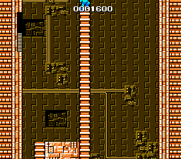
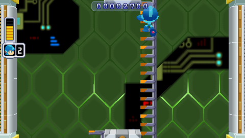
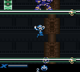
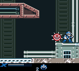
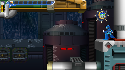
Here are some of the screenshots I used in the last three posts:

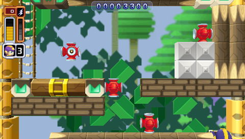
  • Cut Man Stage -- Mega Man
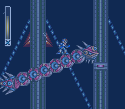
  • Chill Penguin Stage -- Mega Man X
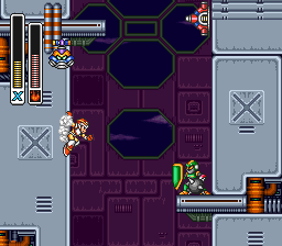
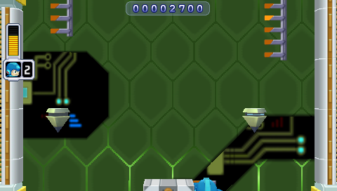
  • Sigma's Fortress -- Mega Man Xtreme
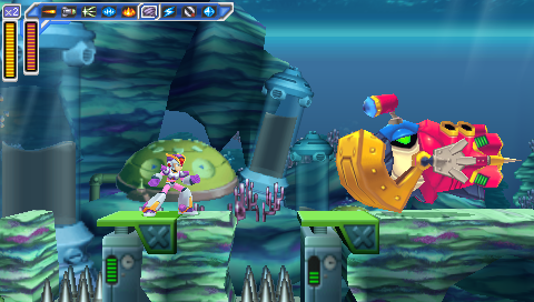
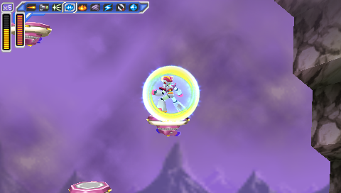
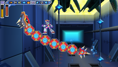
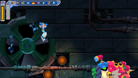
  • Launch Octopus Stage -- Mega Man: Maverick Hunter X

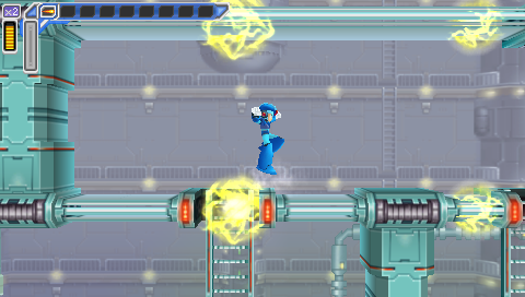
And here are what those games look like when I play the game scaled up for a 1080p screen and with a graphics filter turned on:

  • Cut Man Stage -- Mega Man
  • Highway Stage -- Mega Man X
  • Highway Stage -- Mega Man Xtreme
  • Highway Stage -- Mega Man: Maverick Hunter X

Now, first of all, those images are pretty big. In fact, unless you've zoomed this page in, you're not even looking at them at full size right now, because they've been scaled to fit the content area of this post. That's 892px wide (unless you're viewing it on a mobile device, in which case it's less), whereas the images are between 1157 and 1920px wide.

And they're PNG's, which means they're also pretty big in terms of filesize (except the Mega Man Xtreme one). Unnecessarily big; you just loaded a 1920px-wide image just to display a scaled-down 892px version. Or less. If you're reading this on a 3G connection, then I probably owe you an apology.

Now, there are things I could do differently. I could set my emulators to output as JPEG instead of PNG, but that would result in a visible decrease in quality. I could resize the images manually, but that would be more work for me. I could set up a script to scale them automatically, but we'd still end up with a bunch of images all scaled to the same width. Which isn't really ideal; it doesn't make a lot of sense for the Game Boy screenshots to be the same size as the PSP ones, and 892px is just too damn big to get multiple images onscreen and get a good comparison anyway.

So, instead of that, what I did was turn off the filters and, when I was ready to take a screenshot, toggle fullscreen off to take it.

This is a pain in the ass, not just because it interrupts the flow of the game but because it's fucking difficult to set up a good screenshot in a tiny 160x144 window on a 1080p TV when you're sitting on the couch across the room.

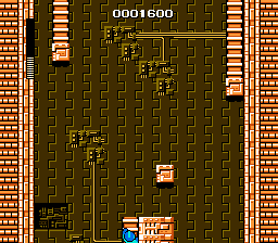
And that's before you get into weird shit like this:

  • Cut Man Stage -- Mega Man
  • Cut Man Stage -- Mega Man

I don't know why the fuck RetroArch did this. I told it to size the window to native NES resolution, and it gave me these monstrosities instead. That is not native NES resolution. And it's not a problem with the core I was using, because I tried it with two different cores. (I thought it might be some weird leftover setting from when I'd done the Game Boy screen grabs, but that doesn't make sense; the Game Boy screen grabs were 160x144, while these are 205x191.)

And I took a bunch of screenshots before realizing what it had done. I had to go back and replay fucking Ice Man's stage and do it all over again.

So I think the best solution would be to use emulators that output screenshots at native resolution and without filters, regardless of what scaling and filters are applied as I'm playing them. I know I've used emulators like that before, but I can't remember which ones they were offhand.

And there's another requirement: I want to be able to take a screenshot without having to use the damn keyboard. I want to be able to use one of the buttons on my controller to take the screenshot. Because having to stage a shot and then quickly take my hands off the controller to hit F12 on a keyboard doesn't just interrupt the flow of the game, it's a good way to get yourself killed if you're trying to grab a screenshot of a particularly difficult section of game.

Snes9x let me map the screenshot button to my controller, and I think FCEUX did too, but I couldn't find any feature like that in PPSSPP or RetroArch.

So I guess what I'm looking for is an emulator that lets you output screenshots with no scaling or filters applied, and lets you map that function to a button on your controller.

That would make the whole exercise a lot quicker and easier, but it wouldn't fix a number of other problems -- I'd still have to wade through a bunch of files with names like ULUS10068_00017.png and RetroArch-1011-165734.png and find the ones I wanted, and then realize "Fuck, I forgot to take a screenshot of Spark Mandrill's stage" and have to go back and replay that section, and seriously, you have no idea how many times I did that.

And that's without even getting into the editing portion.

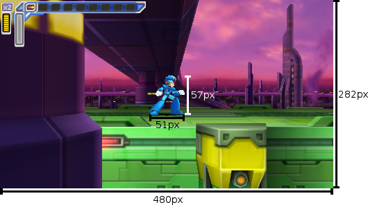
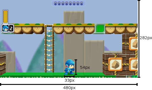
Remember this guy from the first post, with the measurements?

Mega Man is 33x54px

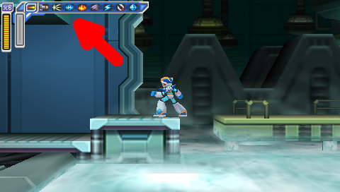
I added those rulers and numbers myself, manually, in Gimp (and it probably shows). And it wound up being way more fiddly and time-consuming than it should have. I guess I probably should have gone looking for plugins to see if somebody had already coded up a tool to draw a shape like that automatically so I wouldn't have to do it myself; that is what I ended up doing for this graphic, with the arrow in it:

Flame Mammoth Stage -- Mega Man: Maverick Hunter X, with Giant Red Arrow

So, I dunno. Like I said, I'm pretty pleased with how the feature turned out (and it's gotten a positive response from the Brontos, which is nice), but it just took so long to put together, and it was not very fun. I might try it again sometime -- especially if somebody can steer me in the right direction and help make it easier next time -- but for now I'll probably go on back to my usual Wall of Text posts.

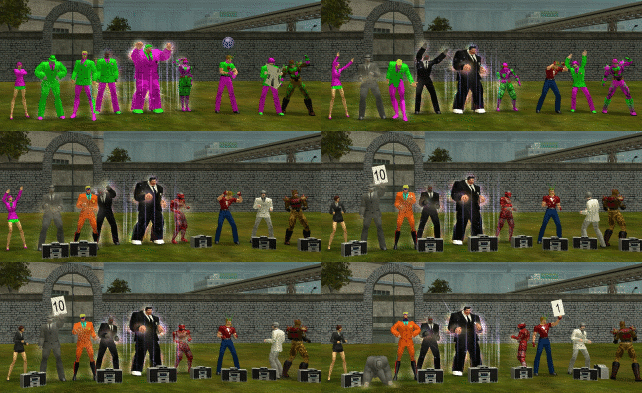
Course, in the old days I used to enjoy doing shit like this:

City of Heroes time-lapse

But there's a pretty important difference: we were already just fuckin' around and essentially posing for photos anyway; it's not like I was taking screenshots in the middle of a difficult mission. (And even if I were, it was pretty easy just to reach over and hit PrtScn without breaking stride in the game.) I wasn't trying to get a grab of any specific gameplay element -- let alone compare and contrast across five different games.

Maybe if I do this again I'll just pick an easier topic.

In the meantime, I think I'll go back to just playing games. Maybe I'll replay some more Mega Man X games. I never did get around to finishing X8. Fucking vehicle levels.


Mega Man ® 1989 and © 1987 Capcom Co, Ltd
Mega Man X ™ and © 1993 Capcom Co, Ltd
Mega Man Xtreme © 2001 Capcom Co, Ltd
Mega Man Powered Up and Mega Man: Maverick Hunter X © 2006 Capcom Co, Ltd
City of Heroes © 2004 NCsoft

I took all the screenshots myself.
I used the following emulators:
NES: FCEUX and Libretro with the FCEUmm and Nestopia cores
SNES: Snes9x and Libretro with the Snes9x Next core
Game Boy Color: Libretro with the Gambatte core
PSP: PPSSPP

Dueling Mega Men, Part 3: Rebalancing Act

As I've indicated in the last two posts, Mega Man: Powered Up has a lot more changes from the original game than Mega Man: Maverick Hunter X. And the changes to Powered Up are usually for the better, while the ones to MHX are usually for the worse.

There's a pretty simple reason for that: Mega Man has a lot more to improve than Mega Man X.

Back in the first post, I described Maverick Hunter X as "a pretty solid remake of an excellent game." Powered Up is the reverse: an excellent remake of a pretty solid game.

The original Mega Man is a classic, but it's got rough edges; it's an amazing first effort but it's got its share of flaws. There's a reason Mega Man 2 is universally considered to be a much better game.

The original Mega Man X, on the other hand, is pretty much perfect. It's exquisitely designed and balanced.

So, rebalancing Mega Man resulted in a better-balanced game, while rebalancing Mega Man X resulted in a worse-balanced one.

Let's start with Mega Man.

Powered Up changes the original game so fundamentally that it actually changes the boss weaknesses.

In the original Mega Man, the order is:
Bomb Man Guts Man Cut Man Elec Man Ice Man Fire Man

In Powered Up, it's:
Cut Man Bomb Man Ice Man Fire Man Oil Man Elec Man Time Man Guts Man.

The change in order does more than just accommodate the two new bosses; it makes for a more natural stage order.

The original game has two logical starting points: Bomb Man's level and Cut Man's. The trouble is, if you follow the order of weapon weaknesses, starting with Bomb Man means you go to Guts Man's famously difficult level second. Starting with Cut Man means you take Elec Man's stage before Guts Man and have to go back later to get the Magnet Beam (though, granted, this wouldn't be an issue in Powered Up, which removes the Magnet Beam entirely).

The weakness order in Powered Up puts the two easiest stages right at the start, first Cut Man and then Bomb Man, and puts trickier levels like Elec Man, Guts Man, and the new Time Man near the end.

Mega Man: Maverick Hunter X doesn't change the Mavericks' weaknesses, but it does play musical chairs with the capsules. And that's enough to wreak havoc on the original game's finely-crafted balance.

The most important of the four capsules, the one you need in order to get the other three, is the Leg Upgrade. Here's where it is in the original game:

Chill Penguin Stage -- Mega Man X

It's about halfway through Chill Penguin's stage (the easiest in the game), smack dab in the middle of the path. You literally can't miss it.

Whereas in Maverick Hunter X, not only is it possible to miss it, it's likely. Here's where it is in that version:

Flame Mammoth Stage -- Mega Man: Maverick Hunter X

Don't see it? Let's try that again.

Flame Mammoth Stage -- Mega Man: Maverick Hunter X, with Giant Red Arrow

That's right: the ledge you grab onto to reach the Leg Parts is covered up by the fucking HUD. It's so hard to see that you can walk right past it even if you know it's there.

Contrast with the same location in the original Mega Man X (which, in that game, had the Arm Parts capsule):

  • Flame Mammoth Stage -- Mega Man X
  • Flame Mammoth Stage -- Mega Man: Maverick Hunter X

The original game gives a very clear visual cue that there is something up there. Maverick Hunter X, on the other hand, once again fails to handle the conversion from 4:3 to 16:9, and makes the hanging section almost impossible to see. And if you don't find that tiny ledge, you can't get any of the other upgrade parts -- your mobility, offense, and defense are all severely limited, and the game is much harder. Not fun hard, unfair hard.

And if you do know the Leg Parts are on Flame Mammoth's stage, there's another problem: nobody in their right mind would pick Flame Mammoth's stage first.

It disrupts the entire stage order. Do you start with Chill Penguin and then end with Flame Mammoth? That makes the game a whole lot more difficult, going through seven stages with no capsule upgrades.

No, the best option here is to base the stage order around the capsules, not the bosses' weaknesses. Take out Chill Penguin first, then Flame Mammoth, with maybe a stop-over at Storm Eagle along the way (he's a relatively easy boss and Flame Mammoth is weak against his weapon, and it also makes Spark Mandrill's stage easier; on the other hand, it's got all the shitty vertical parts I mentioned in my previous post, and they're harder without the Leg Parts).

The other three capsules are rearranged too. Chill Penguin has the Head Parts instead of the Leg Parts, Sting Chameleon has the Arm Parts instead of the Body Parts, and Storm Eagle has the Body Parts instead of the Head Parts.

The Head Parts are damn near useless in the original game, and they're not any more useful in the remake. In the original game, they protect you from falling rocks in one section of Sting Chameleon's stage, and are also necessary to reach the Arm Parts capsule in Flame Mammoth's stage. Maverick Hunter X is much the same, except that in this case you need them to reach the Body Parts capsule in Storm Eagle's stage. Chill Penguin's stage -- which, again, is the easiest level and, in the original game, the best one to start with -- has gone from having the most useful of the four upgrades to the least useful. Storm Eagle's stage, on the other hand, ends up with a much more useful upgrade than it had in the original, and one more reason to hit that level earlier in this version of the game than in the SNES version.

The change to Sting Chaemeleon's stage probably makes the most sense of the four, though it removes the nice sense of symmetry the original game gives you of defeating a suit of robot armor to gain an armor upgrade.

If you follow the stage order implied by the capsule locations (ie fight Storm Eagle and Flame Mammoth early), then that means Sting Chameleon will be the last of the eight stages. Getting the Arm Parts right before the Sigma stages, or right at the beginning of the Sigma stages, matches the original game, where if you started with Chill Penguin you'd end with Flame Mammoth, and get a chance to get the Buster Upgrade -- and if you missed it, you'd get it on the very next level.

Which brings us to another change.

In Mega Man X, midway through the first Sigma stage, Zero confronts Vile, and sacrifices himself. If you didn't get the Buster Upgrade from the capsule, Zero will give it to you.

Maverick Hunter X changes this in two ways. First, it moves the battle to the third Sigma stage instead of the first. Second, instead of Zero giving you a Buster Upgrade that's identical to the one you would have gotten from the capsule, he gives you a different Buster Upgrade.

It's an interesting idea, but I don't think it's a very good one, for two reasons.

The first is that it messes up the narrative structure. There's a reason Zero dies, and passes the torch to X, in the first Sigma stage in the original game: it changes the atmosphere of the rest of the game. It establishes a sense of loneliness and isolation that lingers through the end. Nobody else is going to help you; you're humanity's last hope. And you've done what Zero said you'd do all the way back at the end of the first stage: you've become stronger. The student has become the master.

In Maverick Hunter X, on the other hand, you spend most of the Sigma stages playing catchup. Zero's gone on ahead. Even at full power, X is playing second fiddle, right up until the end.

Which brings us to the gameplay reason why it doesn't make sense to kill off Zero right before the end: it's right before the end. I understand the reasoning behind rewarding the player for getting almost to the end of the game without the Buster Upgrade with a cool, unique weapon -- but what the fuck good is it? You've got exactly half a level left in the game at that point, and then four bosses. (And I guess the caterpillar things in the last level, but they're pretty much just there to fill up your Sub Tanks.) The game rewards you by giving you a weapon you'll hardly get to use.

Aside from that, there are other weird little changes. The X-Buster takes longer to charge to its maximum level, and bosses are invulnerable for a longer period of time after you hit them.

And then there's stuff like this:

  • Spark Mandrill Stage -- Mega Man X
  • Spark Mandrill Stage -- Mega Man: Maverick Hunter X

In the original game, when Spark Mandrill's stage goes "dark", it's just a transparency effect; you can still see where you need to go.

In Maverick Hunter X, the lights cycle off and on; the platforms go from being completely illuminated to being completely invisible. This, combined with the reduction in height, makes the section a lot harder, the timing a lot trickier, and makes it damned difficult to get through this section without getting clipped by the fireflies that whiz through it.

In fact, this section seems to be taking a cue from the Mega Man Xtreme version of the stage.

Spark Mandrill Stage -- Mega Man Xtreme

(It may look like the platforms are visible in that screenshot, but I assure you that if you play the game on authentic Game Boy Color hardware, you can't see shit.)

Basically, the game's full of changes, great and small. And most of them are for the worse.

All of this stuff, all of these changes, the reordering of the Capsules and the Sigma stages and Zero's death scene -- I think they actually could have made for an interesting game, if they were only on Hard Mode. The way I see it, Normal Mode should have kept everything where it was in the original game (with some changes, of course, to accommodate the screen height), while Hard Mode could have jumbled things around and created a legitimate challenge for experienced players. Think of it like the original Legend of Zelda: the Second Quest is neat, but it would have made a pretty crummy first quest.

Instead, Hard Mode gives the bosses some additional attacks (that's good!) and ups the amount of damage all the enemies do (that's cheap and lazy).

And then there's Vile Mode, which makes for a pretty great addition but can be overwhelming in the sheer number of options provided. Vile gets a total of 45 weapons, and while it's great to have that kind of versatility, it also means it takes a lot of time testing out all those choices and deciding which ones fit your play style -- and it also makes it a lot harder to figure out which weapons are effective against which bosses. If you're X, you can swap weapons on the fly and keep trying until you find one that works; if you're Vile, you can only equip three weapons at a time, and if none of them do the job, you have to start the level over if you want to try other options.

Plus, when you're Vile they move the Heart Tanks and Sub Tanks around, and while the save screen has a counter for how many you've got, it doesn't tell you which ones you've gotten. Okay, I've got seven out of the eight Heart Tanks; guess I get to figure out which one I'm missing.

(Also, I sincerely hope the decision to make every fucking stage use the same music when you play as Vile was an accident. Giving him is own theme music on the first stage is fine; reusing it on the next eight is not.)

To summarize three long posts, it's really easy to recommend Mega Man: Powered Up. It's thoughtfully and exquisitely redesigned, and good enough to be considered the definitive version of the game, even before you get into all the extras like the many playable characters and the level design toolkit.

Maverick Hunter X isn't bad but it's a much harder sell. Play the SNES game first; it's better; it's that simple.

But if you've played the SNES game already, forward and backward and side-to-side, and you're interested in trying out a new take? Then I'd recommend you take a crack at Maverick Hunter X. But remember going in that things are going to be different, and sometimes maddeningly so.


Mega Man ® 1989 Capcom Co, Ltd
Mega Man X ™ and © 1993 Capcom Co, Ltd
Mega Man Xtreme © 2001 Capcom Co, Ltd
Mega Man: Maverick Hunter X © 2006 Capcom Co, Ltd

I took all the screenshots myself, and tried to get them all at native resolution with no filters.
I used the following emulators:
SNES: Snes9x
Game Boy Color: Libretro with the Gambatte core
PSP: PPSSPP

Dueling Mega Men, Part 2: Verticality

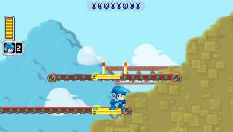
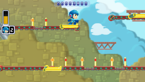
The original Mega Man has some tricky platforming sequences. Mega Man Powered Up actually does a pretty solid job of redesigning them to make them more fair. Here's one of the most infamous examples, the gauntlet at the beginning of Guts Man's stage:

  • Guts Man Stage -- Mega Man
  • Guts Man Stage -- Mega Man Powered Up

Mega Man drops you right into what may be the toughest sequence in the game, and it's right at the beginning of the level. Powered Up, by contrast, starts you off with some training wheels.

Lest you think it's going easy on you, though, what it actually does is move that bastard platform to the end of the level:

Guts Man Stage -- Mega Man Powered Up

On the one hand, that's a much better balance, putting the easy stuff at the beginning of the level and the tough stuff at the end. On the other, it's even more infuriating to repeatedly die right before the end of a level than right at the beginning. And it's actually even harder in Powered Up: note the spacing of the "safe" spots in the lower belt; there's much less time to land and jump than the original game.

There's another sequence, in Ice Man's stage, which is, for my money, the worst part of the original Mega Man.

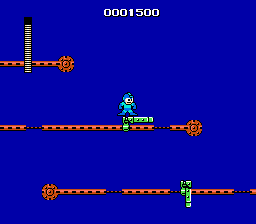
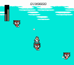
  • Ice Man Stage -- Mega Man
  • Ice Man Stage -- Mega Man Powered Up

In the original game, you have to jump from moving platform to moving platform over a vast empty pit. The platforms' movements are not predictable, they shoot at you while you're trying to time your jumps (and, not shown, penguin guys fly at you too), and sometimes just for the sheer fuck of it instead of landing on a platform you will fall right through it and die.

Powered Up reduces the number of platforms to two, makes them move in consistent zigzag patterns, and eliminates the additional obstacles that you have to avoid (not to mention fixes the collision detection). And greatly reduces the amount of space you have to pass over.

It's a pretty perfect example of Powered Up finding something that was wrong with the original game and fixing it.

Maverick Hunter X does not do that.

Here's an example from Storm Eagle's stage:

  • Storm Eagle Stage -- Mega Man X
  • Storm Eagle Stage -- Mega Man: Maverick Hunter X

It's hard to tell from a static screenshot, but those three platforms all move up and down. And while it's easy to keep an eye on the next platform in the original Mega Man X, in Maverick Hunter X they move right off the screen.

It gets worse in Sigma's fortress.

  • Sigma's Fortress -- Mega Man X
  • Sigma's Fortress -- Mega Man: Maverick Hunter X

Once again, Mega Man Xtreme actually does a better job than Maverick Hunter X; it reduces the number of platforms and their amount of vertical movement. It even turns the Sigma's Fortress sequence from a vertical section to a horizontal one.

  • Storm Eagle Stage -- Mega Man Xtreme
  • Sigma's Fortress -- Mega Man Xtreme

(Of course, don't let any of this faint praise give you the mistaken impression that Mega Man Xtreme is a good game. Its version of the Sigma Fortress platform sequence ends with a blind leap off into nowhere.)

The pattern here is that, while the Mega Man: Powered Up devs were more than happy to retool tricky platform sequences, the Maverick Hunter X team seems oddly reluctant to change them, even just to accommodate the different aspect ratio. ("Oddly" because they made plenty of other, and much worse, changes; we'll get to some of them in a little bit.)

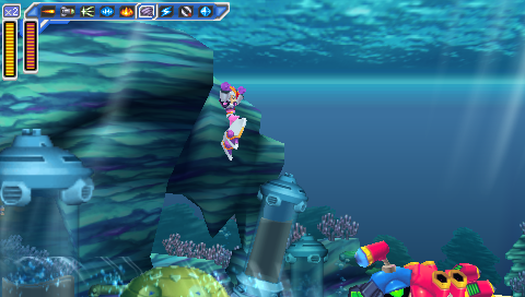
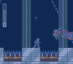
The other big problem is the underwater sequences, because of the increased height of your jump. In Maverick Hunter X, you jump so high that you can no longer see where you're going to land. Here's a miniboss from Launch Octopus's stage:

  • Launch Octopus Stage -- Mega Man X
  • Launch Octopus Stage -- Mega Man: Maverick Hunter X
  • Launch Octopus Stage -- Mega Man X
  • Launch Octopus Stage -- Mega Man: Maverick Hunter X

The enemy uses a weapon that pulls you towards the spikes; if you jump to get out of its range in the original Mega Man X, you'll still be able to see the platforms where it's safe to land, but in Maverick Hunter X, you'll scroll them right off the bottom of the screen.

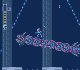
And here's another miniboss from Launch Octopus's stage, a serpent which you can ride:

  • Launch Octopus Stage -- Mega Man X
  • Launch Octopus Stage -- Mega Man: Maverick Hunter X
  • Launch Octopus Stage -- Mega Man X
  • Launch Octopus Stage -- Mega Man: Maverick Hunter X

While you can ride the serpent past the point where the spikes and platforms scroll off the bottom of the screen in the original Mega Man X, you go higher before that happens -- and it's still not too hard to land safely.

  • Launch Octopus Stage -- Mega Man X
  • Launch Octopus Stage -- Mega Man X

Riding the serpent and shooting it in the back of the head until it drops you is a viable strategy in the original game, but it's likely to get you killed in the remake.

Of course, for all the examples so far, there's at least an explanation for why these sequences are like that in Maverick Hunter X: because they were like that in the original. What's entirely baffling is when they add new vertical hazards, on purpose, and they have the same problems or worse.

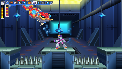
Maverick Hunter X significantly redesigns the Sigma's Fortress stages (which, again, makes it even stranger that it leaves the sequence with the floating platforms as-is, albeit in a later level than in the original game). Early on in the first fortress level, there's another fight with one of the giant fish minibosses from Launch Octopus's stage, which wasn't in the original game.

  • Sigma's Fortress -- Mega Man: Maverick Hunter X
  • Sigma's Fortress -- Mega Man: Maverick Hunter X

Let's compare that to the one on Launch Octopus's level again.

  • Launch Octopus Stage -- Mega Man: Maverick Hunter X
  • Sigma's Fortress -- Mega Man: Maverick Hunter X

The one on the Sigma stage is definitely worse: the spike traps are twice as wide, there's only one place where you can stand and it's half as wide as the Launch Octopus version, and the platform is at the same height as the spikes, so if you miss it you're dead, instead of having a chance to grab onto the side and jump back out.

The underwater section is followed by a reworked version of the vertical section from the original game, and I'll actually give some props here: this is one of the few instances where I like the Maverick Hunter X version better.

  • Sigma's Fortress -- Mega Man X
  • Sigma's Fortress -- Mega Man: Maverick Hunter X
  • Sigma's Fortress -- Mega Man X
  • Sigma's Fortress -- Mega Man: Maverick Hunter X

There are several reasons the Maverick Hunter X version is better: it's shorter, there are fewer enemies, and there are more places to stand. But most of all, this is an instance where the devs understand that they're working with a different aspect ratio, and make it work for them. They don't try to preserve the narrow shaft, or keep the Joes on tiny platforms backed right up against the wall where it's nearly impossible to get them to attack, then hit them while their shields are down, and then get onto the platform they were standing on. It's not perfect, but it's a thoughtfully-designed sequence that's a legitimate improvement on the original. And it's a frustrating example of how good this remake could have been if this same kind of care had been applied to other vertical sequences.

And then it passes, and you're in another vexing vertical sequence that wasn't in the original game. It isn't as likely to cause cheap instant deaths as the aquatic sequence at the beginning of the level, but it is incredibly awkward and annoying because of the screen's limited height and your inability to see where you're going:

Sigma's Fortress -- Mega Man: Maverick Hunter X

But the worst new sequence of all is the end of Armored Armadillo's stage when you play as Vile:

Armored Armadillo Stage -- Mega Man: Maverick Hunter X

It's similar to the sequence in Sigma's Fortress, with platforms at multiple heights and those same helicopter dudes coming at you. But there are more of them, they're harder to hit when you're playing as Vile (and you can't just use a powered-up Rolling Shield to protect yourself like when you play as X), and you have to jump to platforms below you, not just ones above you. And of course when you jump, you may very well scroll your destination platform right off the bottom of the screen and have to guess where it's going to be by the time you land. It's a friggin' nightmare, and a great justification for savestate-scumming.

All in all, Maverick Hunter X does a terrible job with pretty much any sequence that deals with vertical scrolling.

Powered Up doesn't have that problem -- but the comparison's not entirely fair, because Powered Up has an advantage: it's a remake of a game that has no vertical scrolling.

There are lots of vertical sequences in Mega Man, but the screen never scrolls. When you have to traverse a section that's taller than a single screen, that means climbing from the bottom of the screen to the top and then climbing a ladder up to the next screen, where you end up back at the bottom. The screen doesn't move up and down as Mega Man does, only left and right.

  • Elec Man Stage -- Mega Man
  • Elec Man Stage -- Mega Man Powered Up
  • Elec Man Stage -- Mega Man
  • Elec Man Stage -- Mega Man Powered Up

So it was easy for Powered Up to follow that pattern. As substantially as it changes some segments of the game (and adds two entirely new levels), it keeps that rule. No room is ever taller than one screen high; the screen doesn't scroll vertically -- and so the game never has to deal with the challenge of how to handle vertically-scrolling sequences.

Maverick Hunter X does. And it proves, time and again, that it's not up to the challenge. And then, bafflingly, it doubles down on this flaw and adds entirely new vertically-scrolling sequences. And they're even worse.

That's a major reason why, despite all its polish, despite all the effort that clearly went into it, and despite the many things it does right, Maverick Hunter X is an inferior game, both to the original Mega Man X and to Mega Man: Powered Up.

Another major reason is that it completely fucks up the balance of the original Mega Man X. And that's the topic of my next post.


Mega Man ® 1989 and © 1987 Capcom Co, Ltd
Mega Man X ™ and © 1993 Capcom Co, Ltd
Mega Man Xtreme © 2001 Capcom Co, Ltd
Mega Man Powered Up and Mega Man: Maverick Hunter X © 2006 Capcom Co, Ltd

I took all the screenshots myself, and tried to get them all at native resolution with no filters.
I used the following emulators:
NES: FCEUX
SNES: Snes9x
Game Boy Color: Libretro with the Gambatte core
PSP: PPSSPP

What Mega Man Powered Up Does Right and Mega Man: Maverick Hunter X Does Wrong, Part 1: Aspect Ratio

So the other day, I got to listening to OCRemix's Mega Man X: Maverick Hunter Rising album, and it got me jonesing to replay some Mega Man X.

I decided to take another crack at the 2006 PSP remake, Mega Man: Maverick Hunter X; it had disappointed me on my first playthrough, but I thought maybe I'd give it another chance.

And on a second playthrough, now that I'm familiar with its changes and idiosyncrasies, it went a lot smoother. Those changes and idiosyncrasies are glaring -- and they're what this series of posts is about -- but underneath them, it's a pretty solid remake of an excellent game.

But it's no substitute for the original.

And it's interesting to look at its immediate contemporary, Mega Man Powered Up, and see how much better Powered Up is than Maverick Hunter X.

There are a couple of reasons. One seems obvious -- in fact, it's the very first thing you notice:

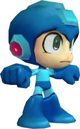
  • Mega Man model
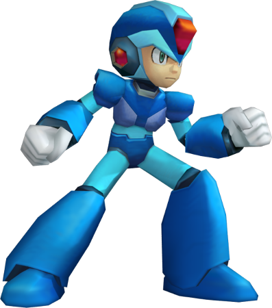
  • X model

Mega Man is short and squat, while X is tall and thin.

Now, these graphics tell you one thing right off the bat, and it's tone. Mega Man is fun and lighthearted; X takes himself seriously.

But the thing is, those designs affect every aspect of the game's design. And what you're looking at, in both cases, is a game that was originally designed for a 4:3 screen ratio, remade for a 16:9 one.

And which one of these guys do you suppose makes the transition better from 4:3 to 16:9 -- the one who's short and squat, or the one who's tall and thin?

At least, that's how it looks. But it's an illusion. Let's take a look at their actual dimensions, in-game:

  • Mega Man is 33x54px
  • X is 51x57px

Those are back-of-the-napkin measurements; I haven't taken the models through their full range of motion, and I'm not sure what the exact dimensions of their hitboxes are. But it's enough to see that Mega Man only looks shorter and squatter -- in terms of the dimensions rendered in-game, X isn't significantly taller than Mega Man, and he is significantly wider.

But it's not really just about the ratio of the character models -- it's about the design of the worlds they inhabit.

Both games face the same challenge: they have to substantially rework stage designs to fit a different screen ratio, while still making them feel like they play the same. Take a look at this screen from Cut Man's stage:

  • Cut Man Stage -- Mega Man
  • Cut Man Stage -- Mega Man Powered Up

It's pretty close.

In fact, it just hacks out the brick below the ladder, and the (inconsequential) top section of the ladder, above the range of the enemies.

It's got the same number of little eye-lantern guys, and nearly the same width to move around in. (The movable width of the screen in the original Mega Man is 12 "blocks", where in Powered Up it's a very close 11. And the height from the floor to the topmost enemy is 9 blocks in the original and 6 in Powered Up.)

There are places where Maverick Hunter X does a similarly good job, like here in Flame Mammoth's stage (after defeating Chill Penguin and freezing the lava):

  • Flame Mammoth Stage -- Mega Man X
  • Flame Mammoth Stage -- Mega Man: Maverick Hunter X

There's a lot less vertical space to move under that platform, but it's not important; it's still enough to fit, and still keep the entire room onscreen.

But other sections don't always fare as well. Look at the beginning of Spark Mandrill's stage:

  • Spark Mandrill Stage -- Mega Man X
  • Spark Mandrill Stage -- Mega Man Xtreme
  • Spark Mandrill Stage -- Mega Man: Maverick Hunter X

In the original SNES version of Spark Mandrill's stage, the sparks that run along the floor and ceiling are half X's height and half his width, and the gap between them gives you plenty of room to dodge them. In the Maverick Hunter X version, they're as big as X, and there's very little room in between them. Even the Game Boy Color Mega Man Xtreme, with its severely compromised screen size, didn't have that problem.

(On the plus side, this does mean that defeating Storm Eagle before Spark Mandrill (and thereby disabling the sparks in the floors) makes a much more significant difference in how the level plays than it does in the original game.)

Chill Penguin's stage has problems too:

  • Chill Penguin Stage -- Mega Man X
  • Chill Penguin Stage -- Mega Man Xtreme
  • Chill Penguin Stage -- Mega Man: Maverick Hunter X

In the original, you can see the wheel coming and have time to get out of the way; in Maverick Hunter X, you can't and you don't. Though in this case, at least it's not being shown up by Xtreme, which has the same issue.

In a nutshell, Powered Up does a really good job of redesigning its vertical segments to fit a 16:9 screen, while Maverick Hunter X doesn't. And this really sticks out, because like Powered Up, MHX is a really polished remake. It shouldn't have these kinds of glaring issues with cropping; they're the hallmark of much lazier ports, like Mega Man for Game Gear, Mega Man and Bass for GBA, and, yes, Mega Man Xtreme.

But it's not just a few sucker punches by enemies that are too big, or that come out of nowhere. No, worst of all are the tricky platform segments where your limited field of vision can result in cheap, instant deaths. And I'll get to those in my next post.


Mega Man ® 1989 and © 1987 Capcom Co, Ltd
Mega Man X ™ and © 1993 Capcom Co, Ltd
Mega Man Xtreme © 2001 Capcom Co, Ltd
Mega Man Powered Up and Mega Man: Maverick Hunter X © 2006 Capcom Co, Ltd

Character models supplied by Models Resource

I took all the screenshots myself, and tried to get them all at native resolution with no filters.
I used the following emulators:
NES: FCEUX
SNES: Snes9x
Game Boy Color: Libretro with the Gambatte core
PSP: PPSSPP

Final Fantasy 7, Fourteen Years Later

The thing that surprised me most, on a replay of FF7 after lo these many years was, you know, it's actually pretty good. Not the best game ever, not even the best Final Fantasy -- hell, not even the best Final Fantasy released in a six-month period --, but pretty good.

It's easy to scoff at it in hindsight, probably because it's not nearly as good as some people claim it is. And frankly I'm embarrassed by my own youthful enthusiasm for it. But, truth be told, it's a good game. And it's not really logically consistent to love 6 and hate 7, because 7 is so clearly a refinement of 6. Amnesiac hero reluctantly joins underground organization fighting an evil, technocratic Empire that is extracting the spirits of a dead, magical race into glowing stones to use for its own nefarious purposes? Yeah, that sounds pretty familiar. The leader of the Empire is killed by a psychopath who is the product of one of its magical infusion experiments gone wrong, and who then becomes the Big Bad? Check. The key to saving the world is a mysterious girl who escaped from the empire's lab and turns out to be the daughter of a human and one of the aforementioned magical race? Mhm. Even the environments and the music are awfully familiar.

Which I suppose in itself could be taken as a knock against FF7 -- it hits a lot of the same beats as its predecessor. But this is Final Fantasy we're talking about. It's not like FF6 was fresh and new -- if you squint, the above plot summary isn't too far off from FF4's, either. And truth be told, 7 does some things better than 6.

It's easy to lose sight of in a flashy, forty-hour game, but, at least in places, FF7 shows a remarkable economy of storytelling. Take President Shinra -- for the first act of the game, he's the presumptive villain, and he makes a hell of an impression. But in truth he only appears in two scenes, I can count his lines of dialogue on my hands, and then he's promptly killed, offscreen, by a character you've never seen and have only heard of in rumors.

That's a pretty far cry from Kefka and Gestahl, really. Kefka is clearly the game's villain from the get-go, and you know sooner or later he's going to take out the Emperor. As for Gestahl, he doesn't get a lot of development but he's in a few scenes and you get a decent sense of who he is.

With Shinra, by contrast, you get a sense of who he is with very minimal information. It's quite well done. And then he's killed just a few hours in, by somebody who hasn't even been introduced yet. That's a shock -- and the presentation, the darkened halls filled with blood, is pretty unexpected too.

The key difference between Shinra and Gestahl -- and the key difference between their respective empires, and arguably between the settings of the two games -- is that Gestahl is an actual head of state, while Shinra is a CEO. The Mayor of Midgar only briefly appears in the game, and makes it very clear that he's a powerless figurehead. The man who runs the reactors rules the world. Forget the motorcycles, that's the most modern thing about FF7.

Shinra's also utterly ruthless and calculating. He wipes out an entire slum and blames it on the terrorists who have been sabotaging his reactors.

(It does fall apart a bit in the Corel flashback. Barrett convinces the people of his town to sell out to Shinra -- and then Shinra burns down the town anyway? I really have no idea how that serves the plot at all. It's not even there to fill the "hero's hometown gets burned down" box on JRPG Bingo, because by that point in the game Sephiroth's already burned Nibelheim, in a different flashback.)

Rufus makes an interesting contrast to his father. For all his initial talk about ruling by fear, his death is a contrast to his father's: the elder Shinra dies after destroying Sector 7; the younger dies saving Midgar. He doesn't have to be there; he could have evacuated, and he chose not to. His deeds redeem him, even if he's still not a very nice person -- and even if Midgar ends up destroyed anyway.

But probably the best example of FF7's skill in economical storytelling is the destruction of Sector 7 and the deaths of Biggs, Wedge, and Jessie. Sure, they're the requisite Star Wars-named fodder characters (Romanized correctly here for the first time!), and no, they don't have that much screentime, but you grow to like them in that short time. You learn just enough about their hopes and their doubts -- Wedge's guilt over the civilian casualties, Jessie's nervousness about her forged ID cards -- to feel for them. And Wedge is a legitimately fantastic example of a character whose personality is communicated visually, through his model and his body language. Which of course starts to bleed into my previous post and the observation that simple, iconic images can convey a whole lot to an audience.

There's a point where the uniqueness of gaming comes into the Sector 7 collapse, too. Sure, killing a bunch of poor people and blaming it on the hero is stock Bond Villain stuff, but this is different: the first opportunity you get to do a little bit of free exploration is Sector 7. You wander around, you meet people, you slowly get introduced to the world of the game there. It's not that the villagers have gotten too much more complicated since welcoming you to Coneria and warning you that the Fire Fiend will burn everything up, but they have little stories and personalities -- hell, the building designs have more character than the people, but the bottom line is that you get a feel for Sector 7 that you don't get for most fodder locations. (Contrast with FF6: Kefka's murder of the population of Doma establishes him as a very bad man, but you're not emotionally invested in Doma or in anyone there except Cyan and his family.) In short, a couple of lines of dialogue, some atmospheric design, and the proper placement in a game's narrative and presentation can really make a minor location stand out.

Oh, and the steel beam through the playground is as subtle as a chainsaw to the face, but it's definitely a memorable image.

And while the game can get awfully overbearing in places, it has some deep themes that are presented without being harped on. Of course the whole thing revolves around Japan's complex relationship with nuclear power -- something thrown into stark relief as I replayed it a few months ago when the Fukushima meltdown was in the news -- and it makes Barrett's team the ostensible heroes, but there are shades of gray there. Barrett is well-meaning, and perhaps the character with the purest motives in the game (leave a better world for the little girl he's adopted) -- but he's also a revenge-obsessed terrorist who gets a lot of people killed, most of them innocent and some of them his own team. And he's easily the most sanctimonious character in the game -- he rants constantly about saving the planet from the monsters who are sucking its lifeblood to generate power, and the game respects our intelligence enough not to point out the irony that he's a former coal miner.

Interface

It's not just the story that feels like an update of FF6; the actual gameplay is really quite similar too. Materia's not so far off from Espers -- the main difference is that it makes the characters even more interchangeable -- and the game is similarly unbalanced. It's still trivial to produce a party that will take the last boss out in a round or two; the game ups his stats a bit if you're at level 98 or 99, but it doesn't really make for a challenge.

There are challenges, of course, for advanced characters -- Huge Materia and the Weapons -- and in this sense, the game is better-rounded than FF6. The biggest problem is that, for the most part, they suck. On my latest play-through, I probably spent about ten hours grinding on Magic Pots and Movers, and for what? Spammy, unsatisfying battles with the Weapons, and a bunch of Master Materia I didn't need.

Seriously, if I ever try to beat Ruby and Emerald on a future playthrough, or get any Master Materia (with the possible exception of yellow), just give me a quick smack in the back of the head. It's stupid and it's a waste of time. And the Arena's not much better.

...but back to the interface. If you don't bother with all the side crap, it's pretty neat! And while weapons and armor have been simplified way down from 6, they complement the Materia system nicely. Do you optimize for equipment stats, for number of Materia slots, for number of linked Materia slots, or Materia growth?

And the Blue Materia are pretty neat too. Added Effect/Hades was always a favorite, and Phoenix/Final Attack is clever if overkill.

Where FF7 runs into its biggest gameplay problems is in simply interacting with the world. It's an early 3D game, and it's obvious that the team was still trying to figure out how to realize the Final Fantasy rules in that context.

This is most apparent in the field. There is a stunning variety of detailed backgrounds in the game. The trouble is that they're low-resolution, low-color prerenders, and much of the time it's difficult to figure out simple things like where you can walk and where you can't.
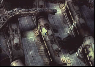
Image: Train yard
Can anybody tell me where the fuck I'm supposed to go on this screen?

There's a toggle you can use to show points of interest, but it's not very useful.

And battle's not much better. In classic Final Fantasy style, it consists of your party in one line and the enemy party in another line, but, for the first time, the characters actually move across the screen when they attack each other -- and the devs thought it would be a good idea to compensate for that by adding movement tracking to the battle interface.

They were wrong.

Say I'm trying to attack a monster, and it moves across the screen while I'm trying to point at it. Well, suddenly it's not where it was a second ago, and I have to move the pointer around to get to it. And probably wind up pointing at my own party somewhere in the process. Or, the reverse -- I'm trying to heal or buff one of my party members, and she jumps across the screen. (Actually it's a pain in the ass to target your own party members even when they're standing still, because the game can't seem to decide whether they're arranged left-right or up-down.)

All of which is just needlessly complicated, seemed-like-a-good-idea naivete. Changing the graphical presentation should not have actually changed the controls! FF7's battle interface is functionally identical to the previous six games'; it should play exactly the same even though it looks different. So that monster's not actually standing in his spot when I point at it? It doesn't matter; if I point at where he was standing a half-second ago it should still target him!

Music

The music in this one is just superb; it's legitimately one of the best original soundtracks in gaming history. Can you remember the first time you heard the boss theme? I can.

If I have one complaint, it's that you can pretty clearly hear Uematsu recycling the same themes at this point in the series -- Aeris's theme sounds a lot like Celes's theme, and they both bear a more-than-passing resemblance to Fanfare for the Common Man.

On the other hand, it's hard to fault Uematsu for retreading musical themes when the game retreads so many story themes -- you can't really blame him for making the Mako Plant sound like Vector when it looks so damn much like Vector too.

Ultimately, I can't take too many points off Uematsu for experimenting with the same riffs throughout the years. Charting his career through the series, it's the story of a guy learning his craft and learning new tools as they develop -- in his chiptune days, he was a programmer as much as a composer. The very first thing you hear in the very first 16-bit Final Fantasy is an extended version of the Prelude theme from the preceding three games. The first thing you hear in 7 is that theme again, this time with harp and vocals.

The move to the PS1 hardware had almost as profound an effect on the audio of the Final Fantasy series as the video. It allowed Uematsu a wide-open world to compose in MIDI, and, in a couple of cases, to use Redbook audio as well. FF6 had already involved some long, complex pieces that went on quite awhile before looping back to the start (Terra's overworld theme being the best example), but 7 had many more. And with instrument samples, the MIDI sounded less artificial than the chiptunes of yore.

The Love Triangle

The biggest problem with the Cloud/Aeris/Tifa triangle is that it's a case of two Bettys and no Veronica. (For you kids out there, you can substitute "Betty and Veronica" with "Edward and Jacob". Probably. I don't know; I couldn't even make it all the way through Steve's summary of Twilight. And it was hilarious.)

Tifa and Aeris are too much alike. At a glance, you expect the obvious trope: the scantily-clad, well-endowed one is the sassy, liberated one, while the conservatively-dressed one is a shy girl-nextdoor type. And at first, the game seems set to go down that path -- after all, you meet Aeris in a church and Tifa in a bar. Then, it takes an interesting turn suggesting that maybe they're about to subvert the trope and reverse the roles, as Tifa turns out to be literally the girl nextdoor and Aeris fearlessly guides you through the slums where she's grown up. But that potential twist never really pays off, and ultimately Tifa and Aeris are both the shy girl nextdoor. There's not a whole lot that distinguishes them from one another, and ultimately the competition between them never really feels like there's anything at stake in it.

Of course, once Aeris gets shish kebabed the triangle is resolved while simultaneously finally achieving a real dichotomy -- Cloud never makes a choice between the two women, the choice is made for him, and the rivalry for the audience's affection is no longer between two sweet girl-nextdoor types but, instead, between the angelic figure who died tragically and the girl who survives, stands by Cloud through his breakdown, and literally follows him to the ends of the earth. That is an interesting contrast, and it's most likely why people still care about Tifa and Aeris all these years later.

And of course there's also the rudimentary romance subquest that served to define them throughout RPG's to come. You can't seriously tell me that any of BioWare's romances are substantially more complex or nuanced than choosing your date for the Gold Saucer. Hell, it's even got a same-sex option!

The Translation

My God.

I played the PC version on my recent playthrough, and the most infamous errors ("This guy are sick", "Off course!/No, way!") were fixed, but there was still a "creek in the floor", and I'm pretty sure I saw "shit" spelled with an apostrophe. And the first boss fight still begins with Cloud instructing you to "Attack while it's tail's up!" -- less notable for the misplaced apostrophe than the omission of the rather nontrivial word "Don't", pretty much guaranteeing everyone playing the game for the first time would die twenty minutes in.

There's an absolutely fantastic peek behind the curtain in The Rise of Squaresoft Localization, an article by Wesley Fenlon at 1up. To wit: the massive script of FF7 was translated by one guy, who had little or no access to the original team, had no "series bible" of common Final Fantasy names and words, and had to hack the whole thing into a foreign character set. Considering that, he did a pretty good job -- I mean, we're still talking about the damn thing, aren't we?

But on the whole it was a big step down from Ted Woolsey's FF6 translation. Sure, that one has its detractors, but I can't for the life of me figure out why. It's got mistakes ("Vicks and Wedge"), truncations ("Fenix Down", "Carbunkl"), and plenty of 1990's-era-Nintendo censorship, but not only does it exceed 7 in its adherence to the basic rules of English spelling and grammar, it's also a lot more fun.

I suspect that FF7 is more like the American FF2 writ large in that people enjoyed it because the deeper themes of its story shone through the lousy script that conveyed them.

Right Time

I think the defining characteristic of FF7 is that it is spectacularly adolescent.

That's not entirely a bad thing -- in fact, it was adolescent in a time when its medium and its audience were adolescent too. It was big, it was operatic, it was bombastic; it was obsessed with its own appearance; it treated its shallow, superficial philosophy as if it were really deep and thought-provoking; it featured awkward cursing and a busty girl nextdoor and in the end it wasn't nearly as damn important as it seemed at the time. In other words, it's pretty damn obvious where its appeal to its target audience came from.
Final Fantasy 7 and Iconic Images

I closed Part One of my Final Fantasy 7 retrospective by saying that the Phoenix Rejuvenation Project, a mod designed to replace all the super-deformed field character models in the game with more detailed and realistically-proportioned ones, was the product of a lot of hard work by a lot of talented people...but just a bad idea on principle. The reason I believe this comes down to one essential point:

Final Fantasy 7 is ridiculous.

Now, the game has a huge fanbase, most of which was captivated by its epic story, cinematic atmosphere, and shocking moments. And I think that, given those elements, people tend to forget exactly how damn silly it is.

Here's an example. You're following Sephiroth -- the man who left a trail of blood and bodies ending in a dead President, a man who burned the heroes' village to the ground -- and his trail leads to...an amusement park. After you get your fortune told by a talking stuffed cat, and optionally ride the roller coaster and play an arcade game about the mating habits of Moogles, you find another trail of blood and bodies, these cut down by machine-gun fire. It's briefly implied that your colleague Barrett is the killer, but it turns out it's actually his best friend Dyne. Dyne's gone off the deep end and just wants to burn everything down; when he hears his daughter is still alive and Barrett's adopted her, he threatens to kill her and Barrett has to kill him first.

And then you go race a Chocobo.

Seriously. That is not an exaggeration. At all. The delay between Barrett having to gun down his best friend in order to protect his daughter and Cloud becoming a jockey in a race between giant pastel-colored birds is approximately thirty seconds.

The tone of FF7 shifts so often and so wildly that if you think too hard about it your brain will get whiplash. Do I even need to get into Wall Market and Don Corneo's Mansion? Do I ever want to see a realistically-proportioned Don Corneo thrusting his hips at me? (Actually, I looked for one from the Rejuvenation Project to inflict upon you, my audience, and couldn't find one. Maybe they don't want to see it any more than we do.)

And I can't stress this enough: one of your party members is a talking stuffed cat.

Final Fantasy games, at least since the 16-bit era, are a delicate balancing act of the serious and the silly, and 7 is probably the one that shows that contrast most clearly. And key to its balancing act is its use of exaggerated, iconic character models.

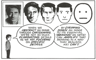
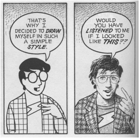
In the essential Understanding Comics, Scott McCloud explores the power of simple, iconic images:

Image: Understanding Comics

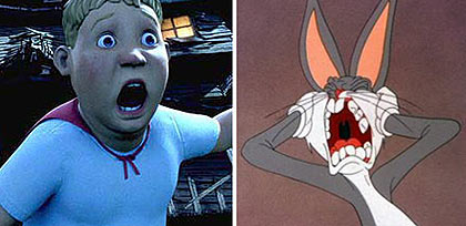
It doesn't just apply to comics, of course; it works for any form of cartooning. Similarly, a few years back some dumbass critic wrote a review of Monster House where he loudly proclaimed that it was the most important animated film of all time, and summarily dismissed the entire history of animation on the grounds that, prior to performance capture, cartoons couldn't truly convey emotion. I'm convinced he was just trolling, but Amid Amidi at Cartoon Brew tore him a new one across multiple blog posts, including one with this side-by-side comparison:

Image: Monster House vs. Bugs Bunny

One's got a dead-eyed Uncanny Valley face, and the other one is Bugs goddamn Bunny. Bugs is an enduring icon who is recognized the world over and has remained popular for over 70 years, whereas Monster House...well, did you even remember what Monster House was when I mentioned it?

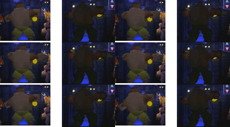
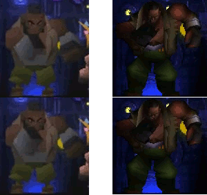
The point is, in cartooning, you take essential elements and exaggerate them. FF7's chibis do that: little bodies, big heads, and exaggerated movements in a story that is itself bigger-than-life. The Phoenix Rejuvenation Project injects more realistically-proportioned figures into those same exaggerated movements and bigger-than-life story, and the result is a pretty clear clash:
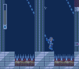
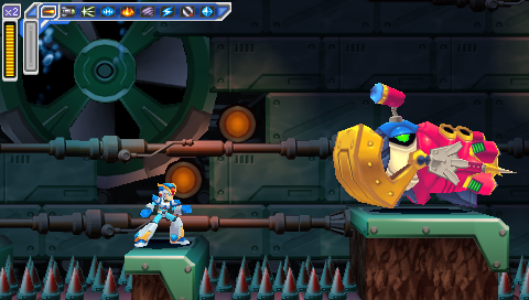
Image: Comparison of Barrett waving his arms, original vs. Rejuvenation
Image: Comparison of Barrett shaking his fist, original vs. Rejuvenation

FF7's field models lack even the basic facial emotions of FF6; each character has only one unchanging facial expression, and emotions are conveyed through exaggerated movement. In the Phoenix Rejuvenation Project, that doesn't change -- and it's a lot easier to accept a static facial expression when it's just a couple of lines and dots than when it's more fully formed, easier to accept ridiculous arm-waving from a squat little Playmobil man than one who's more reasonably proportioned.

And even if they could somehow take all that out, give the characters emote animations that fit their new models, you'd still have the Honeybee Inn, Sephiroth tossing people around like ragdolls in Nibelheim, Yuffie leaping across the screen, and, oh yeah, a talking stuffed cat. There are large swaths of the game that simply cannot be made to fit this art style.

I'm not opposed to overhauling FF7's field graphics by any means -- but Team Avalanche has the right idea: keep them chibi, just make them smoother and more detailed chibis.

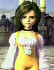
Of course, even that approach is fraught with peril; FF9 tried it and we got a leading lady who doesn't look like a detailed chibi so much as, well, a dwarf.

Image: Final Fantasy 9's Princess Garnet


Next time: An attempt at a thorough critical analysis of Final Fantasy 7, what it did right and what it did wrong. Combat! Love triangles! Japanese nuclear anxiety! Recurring themes, both literary and musical! Keep goin'? Off course!

And in the meantime, don't forget to join the discussion currently raging at Brontoforumus!

Final Fantasy 7 PC Mods

I'm not altogether sure when I first stumbled across the Final Fantasy 7 modding community. It's not surprising that it exists -- it is, after all, a popular game with a huge fan following -- but it is perhaps surprising that there are some really high-quality improvements to the game out there. High enough that I got the itch to replay the game for the first time in about a decade.

I'll talk about the experience of replaying it at 28 later. (tl;dr: it's not as good as 15-year-old Thad thought, but it's better than 18-year-old Thad thought.) For now, I'll stick with the technical.

Now, there are advantages to simply emulating the PlayStation version -- the ability to save anywhere is a biggie, and emulator-level texture smoothing is nice too. But I decided to go with the PC version because, again, it's the mods that drew me in. The major hub of mod development is the qhimm forums. And here are a few I've been using, ranked in order of importance.

The Essential

First, you'll need to get the game. Try eBay.

Then, you'll need to patch it to version 1.02.

And there's one mod that is absolutely necessary to get Final Fantasy 7 PC to run at all on a post-Win98 computer: Aali's Custom Graphics Driver. At the time of this writing it's at version 0.7.10b, but it's under active development. Make sure you jump to the end of the thread and grab the latest version; the link in the first post is version 0.1a from March 2009.

Setting it up is a simple process and described in the post that links it. You need to run both ff7config.exe and ff7.exe with full Administrator privileges, and I found that the graphics looked washed-out until I set compress_textures = no in the ff7_opengl.cfg file. It's probably a good idea to go through the troubleshooting thread if you have any other issues with it.

The Pretty Great

FMV Updates -- the PC versions of the FMV cutscenes look, inexplicably, even worse than the PlayStation versions. Modder DLPB has taken the PS1 versions and given them frame-by-frame upscaling and cleanup. The end result is, as he put it, a polished turd -- it's still kind of a mess but it's a damn sight better than what you get out of the box. Keep in mind that, after installing, you'll need to edit the videopath setting in your Windows registry.

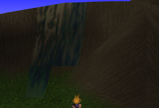
Avalanche's Graphical Overhaul: Gorgeous but not quite finished.Team Avalanche's Graphical Overhaul (the thread links the GUI Update as well, but I'll get to that a little lower down). Many of the models in FF7 -- such as the characters, monsters, and treasure chests -- are untextured polygons. That means they upscale without loss of quality, and actually hold up pretty well even though they're not as smooth as what we're used to in this day and age. The polygons with 2D textures on top of them, on the other hand -- like, say, the world map -- look quite a lot the worse for wear upscaled to a modern resolution. The Avalanche World Map Patch adds hi-res textures, in both 720p-and-down and 1080p-and-up flavors, and it looks goddamn gorgeous. It's currently an 0.9, which means it's not quite there yet -- now and again you'll see a low-res stripe on a hi-res mountain, as in the image to your right -- but it's close, and it's well worth installing in its mostly-complete state. (YMMV on which components you want to install -- I don't use the alternate avatars or the replacement Barrett model.)

FF7Music: Okay, so the FF7 soundtrack sounds not-very-good coming out of Windows's default MIDI sequencer. It's bundled with its own Yamaha sequencer, but it's incompatible with modern versions of Windows. It's possible -- and perhaps more elegant -- to tweak your soundfont with Timidity, but FF7Music gives you the flexibility to set whatever tracks you want. The installer I linked includes the PS1 version of the music, and also a resequenced version by a guy going by the handle finalfantim -- it's not a remix as it's the exact same MIDI tracks, but he's resequenced them using high-quality instruments and, while it's a matter of taste, I find that they sound better in nearly all cases. (Except the guitar on his version of the Cosmo Canyon theme; I don't care for that and use the PS1 version.) Of course, there's also the option of customizing it with music of your choice -- I've always hated the FF7 version of the Victory Fanfare, so I've swapped it out for a nice Minibosses version instead. And if you want to edit music files so they loop properly, there's a tutorial for that, too.

(The biggest drawback for me? While the thread says FF7Music works in Wine, I've found it doesn't work very well on my system -- it'll play a track or two, the opening, maybe the overworld theme when I load my game, but it stops after a few track changes. So if I want to enjoy the benefits of FF7Music, I have to reboot to Windows proper. YMMV, though; if you want to try using it under Wine, maybe you'll have better luck than I did.)

(I should add, though, that in my experience every single other mod I list here works great under Wine.)

Haven't Decided What I Think of These Yet

Team Avalanche's GUI Overhaul -- I linked this same thread up above to praise the Graphical Overhaul, but the GUI update is a separate mod. And as the header implies, I'm not sure if I like it or not. It's added a font that looks more like the one in the PS1 version of the game, but I'm not sure it looks as good as the default Windows font; there are some spacing issues I don't care for. And it actually supercedes some of the additions in the Graphical Overhaul -- for example, the GO includes a rather nice set of color item icons by a guy named romeo14, but the custom GUI will ignore them in favor of its own grayscale versions. And while it works fine on one of the two computers I installed it on, it somehow managed to hose my installation on the other, leaving it so that the game crashes as soon as I load a menu -- and it must have overwritten a setting somewhere, because it happens even if I disable the mod.

Project Blackfan -- Okay, so we've covered overworld graphics. This is a huge attempt to replace all the field graphics. Modder yarLson is extracting every single background image and running it through a Photoshop filter. The result -- well, the biggest problem is that they're all PNGs because that's the only format Aali's driver supports; highest-quality JPEGs would have looked just as good and taken up a fraction of the space. As for how they look, that's a matter of personal perspective; all graphics filters inevitably come down to whether you prefer your upscaled lo-res images to be pixellated or blurry. These are blurry. For my money, they work absolutely wonderfully on natural environments that look like photographs (like the rocky areas in the North Crater) but aren't as good on the technological sets (like the Highwind). It's worth checking out to see what you think; since the files sit in the mods\[modpath]\field directory, they're trivial to remove if you don't like them.

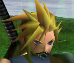
Millenia's custom weapons for Cloud -- from what I've seen these look great; however, the new swords appear to have finally shattered my Cloud's fragile psyche and convinced him to join Cobra.

Image: Cloud's messed-up jaw

Keep an Eye on These

Retranslation -- this could go either way. It's sure to be more competent than the game's official translation, but it's too early to tell whether it will be any fun. Fan translations of Final Fantasy 4 and 5 back in the 1990's were fun and vastly superior to Square's initial attempts at English scripts for those games, but the fan translation of 6 met a more lukewarm reception; I'm part of the group that thinks it sucks all the charm out of Woolsey's (admittedly compromised) version. Now, this 7 fan translation could end up like 4 and 5, or it could end up like 6 -- and given that the focus seems to be on debating whether the Turks should be named Reno and Elena or Leno and Yrena, I'm sadly inclined to fear the latter. But hey, at least they know how to spell mithril.

Menu overhaul -- this is actually included in the Retranslation mod, so don't install both. (Actually, at the time of this writing neither one of them has a demo available to install at all, but...you know, keep it in mind once they're updated.) At any rate, it changes the menu font and alignment, apparently to something more closely resembling Final Fantasy 9's version. It was initially designed to accommodate the longer names of items, spells, and summons in the retranslation, but I foresee it improving aesthetics and possibly even gameplay for the existing version of the game as well.

FL's Battle Scene/World Map Enhancement -- I've covered projects to improve the world map and the field maps; this one is for the battle scenes. (And also the 2D bits of the world map, like the skyline with Meteor, though I couldn't get that bit to work -- maybe it's incompatible with Team Avalanche's world map version?) It's still early days, but it's looking good.

Project Bombing Mission -- Team Avalanche's project to replace all graphics -- battle and field, background and character -- in the opening section of the game.

Q-Gears -- an attempt to rewrite the FF7 engine from scratch. It's the equivalent of Exult, the open-source engine for Ultima 7; it would use the FF7 resource files but would provide its own executable. If this project is finished, it has potentially huge ramifications; it would mean multiplatform support for FF7 and, potentially, other PS1-era Square games like 8, 9, and Xenogears. It could make all of them easier to mod, as well as open up opportunities for people to develop their own games based on the engine.

Haven't Tried

Kranmer's Trainer -- I griped earlier about FF7 PC's lack of save-anywhere functionality. Well, nobody's grafted save states onto the thing, but this trainer purports to do the next best thing: enables the "Save" and "PHS" options any time you open the menu. I say "purports" because AVG flags the binary as a Trojan and refuses to run it, so I haven't actually tried it; I believe it's a false positive but fair warning, use it at your own risk.

AnyCD -- purportedly this removes the need to change discs/mounted disc images. It's not a nodisc crack, as you'll still need at least one game disc (or image) to play, but if it works that's two disc images you don't need to store on your hard drive. Three if you include the installation CD.

Zerox's Tifa model -- I haven't tried any replacement character models because it would be distracting to have a detailed character standing in-between two PS1-vintage ones; maybe I'll replay the game when there are high-detail models for every character. But this one looks good from the screenshots!

Not Actually a Mod

Can't really think of a better place to put this. While FF7 PC has joystick support, I couldn't get it to recognize my Rumblepad 2. I rigged up keyboard emulation using Logitech's Gaming Software. I mapped the buttons to the appropriate keys to match the PS1 button config, and additionally set up the left stick for movement and the right stick for camera rotation. (I also set it up so pushing in the left stick works as a second Run button, but it doesn't work very well.) You can import my settings or, if you don't have a Logitech controller or just don't like my settings for some reason, try rolling your own using finalfantasy7pc.com's game controls page as reference. (If you are using Logitech's Gaming Software, remember to check the inexplicably-named "FPS Style Movement" box or diagonals won't work on the D-pad. Because FPS, apparently, is the only genre where you hit two directional buttons to make a diagonal.)

Not My Cuppa

APZ Cloud -- this one's been pulled from the qhimm forums since the designer swiped the textures from somewhere else; he's working on a new version now. The existing APZ Cloud is a popular mod but I don't really like the look of it -- but YMMV. I preferred his Kingdom Hearts model, but he never released it for download; the qhimm forums have a strict policy against ripping models from other games.

Phoenix Rejuvenation Project -- an incredibly ambitious project to replace every single "chibi" field character with a more detailed, more realistically-proportioned version. I have a great deal of respect for the talent and work that's gone into the project, but I think it's a bad idea from the get-go; I'm all for more detailed models but the field models should stay chibi. In fact, I intend to devote my entire next post to the subject. Be here.


If you would rather be somewhere else, do feel free to discuss this post and general FF7age over at Brontoforumus.

Also, I finally fixed the horribly outdated worstforumsever.com link at the top of the sidebar. Just in time for my background check!