Someday I want to make a webcomic out of last year's trip to the ER.

Phoenix Metro is a lousy place to live if you enjoy breathing. Sooner or later, you're going to get a lung fungus. The irony is that my family moved here because my great-uncle had asthma, and I'd dearly love to move away from here because now I do too.

I've never seen a summer like this past one before. It stormed but it didn't rain. Instead we had these monstrous dust storms called haboobs. They are, unlike most boobs, not fun.

Somewhere along the line, my girlfriend lost the ability to breathe comfortably. Finally she went to urgent care; they diagnosed her with pneumonia, gave her some steroids and antibiotics, and sent her home.

Well, the steroids made her hyperventilate, so we spent the next day in the ER. They told us it wasn't pneumonia and prescribed less harsh steroids.

Well, those steroids were still too harsh, and within a couple of days she was hyperventilating again and we had to call the paramedics. We managed to avoid another trip to the ER and she went off her prescriptions.

Since then, she's seen a couple specialists who appear to know what the fuck they're talking about. They told her it was a bad allergy to dust and we'd have to tear our carpets out.

So we spent this past weekend taking all the furniture out of all the bedrooms. It's kinda like moving, except instead of begging to borrow your friend's pickup you just move all your shit to your back porch.

Well, the floor guys were about 5 hours late today. So that's, you know, one whole day's worth of moving shit back into the house lost. Which gave us time for the power to go out in half our house. Second time in about 36 hours.

It was about this point that I decided I needed a beer.

The electrician told us that our transformer must be going out and the electric company would have to come out. In the meantime he hooked the other half of the house up to the same circuit as the functioning half of the house, so that the floor guys would be able to see things.

It was about this point that I decided fuck it, Halloween, you know I love you, but I am not dressing up this year; my house is mostly-disassembled and I was just going to reuse last year's Axe Cop costume anyway. Which is like a regular cop costume, but with an axe.

It was not much later that I decided I needed another beer.

The second beer exploded on me.

So I am currently sitting in my kitchen with a laptop; the flood of Trick-or-Treaters has dwindled to the point that I can finally bang out this post. My house is full of choking, eye-searing dust --

At this point in the story the dust got so bad I went outside. I gave candy to trick-or-treaters until people from the power company told me they were taking the power out. So, guess I'll wrap this and unplug my router.

Happy Halloween!

...was going to be the end of my post, but before I could get to the Post button the power went out. The floor guys, obviously, will not be finishing tonight.

I am currently at my grandparents' house. First thing I did was get a glass of water. Continuing the evening's theme, the dispenser did not turn off when I was done with it, and for the second time tonight I found myself toweling up a spilled beverage.

Well, happy Halloween.

To be continued? God, I sure hope not.

Oh, and also I've got company coming on Friday. Good times.

The thing that surprised me most, on a replay of FF7 after lo these many years was, you know, it's actually pretty good. Not the best game ever, not even the best Final Fantasy -- hell, not even the best Final Fantasy released in a six-month period --, but pretty good.

It's easy to scoff at it in hindsight, probably because it's not nearly as good as some people claim it is. And frankly I'm embarrassed by my own youthful enthusiasm for it. But, truth be told, it's a good game. And it's not really logically consistent to love 6 and hate 7, because 7 is so clearly a refinement of 6. Amnesiac hero reluctantly joins underground organization fighting an evil, technocratic Empire that is extracting the spirits of a dead, magical race into glowing stones to use for its own nefarious purposes? Yeah, that sounds pretty familiar. The leader of the Empire is killed by a psychopath who is the product of one of its magical infusion experiments gone wrong, and who then becomes the Big Bad? Check. The key to saving the world is a mysterious girl who escaped from the empire's lab and turns out to be the daughter of a human and one of the aforementioned magical race? Mhm. Even the environments and the music are awfully familiar.

Which I suppose in itself could be taken as a knock against FF7 -- it hits a lot of the same beats as its predecessor. But this is Final Fantasy we're talking about. It's not like FF6 was fresh and new -- if you squint, the above plot summary isn't too far off from FF4's, either. And truth be told, 7 does some things better than 6.

It's easy to lose sight of in a flashy, forty-hour game, but, at least in places, FF7 shows a remarkable economy of storytelling. Take President Shinra -- for the first act of the game, he's the presumptive villain, and he makes a hell of an impression. But in truth he only appears in two scenes, I can count his lines of dialogue on my hands, and then he's promptly killed, offscreen, by a character you've never seen and have only heard of in rumors.

That's a pretty far cry from Kefka and Gestahl, really. Kefka is clearly the game's villain from the get-go, and you know sooner or later he's going to take out the Emperor. As for Gestahl, he doesn't get a lot of development but he's in a few scenes and you get a decent sense of who he is.

With Shinra, by contrast, you get a sense of who he is with very minimal information. It's quite well done. And then he's killed just a few hours in, by somebody who hasn't even been introduced yet. That's a shock -- and the presentation, the darkened halls filled with blood, is pretty unexpected too.

The key difference between Shinra and Gestahl -- and the key difference between their respective empires, and arguably between the settings of the two games -- is that Gestahl is an actual head of state, while Shinra is a CEO. The Mayor of Midgar only briefly appears in the game, and makes it very clear that he's a powerless figurehead. The man who runs the reactors rules the world. Forget the motorcycles, that's the most modern thing about FF7.

Shinra's also utterly ruthless and calculating. He wipes out an entire slum and blames it on the terrorists who have been sabotaging his reactors.

(It does fall apart a bit in the Corel flashback. Barrett convinces the people of his town to sell out to Shinra -- and then Shinra burns down the town anyway? I really have no idea how that serves the plot at all. It's not even there to fill the "hero's hometown gets burned down" box on JRPG Bingo, because by that point in the game Sephiroth's already burned Nibelheim, in a different flashback.)

Rufus makes an interesting contrast to his father. For all his initial talk about ruling by fear, his death is a contrast to his father's: the elder Shinra dies after destroying Sector 7; the younger dies saving Midgar. He doesn't have to be there; he could have evacuated, and he chose not to. His deeds redeem him, even if he's still not a very nice person -- and even if Midgar ends up destroyed anyway.

But probably the best example of FF7's skill in economical storytelling is the destruction of Sector 7 and the deaths of Biggs, Wedge, and Jessie. Sure, they're the requisite Star Wars-named fodder characters (Romanized correctly here for the first time!), and no, they don't have that much screentime, but you grow to like them in that short time. You learn just enough about their hopes and their doubts -- Wedge's guilt over the civilian casualties, Jessie's nervousness about her forged ID cards -- to feel for them. And Wedge is a legitimately fantastic example of a character whose personality is communicated visually, through his model and his body language. Which of course starts to bleed into my previous post and the observation that simple, iconic images can convey a whole lot to an audience.

There's a point where the uniqueness of gaming comes into the Sector 7 collapse, too. Sure, killing a bunch of poor people and blaming it on the hero is stock Bond Villain stuff, but this is different: the first opportunity you get to do a little bit of free exploration is Sector 7. You wander around, you meet people, you slowly get introduced to the world of the game there. It's not that the villagers have gotten too much more complicated since welcoming you to Coneria and warning you that the Fire Fiend will burn everything up, but they have little stories and personalities -- hell, the building designs have more character than the people, but the bottom line is that you get a feel for Sector 7 that you don't get for most fodder locations. (Contrast with FF6: Kefka's murder of the population of Doma establishes him as a very bad man, but you're not emotionally invested in Doma or in anyone there except Cyan and his family.) In short, a couple of lines of dialogue, some atmospheric design, and the proper placement in a game's narrative and presentation can really make a minor location stand out.

Oh, and the steel beam through the playground is as subtle as a chainsaw to the face, but it's definitely a memorable image.

And while the game can get awfully overbearing in places, it has some deep themes that are presented without being harped on. Of course the whole thing revolves around Japan's complex relationship with nuclear power -- something thrown into stark relief as I replayed it a few months ago when the Fukushima meltdown was in the news -- and it makes Barrett's team the ostensible heroes, but there are shades of gray there. Barrett is well-meaning, and perhaps the character with the purest motives in the game (leave a better world for the little girl he's adopted) -- but he's also a revenge-obsessed terrorist who gets a lot of people killed, most of them innocent and some of them his own team. And he's easily the most sanctimonious character in the game -- he rants constantly about saving the planet from the monsters who are sucking its lifeblood to generate power, and the game respects our intelligence enough not to point out the irony that he's a former coal miner.

Interface

It's not just the story that feels like an update of FF6; the actual gameplay is really quite similar too. Materia's not so far off from Espers -- the main difference is that it makes the characters even more interchangeable -- and the game is similarly unbalanced. It's still trivial to produce a party that will take the last boss out in a round or two; the game ups his stats a bit if you're at level 98 or 99, but it doesn't really make for a challenge.

There are challenges, of course, for advanced characters -- Huge Materia and the Weapons -- and in this sense, the game is better-rounded than FF6. The biggest problem is that, for the most part, they suck. On my latest play-through, I probably spent about ten hours grinding on Magic Pots and Movers, and for what? Spammy, unsatisfying battles with the Weapons, and a bunch of Master Materia I didn't need.

Seriously, if I ever try to beat Ruby and Emerald on a future playthrough, or get any Master Materia (with the possible exception of yellow), just give me a quick smack in the back of the head. It's stupid and it's a waste of time. And the Arena's not much better.

...but back to the interface. If you don't bother with all the side crap, it's pretty neat! And while weapons and armor have been simplified way down from 6, they complement the Materia system nicely. Do you optimize for equipment stats, for number of Materia slots, for number of linked Materia slots, or Materia growth?

And the Blue Materia are pretty neat too. Added Effect/Hades was always a favorite, and Phoenix/Final Attack is clever if overkill.

Where FF7 runs into its biggest gameplay problems is in simply interacting with the world. It's an early 3D game, and it's obvious that the team was still trying to figure out how to realize the Final Fantasy rules in that context.

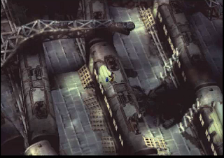
This is most apparent in the field. There is a stunning variety of detailed backgrounds in the game. The trouble is that they're low-resolution, low-color prerenders, and much of the time it's difficult to figure out simple things like where you can walk and where you can't.

Image: Train yard
Can anybody tell me where the fuck I'm supposed to go on this screen?

There's a toggle you can use to show points of interest, but it's not very useful.

And battle's not much better. In classic Final Fantasy style, it consists of your party in one line and the enemy party in another line, but, for the first time, the characters actually move across the screen when they attack each other -- and the devs thought it would be a good idea to compensate for that by adding movement tracking to the battle interface.

They were wrong.

Say I'm trying to attack a monster, and it moves across the screen while I'm trying to point at it. Well, suddenly it's not where it was a second ago, and I have to move the pointer around to get to it. And probably wind up pointing at my own party somewhere in the process. Or, the reverse -- I'm trying to heal or buff one of my party members, and she jumps across the screen. (Actually it's a pain in the ass to target your own party members even when they're standing still, because the game can't seem to decide whether they're arranged left-right or up-down.)

All of which is just needlessly complicated, seemed-like-a-good-idea naivete. Changing the graphical presentation should not have actually changed the controls! FF7's battle interface is functionally identical to the previous six games'; it should play exactly the same even though it looks different. So that monster's not actually standing in his spot when I point at it? It doesn't matter; if I point at where he was standing a half-second ago it should still target him!

Music

The music in this one is just superb; it's legitimately one of the best original soundtracks in gaming history. Can you remember the first time you heard the boss theme? I can.

If I have one complaint, it's that you can pretty clearly hear Uematsu recycling the same themes at this point in the series -- Aeris's theme sounds a lot like Celes's theme, and they both bear a more-than-passing resemblance to Fanfare for the Common Man.

On the other hand, it's hard to fault Uematsu for retreading musical themes when the game retreads so many story themes -- you can't really blame him for making the Mako Plant sound like Vector when it looks so damn much like Vector too.

Ultimately, I can't take too many points off Uematsu for experimenting with the same riffs throughout the years. Charting his career through the series, it's the story of a guy learning his craft and learning new tools as they develop -- in his chiptune days, he was a programmer as much as a composer. The very first thing you hear in the very first 16-bit Final Fantasy is an extended version of the Prelude theme from the preceding three games. The first thing you hear in 7 is that theme again, this time with harp and vocals.

The move to the PS1 hardware had almost as profound an effect on the audio of the Final Fantasy series as the video. It allowed Uematsu a wide-open world to compose in MIDI, and, in a couple of cases, to use Redbook audio as well. FF6 had already involved some long, complex pieces that went on quite awhile before looping back to the start (Terra's overworld theme being the best example), but 7 had many more. And with instrument samples, the MIDI sounded less artificial than the chiptunes of yore.

The Love Triangle

The biggest problem with the Cloud/Aeris/Tifa triangle is that it's a case of two Bettys and no Veronica. (For you kids out there, you can substitute "Betty and Veronica" with "Edward and Jacob". Probably. I don't know; I couldn't even make it all the way through Steve's summary of Twilight. And it was hilarious.)

Tifa and Aeris are too much alike. At a glance, you expect the obvious trope: the scantily-clad, well-endowed one is the sassy, liberated one, while the conservatively-dressed one is a shy girl-nextdoor type. And at first, the game seems set to go down that path -- after all, you meet Aeris in a church and Tifa in a bar. Then, it takes an interesting turn suggesting that maybe they're about to subvert the trope and reverse the roles, as Tifa turns out to be literally the girl nextdoor and Aeris fearlessly guides you through the slums where she's grown up. But that potential twist never really pays off, and ultimately Tifa and Aeris are both the shy girl nextdoor. There's not a whole lot that distinguishes them from one another, and ultimately the competition between them never really feels like there's anything at stake in it.

Of course, once Aeris gets shish kebabed the triangle is resolved while simultaneously finally achieving a real dichotomy -- Cloud never makes a choice between the two women, the choice is made for him, and the rivalry for the audience's affection is no longer between two sweet girl-nextdoor types but, instead, between the angelic figure who died tragically and the girl who survives, stands by Cloud through his breakdown, and literally follows him to the ends of the earth. That is an interesting contrast, and it's most likely why people still care about Tifa and Aeris all these years later.

And of course there's also the rudimentary romance subquest that served to define them throughout RPG's to come. You can't seriously tell me that any of BioWare's romances are substantially more complex or nuanced than choosing your date for the Gold Saucer. Hell, it's even got a same-sex option!

The Translation

My God.

I played the PC version on my recent playthrough, and the most infamous errors ("This guy are sick", "Off course!/No, way!") were fixed, but there was still a "creek in the floor", and I'm pretty sure I saw "shit" spelled with an apostrophe. And the first boss fight still begins with Cloud instructing you to "Attack while it's tail's up!" -- less notable for the misplaced apostrophe than the omission of the rather nontrivial word "Don't", pretty much guaranteeing everyone playing the game for the first time would die twenty minutes in.

There's an absolutely fantastic peek behind the curtain in The Rise of Squaresoft Localization, an article by Wesley Fenlon at 1up. To wit: the massive script of FF7 was translated by one guy, who had little or no access to the original team, had no "series bible" of common Final Fantasy names and words, and had to hack the whole thing into a foreign character set. Considering that, he did a pretty good job -- I mean, we're still talking about the damn thing, aren't we?

But on the whole it was a big step down from Ted Woolsey's FF6 translation. Sure, that one has its detractors, but I can't for the life of me figure out why. It's got mistakes ("Vicks and Wedge"), truncations ("Fenix Down", "Carbunkl"), and plenty of 1990's-era-Nintendo censorship, but not only does it exceed 7 in its adherence to the basic rules of English spelling and grammar, it's also a lot more fun.

I suspect that FF7 is more like the American FF2 writ large in that people enjoyed it because the deeper themes of its story shone through the lousy script that conveyed them.

Right Time

I think the defining characteristic of FF7 is that it is spectacularly adolescent.

That's not entirely a bad thing -- in fact, it was adolescent in a time when its medium and its audience were adolescent too. It was big, it was operatic, it was bombastic; it was obsessed with its own appearance; it treated its shallow, superficial philosophy as if it were really deep and thought-provoking; it featured awkward cursing and a busty girl nextdoor and in the end it wasn't nearly as damn important as it seemed at the time. In other words, it's pretty damn obvious where its appeal to its target audience came from.

I closed Part One of my Final Fantasy 7 retrospective by saying that the Phoenix Rejuvenation Project, a mod designed to replace all the super-deformed field character models in the game with more detailed and realistically-proportioned ones, was the product of a lot of hard work by a lot of talented people...but just a bad idea on principle. The reason I believe this comes down to one essential point:

Final Fantasy 7 is ridiculous.

Now, the game has a huge fanbase, most of which was captivated by its epic story, cinematic atmosphere, and shocking moments. And I think that, given those elements, people tend to forget exactly how damn silly it is.

Here's an example. You're following Sephiroth -- the man who left a trail of blood and bodies ending in a dead President, a man who burned the heroes' village to the ground -- and his trail leads to...an amusement park. After you get your fortune told by a talking stuffed cat, and optionally ride the roller coaster and play an arcade game about the mating habits of Moogles, you find another trail of blood and bodies, these cut down by machine-gun fire. It's briefly implied that your colleague Barrett is the killer, but it turns out it's actually his best friend Dyne. Dyne's gone off the deep end and just wants to burn everything down; when he hears his daughter is still alive and Barrett's adopted her, he threatens to kill her and Barrett has to kill him first.

And then you go race a Chocobo.

Seriously. That is not an exaggeration. At all. The delay between Barrett having to gun down his best friend in order to protect his daughter and Cloud becoming a jockey in a race between giant pastel-colored birds is approximately thirty seconds.

The tone of FF7 shifts so often and so wildly that if you think too hard about it your brain will get whiplash. Do I even need to get into Wall Market and Don Corneo's Mansion? Do I ever want to see a realistically-proportioned Don Corneo thrusting his hips at me? (Actually, I looked for one from the Rejuvenation Project to inflict upon you, my audience, and couldn't find one. Maybe they don't want to see it any more than we do.)

And I can't stress this enough: one of your party members is a talking stuffed cat.

Final Fantasy games, at least since the 16-bit era, are a delicate balancing act of the serious and the silly, and 7 is probably the one that shows that contrast most clearly. And key to its balancing act is its use of exaggerated, iconic character models.

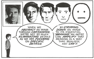
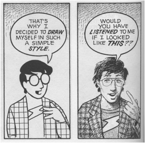
In the essential Understanding Comics, Scott McCloud explores the power of simple, iconic images:

Image: Understanding Comics

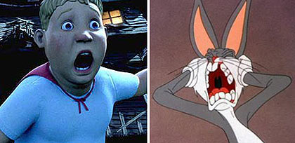
It doesn't just apply to comics, of course; it works for any form of cartooning. Similarly, a few years back some dumbass critic wrote a review of Monster House where he loudly proclaimed that it was the most important animated film of all time, and summarily dismissed the entire history of animation on the grounds that, prior to performance capture, cartoons couldn't truly convey emotion. I'm convinced he was just trolling, but Amid Amidi at Cartoon Brew tore him a new one across multiple blog posts, including one with this side-by-side comparison:

Image: Monster House vs. Bugs Bunny

One's got a dead-eyed Uncanny Valley face, and the other one is Bugs goddamn Bunny. Bugs is an enduring icon who is recognized the world over and has remained popular for over 70 years, whereas Monster House...well, did you even remember what Monster House was when I mentioned it?

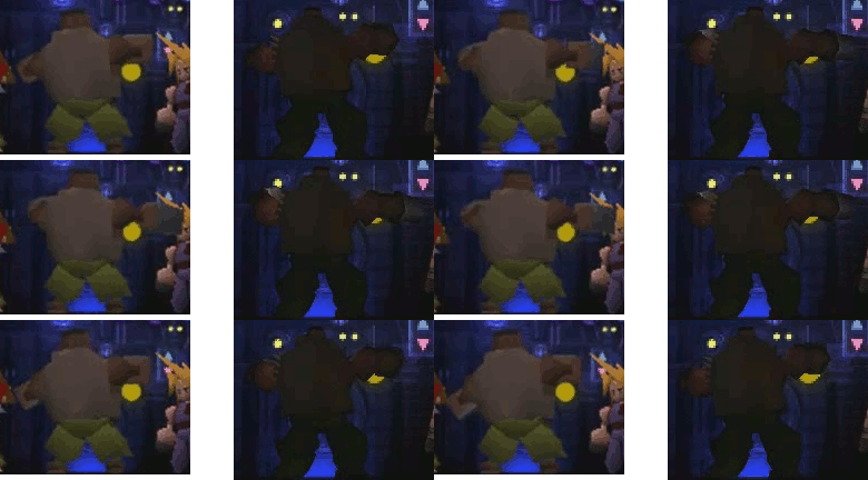
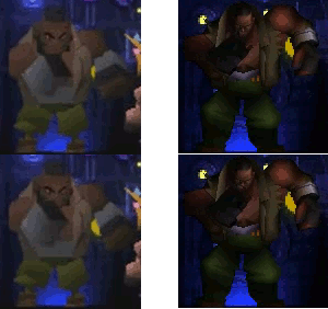
The point is, in cartooning, you take essential elements and exaggerate them. FF7's chibis do that: little bodies, big heads, and exaggerated movements in a story that is itself bigger-than-life. The Phoenix Rejuvenation Project injects more realistically-proportioned figures into those same exaggerated movements and bigger-than-life story, and the result is a pretty clear clash:

Image: Comparison of Barrett waving his arms, original vs. Rejuvenation
Image: Comparison of Barrett shaking his fist, original vs. Rejuvenation

FF7's field models lack even the basic facial emotions of FF6; each character has only one unchanging facial expression, and emotions are conveyed through exaggerated movement. In the Phoenix Rejuvenation Project, that doesn't change -- and it's a lot easier to accept a static facial expression when it's just a couple of lines and dots than when it's more fully formed, easier to accept ridiculous arm-waving from a squat little Playmobil man than one who's more reasonably proportioned.

And even if they could somehow take all that out, give the characters emote animations that fit their new models, you'd still have the Honeybee Inn, Sephiroth tossing people around like ragdolls in Nibelheim, Yuffie leaping across the screen, and, oh yeah, a talking stuffed cat. There are large swaths of the game that simply cannot be made to fit this art style.

I'm not opposed to overhauling FF7's field graphics by any means -- but Team Avalanche has the right idea: keep them chibi, just make them smoother and more detailed chibis.

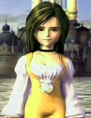
Of course, even that approach is fraught with peril; FF9 tried it and we got a leading lady who doesn't look like a detailed chibi so much as, well, a dwarf.

Image: Final Fantasy 9's Princess Garnet


Next time: An attempt at a thorough critical analysis of Final Fantasy 7, what it did right and what it did wrong. Combat! Love triangles! Japanese nuclear anxiety! Recurring themes, both literary and musical! Keep goin'? Off course!

And in the meantime, don't forget to join the discussion currently raging at Brontoforumus!

I'm not altogether sure when I first stumbled across the Final Fantasy 7 modding community. It's not surprising that it exists -- it is, after all, a popular game with a huge fan following -- but it is perhaps surprising that there are some really high-quality improvements to the game out there. High enough that I got the itch to replay the game for the first time in about a decade.

I'll talk about the experience of replaying it at 28 later. (tl;dr: it's not as good as 15-year-old Thad thought, but it's better than 18-year-old Thad thought.) For now, I'll stick with the technical.

Now, there are advantages to simply emulating the PlayStation version -- the ability to save anywhere is a biggie, and emulator-level texture smoothing is nice too. But I decided to go with the PC version because, again, it's the mods that drew me in. The major hub of mod development is the qhimm forums. And here are a few I've been using, ranked in order of importance.

The Essential

First, you'll need to get the game. Try eBay.

Then, you'll need to patch it to version 1.02.

And there's one mod that is absolutely necessary to get Final Fantasy 7 PC to run at all on a post-Win98 computer: Aali's Custom Graphics Driver. At the time of this writing it's at version 0.7.10b, but it's under active development. Make sure you jump to the end of the thread and grab the latest version; the link in the first post is version 0.1a from March 2009.

Setting it up is a simple process and described in the post that links it. You need to run both ff7config.exe and ff7.exe with full Administrator privileges, and I found that the graphics looked washed-out until I set compress_textures = no in the ff7_opengl.cfg file. It's probably a good idea to go through the troubleshooting thread if you have any other issues with it.

The Pretty Great

FMV Updates -- the PC versions of the FMV cutscenes look, inexplicably, even worse than the PlayStation versions. Modder DLPB has taken the PS1 versions and given them frame-by-frame upscaling and cleanup. The end result is, as he put it, a polished turd -- it's still kind of a mess but it's a damn sight better than what you get out of the box. Keep in mind that, after installing, you'll need to edit the videopath setting in your Windows registry.

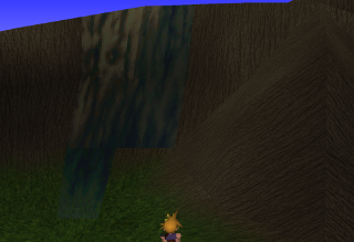
Avalanche's Graphical Overhaul: Gorgeous but not quite finished.Team Avalanche's Graphical Overhaul (the thread links the GUI Update as well, but I'll get to that a little lower down). Many of the models in FF7 -- such as the characters, monsters, and treasure chests -- are untextured polygons. That means they upscale without loss of quality, and actually hold up pretty well even though they're not as smooth as what we're used to in this day and age. The polygons with 2D textures on top of them, on the other hand -- like, say, the world map -- look quite a lot the worse for wear upscaled to a modern resolution. The Avalanche World Map Patch adds hi-res textures, in both 720p-and-down and 1080p-and-up flavors, and it looks goddamn gorgeous. It's currently an 0.9, which means it's not quite there yet -- now and again you'll see a low-res stripe on a hi-res mountain, as in the image to your right -- but it's close, and it's well worth installing in its mostly-complete state. (YMMV on which components you want to install -- I don't use the alternate avatars or the replacement Barrett model.)

FF7Music: Okay, so the FF7 soundtrack sounds not-very-good coming out of Windows's default MIDI sequencer. It's bundled with its own Yamaha sequencer, but it's incompatible with modern versions of Windows. It's possible -- and perhaps more elegant -- to tweak your soundfont with Timidity, but FF7Music gives you the flexibility to set whatever tracks you want. The installer I linked includes the PS1 version of the music, and also a resequenced version by a guy going by the handle finalfantim -- it's not a remix as it's the exact same MIDI tracks, but he's resequenced them using high-quality instruments and, while it's a matter of taste, I find that they sound better in nearly all cases. (Except the guitar on his version of the Cosmo Canyon theme; I don't care for that and use the PS1 version.) Of course, there's also the option of customizing it with music of your choice -- I've always hated the FF7 version of the Victory Fanfare, so I've swapped it out for a nice Minibosses version instead. And if you want to edit music files so they loop properly, there's a tutorial for that, too.

(The biggest drawback for me? While the thread says FF7Music works in Wine, I've found it doesn't work very well on my system -- it'll play a track or two, the opening, maybe the overworld theme when I load my game, but it stops after a few track changes. So if I want to enjoy the benefits of FF7Music, I have to reboot to Windows proper. YMMV, though; if you want to try using it under Wine, maybe you'll have better luck than I did.)

(I should add, though, that in my experience every single other mod I list here works great under Wine.)

Haven't Decided What I Think of These Yet

Team Avalanche's GUI Overhaul -- I linked this same thread up above to praise the Graphical Overhaul, but the GUI update is a separate mod. And as the header implies, I'm not sure if I like it or not. It's added a font that looks more like the one in the PS1 version of the game, but I'm not sure it looks as good as the default Windows font; there are some spacing issues I don't care for. And it actually supercedes some of the additions in the Graphical Overhaul -- for example, the GO includes a rather nice set of color item icons by a guy named romeo14, but the custom GUI will ignore them in favor of its own grayscale versions. And while it works fine on one of the two computers I installed it on, it somehow managed to hose my installation on the other, leaving it so that the game crashes as soon as I load a menu -- and it must have overwritten a setting somewhere, because it happens even if I disable the mod.

Project Blackfan -- Okay, so we've covered overworld graphics. This is a huge attempt to replace all the field graphics. Modder yarLson is extracting every single background image and running it through a Photoshop filter. The result -- well, the biggest problem is that they're all PNGs because that's the only format Aali's driver supports; highest-quality JPEGs would have looked just as good and taken up a fraction of the space. As for how they look, that's a matter of personal perspective; all graphics filters inevitably come down to whether you prefer your upscaled lo-res images to be pixellated or blurry. These are blurry. For my money, they work absolutely wonderfully on natural environments that look like photographs (like the rocky areas in the North Crater) but aren't as good on the technological sets (like the Highwind). It's worth checking out to see what you think; since the files sit in the mods\[modpath]\field directory, they're trivial to remove if you don't like them.

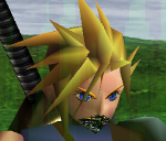
Millenia's custom weapons for Cloud -- from what I've seen these look great; however, the new swords appear to have finally shattered my Cloud's fragile psyche and convinced him to join Cobra.

Image: Cloud's messed-up jaw

Keep an Eye on These

Retranslation -- this could go either way. It's sure to be more competent than the game's official translation, but it's too early to tell whether it will be any fun. Fan translations of Final Fantasy 4 and 5 back in the 1990's were fun and vastly superior to Square's initial attempts at English scripts for those games, but the fan translation of 6 met a more lukewarm reception; I'm part of the group that thinks it sucks all the charm out of Woolsey's (admittedly compromised) version. Now, this 7 fan translation could end up like 4 and 5, or it could end up like 6 -- and given that the focus seems to be on debating whether the Turks should be named Reno and Elena or Leno and Yrena, I'm sadly inclined to fear the latter. But hey, at least they know how to spell mithril.

Menu overhaul -- this is actually included in the Retranslation mod, so don't install both. (Actually, at the time of this writing neither one of them has a demo available to install at all, but...you know, keep it in mind once they're updated.) At any rate, it changes the menu font and alignment, apparently to something more closely resembling Final Fantasy 9's version. It was initially designed to accommodate the longer names of items, spells, and summons in the retranslation, but I foresee it improving aesthetics and possibly even gameplay for the existing version of the game as well.

FL's Battle Scene/World Map Enhancement -- I've covered projects to improve the world map and the field maps; this one is for the battle scenes. (And also the 2D bits of the world map, like the skyline with Meteor, though I couldn't get that bit to work -- maybe it's incompatible with Team Avalanche's world map version?) It's still early days, but it's looking good.

Project Bombing Mission -- Team Avalanche's project to replace all graphics -- battle and field, background and character -- in the opening section of the game.

Q-Gears -- an attempt to rewrite the FF7 engine from scratch. It's the equivalent of Exult, the open-source engine for Ultima 7; it would use the FF7 resource files but would provide its own executable. If this project is finished, it has potentially huge ramifications; it would mean multiplatform support for FF7 and, potentially, other PS1-era Square games like 8, 9, and Xenogears. It could make all of them easier to mod, as well as open up opportunities for people to develop their own games based on the engine.

Haven't Tried

Kranmer's Trainer -- I griped earlier about FF7 PC's lack of save-anywhere functionality. Well, nobody's grafted save states onto the thing, but this trainer purports to do the next best thing: enables the "Save" and "PHS" options any time you open the menu. I say "purports" because AVG flags the binary as a Trojan and refuses to run it, so I haven't actually tried it; I believe it's a false positive but fair warning, use it at your own risk.

AnyCD -- purportedly this removes the need to change discs/mounted disc images. It's not a nodisc crack, as you'll still need at least one game disc (or image) to play, but if it works that's two disc images you don't need to store on your hard drive. Three if you include the installation CD.

Zerox's Tifa model -- I haven't tried any replacement character models because it would be distracting to have a detailed character standing in-between two PS1-vintage ones; maybe I'll replay the game when there are high-detail models for every character. But this one looks good from the screenshots!

Not Actually a Mod

Can't really think of a better place to put this. While FF7 PC has joystick support, I couldn't get it to recognize my Rumblepad 2. I rigged up keyboard emulation using Logitech's Gaming Software. I mapped the buttons to the appropriate keys to match the PS1 button config, and additionally set up the left stick for movement and the right stick for camera rotation. (I also set it up so pushing in the left stick works as a second Run button, but it doesn't work very well.) You can import my settings or, if you don't have a Logitech controller or just don't like my settings for some reason, try rolling your own using finalfantasy7pc.com's game controls page as reference. (If you are using Logitech's Gaming Software, remember to check the inexplicably-named "FPS Style Movement" box or diagonals won't work on the D-pad. Because FPS, apparently, is the only genre where you hit two directional buttons to make a diagonal.)

Not My Cuppa

APZ Cloud -- this one's been pulled from the qhimm forums since the designer swiped the textures from somewhere else; he's working on a new version now. The existing APZ Cloud is a popular mod but I don't really like the look of it -- but YMMV. I preferred his Kingdom Hearts model, but he never released it for download; the qhimm forums have a strict policy against ripping models from other games.

Phoenix Rejuvenation Project -- an incredibly ambitious project to replace every single "chibi" field character with a more detailed, more realistically-proportioned version. I have a great deal of respect for the talent and work that's gone into the project, but I think it's a bad idea from the get-go; I'm all for more detailed models but the field models should stay chibi. In fact, I intend to devote my entire next post to the subject. Be here.


If you would rather be somewhere else, do feel free to discuss this post and general FF7age over at Brontoforumus.

Also, I finally fixed the horribly outdated worstforumsever.com link at the top of the sidebar. Just in time for my background check!

Hey, been awhile. Have been ignoring the blog (even my traditional New Year's Eve Post) and many of my other Internet habits in favor of various projects I've been hard at work on. I just pulled off a WordPress update; you're reading this so it looks like it went smoothly.

Anyhow. One of the aforementioned projects (and the thing you came here to read, if you found this page by Googling an error message -- and if you did, you may want to skip my meandering explanation and go straight for the numbered steps at the bottom of this post): I recently decided to set up a file sync system across the computers in my house. It's useful for syncing things like savegames, RSS feeds, and the public-domain ebooks I've been grabbing from Project Gutenberg and MobileRead and comics from Digital Comic Museum across multiple devices.

I'd done some command-line RSS before, and also set up backup systems with Toucan, but figured I'd try something different on this one. I gave Ubuntu One a shot and it seemed promising until I realized it isn't open-source and I can't set up my own server. Canonical is swiftly becoming the Apple of the Linux world -- good at taking open-source software and making it pretty and usable, but not so great at giving back to the open-source community.

Ultimately I settled on Unison, which proved to be a bit of a headache -- frankly if anybody has a better solution I'd be happy to hear it, but here's how I got it to work.

First of all, the Unison GUI requires GTK. Hardly a problem on the Linux side, but under Windows, extracting the binaries from gtk.org and setting the PATH variable didn't work, no matter what I did. Maybe it's a Windows 7 thing, or maybe it's a Unison thing, but either way, Unison threw up "This application has failed to start because libgtk-win32-2.0-0.dll was not found. Re-installing the application may fix this problem." every time I ran it. Sticking it directly in the GTK\bin directory worked but is an ugly solution; multiple sites suggested installing Pidgin, which comes with GTK, but produces the same problem as Unison doesn't find it in the path.

(Actually, let me back up a bit: I couldn't get Unison to work with 64-bit GTK at all. The only Unison binaries I could find were 32-bit; I opted to install a 32-bit version of GTK rather than stick Cygwin on my HTPC and compile Unison from source.)

Ultimately, I found a binary Windows installer for GTK (conveniently the first Google match for gtk windows binary installer); whatever my PATH problem was, this installer fixed it. The Unison GUI was up and running, from its own folder.

Next problem, though: SSH. Unison did not play nice with PuTTy.

Googling the problem, I found a page called Unison-ssh, which includes a wrapper named ssh.exe for download. If you've read this far you've probably already installed PuTTy, but in case you haven't, you'll only need it if you want to use public key authentication -- this ssh.exe will automatically install a copy of PuTTy's command-line SSH utility, plink.exe, if it can't find it. (Well, hypothetically. It tries to stick it in WINDIR and if you're not running it with admin privileges it'll fail.)

Now, I should add that this ssh.exe doesn't work properly under Windows 7; it'll prompt you for a username but only let you type one character and then automatically Enter it. Same problem with the password prompt. The comments thread in the page is filled with people who have the same problem. Maybe a clean compile would fix it, I don't know; again, I didn't want to go to the trouble of setting up compilers on my HTPC.

There's a solution a ways down the comments thread. Unison stores its data in the .unison directory, even under Windows. (That'd be \Users\name\.unison under Win7.) They're simple text files with the .prf extension. And you can add an "sshargs" line to give command-line arguments. If you're comfortable sticking your password in plain text, you can add the line "sshargs = -pw [pass]" and you're done. But if you're not, you can set it up with RSA keys. A later comment links a post on Palin's Technical Blog that runs down how to generate a keypair with puttygen -- the problem is, I couldn't get my Linux server to accept it; I kept getting a "Server refused our key" error.

I found the solution on Andre Molnar's blog: you need to generate the keypair on the Linux server, using ssh-keygen, add the public key to your authorized_keys file, then move the private key over to the Windows machine and use puttygen to import it and then save as a PuTTy .ppk file. From there, add "sshargs = -i [path to private key]" to the appropriate .prf file.

Almost done, but the Unison GUI still has path issues, even if you stick ssh.exe in the same directory as PuTTy and add that to your PATH. I got around it by sticking a shortcut on the desktop with the PuTTy directory as the working directory.

In summary:

  1. Install openssh-server on your Linux server and PuTTy on your Windows client.
  2. Install Unison and its dependencies on your Linux server. (It's offered in the Ubuntu repos; command-line is unison, GUI is unison-gtk.)
  3. Install Unison on the Windows client.
  4. If you want to use Unison's GUI, install GTK on Windows.
  5. Download the ssh.exe wrapper for PuTTy. Stick ssh.exe in the same directory as PuTTy and put that directory in your PATH.
  6. Generate an RSA keypair on your Linux server using ssh-keygen. By default it will put the keys in ~/.ssh/id_rsa and id_rsa.pub.
  7. Copy the contents of the public key (id_rsa.pub) to ~/.ssh/authorized_keys. Remember to set perms on ~/.ssh to 700 and authorized_keys to 600.
  8. Move the private key (id_rsa) to the Windows machine. That's move, not copy; delete it from the Linux side as you don't want to store the same private key in more than one place.
  9. Run puttygen.exe. Import your existing private key, then save the result as a new .ppk file. Delete the original key file. Again, only the owner should have read perms on this file.
  10. At a minimum, your \Users\name\.unison\foo.prf file should contain the following:

    root = [Windows path]
    root = ssh://[user]@[host]//[Linux path]
    sshargs = -i [path to private key]

  11. To get the Unison GUI to run ssh.exe properly, create a shortcut and set its working directory to the PuTTy directory.
  12. You can schedule regular syncs using Windows Task Scheduler; run the command-line Unison executable, with args "-batch [name of pref file]". Don't include path or extension, just the filename ("foo" in my example above).

So there you go: a cross-platform syncing solution. Good for backups, for keeping files consistent between your desktop and your laptop, or for anything else that requires keeping the same files on multiple machines.


Playing: Just finished playing a fan translation of Act Raiser. Maybe a bit more on that soon.

Reading: Blood of the Elves. As I await The Witcher 2.

My mom read me Mrs. Frisby and the Rats of NIMH when I was a kid. A few times, as I recall.

I first saw Secret of NIMH on VHS when I was in fourth grade. Mostly I was put off by the divergences from the book.

Now, the movie's got a pretty devoted fanbase, and I do love me some Bluth, so I decided to give it another shot 18 years later and see what the fuss was about. I figured my older self would be more ready to appreciate the movie on its own merits.

On one level, I was right: it was much easier to appreciate the gorgeous animation, the superb voice casting, and the sheer scope and ambition of the project than when I was 10. On the other, my gripes with the movie remain surprisingly similar to what they were back then.

Some spoilers follow, as well as my dim recollections of how things went in a book I haven't revisited in twentyish years.

First, the good: the movie is fucking beautiful. Just amazingly animated. I love the character designs, from the scabby, scaly claws of Nicodemus and the owl to Dragon the cat, who resembles a nightmare version of the Cheshire Cat. Bluth was a visionary who helped drag animation from the dark ages after Disney's death, and he assembled one hell of a crew (I noticed a Bruce W Timm in the credits). And the cast -- well, Derek Jacobi is currently touring internationally in a critically-acclaimed performance of King Lear.

It's also, as best I remember it, a decent if truncated recreation of the major arc of the book: Mrs. Frisby (Brisby in the movie) needs to move her house because her sick child can't travel, she's directed to a group of superintelligent rats living under the rosebush, and they help her because her husband was a compatriot of theirs. It turns out they were subjected to scientific experiments at the National Institute of Mental Health; they've escaped and are currently in hiding, stealing electricity from a farmer's house, but they want to move shop and survive on their own resources. This has to happen a lot faster than anticipated because the scientists from NIMH track them down and seek to destroy their lair.

The movie does a pretty good job of telling that story in under 90 minutes. But it's got its share of flaws, too.

First of all, I can see why the movie had trouble finding an audience on release: because it finds trouble finding its audience in its presentation. It's too scary for young children, but the humor is too dopey for older ones.

As for the changes -- well, I think bringing Jenner in as a present antagonist instead of relegating him to flashbacks, and giving the film a clear villain, is a smart move. However, I have to go with 10-year-old Thad's assessment that all the nuance is drained out of his character from the book. Book Jenner was a tragic figure; not evil per se, just someone who had a fundamental disagreement with Nicodemus's plan. Here he's a conniving, mustache-twirling, murderous cliché. And an irrational one at that -- when Mrs. Brisby warns the rats that the NIMH scientists are coming to destroy their lair, Jenner calls her a liar and attacks her. How does that make sense? He may be a power-mad murderer, but he has no reason to doubt her, and it's hardly in his best interest just to assume she's lying and go back home without investigating whether or not anyone actually is coming to kill him and undo the life's work he's fought so hard to preserve. All in all, the movie trades a complex character for a lame caricature.

And about that "NIMH is coming, you have to escape" bit? No payoff! We never see the rats scrambling to move; we just find out they got out of there, seemingly with no pain or trouble in the process. The climax of the book is completely gone, with the fight with Jenner taking its place.

And the fight with Jenner -- well, I'm not as bothered by Nicodemus's death in the movie as 10-year-old Thad was; it's a tragic, affecting scene, and killing off the wise old mentor character is a classic storytelling component that is probably more satisfying to a general audience than the book's ending, where Nicodemus survives but Justin apparently, but not certainly, dies.

But then there's a swordfight.

Don't get me wrong, swordfights are awesome. And this particular swordfight is awesome. But it doesn't really fit. Those miniature swords look awfully well-made; they're not what you'd expect a group of rats living under a rosebush to make, no matter how highly developed they were. And what do they have them for? Justin's a guard, but we never actually see him turn a sword on anyone outside of this scene. The rats presumably don't want to swordfight the cat because it would risk revealing their existence to the farmer -- so why do they have them in the first place?

And the swordfight leads to the movie's biggest weakness: the fucking amulet.

See, in the movie, Nicodemus has two magic artifacts: a screenie thing that lets him watch the outside world and show flashbacks, and a magic amulet. I'll come back to the amulet in a minute, but let me start by saying the screen contributes absolutely nothing to the story. We see Nicodemus looking through it at the beginning and narrating to the audience that Mrs. Brisby is going to ask him for help, and then later he has her look through it so she can see the origin story.

You don't need a damn magic screen for either of these things.

Nicodemus is sharp enough to know Mrs. Brisby is going to come knocking on his door following her husband's death without a damn magic screen. And Mrs. Brisby doesn't need to see the origin story flashback; only the audience does. The screen as a framing device is used as an excuse for some of the best animation in the film, but again, you don't need a magic screen to set up the use of special effects to frame a flashback; that's a movie trope that the audience already understands.

But the real irony of using the magic screen to show the origin story is that it effectively demonstrates why the magic screen doesn't fit the story. We're looking at a story about rats who become superintelligent as a result of medical experiments. It is fundamentally a science fiction story. The magic artifacts don't match the SF premise, and are never fucking explained; Nicodemus just has them, because wise old people in movies have magical artifacts.

Which brings us to the amulet. The movie doesn't bother explaining where it came from, just that Nicodemus has it for some reason, and that Jenner apparently knows what it is but doesn't know Nicodemus has it. Which really doesn't make a whole lot of sense, because you have to figure that if Jenner knew about a magic artifact but didn't know who had it, Nicodemus would be a really, really obvious guess.

So okay. The rats set up an elaborate pulley system to move Mrs. Brisby's house; Jenner sabotages it and causes the whole thing to collapse and kill Nicodemus. Jenner gets in a swordfight with Justin; Jenner's lackey, who's been reluctant about this whole "let's kill Nicodemus" plan for some time, saves Justin and then he and Jenner both die. Then, when all hope seems lost, Mrs. Brisby moves her house using her magic amulet.

So okay. My biggest problem with the amulet? It's not that it doesn't make sense in the context of the story, it's not that its origin and purpose are never explained, it's not that it's a MacGuffin and a deus ex machina. My biggest problem with the amulet is that fucking amulet is an asshole. Seriously. The fucking thing could have moved Mrs. Brisby's house any time, but it waited until three people were dead. And two of them seemed like pretty nice guys!

My girlfriend's a big Glee fan. I watch it with her now and again -- it's a little poppy for my tastes, and has gotten too big too fast, but it's not bad; there's some good singin' and dancin' and I've loved me some Jane Lynch since Best in Show.

So last night I did what any self-respecting owner of a Denton High Class of 1963 jacket (if that's not an oxymoron) would do: I watched the Rocky Horror episode. And...I am deeply ambivalent about it.

The singing, dancing, choreography, and costumes were generally great...but to say there were compromises for network TV is an understatement. Yes, I understand that twelve-year-olds watch this show, but not to put too fine a point on it, they just did Rocky Horror with no cross-dressing. Seriously. That happened.

I mean, I'm all for letting a woman play Frank-N-Furter; I've seen some great female Franks in my time (and the best version of Dammit Janet I've ever seen was performed by a female Brad). But Rocky Horror without a single man in fishnets? Basically a contradiction in terms, and rather odd coming from a show that hasn't exactly shied away from drag before.

And then there are the bowdlerized lyrics. Some of them are incoherent -- what the fuck is "heavy sweating"? -- while others change some of the best-known lines in the show. "I'm a sweet transvestite from sensational Transylvania"? What, you can say "transvestite" but not "transexual"? Especially odd given that they used the derogatory version, "tranny", in an earlier scene. (Giving them the benefit of the doubt: as any Rocky cast member can tell you, "Tranny" is also short for "Transylvanian".)

On the other hand, the bowdlerizations made sense in the context of the show's plot, and were fairly clever from a metafictional standpoint. After all, the whole episode revolves around the simple fact that no public high school, anywhere, would ever actually put on Rocky Horror; the show being too kinky for public school works as a metaphor for it being too kinky for this timeslot, and also gives an in-plot explanation for why the lyrics are changed.

But...is it really too kinky for the timeslot? I've seen Rocky on broadcast TV, in prime time, nearly uncut. Hell, The Simpsons put Dr. Hibbert in Frank-N-Furter garb in 1995, and The Drew Carey Show did the same with Diedrich Bader two years later. Maybe Glee has a younger audience than those shows, but it doesn't seem like it's that much younger. And hell, didn't the slutty cheerleaders just make a reference to scissoring each other a couple of weeks ago?

And it's frankly a little mind-boggling that Rocky Horror would even be controversial after 35 years. Somewhere, I'm sure Richard O'Brien is counting his money and having a good chuckle at the fact that it still freaks out TV producers after all this time.

All in all...well, it was fun, the songs were nicely done, and if this introduces some 12-year-olds to Rocky for the first time, good on it. But on the other, the spirit of the work is clearly missing, and, most problematically, the core "It's okay to be different" message becomes "It's okay to be different (as long as you don't do anything more scandalous than walking around in boxers)." (Boxers. They didn't even put Brad in briefs, dammit.) Glee's been pretty gutsy in its positive portrayals of the LGB community up to this point, so it's just weird that it would suddenly get squeamish when the "T" rolled around.

If you'll forgive me an annoying, smug movie review-style closer: the message here seems to be "Don't be it, dream it."

Now, I love me some Grant Morrison. He wrote the quintessential Superman story, he made me revise my "I hate the fucking X-Men" policy, and just look at what he's done with Batman.

But in the mid-1990's, I was more of a Marvel guy, so I never read his run on JLA.

Now, I've been told for years that it's a classic run, and so I finally picked up the first trade the other day. And I have to say...what the fuck is this shit?

Image: Constipated Green Lantern

Yeah, it would be a lot easier to appreciate the spectacle of the seven greatest and most iconic DC superheroes if they didn't look like this:

Image: Mullet Superman, Pointy Batman, Bimbo Wonder Woman, Popeye Flash, Surprised Martian Manhunter, Enraged Green Lantern, Angry Aquaman

Hell, let's take a look at that entire Popeye Flash panel; it's a great "goofy faces" picture in and of itself:

Image: Giant Spitcurl Superman, Grimacing Green Lantern, Martian Manhunter picking up his skirts, Very Surprised Wonder Woman, Popeye Flash

And of course the 1990's art aesthetic didn't just apply to the pencils -- let's see some Photoshop Blur!

Image: Photoshop Blur Abuse!

WHUTT! indeed. And the Photoshop problems don't stop there. It's not really easy to tell onscreen, but I can assure you that on the printed page, there are badly-antialiased fonts and jaggy pixels on backgrounds.

Now, I'm picking on the art a lot here, because it is a constant barrage of pure eye-searing awfulness, but what about the story? Can a brilliantly-written Grant Morrison story redeem truly reprehensible art?

Well, as we all know from New X-Men, the answer is "sometimes". Unfortunately, that doesn't happen here. In fact, I'm not entirely convinced this story was written by Morrison, or even a human being; it reads like it was written by the Justice League Cliché-o-Matic 5000.

New superhero team shows up and promises to save the world?
Image: The Hyperclan pledges to save the world.
Check. They're actually bad guys?
Image: The Hyperclan pledges to bring the world to its knees.
Check. They lose because they underestimate Batman?
Image: Protex dismisses Batman as too fragile to be a threat.
Check. Martian Manhunter is set up as a traitor because he's an alien who doesn't fit in...
Image: Protex recruits J'onn.  Sure he does.
...but it turns out he was a double-agent the whole time and he's still on the JLA's side?
Image: J'onn fakes out the bad guys.
Check and check. (An aside: that's the one artistic touch I really like in the book, is the Martians' shape-shifting depicted as clay crumbling off and reshaping. So kudos for that.)

Overcompensating for the fact that everyone makes fun of Aquaman by constantly showing that no really guys, Aquaman is a total badass!?
Image: AQUAMAN IS HARDCORE.
Check. Kryptonite?
Image: Protex has Kryptonite.
Ch--
Image: THE KRYPTONITE IS A LIE.
Ha, good one, Grant. Almost had me there. But I'm still pretty sure I had a Bingo two clichés ago. ...okay, one more.

Facile explanation for why the JLA doesn't just fix the world like the bad guys said they should?
Image: If you fall they will catch you, they'll be waiting -- time after time

Check. Also, what the hell are they all looking at?

Soooo yeah, a JLA story that would have sent me to the hospital if I'd made it into a drinking game, complete with Liefeld-lite 1990's art atrocities.

My question is, does it get better after that, or has everybody been having fun at my expense and this "classic" run is actually that terrible all the way through? Should I bother picking up any of the rest of it, or just skip to Earth 2? Please advise, Internet.

So, Metroid: Other M has ginned up a fair bit of discussion and controversy. On the whole I liked it -- I probably wouldn't put it in my top five Metroid games (and how weird does that sound, "my top five Metroid games"?), but it was perfectly solid.

That said, there is plenty to gripe about -- and I'm going to throw my hat in, starting with the stuff that didn't work and how it can be fixed, and then moving along into the stuff I did like so we can end on a nice happy upbeat note.

Oh, and major spoilers follow. So, you know, stop here if you don't want to read them.

The cutscenes.

This particular aspect of the game has probably attracted more criticism than any other, and for good reason. We've gone from an essentially mute protagonist to one who constantly narrates -- badly.

How to fix: 90% of the problems with the cutscenes could be improved by cutting out the narration. Ever hear the expression "Show, don't tell"? If someone has to explain what's going on in a visual medium, you're doing it wrong. And we don't need Samus doing these "dear diary" things where she tells us what's going on inside her head -- as the Robot Devil sagely told us, "You can't have your characters just announce how they feel! That makes me feel angry!"

There is one glaring exception: the one time the game doesn't overexplain the plot is the part that most needs it, the identity of the Deleter. Who the hell is he? The game doesn't tell us. Is Samus supposed to have figured it out? If so, why didn't she ever mention it in her incessant damn narration? The closest we ever get is her finding James's body last. Are we then to assume it was him? Or is it deliberately unresolved, perhaps to be revealed in a sequel? And if that's the case, why the hell isn't that set up somewhere? It's this major plot thread that just...gets dropped.

(And if it was anyone but Adam or Anthony, what's the point? Does it really matter which random Redshirt is the traitor?)

Oh, and also, guys...it's the twenty-first damn century. There is no excuse for unskippable cutscenes.

Item acquisition.

Bad for the story. First of all, Samus being told not to use any of her equipment, and just deactivating all of it, has pissed a good many fans off, and rightfully so (see "Samus is a pussy", below). But even ignoring that, the execution is utterly nonsensical -- Adam allows his men to use Ice Beams from the get-go, but won't let Samus use hers until she's spent 10 minutes in a volcano? And speaking of the volcano, she's not allowed to use the friggin' Varia Suit at first? I mean, okay, you can come up with a plot explanation for being careful with missiles and bombs (though this would, you know, require some sort of damn payoff later in the story to actually work), but what the hell possible story justification can there be for not allowing someone to use heat shielding in a fucking volcano?

There is a neat "Screw (Attack) this" moment later on where Samus loses contact with Adam (for, it is later revealed, a profoundly stupid reason), and reenables a couple of moves on her own...but there's still no damn explanation for why she doesn't just unlock her entire arsenal at that point. For God's sake, she doesn't even enable the Gravity Suit until after she's slogged through the high-gravity area.

Oh, and incidentally, guys, it's been mentioned before, but giving a cute explanation for why Samus has to give up all her equipment at the beginning of the game only works if you explain what happened to all her missiles and energy tanks. Which brings us to:

Bad for gameplay. Unlocking Samus's powers at set intervals reduces the variety of items for you to find down to three: missiles, energy tanks, and powerups that reduce your charge time.

Now, reducing charge time is neat, and I was always happy to find one of those. And energy tanks are an essential part of a Metroid game too -- I just wish Nintendo hadn't decided to crib one of the more annoying collect-y bits from the Zelda series and started splitting them up into quarters. Does anybody like hunting for Pieces of Heart? Anybody?

Of course, the vast majority of the stuff you find in walls is going to be missiles. Trouble is, missile upgrades are damn near useless this time around, as you can fully recharge your missile supply in a couple seconds at any time (except, arbitrarily, in the last fight!). I mean, yeah, it's obviously better to have 50 missiles than 10, but the missile count just isn't as significant this time around. Especially when you're incrementing it by one at a time.

How to fix: Easiest thing to do would be just to go back to resetting Samus's powerset at the beginning of the game without explanation and having her get upgrades from Chozo statues. Sure, it requires a little bit of suspension of disbelief, but you know what requires a hell of a lot more suspension of disbelief? Being forced to turn off heat shielding in a volcano. And, you know, all that other shit I just got through complaining about.

If you're really concerned about having an in-plot explanation for Samus losing her powers, set the next game after Fusion and throw together some explanation about how the Fusion Suit can't retain its upgrades over time. Easy.

And it doesn't have to be the same arsenal in every game, guys! Let's see some new equipment!

Samus is a pussy.

We've already covered Samus's subservience to Adam, but the scene that rightfully cheesed a bunch of people off is the one where she's literally transformed into a crying child when Ridley confronts her.

Guys, I see what you're going for here -- the game plays with the image of a child's cry from beginning to end. And you're trying to show Samus gets scared sometimes -- Alien, after all, never had a problem showing Ripley scared shitless.

Difference is, Ripley still got shit done. She never needed a man to swoop in and snap her out of her little-girl crying.

And of course there's the fact that Samus has killed Ridley, what, four times by this point? That doesn't necessarily mean she can't still be afraid of him -- after all, it's not going to make the giant monster who killed your parents less scary if he keeps coming back from the dead -- but she never froze up on the previous four occasions, so it seems silly for her to do so now.

How to fix: I've already covered the "don't make Samus switch her equipment off and on at some dude's whim" point. As for the Ridley scene, it's okay to show her scared, but not to have her fall to pieces and just stand there. You really want to play the "crying child" thing, okay, make it a flashback, but this whole scene, Anthony's non-sacrifice and all, would still have worked without making Samus totally helpless.

Invisible walls.

This game has the worst abuse of invisible barriers I've seen since the Nintendo 64 era. It's embarrassing. If something looks like empty space, I should be able to walk through it. If there's an object with a flat top that's lower than the maximum height of my jump, I should be able to stand on it.

How to fix: If you don't want me to be able to walk through something, put a wall there. If you don't want me to be able to stand on top of something, make it taller, or have it end in a point. It's not rocket science, guys; this is embarrassing.

Pixel hunting.

I am not a guy who usually looks at walkthroughs, but several times throughout this game I had to punch one up after spending ten minutes trying to figure out what I'm supposed to be looking at out of all the tiny objects off in the distance that are almost the same color as the background. It's utter nonsense -- that boss isn't going to attack me until I see the larva? MB's just going to stand at that window and watch me look around for five minutes and only run away once I've actually looked directly at her? -- and it completely kills the momentum of the game.

While scanning worked okay in Metroid Prime, this is fundamentally different. Prime clearly marked everything that was scannable, and let you move around while you were looking for things.

How to fix: It can't be fixed. Fucking get rid of it. The moment you think it would be a good idea to include another pixel hunt, bash your hand with a hammer. Keep doing this until you no longer think it sounds like a good idea.

Unclear objectives and inconsistent rules.

Following off the above section: I had to look up a walkthrough three times in the endgame. First, to find out what I was supposed to be looking for in Room MW. Second, to figure out how to beat the Metroid Queen -- yes, I'd figured Power Bombs, but holding down the button didn't work, you had to go into the menu and activate them. Which would be fine if that had been how it worked for every single other power, but all the rest activated automatically. You can't go changing the way powers are activated at the very end of the game.

And after that, there was one final pixel hunt. In the middle of a fight. Where you can't dodge or recharge your missiles and indeed there's not actually any indication that your goal is to look at the middle of the room instead of the guys shooting you in the face.

How to fix: You don't need to hold my hand and spell everything out for me, but make points of interest visible (at least if they're places I have to go and not, say, missile upgrades), and don't change the rules of the game at the very end.

Anyhow, enough with the complaints and on with the good stuff:

The cutscenes.

It almost feels like the cutscenes were created in order, because -- with the exception of the horrendous Ridley sequence late in the game -- they get progressively better. Adam's death is a real high point, and while Madeline spends a bit too much time on exposition, there's a real sense of tragedy and pathos to the ending. There's potential here; it gives me hope they'll get it right from the beginning in the sequel.

And you know, I didn't really think the voice acting was that bad -- I didn't think it was fantastic, but it was competent, especially given the material.

The Metroids.

I could count all the Metroids in this game on my hands. They only show up at the end of the game, and they are bitch-ass hard to kill.

This is exactly how it should be. Keep the Metroids scarce, make them scary and make them a legitimate challenge.

The high-gravity sequence.

Yeah, it was a pain in the ass to play, and Samus's refusal to activate the Gravity Suit is utterly nonsensical, but it was probably the most legitimately creative point in the game.

The escape sequence.

It's hard to take a formula and make it surprising. Super Metroid put its twist on the escape sequence by making the room tilt; Zero Mission added the Zero Suit stealth sequence, and this one puts the whole thing after the end credits. Great twist; too bad it won't be a surprise next time (and too bad a guy with a loud mouth spoiled it on my messageboard).

The return of the Zero Suit doesn't make a lick of plot sense (and neither does Adam leaving his helmet behind in the first place), but it's fun -- chalk another one up in the "I'm willing to suspend disbelief if you give me something worthwhile in exchange" column.

Speaking of which,

Three Stages of Ridley.

It's completely ridiculous, but I love it.

No drops.

It was a little odd at first, getting used to the lack of energy/missile drops, but it really fits the mechanics of this game well. Running out of missiles is a minor inconvenience, but recharging health requires a real risk -- and pays off often enough that it's not frustrating, while getting you killed often enough that the game's still a challenge.

Well-placed save points and forgiving deaths.

In general, I tend to wish the Japanese would figure out that we're not saving to batteries anymore and realize save points are anachronisms and just let me save wherever I want -- but this is the next best thing. You rarely, if ever, go 20 minutes without hitting a save point and, better still, always respawn close to where you die (eg at the beginning of a boss fight). It allows the game to be challenging without being too punishing -- especially given the aforementioned unskippable cutscenes.

The gameplay!

Saving the most obvious for last -- for all its flaws, this is a pretty fun game to play. It's nailed the atmosphere and mechanics of the series. Sure, combat's a bit more complicated, but it seldom hurts the momentum of the game. Make no mistake: this game plays like a Metroid. It's got its blemishes, but I enjoyed it, and I played it through to the end -- and, perhaps most notably, it made me want to go back and replay its spiritual predecessor (and chronological successor), Metroid Fusion.

All in all, a pretty good game. With some spit and polish, a sequel could be better yet.

So today is Read Comics in Public Day, or, as it's called in my house, a day I walked out the front door. I got to read a bit of Paul Cornell's Action Comics while waiting for a haircut. Nice to see the local barbershop doing good business: the one-two punch of road construction and SB1070 has made it tough for businesses in that area.

So if you happen to be in the neighborhood, Chavez Barbershop is recommended — you can't beat their prices, they're open long hours, and I didn't have to wait long enough to finish my comic. The haircut's pretty good too.