Tag: Nostalgia

School of Wizardry

I've been listening to Jeremy Parish's interview with Robert Woodhead, the co-creator of Wizardry. It's a great interview and recommended.

I think about Wizardry sometimes. I first played it on the Mac.

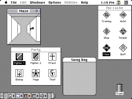
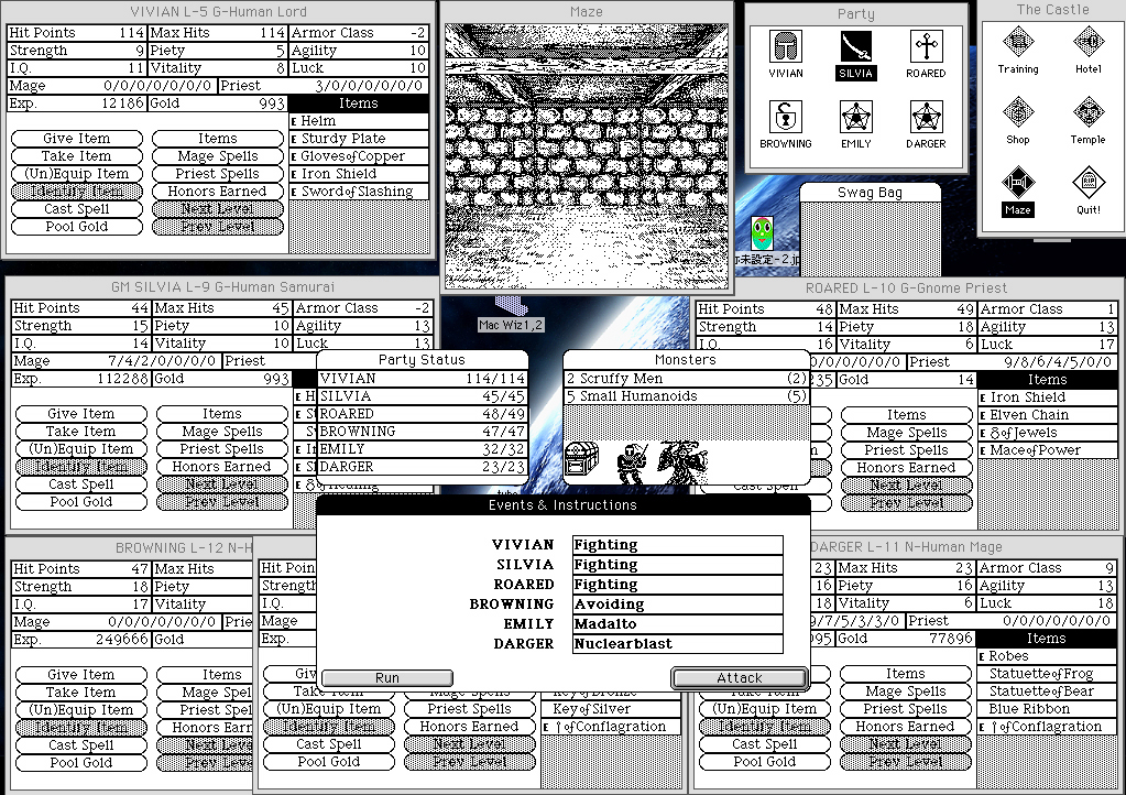
If you pull up the original Wizardry on archive.org, or if you go looking for screenshots, here's the kind of thing you can expect to see:

Wizardry for Mac with lineart dungeon graphics
Via Hardcore Gaming 101, which has a great comparison of the various editions of the game.

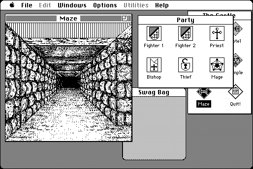
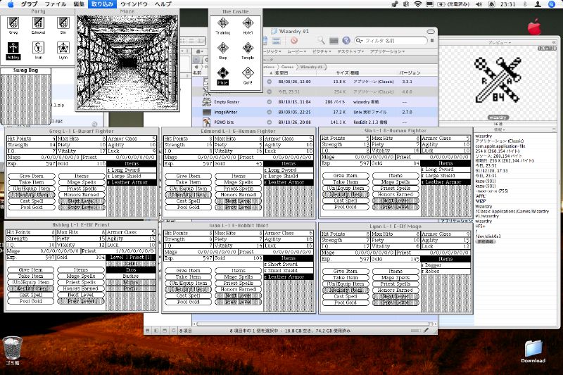
You can get more detailed maze graphics by maximizing the window, but at 512x342 that comes at the cost of having to move other windows on top of each other to fit:

Wizardry for Mac with detailed dungeon graphics
I took this screenshot myself.

Of course, if you want to get fancy, you can try emulating a later version of MacOS with a higher resolution, and then you'll have plenty of room. Like these madmen here:

At any rate, I've gone back and tried some of the other versions of Wizardry, but I still think the Mac version is the best, with its GUI and its more detailed graphics. It's not perfect -- look how small the maze window is, even at its larger size; and why does the Castle window need to be visible when you're in the maze? -- but the game is well-suited for a point-and-click, drag-and-drop interface.

The first five Wizardry games aren't currently sold for modern systems, but GOG and Steam both sell Wizardry 6 bundled with DOSbox. So why not sell the Mac versions of the earlier games and bundle them with Mini vMac? I guess I'm not sure what the legality is of distributing old versions of the MacOS; they might need a license from Apple in addition to getting one from whatever company owns Wizardry these days.

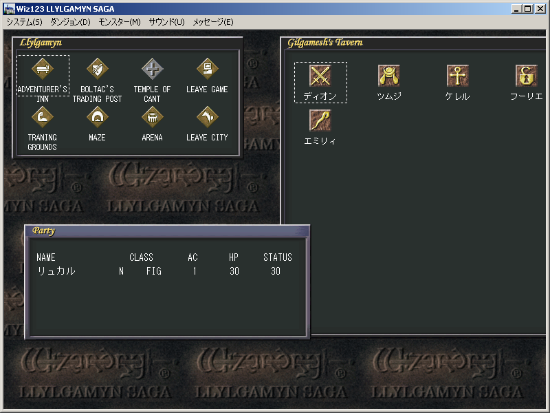
I've also often wondered why nobody's ever remade the original Wizardry for modern computers, taking the Mac version as a base and adding quality-of-life improvements. The closest thing I've ever seen is a Japanese remake of the first three games called Wizardry: Llylgamyn Saga that was released for Windows (as well as PlayStation and Saturn) in 1998.

Wizardry: Llylgamyn Saga for Windows
Via Hardcore Gaming 101

Llylgamyn Saga is not quite what I'm talking about; I tried it a few years back and my impression was that it was a Windows port of a console game and its interface felt like it. It simply didn't handle as smoothly with a mouse as the Mac version.

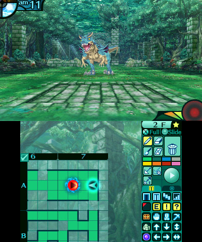
What I'd like to see? Remake the original game. Use touchscreen devices as the primary platform. Copy Etrian Odyssey's mechanic of using the touchscreen to map the dungeon as you go, the way we had to use graph paper in the old days.

Etrian Odyssey Untold 2
Via Jeremy Parish -- him again! -- at USgamer

Using half a phone screen wouldn't be so different from EO using the DS/3DS touchscreen. The biggest immediate hurdle I can think of is fat fingers: Etrian Odyssey is designed for a stylus; drawing with a finger would mean the grid squares would have to be larger. Pinch-to-zoom would be a good idea, or just a toggle to zoom the map in or out. Build to accommodate different resolutions; there's no reason a tablet user should be stuck with a map that's sized for a phone. Of course you could hide the map during combat, menu navigation, in town -- anywhere where it's not necessary. Use a point-and-click, drag-and-drop interface similar to the Mac version; when you go into town, you can drag-and-drop characters between the active party and the reserves.

Add some modern quality-of-life improvements, too. Obviously the weapons shop should behave like it would in a modern RPG: compare a highlighted weapon to the weapon a character currently has equipped. (If it'll fit onscreen, show how it compares to the weapons every character has equipped.)

And allow users to toggle the oldschool rules. Let them play with original inscrutable spell names, or with simple, plain-English ones. Allow them to disable characters aging on a class change, or the possibility of a teleport spell going wrong and permakilling the entire party. Hell, allow a mode where players can navigate through the maps they've made and point to the square they want to teleport to, or even set waypoints so they don't have to do that every time. Maybe even allow them the option of seeing monsters, treasure chests, and other points of interest before walking into them.

Once you've rebuilt the first game in this new engine, it wouldn't be hard to do the second and third. 4-7 would require more work but would be possible. Probably not 8, as it abandons the grid format in favor of free movement.

Hell, open it up. Since I'm dreaming anyway, I might as well say open-source the whole thing -- but failing that, at least release a level editor.

Maybe the best way to go about this would be for a fan group to start by creating a game that's Wizardry-like but noninfringing -- similar D&D-style rules, similar generic fantasy races, classes, and monsters, but different maps, spells, enemy behaviors, etc. -- and then, once they've released a finished game, make an offer to whoever it is who owns the Wizardry copyrights these days to port the original games to the new engine.

A man can dream.

The Old Crew

As part of my policy of updating the photo at the top of the homepage at least once a decade, I've updated the photo at the top of the homepage. It's cropped from this one:

Thad, Jim, David

That's me on the left. I grew a beard again. So for those of you who read this site for the Shaving tag and have spent the past nine months awaiting my next shaving post with bated breath, I'm afraid I'm going to have to disappoint you.

I don't usually dress that fancily. I am dressed fancily because I am at a wedding in that photograph. Specifically, Jim's wedding. Jim is the guy in the middle, and David (right) and I went to his wedding a few weeks back.

The three of us went to NAU together. I see David a few times a year, but hadn't seen Jim in years; it was nice to have a chance to catch up. Nice wedding, nice vacation, and his new wife Liz is a lovely person as well.

If you want some idea of the kind of wild party animals the three of us were in college, I leave you with this: when David and I introduced ourselves to Jim's mom, her response was, "Oh. Mystery Science Theater 3000."

I Remember I Remember Larry

Boy, it's been awhile, hasn't it?

I got sick, and busy. This post is about the Weird Al song I Remember Larry, and I originally intended to post it to coincide with Nathan Rabin's entry on I Remember Larry in his The Weird Accordion to Al series. That went up on December 20. So...yeah, I've been sitting on this one awhile.


In 1996, I moved back to my hometown and started high school. I met some new friends and started hanging out with them at lunchtime.

One day, one of them handed me his Walkman and his headphones and told me I had to listen to this song.

The tape was Bad Hair Day. I was something of a casual Weird Al fan by that point; I'd heard Amish Paradise and Gump. I may even have bought the Gump single by that point; I'm not sure. But I don't think I'd heard any of the other songs on the album, and I'd certainly never heard the one my friend played for me that day.

It was I Remember Larry and my friend was right: it was funny. It's one of Al's cheerful, upbeat songs that ends in murder (I don't think I'd heard Good Old Days yet at that point, but it's certainly reminiscent of that earlier song, albeit bouncier and featuring a much more relatable protagonist).

Some sixteen and a half years later, the kid who played I Remember Larry for me on his Walkman performed my wedding.

Brad performs a wedding

Now, I'm not saying there's a clear path from point A to point B here. I'm not saying that Brad and I became and remained close friends because of I Remember Larry. But I suspect our mutual appreciation for pitch-black humor wrapped in an ironically cheerful veneer is a big part of why we clicked.

He had me keep listening through Phony Calls and The Night Santa Went Crazy, too.

The Last Day at Papago

Papago Brewing used to be my regular watering hole. It closed on Saturday.

Papago Plaza -- the entire complex where the tap room was located -- is being demolished to put up condos. They've expressed hope for finding a new home, but no news yet.

My good friend Brad -- himself a brewery owner these days -- came in from Riverside to pay his respects, and so we got a Lyft van-full of the old gang together and headed up there for the last day.

There are pictures. I don't have them yet. Hopefully I'll get them later and be able to post them.

It was bittersweet. The fridge was mostly empty; most of the items on the menu, food or drink, were sold out. The life-size monk statue had already gone, as had one of the two dartboards.

The writing was literally on the wall; people had been saying their goodbyes in silver Sharpie for months (if one message, dated March, is anything to go on).

We had a few rounds, and then we walked a block south to McFate -- that's my regular watering hole these days. My friends hadn't been there yet, but they were interested in checking it out. There was a nice bit of symmetry: saying goodbye to the old spot, and hello to the new one.

The details of the day are a little hazy. I remember we told old stories, and I laughed some belly laughs.

I'm pretty sure I only drank five beers, and I paced myself, with a glass of water after each. But I do have a tendency to make a beeline for the highest-alcohol beer on the menu when I don't have to drive. (I can recommend the beers I drank at McFate, but can't remember their names. There was an IPA called Hazy something, and a Scotch-aged something or other.)

I'll miss Papago. I hope it reopens someplace. At any rate, it was good to get the band back together for a day, and talk about the good old days.

HyperCard

I was looking for something to post about, and then Jeremy Parish posted a mail call for HyperCard comments over on Retronauts.

And I've got a few things to say about HyperCard, because there's a straight line between HyperCard and what I do for a living (and for a hobby) today.

HyperCard was my first development environment. I was 7 or 8 years old and I wanted to make games. Today we've got Kodu and Super Mario Maker. In 1990, we had HyperCard.

HyperCard's interface bore a certain resemblance to PowerPoint, with drawing tools that looked a lot like MacPaint. You could show slides -- or "cards" -- in order, as in PowerPoint, but you could also use buttons to link to cards out of order. So it was a useful language for making Choose Your Own Adventure-style games. "If you want to examine the sound coming from the next room, turn to page 38. If you want to see what's going on outside, turn to page 44." That kind of thing, but with buttons to click.

My game, SEKR's Awesome Adventures, was mostly that sort of thing. (It's pronounced "Seeker", and it was my grandpa's dog's name.) There were a few roundabout ways to get to where you were going, some of which would result in your untimely death. The most complex sequence involved selecting two tools from a list that you'd be allowed to use later on -- and keeping track of your selection required just a bit of actual programming.

I mostly built SEKR through the simple point-and-click frontend, but HyperCard also came with its own programming language, HyperTalk. I used HyperTalk to track what weapons/tools the user selected, and the endgame would adjust accordingly: you're in a pit; did you bring the grappling hook? It's pitch-black; did you bring the night-vision goggles? Store a variable and test a conditional; this is absolutely as simple as programming gets. It was a pretty good place to start.

And that's more or less how the Web works: fundamentally, it's a set of pages, and users navigate between them using hyperlinks. For more complicated stuff than just moving between pages, your browser has built-in support for a scripting language.

The similarities aren't coincidental. The HyperCard Wikipedia entry says:

Through its influence on Robert Cailliau (who assisted in developing Tim Berners-Lee's first Web browser), HyperCard influenced the development of the Web in late 1990. Javascript was inspired by Hypertalk.

HyperCard is where I started programming. And while I never did make a career of game development, I'm still programming, and there's a more-than-passing resemblance between developing for HyperCard and developing for the Web.

My grandmother's been cleaning old stuff out of her house, and a few weeks ago she gave me a bunch of old 3.5" floppies. SEKR's Awesome Adventures is probably in there somewhere -- the original graphical HyperCard version, the text-only remake I put together in QBasic a few years later, and maybe even the unfinished Turbo Pascal port with PC speaker music (which played fine on the 286 I wrote it on but way too fast on a 486; you had to turn off Turbo to slow it down. Remember Turbo buttons?).

I really should buy a USB floppy drive and see if I can get any data off those disks.

Cassini and Me

In 2004, in the summer before my last year at NAU, I worked at USGS, on the Astrogeology Team. What I did there was nothing special, but it was a pretty special place to be, especially at that time.

I worked on a package called ISIS, Integrated Software for Imagers and Spectrometers. It was software for processing high-resolution photos we received from sources including the Lunar Orbiter, the Mars Rover...and Cassini.

Cassini entered Saturn orbit shortly after I started working there. It was an exciting time. I got to spend a lot of time looking at images that looked a lot like these:

Enceladus features
Enceladus features.
I grabbed this image from FiveThirtyEight. Original source is, obviously, NASA.

My work on ISIS wasn't anything high-level or complicated. I edited makefiles, so that the ISIS source code (a mix of C and FORTRAN) would compile for different platforms. If memory serves, we supported Windows, OSX, Solaris, and x86 GNU/Linux.

My work wasn't glamorous, and I'm sure it's all long-gone for the codebase. But I was thrilled just to be on the team, to be part of something like that -- getting photos back from Saturn.

It's been more than thirteen years, and I've had nearly that many jobs, since my time at USGS. But I still feel that connection to the work and to the project. In all that time, every time I've see a headline about Cassini or Saturn, I've checked out the article. My favorite part is always the pictures.

Today, Cassini concludes its journey, burning up on entry into Saturn's atmosphere, transmitting data back for as long as it can.

It's been a good run. And I'll never forget the small part I played in it.

Actually, It's About How Games Journalism is a Pain in the Ass

Or, Why I Won't Be Doing That Again Any Time Soon: A Postmortem

So the last three posts comparing and contrasting five different Mega Man games required rather a lot of screenshots. It took a long time to get them all, for a number of reasons I'll get into in a moment. It wound up taking a lot longer to get those posts done and posted than planned, and it really wasn't a whole lot of fun.

The other day on Brontoforumus, I described it as taking two things I enjoy doing -- playing video games and talking about video games -- and turning them into work. More specifically, work I don't get paid for.

I like how the whole thing turned out, but it took hours and hours to put together, and playing a game to farm for screenshots is a pretty different and altogether less fun experience than playing it just to play it.

Some of it may be down to the tools I'm using, or just my lack of proficiency with them.

I opted to grab all the screenshots myself, rather than try and find a resource that already had them (or close enough). I think this was probably the right call; VG Museum has a perfectly good shot of the floating platforms in Ice Man's stage that I could have used, but it doesn't really have any other grabs of the Mega Man screens I needed, and it's got next to nothing from Mega Man X and nothing at all from the other three games I was capping.

So I could have poked around the Internet trying to find the screens I was looking for, either as static images on websites or as caps from Let's Play videos on YouTube. But I think that would have taken just as long as getting the damn things myself.

The next decision I made that made my life more difficult was to try and grab all the images at each device's native resolution, with graphical filters turned off.

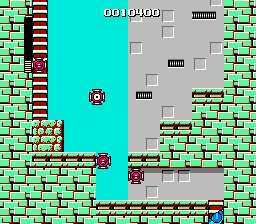
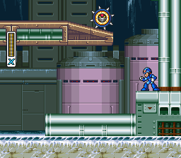
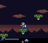
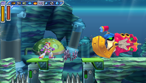
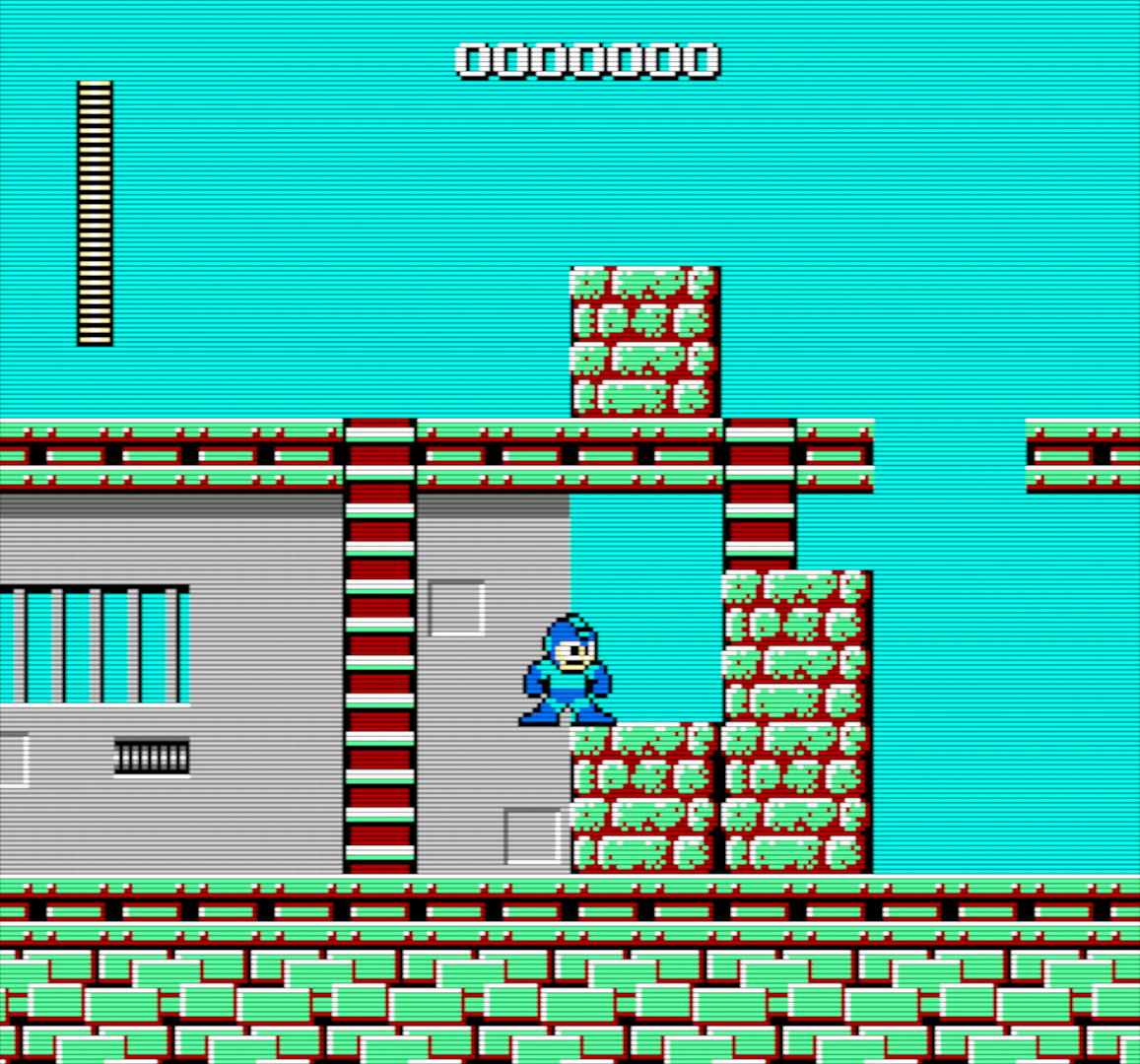
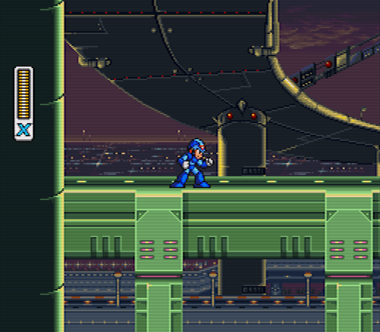
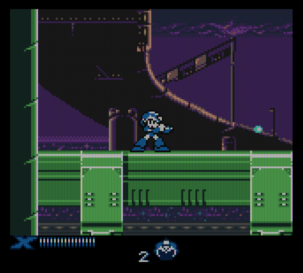
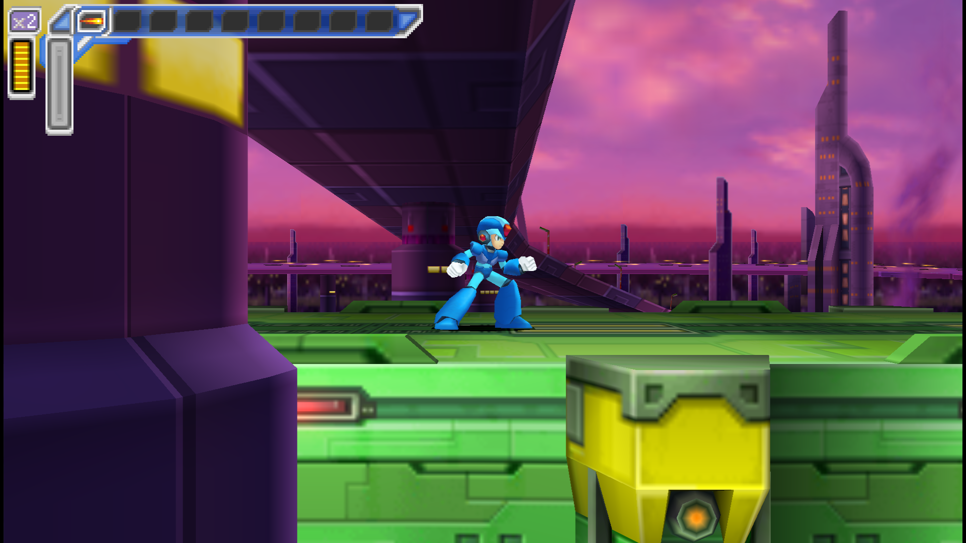
Here are some of the screenshots I used in the last three posts:

  • Cut Man Stage -- Mega Man
  • Chill Penguin Stage -- Mega Man X
  • Sigma's Fortress -- Mega Man Xtreme
  • Launch Octopus Stage -- Mega Man: Maverick Hunter X

And here are what those games look like when I play the game scaled up for a 1080p screen and with a graphics filter turned on:

  • Cut Man Stage -- Mega Man
  • Highway Stage -- Mega Man X
  • Highway Stage -- Mega Man Xtreme
  • Highway Stage -- Mega Man: Maverick Hunter X

Now, first of all, those images are pretty big. In fact, unless you've zoomed this page in, you're not even looking at them at full size right now, because they've been scaled to fit the content area of this post. That's 892px wide (unless you're viewing it on a mobile device, in which case it's less), whereas the images are between 1157 and 1920px wide.

And they're PNG's, which means they're also pretty big in terms of filesize (except the Mega Man Xtreme one). Unnecessarily big; you just loaded a 1920px-wide image just to display a scaled-down 892px version. Or less. If you're reading this on a 3G connection, then I probably owe you an apology.

Now, there are things I could do differently. I could set my emulators to output as JPEG instead of PNG, but that would result in a visible decrease in quality. I could resize the images manually, but that would be more work for me. I could set up a script to scale them automatically, but we'd still end up with a bunch of images all scaled to the same width. Which isn't really ideal; it doesn't make a lot of sense for the Game Boy screenshots to be the same size as the PSP ones, and 892px is just too damn big to get multiple images onscreen and get a good comparison anyway.

So, instead of that, what I did was turn off the filters and, when I was ready to take a screenshot, toggle fullscreen off to take it.

This is a pain in the ass, not just because it interrupts the flow of the game but because it's fucking difficult to set up a good screenshot in a tiny 160x144 window on a 1080p TV when you're sitting on the couch across the room.

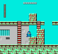
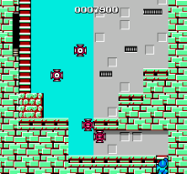
And that's before you get into weird shit like this:

  • Cut Man Stage -- Mega Man
  • Cut Man Stage -- Mega Man

I don't know why the fuck RetroArch did this. I told it to size the window to native NES resolution, and it gave me these monstrosities instead. That is not native NES resolution. And it's not a problem with the core I was using, because I tried it with two different cores. (I thought it might be some weird leftover setting from when I'd done the Game Boy screen grabs, but that doesn't make sense; the Game Boy screen grabs were 160x144, while these are 205x191.)

And I took a bunch of screenshots before realizing what it had done. I had to go back and replay fucking Ice Man's stage and do it all over again.

So I think the best solution would be to use emulators that output screenshots at native resolution and without filters, regardless of what scaling and filters are applied as I'm playing them. I know I've used emulators like that before, but I can't remember which ones they were offhand.

And there's another requirement: I want to be able to take a screenshot without having to use the damn keyboard. I want to be able to use one of the buttons on my controller to take the screenshot. Because having to stage a shot and then quickly take my hands off the controller to hit F12 on a keyboard doesn't just interrupt the flow of the game, it's a good way to get yourself killed if you're trying to grab a screenshot of a particularly difficult section of game.

Snes9x let me map the screenshot button to my controller, and I think FCEUX did too, but I couldn't find any feature like that in PPSSPP or RetroArch.

So I guess what I'm looking for is an emulator that lets you output screenshots with no scaling or filters applied, and lets you map that function to a button on your controller.

That would make the whole exercise a lot quicker and easier, but it wouldn't fix a number of other problems -- I'd still have to wade through a bunch of files with names like ULUS10068_00017.png and RetroArch-1011-165734.png and find the ones I wanted, and then realize "Fuck, I forgot to take a screenshot of Spark Mandrill's stage" and have to go back and replay that section, and seriously, you have no idea how many times I did that.

And that's without even getting into the editing portion.

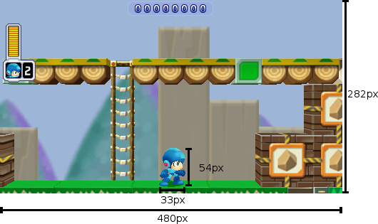
Remember this guy from the first post, with the measurements?

Mega Man is 33x54px

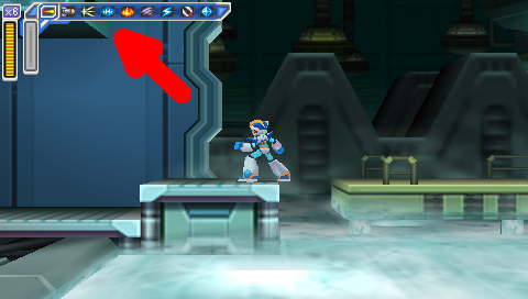
I added those rulers and numbers myself, manually, in Gimp (and it probably shows). And it wound up being way more fiddly and time-consuming than it should have. I guess I probably should have gone looking for plugins to see if somebody had already coded up a tool to draw a shape like that automatically so I wouldn't have to do it myself; that is what I ended up doing for this graphic, with the arrow in it:

Flame Mammoth Stage -- Mega Man: Maverick Hunter X, with Giant Red Arrow

So, I dunno. Like I said, I'm pretty pleased with how the feature turned out (and it's gotten a positive response from the Brontos, which is nice), but it just took so long to put together, and it was not very fun. I might try it again sometime -- especially if somebody can steer me in the right direction and help make it easier next time -- but for now I'll probably go on back to my usual Wall of Text posts.

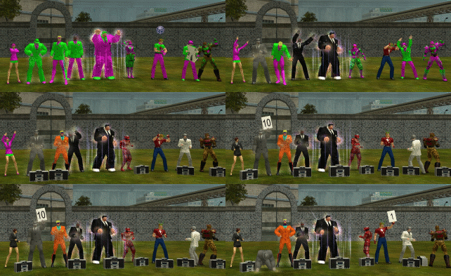
Course, in the old days I used to enjoy doing shit like this:

City of Heroes time-lapse

But there's a pretty important difference: we were already just fuckin' around and essentially posing for photos anyway; it's not like I was taking screenshots in the middle of a difficult mission. (And even if I were, it was pretty easy just to reach over and hit PrtScn without breaking stride in the game.) I wasn't trying to get a grab of any specific gameplay element -- let alone compare and contrast across five different games.

Maybe if I do this again I'll just pick an easier topic.

In the meantime, I think I'll go back to just playing games. Maybe I'll replay some more Mega Man X games. I never did get around to finishing X8. Fucking vehicle levels.


Mega Man ® 1989 and © 1987 Capcom Co, Ltd
Mega Man X ™ and © 1993 Capcom Co, Ltd
Mega Man Xtreme © 2001 Capcom Co, Ltd
Mega Man Powered Up and Mega Man: Maverick Hunter X © 2006 Capcom Co, Ltd
City of Heroes © 2004 NCsoft

I took all the screenshots myself.
I used the following emulators:
NES: FCEUX and Libretro with the FCEUmm and Nestopia cores
SNES: Snes9x and Libretro with the Snes9x Next core
Game Boy Color: Libretro with the Gambatte core
PSP: PPSSPP

Dueling Mega Men, Part 3: Rebalancing Act

As I've indicated in the last two posts, Mega Man: Powered Up has a lot more changes from the original game than Mega Man: Maverick Hunter X. And the changes to Powered Up are usually for the better, while the ones to MHX are usually for the worse.

There's a pretty simple reason for that: Mega Man has a lot more to improve than Mega Man X.

Back in the first post, I described Maverick Hunter X as "a pretty solid remake of an excellent game." Powered Up is the reverse: an excellent remake of a pretty solid game.

The original Mega Man is a classic, but it's got rough edges; it's an amazing first effort but it's got its share of flaws. There's a reason Mega Man 2 is universally considered to be a much better game.

The original Mega Man X, on the other hand, is pretty much perfect. It's exquisitely designed and balanced.

So, rebalancing Mega Man resulted in a better-balanced game, while rebalancing Mega Man X resulted in a worse-balanced one.

Let's start with Mega Man.

Powered Up changes the original game so fundamentally that it actually changes the boss weaknesses.

In the original Mega Man, the order is:
Bomb Man Guts Man Cut Man Elec Man Ice Man Fire Man

In Powered Up, it's:
Cut Man Bomb Man Ice Man Fire Man Oil Man Elec Man Time Man Guts Man.

The change in order does more than just accommodate the two new bosses; it makes for a more natural stage order.

The original game has two logical starting points: Bomb Man's level and Cut Man's. The trouble is, if you follow the order of weapon weaknesses, starting with Bomb Man means you go to Guts Man's famously difficult level second. Starting with Cut Man means you take Elec Man's stage before Guts Man and have to go back later to get the Magnet Beam (though, granted, this wouldn't be an issue in Powered Up, which removes the Magnet Beam entirely).

The weakness order in Powered Up puts the two easiest stages right at the start, first Cut Man and then Bomb Man, and puts trickier levels like Elec Man, Guts Man, and the new Time Man near the end.

Mega Man: Maverick Hunter X doesn't change the Mavericks' weaknesses, but it does play musical chairs with the capsules. And that's enough to wreak havoc on the original game's finely-crafted balance.

The most important of the four capsules, the one you need in order to get the other three, is the Leg Upgrade. Here's where it is in the original game:

Chill Penguin Stage -- Mega Man X

It's about halfway through Chill Penguin's stage (the easiest in the game), smack dab in the middle of the path. You literally can't miss it.

Whereas in Maverick Hunter X, not only is it possible to miss it, it's likely. Here's where it is in that version:

Flame Mammoth Stage -- Mega Man: Maverick Hunter X

Don't see it? Let's try that again.

Flame Mammoth Stage -- Mega Man: Maverick Hunter X, with Giant Red Arrow

That's right: the ledge you grab onto to reach the Leg Parts is covered up by the fucking HUD. It's so hard to see that you can walk right past it even if you know it's there.

Contrast with the same location in the original Mega Man X (which, in that game, had the Arm Parts capsule):

  • Flame Mammoth Stage -- Mega Man X
  • Flame Mammoth Stage -- Mega Man: Maverick Hunter X

The original game gives a very clear visual cue that there is something up there. Maverick Hunter X, on the other hand, once again fails to handle the conversion from 4:3 to 16:9, and makes the hanging section almost impossible to see. And if you don't find that tiny ledge, you can't get any of the other upgrade parts -- your mobility, offense, and defense are all severely limited, and the game is much harder. Not fun hard, unfair hard.

And if you do know the Leg Parts are on Flame Mammoth's stage, there's another problem: nobody in their right mind would pick Flame Mammoth's stage first.

It disrupts the entire stage order. Do you start with Chill Penguin and then end with Flame Mammoth? That makes the game a whole lot more difficult, going through seven stages with no capsule upgrades.

No, the best option here is to base the stage order around the capsules, not the bosses' weaknesses. Take out Chill Penguin first, then Flame Mammoth, with maybe a stop-over at Storm Eagle along the way (he's a relatively easy boss and Flame Mammoth is weak against his weapon, and it also makes Spark Mandrill's stage easier; on the other hand, it's got all the shitty vertical parts I mentioned in my previous post, and they're harder without the Leg Parts).

The other three capsules are rearranged too. Chill Penguin has the Head Parts instead of the Leg Parts, Sting Chameleon has the Arm Parts instead of the Body Parts, and Storm Eagle has the Body Parts instead of the Head Parts.

The Head Parts are damn near useless in the original game, and they're not any more useful in the remake. In the original game, they protect you from falling rocks in one section of Sting Chameleon's stage, and are also necessary to reach the Arm Parts capsule in Flame Mammoth's stage. Maverick Hunter X is much the same, except that in this case you need them to reach the Body Parts capsule in Storm Eagle's stage. Chill Penguin's stage -- which, again, is the easiest level and, in the original game, the best one to start with -- has gone from having the most useful of the four upgrades to the least useful. Storm Eagle's stage, on the other hand, ends up with a much more useful upgrade than it had in the original, and one more reason to hit that level earlier in this version of the game than in the SNES version.

The change to Sting Chaemeleon's stage probably makes the most sense of the four, though it removes the nice sense of symmetry the original game gives you of defeating a suit of robot armor to gain an armor upgrade.

If you follow the stage order implied by the capsule locations (ie fight Storm Eagle and Flame Mammoth early), then that means Sting Chameleon will be the last of the eight stages. Getting the Arm Parts right before the Sigma stages, or right at the beginning of the Sigma stages, matches the original game, where if you started with Chill Penguin you'd end with Flame Mammoth, and get a chance to get the Buster Upgrade -- and if you missed it, you'd get it on the very next level.

Which brings us to another change.

In Mega Man X, midway through the first Sigma stage, Zero confronts Vile, and sacrifices himself. If you didn't get the Buster Upgrade from the capsule, Zero will give it to you.

Maverick Hunter X changes this in two ways. First, it moves the battle to the third Sigma stage instead of the first. Second, instead of Zero giving you a Buster Upgrade that's identical to the one you would have gotten from the capsule, he gives you a different Buster Upgrade.

It's an interesting idea, but I don't think it's a very good one, for two reasons.

The first is that it messes up the narrative structure. There's a reason Zero dies, and passes the torch to X, in the first Sigma stage in the original game: it changes the atmosphere of the rest of the game. It establishes a sense of loneliness and isolation that lingers through the end. Nobody else is going to help you; you're humanity's last hope. And you've done what Zero said you'd do all the way back at the end of the first stage: you've become stronger. The student has become the master.

In Maverick Hunter X, on the other hand, you spend most of the Sigma stages playing catchup. Zero's gone on ahead. Even at full power, X is playing second fiddle, right up until the end.

Which brings us to the gameplay reason why it doesn't make sense to kill off Zero right before the end: it's right before the end. I understand the reasoning behind rewarding the player for getting almost to the end of the game without the Buster Upgrade with a cool, unique weapon -- but what the fuck good is it? You've got exactly half a level left in the game at that point, and then four bosses. (And I guess the caterpillar things in the last level, but they're pretty much just there to fill up your Sub Tanks.) The game rewards you by giving you a weapon you'll hardly get to use.

Aside from that, there are other weird little changes. The X-Buster takes longer to charge to its maximum level, and bosses are invulnerable for a longer period of time after you hit them.

And then there's stuff like this:

  • Spark Mandrill Stage -- Mega Man X
  • Spark Mandrill Stage -- Mega Man: Maverick Hunter X

In the original game, when Spark Mandrill's stage goes "dark", it's just a transparency effect; you can still see where you need to go.

In Maverick Hunter X, the lights cycle off and on; the platforms go from being completely illuminated to being completely invisible. This, combined with the reduction in height, makes the section a lot harder, the timing a lot trickier, and makes it damned difficult to get through this section without getting clipped by the fireflies that whiz through it.

In fact, this section seems to be taking a cue from the Mega Man Xtreme version of the stage.

Spark Mandrill Stage -- Mega Man Xtreme

(It may look like the platforms are visible in that screenshot, but I assure you that if you play the game on authentic Game Boy Color hardware, you can't see shit.)

Basically, the game's full of changes, great and small. And most of them are for the worse.

All of this stuff, all of these changes, the reordering of the Capsules and the Sigma stages and Zero's death scene -- I think they actually could have made for an interesting game, if they were only on Hard Mode. The way I see it, Normal Mode should have kept everything where it was in the original game (with some changes, of course, to accommodate the screen height), while Hard Mode could have jumbled things around and created a legitimate challenge for experienced players. Think of it like the original Legend of Zelda: the Second Quest is neat, but it would have made a pretty crummy first quest.

Instead, Hard Mode gives the bosses some additional attacks (that's good!) and ups the amount of damage all the enemies do (that's cheap and lazy).

And then there's Vile Mode, which makes for a pretty great addition but can be overwhelming in the sheer number of options provided. Vile gets a total of 45 weapons, and while it's great to have that kind of versatility, it also means it takes a lot of time testing out all those choices and deciding which ones fit your play style -- and it also makes it a lot harder to figure out which weapons are effective against which bosses. If you're X, you can swap weapons on the fly and keep trying until you find one that works; if you're Vile, you can only equip three weapons at a time, and if none of them do the job, you have to start the level over if you want to try other options.

Plus, when you're Vile they move the Heart Tanks and Sub Tanks around, and while the save screen has a counter for how many you've got, it doesn't tell you which ones you've gotten. Okay, I've got seven out of the eight Heart Tanks; guess I get to figure out which one I'm missing.

(Also, I sincerely hope the decision to make every fucking stage use the same music when you play as Vile was an accident. Giving him is own theme music on the first stage is fine; reusing it on the next eight is not.)

To summarize three long posts, it's really easy to recommend Mega Man: Powered Up. It's thoughtfully and exquisitely redesigned, and good enough to be considered the definitive version of the game, even before you get into all the extras like the many playable characters and the level design toolkit.

Maverick Hunter X isn't bad but it's a much harder sell. Play the SNES game first; it's better; it's that simple.

But if you've played the SNES game already, forward and backward and side-to-side, and you're interested in trying out a new take? Then I'd recommend you take a crack at Maverick Hunter X. But remember going in that things are going to be different, and sometimes maddeningly so.


Mega Man ® 1989 Capcom Co, Ltd
Mega Man X ™ and © 1993 Capcom Co, Ltd
Mega Man Xtreme © 2001 Capcom Co, Ltd
Mega Man: Maverick Hunter X © 2006 Capcom Co, Ltd

I took all the screenshots myself, and tried to get them all at native resolution with no filters.
I used the following emulators:
SNES: Snes9x
Game Boy Color: Libretro with the Gambatte core
PSP: PPSSPP

Dueling Mega Men, Part 2: Verticality

The original Mega Man has some tricky platforming sequences. Mega Man Powered Up actually does a pretty solid job of redesigning them to make them more fair. Here's one of the most infamous examples, the gauntlet at the beginning of Guts Man's stage:

  • Guts Man Stage -- Mega Man
  • Guts Man Stage -- Mega Man Powered Up

Mega Man drops you right into what may be the toughest sequence in the game, and it's right at the beginning of the level. Powered Up, by contrast, starts you off with some training wheels.

Lest you think it's going easy on you, though, what it actually does is move that bastard platform to the end of the level:

Guts Man Stage -- Mega Man Powered Up

On the one hand, that's a much better balance, putting the easy stuff at the beginning of the level and the tough stuff at the end. On the other, it's even more infuriating to repeatedly die right before the end of a level than right at the beginning. And it's actually even harder in Powered Up: note the spacing of the "safe" spots in the lower belt; there's much less time to land and jump than the original game.

There's another sequence, in Ice Man's stage, which is, for my money, the worst part of the original Mega Man.

  • Ice Man Stage -- Mega Man
  • Ice Man Stage -- Mega Man Powered Up

In the original game, you have to jump from moving platform to moving platform over a vast empty pit. The platforms' movements are not predictable, they shoot at you while you're trying to time your jumps (and, not shown, penguin guys fly at you too), and sometimes just for the sheer fuck of it instead of landing on a platform you will fall right through it and die.

Powered Up reduces the number of platforms to two, makes them move in consistent zigzag patterns, and eliminates the additional obstacles that you have to avoid (not to mention fixes the collision detection). And greatly reduces the amount of space you have to pass over.

It's a pretty perfect example of Powered Up finding something that was wrong with the original game and fixing it.

Maverick Hunter X does not do that.

Here's an example from Storm Eagle's stage:

  • Storm Eagle Stage -- Mega Man X
  • Storm Eagle Stage -- Mega Man: Maverick Hunter X

It's hard to tell from a static screenshot, but those three platforms all move up and down. And while it's easy to keep an eye on the next platform in the original Mega Man X, in Maverick Hunter X they move right off the screen.

It gets worse in Sigma's fortress.

  • Sigma's Fortress -- Mega Man X
  • Sigma's Fortress -- Mega Man: Maverick Hunter X

Once again, Mega Man Xtreme actually does a better job than Maverick Hunter X; it reduces the number of platforms and their amount of vertical movement. It even turns the Sigma's Fortress sequence from a vertical section to a horizontal one.

  • Storm Eagle Stage -- Mega Man Xtreme
  • Sigma's Fortress -- Mega Man Xtreme

(Of course, don't let any of this faint praise give you the mistaken impression that Mega Man Xtreme is a good game. Its version of the Sigma Fortress platform sequence ends with a blind leap off into nowhere.)

The pattern here is that, while the Mega Man: Powered Up devs were more than happy to retool tricky platform sequences, the Maverick Hunter X team seems oddly reluctant to change them, even just to accommodate the different aspect ratio. ("Oddly" because they made plenty of other, and much worse, changes; we'll get to some of them in a little bit.)

The other big problem is the underwater sequences, because of the increased height of your jump. In Maverick Hunter X, you jump so high that you can no longer see where you're going to land. Here's a miniboss from Launch Octopus's stage:

  • Launch Octopus Stage -- Mega Man X
  • Launch Octopus Stage -- Mega Man: Maverick Hunter X
  • Launch Octopus Stage -- Mega Man X
  • Launch Octopus Stage -- Mega Man: Maverick Hunter X

The enemy uses a weapon that pulls you towards the spikes; if you jump to get out of its range in the original Mega Man X, you'll still be able to see the platforms where it's safe to land, but in Maverick Hunter X, you'll scroll them right off the bottom of the screen.

And here's another miniboss from Launch Octopus's stage, a serpent which you can ride:

  • Launch Octopus Stage -- Mega Man X
  • Launch Octopus Stage -- Mega Man: Maverick Hunter X
  • Launch Octopus Stage -- Mega Man X
  • Launch Octopus Stage -- Mega Man: Maverick Hunter X

While you can ride the serpent past the point where the spikes and platforms scroll off the bottom of the screen in the original Mega Man X, you go higher before that happens -- and it's still not too hard to land safely.

  • Launch Octopus Stage -- Mega Man X
  • Launch Octopus Stage -- Mega Man X

Riding the serpent and shooting it in the back of the head until it drops you is a viable strategy in the original game, but it's likely to get you killed in the remake.

Of course, for all the examples so far, there's at least an explanation for why these sequences are like that in Maverick Hunter X: because they were like that in the original. What's entirely baffling is when they add new vertical hazards, on purpose, and they have the same problems or worse.

Maverick Hunter X significantly redesigns the Sigma's Fortress stages (which, again, makes it even stranger that it leaves the sequence with the floating platforms as-is, albeit in a later level than in the original game). Early on in the first fortress level, there's another fight with one of the giant fish minibosses from Launch Octopus's stage, which wasn't in the original game.

  • Sigma's Fortress -- Mega Man: Maverick Hunter X
  • Sigma's Fortress -- Mega Man: Maverick Hunter X

Let's compare that to the one on Launch Octopus's level again.

  • Launch Octopus Stage -- Mega Man: Maverick Hunter X
  • Sigma's Fortress -- Mega Man: Maverick Hunter X

The one on the Sigma stage is definitely worse: the spike traps are twice as wide, there's only one place where you can stand and it's half as wide as the Launch Octopus version, and the platform is at the same height as the spikes, so if you miss it you're dead, instead of having a chance to grab onto the side and jump back out.

The underwater section is followed by a reworked version of the vertical section from the original game, and I'll actually give some props here: this is one of the few instances where I like the Maverick Hunter X version better.

  • Sigma's Fortress -- Mega Man X
  • Sigma's Fortress -- Mega Man: Maverick Hunter X
  • Sigma's Fortress -- Mega Man X
  • Sigma's Fortress -- Mega Man: Maverick Hunter X

There are several reasons the Maverick Hunter X version is better: it's shorter, there are fewer enemies, and there are more places to stand. But most of all, this is an instance where the devs understand that they're working with a different aspect ratio, and make it work for them. They don't try to preserve the narrow shaft, or keep the Joes on tiny platforms backed right up against the wall where it's nearly impossible to get them to attack, then hit them while their shields are down, and then get onto the platform they were standing on. It's not perfect, but it's a thoughtfully-designed sequence that's a legitimate improvement on the original. And it's a frustrating example of how good this remake could have been if this same kind of care had been applied to other vertical sequences.

And then it passes, and you're in another vexing vertical sequence that wasn't in the original game. It isn't as likely to cause cheap instant deaths as the aquatic sequence at the beginning of the level, but it is incredibly awkward and annoying because of the screen's limited height and your inability to see where you're going:

Sigma's Fortress -- Mega Man: Maverick Hunter X

But the worst new sequence of all is the end of Armored Armadillo's stage when you play as Vile:

Armored Armadillo Stage -- Mega Man: Maverick Hunter X

It's similar to the sequence in Sigma's Fortress, with platforms at multiple heights and those same helicopter dudes coming at you. But there are more of them, they're harder to hit when you're playing as Vile (and you can't just use a powered-up Rolling Shield to protect yourself like when you play as X), and you have to jump to platforms below you, not just ones above you. And of course when you jump, you may very well scroll your destination platform right off the bottom of the screen and have to guess where it's going to be by the time you land. It's a friggin' nightmare, and a great justification for savestate-scumming.

All in all, Maverick Hunter X does a terrible job with pretty much any sequence that deals with vertical scrolling.

Powered Up doesn't have that problem -- but the comparison's not entirely fair, because Powered Up has an advantage: it's a remake of a game that has no vertical scrolling.

There are lots of vertical sequences in Mega Man, but the screen never scrolls. When you have to traverse a section that's taller than a single screen, that means climbing from the bottom of the screen to the top and then climbing a ladder up to the next screen, where you end up back at the bottom. The screen doesn't move up and down as Mega Man does, only left and right.

  • Elec Man Stage -- Mega Man
  • Elec Man Stage -- Mega Man Powered Up
  • Elec Man Stage -- Mega Man
  • Elec Man Stage -- Mega Man Powered Up

So it was easy for Powered Up to follow that pattern. As substantially as it changes some segments of the game (and adds two entirely new levels), it keeps that rule. No room is ever taller than one screen high; the screen doesn't scroll vertically -- and so the game never has to deal with the challenge of how to handle vertically-scrolling sequences.

Maverick Hunter X does. And it proves, time and again, that it's not up to the challenge. And then, bafflingly, it doubles down on this flaw and adds entirely new vertically-scrolling sequences. And they're even worse.

That's a major reason why, despite all its polish, despite all the effort that clearly went into it, and despite the many things it does right, Maverick Hunter X is an inferior game, both to the original Mega Man X and to Mega Man: Powered Up.

Another major reason is that it completely fucks up the balance of the original Mega Man X. And that's the topic of my next post.


Mega Man ® 1989 and © 1987 Capcom Co, Ltd
Mega Man X ™ and © 1993 Capcom Co, Ltd
Mega Man Xtreme © 2001 Capcom Co, Ltd
Mega Man Powered Up and Mega Man: Maverick Hunter X © 2006 Capcom Co, Ltd

I took all the screenshots myself, and tried to get them all at native resolution with no filters.
I used the following emulators:
NES: FCEUX
SNES: Snes9x
Game Boy Color: Libretro with the Gambatte core
PSP: PPSSPP

What Mega Man Powered Up Does Right and Mega Man: Maverick Hunter X Does Wrong, Part 1: Aspect Ratio

So the other day, I got to listening to OCRemix's Mega Man X: Maverick Hunter Rising album, and it got me jonesing to replay some Mega Man X.

I decided to take another crack at the 2006 PSP remake, Mega Man: Maverick Hunter X; it had disappointed me on my first playthrough, but I thought maybe I'd give it another chance.

And on a second playthrough, now that I'm familiar with its changes and idiosyncrasies, it went a lot smoother. Those changes and idiosyncrasies are glaring -- and they're what this series of posts is about -- but underneath them, it's a pretty solid remake of an excellent game.

But it's no substitute for the original.

And it's interesting to look at its immediate contemporary, Mega Man Powered Up, and see how much better Powered Up is than Maverick Hunter X.

There are a couple of reasons. One seems obvious -- in fact, it's the very first thing you notice:

  • Mega Man model
  • X model

Mega Man is short and squat, while X is tall and thin.

Now, these graphics tell you one thing right off the bat, and it's tone. Mega Man is fun and lighthearted; X takes himself seriously.

But the thing is, those designs affect every aspect of the game's design. And what you're looking at, in both cases, is a game that was originally designed for a 4:3 screen ratio, remade for a 16:9 one.

And which one of these guys do you suppose makes the transition better from 4:3 to 16:9 -- the one who's short and squat, or the one who's tall and thin?

At least, that's how it looks. But it's an illusion. Let's take a look at their actual dimensions, in-game:

  • Mega Man is 33x54px
  • X is 51x57px

Those are back-of-the-napkin measurements; I haven't taken the models through their full range of motion, and I'm not sure what the exact dimensions of their hitboxes are. But it's enough to see that Mega Man only looks shorter and squatter -- in terms of the dimensions rendered in-game, X isn't significantly taller than Mega Man, and he is significantly wider.

But it's not really just about the ratio of the character models -- it's about the design of the worlds they inhabit.

Both games face the same challenge: they have to substantially rework stage designs to fit a different screen ratio, while still making them feel like they play the same. Take a look at this screen from Cut Man's stage:

  • Cut Man Stage -- Mega Man
  • Cut Man Stage -- Mega Man Powered Up

It's pretty close.

In fact, it just hacks out the brick below the ladder, and the (inconsequential) top section of the ladder, above the range of the enemies.

It's got the same number of little eye-lantern guys, and nearly the same width to move around in. (The movable width of the screen in the original Mega Man is 12 "blocks", where in Powered Up it's a very close 11. And the height from the floor to the topmost enemy is 9 blocks in the original and 6 in Powered Up.)

There are places where Maverick Hunter X does a similarly good job, like here in Flame Mammoth's stage (after defeating Chill Penguin and freezing the lava):

  • Flame Mammoth Stage -- Mega Man X
  • Flame Mammoth Stage -- Mega Man: Maverick Hunter X

There's a lot less vertical space to move under that platform, but it's not important; it's still enough to fit, and still keep the entire room onscreen.

But other sections don't always fare as well. Look at the beginning of Spark Mandrill's stage:

  • Spark Mandrill Stage -- Mega Man X
  • Spark Mandrill Stage -- Mega Man Xtreme
  • Spark Mandrill Stage -- Mega Man: Maverick Hunter X

In the original SNES version of Spark Mandrill's stage, the sparks that run along the floor and ceiling are half X's height and half his width, and the gap between them gives you plenty of room to dodge them. In the Maverick Hunter X version, they're as big as X, and there's very little room in between them. Even the Game Boy Color Mega Man Xtreme, with its severely compromised screen size, didn't have that problem.

(On the plus side, this does mean that defeating Storm Eagle before Spark Mandrill (and thereby disabling the sparks in the floors) makes a much more significant difference in how the level plays than it does in the original game.)

Chill Penguin's stage has problems too:

  • Chill Penguin Stage -- Mega Man X
  • Chill Penguin Stage -- Mega Man Xtreme
  • Chill Penguin Stage -- Mega Man: Maverick Hunter X

In the original, you can see the wheel coming and have time to get out of the way; in Maverick Hunter X, you can't and you don't. Though in this case, at least it's not being shown up by Xtreme, which has the same issue.

In a nutshell, Powered Up does a really good job of redesigning its vertical segments to fit a 16:9 screen, while Maverick Hunter X doesn't. And this really sticks out, because like Powered Up, MHX is a really polished remake. It shouldn't have these kinds of glaring issues with cropping; they're the hallmark of much lazier ports, like Mega Man for Game Gear, Mega Man and Bass for GBA, and, yes, Mega Man Xtreme.

But it's not just a few sucker punches by enemies that are too big, or that come out of nowhere. No, worst of all are the tricky platform segments where your limited field of vision can result in cheap, instant deaths. And I'll get to those in my next post.


Mega Man ® 1989 and © 1987 Capcom Co, Ltd
Mega Man X ™ and © 1993 Capcom Co, Ltd
Mega Man Xtreme © 2001 Capcom Co, Ltd
Mega Man Powered Up and Mega Man: Maverick Hunter X © 2006 Capcom Co, Ltd

Character models supplied by Models Resource

I took all the screenshots myself, and tried to get them all at native resolution with no filters.
I used the following emulators:
NES: FCEUX
SNES: Snes9x
Game Boy Color: Libretro with the Gambatte core
PSP: PPSSPP