


Yesterday I ran across two 2013 articles about books, literacy, and libraries in the Guardian, one by Neil Gaiman and the other by Susan Cooper. The Gaiman one is excellent, but I was disappointed by Cooper's, partly because it digresses substantially from its point, but mostly because of a couple of paragraphs I can't stop thinking about. She starts off quoting a talk she gave in 1990:
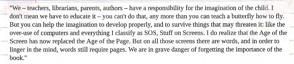
"We – teachers, librarians, parents, authors – have a responsibility for the imagination of the child. I don't mean we have to educate it – you can't do that, any more than you can teach a butterfly how to fly. But you can help the imagination to develop properly, and to survive things that may threaten it: like the over-use of computers and everything I classify as SOS, Stuff on Screens. I do realize that the Age of the Screen has now replaced the Age of the Page. But on all those screens there are words, and in order to linger in the mind, words still require pages. We are in grave danger of forgetting the importance of the book."
All that was 23 years ago and it's all still true. The screens have just grown smaller, and multiplied. In America, there are already a few digital schools, which have no books, not even in the library. And in schools across America, so many children now work on laptops or tablet computers that cursive handwriting is no longer being taught. Maybe that's also happening here. I suppose that's not the end of the world; lots of authors write their first drafts on a computer, though I'm certainly not one of them. But there's something emblematic about handwriting, with its direct organic link between the imagining brain and the writing fingers. Words aren't damaged by technology. But what about the imagination?
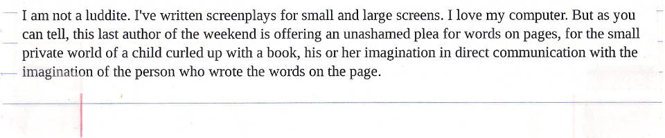
I am not a luddite. I've written screenplays for small and large screens. I love my computer. But as you can tell, this last author of the weekend is offering an unashamed plea for words on pages, for the small private world of a child curled up with a book, his or her imagination in direct communication with the imagination of the person who wrote the words on the page.
I have a great deal of respect for Ms. Cooper. The Dark is Rising Sequence meant a lot to me when I was a kid. And I absolutely agree with her premise that books and libraries are vital and that we must continue to treasure, support, and protect them, even in an increasingly digital world.
But her handwringing about Kids Today and their Screens just strikes me as a bunch of Old Person Nonsense.
At least she acknowledges that the decline of cursive is no big deal.
I heard my aunt bemoan the lack of cursive education in schools recently. My response was, "What the hell do kids need to know cursive for?" It's harder to read than print, it's (at least for me) harder and slower to write than print, and in the twenty-first century it's about as essential a communication skill as Latin. It may be an interesting subject to study, but it's hardly a necessary one.
In sixth grade, I had two teachers who wouldn't let us submit typed papers. Everything had to be written in ink, in cursive. One of them even had the gall to justify this restriction by saying "This is how adults communicate."
Well, it's twenty-one years later, and you know what? I can't think of a single time in my adult life that I've ever written anything in cursive. I don't even sign my name in cursive.
You know what I, as an adult, do use to communicate, each and every single day of my life? A goddamn computer.
I'm a Millennial. At least, I think I am; nobody seems to agree on just what the fuck a Millennial is, exactly. But consensus seems to be that I'm on the older end of the Millennial Generation, and I certainly seem to fit a lot of the generalizations people make about Millennials.
I've been online since I was six years old (though I didn't have a smartphone until I was almost 30); I grew up with Stuff on Screens.
And that means I read a lot.
As far as Stuff on Screens and literacy, I'm inclined to agree with Randall Munroe:
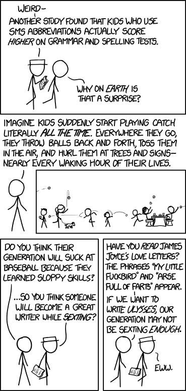
I'd like to find a corpus of writing from children in a non-self-selected sample (e.g. handwritten letters to the president from everyone in the same teacher's 7th grade class every year)--and score the kids today versus the kids 20 years ago on various objective measures of writing quality. I've heard the idea that exposure to all this amateur peer practice is hurting us, but I'd bet on the generation that conducts the bulk of their social lives via the written word over the generation that occasionally wrote book reports and letters to grandma once a year, any day.
Millennials read all the time, and we write all the time. And that promotes the hell out of literacy, no matter how goddamn annoying it is to see somebody spell the word "you" with only one letter.
Per Cooper's contention that people experience a closer kind of bond with words on paper than words on screens, research indicates that this distinction is decreasing as more and more people become accustomed to screens. Via Scientific American:
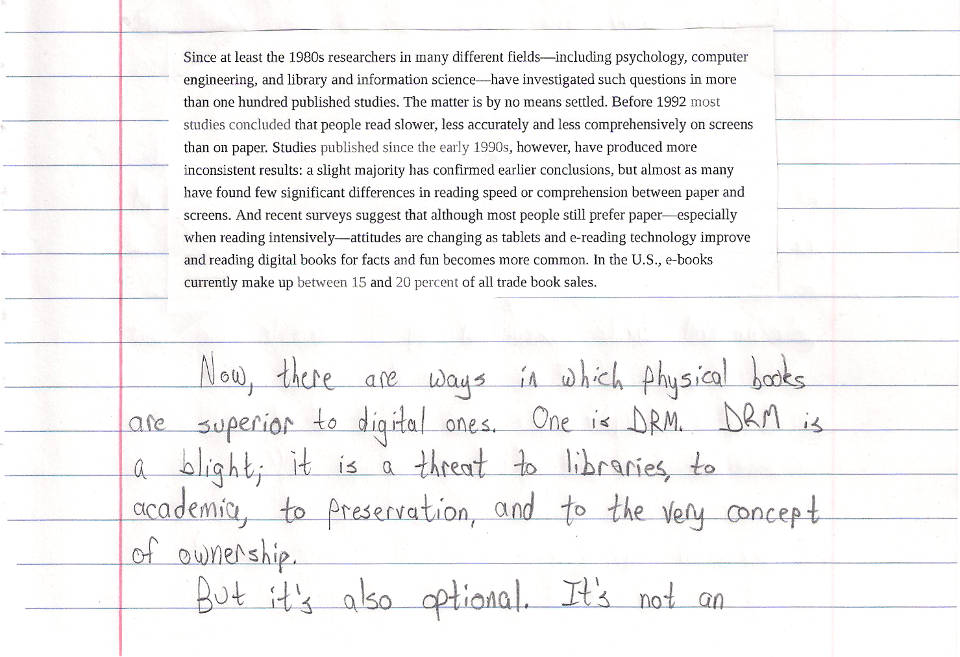
Since at least the 1980s researchers in many different fields—including psychology, computer engineering, and library and information science—have investigated such questions in more than one hundred published studies. The matter is by no means settled. Before 1992 most studies concluded that people read slower, less accurately and less comprehensively on screens than on paper. Studies published since the early 1990s, however, have produced more inconsistent results: a slight majority has confirmed earlier conclusions, but almost as many have found few significant differences in reading speed or comprehension between paper and screens. And recent surveys suggest that although most people still prefer paper—especially when reading intensively—attitudes are changing as tablets and e-reading technology improve and reading digital books for facts and fun becomes more common. In the U.S., e-books currently make up between 15 and 20 percent of all trade book sales.
Now, there are ways in which physical books are superior to digital ones. One is DRM. DRM is a blight; it is a threat to libraries, to academia, to preservation, and to the very concept of ownership.
But it's also optional. Its not an inherent part of ebooks; it's bullshit added to them by assholes. And I suspect that, within a generation, it will be gone, just as music DRM has been gone for about a decade now.
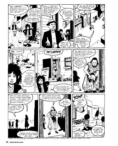
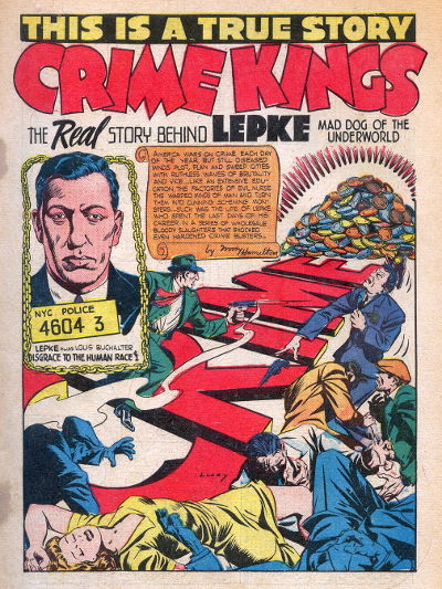
There's one more case where paper books are superior to digital ones: pictures. I've already spoken at length about comic books shrunk to fit a 10" screen, as well as the color problems that can arise when they're not printed on the same paper stock they were designed for. The same goes for picture books, art books, photo books; for magazines whose layouts are designed for the printed page. When you put these things on a small screen, you do lose something tangible (and if you put them on a large screen, you lose portability).
On the other hand, I've currently got some 173 books and 362 comics on a 10" rectangle that fits in my backpack, and that is amazing.
People carry libraries in their pockets now. That's not a threat to literacy, it's a boon -- so long as voters and politicians understand that these portable libraries are not meant to replace the traditional kind, but to supplement them.
But for people who love books -- at least, people of my generation who love books -- it's not an either-or question. It's not "Should I read paper books, or digital ones?" It's "Holy shit, look at all the books I have access to, and all the different ways I can read them!"
The first iPhone was released in 2007. It's too early to gauge what long-term effects, nationally or internationally, the smartphone revolution will have on literacy and reading habits.
But I'm more inclined to agree with Munroe than Cooper: a generation that's reading and writing all the time is going to be better at reading and writing than one that isn't. Even if you think they're doing it wrong.
An angry hat tip to Scott Sharkey, who used to handwrite blog posts, which gave me the utterly terrible idea for this time-consuming pain-in-the-ass of a post. (Granted, I'm pretty sure he had the good sense never to do it with a six-page essay with working links.)
Also, the part where I printed an image and then re-scanned it is kind of like something this one angry lady on a My Little Pony fan site did once.
(And yes, I'm aware that I forgot to use blue pencil for the Scientific American link. I am not going back and redoing it. That's the thing about writing stuff out on paper: it's kinda tough to add formatting to something after you've already written it.)