Author: thad

Where Will the PC Go? -- Part 2: Possible Solutions

In my previous post, I established that, despite strides made in screen keyboards and text-to-speech programs, a hardware keyboard is still the best way to write text documents.

In this one, I'll look at how phones and tablets work as replacements for PC's.

Problem 3: Phones Are Still Phones

Of course, you can connect a phone to a computer monitor, and to a keyboard. Or to a game controller.

Awhile back I hooked my phone up to my TV, and paired it to my DualShock 4, and fired up Sonic 4.

The game ran fine -- I didn't like it very much but it ran fine.

And then my mom called me.

The game stopped, and my TV screen filled up with a message that I was getting a phone call. So I walked across the room, picked up my phone, disconnected it from my TV, and answered it.

This is not optimal behavior for a computer.

Now, there are possible ways to fix this.

Headsets and speakerphone are two ways to answer the phone without having it in your hand, but neither one is optimal. Speakerphone is often hard to hear and can have that awful echo. And as for headsets, well, do I carry one in my pocket? Do I keep one in every room where I might dock my phone and use it as a computer?

A better solution would be to "connect" your phone to a monitor and speakers wirelessly, maybe using a device like a Chromecast. That way you could keep it next to you, or in your pocket, while still editing documents, or playing Sonic 4, or whatever. And if it rang, you could answer it, and not lose whatever was on your screen -- say I get a call where I want to take notes with my keyboard (as frequently happens); there could be a way to do that.

But the easier solution is probably to have the device that's connected to your keyboard and monitor(s) not be your phone. Especially if people continue to buy other devices, such as laptops or tablets.

Problem 4: Phone Interfaces Don't Make Good Desktop Interfaces

Windows 8. Do I even need to elaborate?

Microsoft tried to design an interface that would work on phones and on desktops. It was a huge failure.

This was entirely foreseeable. A 4" touchscreen is completely different from a pair of 1080p monitors with a keyboard and mouse attached to them. An interface designed for the former is a lousy fit for the latter, and vice-versa.

So, with Windows 10, Microsoft tried something else, and something altogether more sensible: the OS was designed with a phone/tablet interface and a desktop computer interface, with the ability to switch between the two. If you connect your phone to a dock that's hooked up to a monitor, a keyboard, and a mouse, then the interface changes to desktop mode.

Which is a good idea (and one that Canonical has been moving toward for years), but Windows Phone hasn't exactly set the world on fire (and Ubuntu Phone isn't a thing that anybody seems to want). Windows tablets, on the other hand, including Lenovo's Yoga series and MS's own Surface line, have fared much better.

Google's moving toward this sort of convergence too; it hasn't gotten as far as MS or Canonical yet, but there have been hints of future compatibility between Android and ChromeOS.

Ah yes, ChromeOS -- and the return to dumb terminals running server-side programs.

I think that's going to be key to bringing a few of the major special-case users on board with the transition to lower-powered systems: gamers and media designers.

We'll get to them soon. But in the next post, I'll be looking at the market that's really going to continue driving PC sales: business.

Where Will the PC Go? -- Part 1: Identifying the Problem

The other day, Ars Technica posted an article called Cringe-worthy “PC Does What?” campaign wants you to upgrade, about a new ad campaign the PC industry is pushing to try and convince users to buy new computers.

The PC industry is in trouble. It's built around a pattern of regular upgrades that customers just aren't buying anymore. And it's trying whatever it can to stop the bleeding.

On the other hand, rumors of its demise have been greatly exaggerated. In the comments thread on the Ars article, someone named erikbc said:

Well, if anyone believes PC is dead they need to get their head checked.
And understand some numbers:

https://en.wikipedia.org/wiki/Usage_share_of_operating_systems#Desktop_and_laptop_computers

A user named has responded:

…said every horse-and-buggy salesman in 1900 ever.

Which, okay, doesn't actually make a whole lot of sense. (In fact I am fairly confident that very few horse-and-buggy salesmen in 1900 ever said "If anyone believes PC is dead they need to get their head checked" and then linked to Wikipedia.) But, like many shitty analogies do, it got me thinking about why it was a shitty analogy.

Mainly, I don't think the PC will go away to the extent that horse-drawn carriages have. I think it's possible that tablets could completely replace desktop and laptop computers, but I don't think that can happen until they effectively duplicate the functionality of PC's -- in effect not actually replacing PC's but becoming them.

General Case: Typical End Users

While it's easy to point to the rise of the smartphone as the reason for declining PC sales, it's only one of the reasons. There's another one: the last processor most end users will ever need was released in 2006.

A typical end user only needs a few things in a PC: a web browser, an office suite, music, and videos. (And those last three are, increasingly, integrated into the first one; I'll circle back to that in a later post.)

In 2006, Intel released the Core 2 Duo, which, paired with even a low-end onboard graphics chip, could handle HD video and drive two 1920x1080 monitors. And it's 64-bit, so it can handle more than the 3GB of RAM that 32-bit processors max out at.

There have been plenty more, and plenty better, processors in the 9 years since. But they're not better for people who only use their computer for browsing, Office, listening to music, and watching videos. The Core 2 Duo was good enough for them.

There are people who greatly benefit from newer and better processors -- gamers and people who produce media rather than just consuming it. But they're special cases; I'll get to them later. For the average user, the difference between a Core 2 Duo and a Core i7 isn't even noticeable.

The computer industry grew up in the 1990's around the expectation that people would upgrade their computer every few years to handle new software. And people just don't do that anymore. They buy a new PC when the old one quits working; not before.

But, at least at this point, they still need a PC. People may be buying more phones than PC's, but, at least in America, a phone is not a replacement for a PC.

Problem 1: Screen Keyboards

Screen keyboards are a pain in the ass.

They're fine for short communication -- text messages and tweets -- but they're just too slow and imprecise for long-form writing. (I thought of writing this post entirely on a screen keyboard -- like last week's handwritten post -- but I think that would make me want to gouge my eyes out.)

There are still plenty of requirements for longform writing in day-to-day life -- reports for school and reports for work, for starters. And that's even in professions where you don't have to write for a living, never mind ones where you do. People who write articles, and especially people who write books, are best served with a keyboard to type on.

And maybe that won't always be the case. Maybe kids growing up with screen keyboards aren't learning to type on traditional keyboards; maybe they're faster with screen keyboards than they are with hardware ones. Maybe, within a generation, we will see essays, reports, articles, even books, all written with screen keyboards. I suspect that if we do, they'll look a whole lot different than they do today.

Or maybe screen keyboards will get better. Maybe predictions and autocorrect will improve. Maybe a faster paradigm than qwerty + swipe will catch on. There's a lot that can happen in this space.

Or maybe we won't be using keyboards at all.

Problem 2: Text-to-Speech

Speech recognition software has grown by leaps and bounds. Terry Pratchett used Dragon Dictate and TalkingPoint to write his last few novels.

But being good enough for a first draft, for a user who is no longer physically capable of using a keyboard, isn't the same thing as being able to recognize a full range of standard and nonstandard grammars and sentence structures, pick correct homonyms, and understand slang and regional dialects. (Pratchett liked to tell the story of how he had to train his text-to-speech software to recognize the word "arsehole".)

Text-to-speech software might be good enough for simple, clear documents, such as manuals, lists, daily work logs, AP-style newsbriefs, and technical writing (provided you're writing on a subject that doesn't have a lot of jargon words that don't appear in a simple dictionary). But for writing that's meant to convey personality -- editorials, reviews, fiction, even this blog post -- text-to-speech algorithms have a long way to go.

So, for now at least, a good old hardware keyboard remains the best way to input large blocks of text into a computer. In my next post, I'll examine why a dedicated PC is still the best thing to connect to that keyboard, and how phone and tablet OS's are (or aren't) working to bridge that gap.

Updated

The migration should be complete and everything should be here. If you trip over any missing images, wrong formatting, etc., contact me.

Magical Disappearing Posts

My hosting company is in the process of moving servers and I didn't get the memo; all my stuff was copied over a week ago but I haven't changed DNS settings yet. So if some posts disappear and reappear, that's why; normal service should resume within the next couple of days.

Stuff On Screens

Handwriting
Type

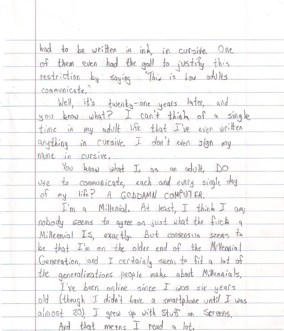
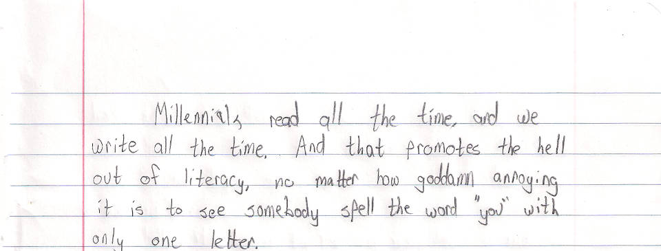
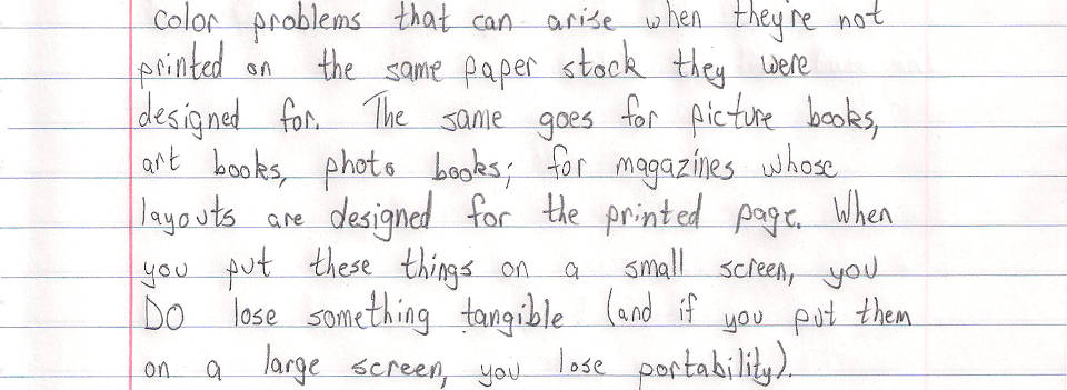
This blog post is handwritten.  Instead of alt text, the complete text is transcribed in the Typed tab.


Yesterday I ran across two 2013 articles about books, literacy, and libraries in the Guardian, one by Neil Gaiman and the other by Susan Cooper. The Gaiman one is excellent, but I was disappointed by Cooper's, partly because it digresses substantially from its point, but mostly because of a couple of paragraphs I can't stop thinking about. She starts off quoting a talk she gave in 1990:

"We – teachers, librarians, parents, authors – have a responsibility for the imagination of the child. I don't mean we have to educate it – you can't do that, any more than you can teach a butterfly how to fly. But you can help the imagination to develop properly, and to survive things that may threaten it: like the over-use of computers and everything I classify as SOS, Stuff on Screens. I do realize that the Age of the Screen has now replaced the Age of the Page. But on all those screens there are words, and in order to linger in the mind, words still require pages. We are in grave danger of forgetting the importance of the book."

All that was 23 years ago and it's all still true. The screens have just grown smaller, and multiplied. In America, there are already a few digital schools, which have no books, not even in the library. And in schools across America, so many children now work on laptops or tablet computers that cursive handwriting is no longer being taught. Maybe that's also happening here. I suppose that's not the end of the world; lots of authors write their first drafts on a computer, though I'm certainly not one of them. But there's something emblematic about handwriting, with its direct organic link between the imagining brain and the writing fingers. Words aren't damaged by technology. But what about the imagination?

I am not a luddite. I've written screenplays for small and large screens. I love my computer. But as you can tell, this last author of the weekend is offering an unashamed plea for words on pages, for the small private world of a child curled up with a book, his or her imagination in direct communication with the imagination of the person who wrote the words on the page.

I have a great deal of respect for Ms. Cooper. The Dark is Rising Sequence meant a lot to me when I was a kid. And I absolutely agree with her premise that books and libraries are vital and that we must continue to treasure, support, and protect them, even in an increasingly digital world.

But her handwringing about Kids Today and their Screens just strikes me as a bunch of Old Person Nonsense.

At least she acknowledges that the decline of cursive is no big deal.

I heard my aunt bemoan the lack of cursive education in schools recently. My response was, "What the hell do kids need to know cursive for?" It's harder to read than print, it's (at least for me) harder and slower to write than print, and in the twenty-first century it's about as essential a communication skill as Latin. It may be an interesting subject to study, but it's hardly a necessary one.

In sixth grade, I had two teachers who wouldn't let us submit typed papers. Everything had to be written in ink, in cursive. One of them even had the gall to justify this restriction by saying "This is how adults communicate."

Well, it's twenty-one years later, and you know what? I can't think of a single time in my adult life that I've ever written anything in cursive. I don't even sign my name in cursive.

You know what I, as an adult, do use to communicate, each and every single day of my life? A goddamn computer.

I'm a Millennial. At least, I think I am; nobody seems to agree on just what the fuck a Millennial is, exactly. But consensus seems to be that I'm on the older end of the Millennial Generation, and I certainly seem to fit a lot of the generalizations people make about Millennials.

I've been online since I was six years old (though I didn't have a smartphone until I was almost 30); I grew up with Stuff on Screens.

And that means I read a lot.

As far as Stuff on Screens and literacy, I'm inclined to agree with Randall Munroe:

XKCD Writing Skills strip

I'd like to find a corpus of writing from children in a non-self-selected sample (e.g. handwritten letters to the president from everyone in the same teacher's 7th grade class every year)--and score the kids today versus the kids 20 years ago on various objective measures of writing quality. I've heard the idea that exposure to all this amateur peer practice is hurting us, but I'd bet on the generation that conducts the bulk of their social lives via the written word over the generation that occasionally wrote book reports and letters to grandma once a year, any day.

Millennials read all the time, and we write all the time. And that promotes the hell out of literacy, no matter how goddamn annoying it is to see somebody spell the word "you" with only one letter.

Per Cooper's contention that people experience a closer kind of bond with words on paper than words on screens, research indicates that this distinction is decreasing as more and more people become accustomed to screens. Via Scientific American:

Since at least the 1980s researchers in many different fields—including psychology, computer engineering, and library and information science—have investigated such questions in more than one hundred published studies. The matter is by no means settled. Before 1992 most studies concluded that people read slower, less accurately and less comprehensively on screens than on paper. Studies published since the early 1990s, however, have produced more inconsistent results: a slight majority has confirmed earlier conclusions, but almost as many have found few significant differences in reading speed or comprehension between paper and screens. And recent surveys suggest that although most people still prefer paper—especially when reading intensively—attitudes are changing as tablets and e-reading technology improve and reading digital books for facts and fun becomes more common. In the U.S., e-books currently make up between 15 and 20 percent of all trade book sales.

Now, there are ways in which physical books are superior to digital ones. One is DRM. DRM is a blight; it is a threat to libraries, to academia, to preservation, and to the very concept of ownership.

But it's also optional. Its not an inherent part of ebooks; it's bullshit added to them by assholes. And I suspect that, within a generation, it will be gone, just as music DRM has been gone for about a decade now.

There's one more case where paper books are superior to digital ones: pictures. I've already spoken at length about comic books shrunk to fit a 10" screen, as well as the color problems that can arise when they're not printed on the same paper stock they were designed for. The same goes for picture books, art books, photo books; for magazines whose layouts are designed for the printed page. When you put these things on a small screen, you do lose something tangible (and if you put them on a large screen, you lose portability).

On the other hand, I've currently got some 173 books and 362 comics on a 10" rectangle that fits in my backpack, and that is amazing.

People carry libraries in their pockets now. That's not a threat to literacy, it's a boon -- so long as voters and politicians understand that these portable libraries are not meant to replace the traditional kind, but to supplement them.

But for people who love books -- at least, people of my generation who love books -- it's not an either-or question. It's not "Should I read paper books, or digital ones?" It's "Holy shit, look at all the books I have access to, and all the different ways I can read them!"

The first iPhone was released in 2007. It's too early to gauge what long-term effects, nationally or internationally, the smartphone revolution will have on literacy and reading habits.

But I'm more inclined to agree with Munroe than Cooper: a generation that's reading and writing all the time is going to be better at reading and writing than one that isn't. Even if you think they're doing it wrong.


An angry hat tip to Scott Sharkey, who used to handwrite blog posts, which gave me the utterly terrible idea for this time-consuming pain-in-the-ass of a post. (Granted, I'm pretty sure he had the good sense never to do it with a six-page essay with working links.)

Also, the part where I printed an image and then re-scanned it is kind of like something this one angry lady on a My Little Pony fan site did once.

(And yes, I'm aware that I forgot to use blue pencil for the Scientific American link. I am not going back and redoing it. That's the thing about writing stuff out on paper: it's kinda tough to add formatting to something after you've already written it.)

Pests

This morning I went into my bathroom and there were ants wandering around. They hadn't formed a line yet, but there were maybe a dozen, moving around and exploring. I didn't see them in any other rooms; I couldn't find where they were coming from but I think it was probably under the floor.

I squished as many as I could see (and took the bathroom rug out and threw it in the wash), but when I came back, more had come; there were about the same number as the first time.

I squished them again; more came again.

Then I had a bright idea: I turned my Roomba loose in the bathroom and closed the door.

The next time I went in? No ants, living or dead.

I was pretty pleased with myself, until I saw the black widow spider in my shower, at which point I decided yeah maybe it is time to call an exterminator.

Essex County is Really Good

As I mentioned a couple weeks ago in my post about the Humble Forbidden Comics Bundle, I bought the bundle partially because I'd been meaning to read Essex County. And now that I've read it, I can say with confidence that it was worth the $15 all by itself.

Essex County was the breakhout hit for cartoonist Jeff Lemire; he went on to do Sweet Tooth (which is where I first discovered his work and became a fan), and then to become a pretty big name at DC and Valiant. Last I heard he was acting as more of a story architect across multiple titles and less of an artist on his own, smaller work; it's wonderful to see his success but I have to admit I miss his art and his originality.

So I gave Essex County a read. And I haven't read a comic like it in years. I think comparisons to Love and Rockets are inevitable -- it's a character-based work of magical realism focusing on families over generations, with a vibe of loneliness and melancholy, and its setting is an essential component in establishing its tone -- but it's not Love and Rockets. The most obvious difference is in the art: Jeff Lemire doesn't do the smooth, clean lines of Los Bros Hernandez; his work is rough, angular, and jagged. The people in Love and Rockets are beautiful; the people in Essex County are not.

Essex County page

But it's not just Lemire's art that strikes a different tone than the Hernandezes'; it's his setting. Gilbert Hernandez's Palomar may be a small town, but the streets always seem busy, and his later stories (as well as Jaime's) mostly take place in and around LA. Love and Rockets has a huge cast of characters, and it did even in the early days before 30 years of continuity piled up.

Essex County takes place, mostly, in rural Canada, on small family farms. There is one section in the second book, Ghost Stories, which takes place in Toronto; the cast is briefly packed with enough supporting characters to form a hockey team. But, before long, those characters drift away, and while Lou Lebeuf stays in the big city, he finds himself lonely despite the throngs of people around him.

And, to a large extent, Essex County is about loneliness. Lester is lonely because his mother died, he never knew his father, he's moved to a farm to live with an uncle he barely knows, and the other kids make fun of him. Anne is lonely because she works long hours, her husband is dead, and her son barely speaks to her. Lou is lonely first because of his self-imposed exile from his family, then because he goes deaf, then because he outlives everyone he knows, and finally because he gets Alzheimer's. The wide, open, snow-filled spaces of Essex County externalize their loneliness and isolation, but they're not the cause -- at least, not the only one.

These three stories aren't happy, I don't suppose, though they've got moments of happiness. And I think, really, that's what they're about: find those moments of happiness. Find a connection with someone when you can.

Or maybe I'm off-base. Maybe that's not what the book is about at all. For all that it shows that those connections are precious, it shows how fraught they can be. Lou's problems start when he connects with somebody who he shouldn't. Lester doesn't know his father because two people made a connection that they couldn't sustain. Life is like that; it tends to defy simplistic morals.

And that's what Essex County is about, really: slices of life; moments in time. And families, and history.

And hockey. There's a whole lot of hockey. This comic is Canadian as fuck, eh?

Actually, It's About How Games Journalism is a Pain in the Ass

Or, Why I Won't Be Doing That Again Any Time Soon: A Postmortem

So the last three posts comparing and contrasting five different Mega Man games required rather a lot of screenshots. It took a long time to get them all, for a number of reasons I'll get into in a moment. It wound up taking a lot longer to get those posts done and posted than planned, and it really wasn't a whole lot of fun.

The other day on Brontoforumus, I described it as taking two things I enjoy doing -- playing video games and talking about video games -- and turning them into work. More specifically, work I don't get paid for.

I like how the whole thing turned out, but it took hours and hours to put together, and playing a game to farm for screenshots is a pretty different and altogether less fun experience than playing it just to play it.

Some of it may be down to the tools I'm using, or just my lack of proficiency with them.

I opted to grab all the screenshots myself, rather than try and find a resource that already had them (or close enough). I think this was probably the right call; VG Museum has a perfectly good shot of the floating platforms in Ice Man's stage that I could have used, but it doesn't really have any other grabs of the Mega Man screens I needed, and it's got next to nothing from Mega Man X and nothing at all from the other three games I was capping.

So I could have poked around the Internet trying to find the screens I was looking for, either as static images on websites or as caps from Let's Play videos on YouTube. But I think that would have taken just as long as getting the damn things myself.

The next decision I made that made my life more difficult was to try and grab all the images at each device's native resolution, with graphical filters turned off.

Here are some of the screenshots I used in the last three posts:

  • Cut Man Stage -- Mega Man
  • Chill Penguin Stage -- Mega Man X
  • Sigma's Fortress -- Mega Man Xtreme
  • Launch Octopus Stage -- Mega Man: Maverick Hunter X

And here are what those games look like when I play the game scaled up for a 1080p screen and with a graphics filter turned on:

  • Cut Man Stage -- Mega Man
  • Highway Stage -- Mega Man X
  • Highway Stage -- Mega Man Xtreme
  • Highway Stage -- Mega Man: Maverick Hunter X

Now, first of all, those images are pretty big. In fact, unless you've zoomed this page in, you're not even looking at them at full size right now, because they've been scaled to fit the content area of this post. That's 892px wide (unless you're viewing it on a mobile device, in which case it's less), whereas the images are between 1157 and 1920px wide.

And they're PNG's, which means they're also pretty big in terms of filesize (except the Mega Man Xtreme one). Unnecessarily big; you just loaded a 1920px-wide image just to display a scaled-down 892px version. Or less. If you're reading this on a 3G connection, then I probably owe you an apology.

Now, there are things I could do differently. I could set my emulators to output as JPEG instead of PNG, but that would result in a visible decrease in quality. I could resize the images manually, but that would be more work for me. I could set up a script to scale them automatically, but we'd still end up with a bunch of images all scaled to the same width. Which isn't really ideal; it doesn't make a lot of sense for the Game Boy screenshots to be the same size as the PSP ones, and 892px is just too damn big to get multiple images onscreen and get a good comparison anyway.

So, instead of that, what I did was turn off the filters and, when I was ready to take a screenshot, toggle fullscreen off to take it.

This is a pain in the ass, not just because it interrupts the flow of the game but because it's fucking difficult to set up a good screenshot in a tiny 160x144 window on a 1080p TV when you're sitting on the couch across the room.

And that's before you get into weird shit like this:

  • Cut Man Stage -- Mega Man
  • Cut Man Stage -- Mega Man

I don't know why the fuck RetroArch did this. I told it to size the window to native NES resolution, and it gave me these monstrosities instead. That is not native NES resolution. And it's not a problem with the core I was using, because I tried it with two different cores. (I thought it might be some weird leftover setting from when I'd done the Game Boy screen grabs, but that doesn't make sense; the Game Boy screen grabs were 160x144, while these are 205x191.)

And I took a bunch of screenshots before realizing what it had done. I had to go back and replay fucking Ice Man's stage and do it all over again.

So I think the best solution would be to use emulators that output screenshots at native resolution and without filters, regardless of what scaling and filters are applied as I'm playing them. I know I've used emulators like that before, but I can't remember which ones they were offhand.

And there's another requirement: I want to be able to take a screenshot without having to use the damn keyboard. I want to be able to use one of the buttons on my controller to take the screenshot. Because having to stage a shot and then quickly take my hands off the controller to hit F12 on a keyboard doesn't just interrupt the flow of the game, it's a good way to get yourself killed if you're trying to grab a screenshot of a particularly difficult section of game.

Snes9x let me map the screenshot button to my controller, and I think FCEUX did too, but I couldn't find any feature like that in PPSSPP or RetroArch.

So I guess what I'm looking for is an emulator that lets you output screenshots with no scaling or filters applied, and lets you map that function to a button on your controller.

That would make the whole exercise a lot quicker and easier, but it wouldn't fix a number of other problems -- I'd still have to wade through a bunch of files with names like ULUS10068_00017.png and RetroArch-1011-165734.png and find the ones I wanted, and then realize "Fuck, I forgot to take a screenshot of Spark Mandrill's stage" and have to go back and replay that section, and seriously, you have no idea how many times I did that.

And that's without even getting into the editing portion.

Remember this guy from the first post, with the measurements?

Mega Man is 33x54px

I added those rulers and numbers myself, manually, in Gimp (and it probably shows). And it wound up being way more fiddly and time-consuming than it should have. I guess I probably should have gone looking for plugins to see if somebody had already coded up a tool to draw a shape like that automatically so I wouldn't have to do it myself; that is what I ended up doing for this graphic, with the arrow in it:
Flame Mammoth Stage -- Mega Man: Maverick Hunter X, with Giant Red Arrow

So, I dunno. Like I said, I'm pretty pleased with how the feature turned out (and it's gotten a positive response from the Brontos, which is nice), but it just took so long to put together, and it was not very fun. I might try it again sometime -- especially if somebody can steer me in the right direction and help make it easier next time -- but for now I'll probably go on back to my usual Wall of Text posts.

Course, in the old days I used to enjoy doing shit like this:

City of Heroes time-lapse

But there's a pretty important difference: we were already just fuckin' around and essentially posing for photos anyway; it's not like I was taking screenshots in the middle of a difficult mission. (And even if I were, it was pretty easy just to reach over and hit PrtScn without breaking stride in the game.) I wasn't trying to get a grab of any specific gameplay element -- let alone compare and contrast across five different games.

Maybe if I do this again I'll just pick an easier topic.

In the meantime, I think I'll go back to just playing games. Maybe I'll replay some more Mega Man X games. I never did get around to finishing X8. Fucking vehicle levels.


Mega Man ® 1989 and © 1987 Capcom Co, Ltd
Mega Man X ™ and © 1993 Capcom Co, Ltd
Mega Man Xtreme © 2001 Capcom Co, Ltd
Mega Man Powered Up and Mega Man: Maverick Hunter X © 2006 Capcom Co, Ltd
City of Heroes © 2004 NCsoft

I took all the screenshots myself.
I used the following emulators:
NES: FCEUX and Libretro with the FCEUmm and Nestopia cores
SNES: Snes9x and Libretro with the Snes9x Next core
Game Boy Color: Libretro with the Gambatte core
PSP: PPSSPP

Dueling Mega Men, Part 3: Rebalancing Act

As I've indicated in the last two posts, Mega Man: Powered Up has a lot more changes from the original game than Mega Man: Maverick Hunter X. And the changes to Powered Up are usually for the better, while the ones to MHX are usually for the worse.

There's a pretty simple reason for that: Mega Man has a lot more to improve than Mega Man X.

Back in the first post, I described Maverick Hunter X as "a pretty solid remake of an excellent game." Powered Up is the reverse: an excellent remake of a pretty solid game.

The original Mega Man is a classic, but it's got rough edges; it's an amazing first effort but it's got its share of flaws. There's a reason Mega Man 2 is universally considered to be a much better game.

The original Mega Man X, on the other hand, is pretty much perfect. It's exquisitely designed and balanced.

So, rebalancing Mega Man resulted in a better-balanced game, while rebalancing Mega Man X resulted in a worse-balanced one.

Let's start with Mega Man.

Powered Up changes the original game so fundamentally that it actually changes the boss weaknesses.

In the original Mega Man, the order is:
Bomb Man Guts Man Cut Man Elec Man Ice Man Fire Man

In Powered Up, it's:
Cut Man Bomb Man Ice Man Fire Man Oil Man Elec Man Time Man Guts Man.

The change in order does more than just accommodate the two new bosses; it makes for a more natural stage order.

The original game has two logical starting points: Bomb Man's level and Cut Man's. The trouble is, if you follow the order of weapon weaknesses, starting with Bomb Man means you go to Guts Man's famously difficult level second. Starting with Cut Man means you take Elec Man's stage before Guts Man and have to go back later to get the Magnet Beam (though, granted, this wouldn't be an issue in Powered Up, which removes the Magnet Beam entirely).

The weakness order in Powered Up puts the two easiest stages right at the start, first Cut Man and then Bomb Man, and puts trickier levels like Elec Man, Guts Man, and the new Time Man near the end.

Mega Man: Maverick Hunter X doesn't change the Mavericks' weaknesses, but it does play musical chairs with the capsules. And that's enough to wreak havoc on the original game's finely-crafted balance.

The most important of the four capsules, the one you need in order to get the other three, is the Leg Upgrade. Here's where it is in the original game:

Chill Penguin Stage -- Mega Man X

It's about halfway through Chill Penguin's stage (the easiest in the game), smack dab in the middle of the path. You literally can't miss it.

Whereas in Maverick Hunter X, not only is it possible to miss it, it's likely. Here's where it is in that version:

Flame Mammoth Stage -- Mega Man: Maverick Hunter X

Don't see it? Let's try that again.

Flame Mammoth Stage -- Mega Man: Maverick Hunter X, with Giant Red Arrow

That's right: the ledge you grab onto to reach the Leg Parts is covered up by the fucking HUD. It's so hard to see that you can walk right past it even if you know it's there.

Contrast with the same location in the original Mega Man X (which, in that game, had the Arm Parts capsule):

  • Flame Mammoth Stage -- Mega Man X
  • Flame Mammoth Stage -- Mega Man: Maverick Hunter X

The original game gives a very clear visual cue that there is something up there. Maverick Hunter X, on the other hand, once again fails to handle the conversion from 4:3 to 16:9, and makes the hanging section almost impossible to see. And if you don't find that tiny ledge, you can't get any of the other upgrade parts -- your mobility, offense, and defense are all severely limited, and the game is much harder. Not fun hard, unfair hard.

And if you do know the Leg Parts are on Flame Mammoth's stage, there's another problem: nobody in their right mind would pick Flame Mammoth's stage first.

It disrupts the entire stage order. Do you start with Chill Penguin and then end with Flame Mammoth? That makes the game a whole lot more difficult, going through seven stages with no capsule upgrades.

No, the best option here is to base the stage order around the capsules, not the bosses' weaknesses. Take out Chill Penguin first, then Flame Mammoth, with maybe a stop-over at Storm Eagle along the way (he's a relatively easy boss and Flame Mammoth is weak against his weapon, and it also makes Spark Mandrill's stage easier; on the other hand, it's got all the shitty vertical parts I mentioned in my previous post, and they're harder without the Leg Parts).

The other three capsules are rearranged too. Chill Penguin has the Head Parts instead of the Leg Parts, Sting Chameleon has the Arm Parts instead of the Body Parts, and Storm Eagle has the Body Parts instead of the Head Parts.

The Head Parts are damn near useless in the original game, and they're not any more useful in the remake. In the original game, they protect you from falling rocks in one section of Sting Chameleon's stage, and are also necessary to reach the Arm Parts capsule in Flame Mammoth's stage. Maverick Hunter X is much the same, except that in this case you need them to reach the Body Parts capsule in Storm Eagle's stage. Chill Penguin's stage -- which, again, is the easiest level and, in the original game, the best one to start with -- has gone from having the most useful of the four upgrades to the least useful. Storm Eagle's stage, on the other hand, ends up with a much more useful upgrade than it had in the original, and one more reason to hit that level earlier in this version of the game than in the SNES version.

The change to Sting Chaemeleon's stage probably makes the most sense of the four, though it removes the nice sense of symmetry the original game gives you of defeating a suit of robot armor to gain an armor upgrade.

If you follow the stage order implied by the capsule locations (ie fight Storm Eagle and Flame Mammoth early), then that means Sting Chameleon will be the last of the eight stages. Getting the Arm Parts right before the Sigma stages, or right at the beginning of the Sigma stages, matches the original game, where if you started with Chill Penguin you'd end with Flame Mammoth, and get a chance to get the Buster Upgrade -- and if you missed it, you'd get it on the very next level.

Which brings us to another change.

In Mega Man X, midway through the first Sigma stage, Zero confronts Vile, and sacrifices himself. If you didn't get the Buster Upgrade from the capsule, Zero will give it to you.

Maverick Hunter X changes this in two ways. First, it moves the battle to the third Sigma stage instead of the first. Second, instead of Zero giving you a Buster Upgrade that's identical to the one you would have gotten from the capsule, he gives you a different Buster Upgrade.

It's an interesting idea, but I don't think it's a very good one, for two reasons.

The first is that it messes up the narrative structure. There's a reason Zero dies, and passes the torch to X, in the first Sigma stage in the original game: it changes the atmosphere of the rest of the game. It establishes a sense of loneliness and isolation that lingers through the end. Nobody else is going to help you; you're humanity's last hope. And you've done what Zero said you'd do all the way back at the end of the first stage: you've become stronger. The student has become the master.

In Maverick Hunter X, on the other hand, you spend most of the Sigma stages playing catchup. Zero's gone on ahead. Even at full power, X is playing second fiddle, right up until the end.

Which brings us to the gameplay reason why it doesn't make sense to kill off Zero right before the end: it's right before the end. I understand the reasoning behind rewarding the player for getting almost to the end of the game without the Buster Upgrade with a cool, unique weapon -- but what the fuck good is it? You've got exactly half a level left in the game at that point, and then four bosses. (And I guess the caterpillar things in the last level, but they're pretty much just there to fill up your Sub Tanks.) The game rewards you by giving you a weapon you'll hardly get to use.

Aside from that, there are other weird little changes. The X-Buster takes longer to charge to its maximum level, and bosses are invulnerable for a longer period of time after you hit them.

And then there's stuff like this:

  • Spark Mandrill Stage -- Mega Man X
  • Spark Mandrill Stage -- Mega Man: Maverick Hunter X

In the original game, when Spark Mandrill's stage goes "dark", it's just a transparency effect; you can still see where you need to go.

In Maverick Hunter X, the lights cycle off and on; the platforms go from being completely illuminated to being completely invisible. This, combined with the reduction in height, makes the section a lot harder, the timing a lot trickier, and makes it damned difficult to get through this section without getting clipped by the fireflies that whiz through it.

In fact, this section seems to be taking a cue from the Mega Man Xtreme version of the stage.

Spark Mandrill Stage -- Mega Man Xtreme

(It may look like the platforms are visible in that screenshot, but I assure you that if you play the game on authentic Game Boy Color hardware, you can't see shit.)

Basically, the game's full of changes, great and small. And most of them are for the worse.

All of this stuff, all of these changes, the reordering of the Capsules and the Sigma stages and Zero's death scene -- I think they actually could have made for an interesting game, if they were only on Hard Mode. The way I see it, Normal Mode should have kept everything where it was in the original game (with some changes, of course, to accommodate the screen height), while Hard Mode could have jumbled things around and created a legitimate challenge for experienced players. Think of it like the original Legend of Zelda: the Second Quest is neat, but it would have made a pretty crummy first quest.

Instead, Hard Mode gives the bosses some additional attacks (that's good!) and ups the amount of damage all the enemies do (that's cheap and lazy).

And then there's Vile Mode, which makes for a pretty great addition but can be overwhelming in the sheer number of options provided. Vile gets a total of 45 weapons, and while it's great to have that kind of versatility, it also means it takes a lot of time testing out all those choices and deciding which ones fit your play style -- and it also makes it a lot harder to figure out which weapons are effective against which bosses. If you're X, you can swap weapons on the fly and keep trying until you find one that works; if you're Vile, you can only equip three weapons at a time, and if none of them do the job, you have to start the level over if you want to try other options.

Plus, when you're Vile they move the Heart Tanks and Sub Tanks around, and while the save screen has a counter for how many you've got, it doesn't tell you which ones you've gotten. Okay, I've got seven out of the eight Heart Tanks; guess I get to figure out which one I'm missing.

(Also, I sincerely hope the decision to make every fucking stage use the same music when you play as Vile was an accident. Giving him is own theme music on the first stage is fine; reusing it on the next eight is not.)

To summarize three long posts, it's really easy to recommend Mega Man: Powered Up. It's thoughtfully and exquisitely redesigned, and good enough to be considered the definitive version of the game, even before you get into all the extras like the many playable characters and the level design toolkit.

Maverick Hunter X isn't bad but it's a much harder sell. Play the SNES game first; it's better; it's that simple.

But if you've played the SNES game already, forward and backward and side-to-side, and you're interested in trying out a new take? Then I'd recommend you take a crack at Maverick Hunter X. But remember going in that things are going to be different, and sometimes maddeningly so.


Mega Man ® 1989 Capcom Co, Ltd
Mega Man X ™ and © 1993 Capcom Co, Ltd
Mega Man Xtreme © 2001 Capcom Co, Ltd
Mega Man: Maverick Hunter X © 2006 Capcom Co, Ltd

I took all the screenshots myself, and tried to get them all at native resolution with no filters.
I used the following emulators:
SNES: Snes9x
Game Boy Color: Libretro with the Gambatte core
PSP: PPSSPP

Dueling Mega Men, Part 2: Verticality

The original Mega Man has some tricky platforming sequences. Mega Man Powered Up actually does a pretty solid job of redesigning them to make them more fair. Here's one of the most infamous examples, the gauntlet at the beginning of Guts Man's stage:

  • Guts Man Stage -- Mega Man
  • Guts Man Stage -- Mega Man Powered Up

Mega Man drops you right into what may be the toughest sequence in the game, and it's right at the beginning of the level. Powered Up, by contrast, starts you off with some training wheels.

Lest you think it's going easy on you, though, what it actually does is move that bastard platform to the end of the level:

Guts Man Stage -- Mega Man Powered Up

On the one hand, that's a much better balance, putting the easy stuff at the beginning of the level and the tough stuff at the end. On the other, it's even more infuriating to repeatedly die right before the end of a level than right at the beginning. And it's actually even harder in Powered Up: note the spacing of the "safe" spots in the lower belt; there's much less time to land and jump than the original game.

There's another sequence, in Ice Man's stage, which is, for my money, the worst part of the original Mega Man.

  • Ice Man Stage -- Mega Man
  • Ice Man Stage -- Mega Man Powered Up

In the original game, you have to jump from moving platform to moving platform over a vast empty pit. The platforms' movements are not predictable, they shoot at you while you're trying to time your jumps (and, not shown, penguin guys fly at you too), and sometimes just for the sheer fuck of it instead of landing on a platform you will fall right through it and die.

Powered Up reduces the number of platforms to two, makes them move in consistent zigzag patterns, and eliminates the additional obstacles that you have to avoid (not to mention fixes the collision detection). And greatly reduces the amount of space you have to pass over.

It's a pretty perfect example of Powered Up finding something that was wrong with the original game and fixing it.

Maverick Hunter X does not do that.

Here's an example from Storm Eagle's stage:

  • Storm Eagle Stage -- Mega Man X
  • Storm Eagle Stage -- Mega Man: Maverick Hunter X

It's hard to tell from a static screenshot, but those three platforms all move up and down. And while it's easy to keep an eye on the next platform in the original Mega Man X, in Maverick Hunter X they move right off the screen.

It gets worse in Sigma's fortress.

  • Sigma's Fortress -- Mega Man X
  • Sigma's Fortress -- Mega Man: Maverick Hunter X

Once again, Mega Man Xtreme actually does a better job than Maverick Hunter X; it reduces the number of platforms and their amount of vertical movement. It even turns the Sigma's Fortress sequence from a vertical section to a horizontal one.

  • Storm Eagle Stage -- Mega Man Xtreme
  • Sigma's Fortress -- Mega Man Xtreme

(Of course, don't let any of this faint praise give you the mistaken impression that Mega Man Xtreme is a good game. Its version of the Sigma Fortress platform sequence ends with a blind leap off into nowhere.)

The pattern here is that, while the Mega Man: Powered Up devs were more than happy to retool tricky platform sequences, the Maverick Hunter X team seems oddly reluctant to change them, even just to accommodate the different aspect ratio. ("Oddly" because they made plenty of other, and much worse, changes; we'll get to some of them in a little bit.)

The other big problem is the underwater sequences, because of the increased height of your jump. In Maverick Hunter X, you jump so high that you can no longer see where you're going to land. Here's a miniboss from Launch Octopus's stage:

  • Launch Octopus Stage -- Mega Man X
  • Launch Octopus Stage -- Mega Man: Maverick Hunter X
  • Launch Octopus Stage -- Mega Man X
  • Launch Octopus Stage -- Mega Man: Maverick Hunter X

The enemy uses a weapon that pulls you towards the spikes; if you jump to get out of its range in the original Mega Man X, you'll still be able to see the platforms where it's safe to land, but in Maverick Hunter X, you'll scroll them right off the bottom of the screen.

And here's another miniboss from Launch Octopus's stage, a serpent which you can ride:

  • Launch Octopus Stage -- Mega Man X
  • Launch Octopus Stage -- Mega Man: Maverick Hunter X
  • Launch Octopus Stage -- Mega Man X
  • Launch Octopus Stage -- Mega Man: Maverick Hunter X

While you can ride the serpent past the point where the spikes and platforms scroll off the bottom of the screen in the original Mega Man X, you go higher before that happens -- and it's still not too hard to land safely.

  • Launch Octopus Stage -- Mega Man X
  • Launch Octopus Stage -- Mega Man X

Riding the serpent and shooting it in the back of the head until it drops you is a viable strategy in the original game, but it's likely to get you killed in the remake.

Of course, for all the examples so far, there's at least an explanation for why these sequences are like that in Maverick Hunter X: because they were like that in the original. What's entirely baffling is when they add new vertical hazards, on purpose, and they have the same problems or worse.

Maverick Hunter X significantly redesigns the Sigma's Fortress stages (which, again, makes it even stranger that it leaves the sequence with the floating platforms as-is, albeit in a later level than in the original game). Early on in the first fortress level, there's another fight with one of the giant fish minibosses from Launch Octopus's stage, which wasn't in the original game.

  • Sigma's Fortress -- Mega Man: Maverick Hunter X
  • Sigma's Fortress -- Mega Man: Maverick Hunter X

Let's compare that to the one on Launch Octopus's level again.

  • Launch Octopus Stage -- Mega Man: Maverick Hunter X
  • Sigma's Fortress -- Mega Man: Maverick Hunter X

The one on the Sigma stage is definitely worse: the spike traps are twice as wide, there's only one place where you can stand and it's half as wide as the Launch Octopus version, and the platform is at the same height as the spikes, so if you miss it you're dead, instead of having a chance to grab onto the side and jump back out.

The underwater section is followed by a reworked version of the vertical section from the original game, and I'll actually give some props here: this is one of the few instances where I like the Maverick Hunter X version better.

  • Sigma's Fortress -- Mega Man X
  • Sigma's Fortress -- Mega Man: Maverick Hunter X
  • Sigma's Fortress -- Mega Man X
  • Sigma's Fortress -- Mega Man: Maverick Hunter X

There are several reasons the Maverick Hunter X version is better: it's shorter, there are fewer enemies, and there are more places to stand. But most of all, this is an instance where the devs understand that they're working with a different aspect ratio, and make it work for them. They don't try to preserve the narrow shaft, or keep the Joes on tiny platforms backed right up against the wall where it's nearly impossible to get them to attack, then hit them while their shields are down, and then get onto the platform they were standing on. It's not perfect, but it's a thoughtfully-designed sequence that's a legitimate improvement on the original. And it's a frustrating example of how good this remake could have been if this same kind of care had been applied to other vertical sequences.

And then it passes, and you're in another vexing vertical sequence that wasn't in the original game. It isn't as likely to cause cheap instant deaths as the aquatic sequence at the beginning of the level, but it is incredibly awkward and annoying because of the screen's limited height and your inability to see where you're going:

Sigma's Fortress -- Mega Man: Maverick Hunter X

But the worst new sequence of all is the end of Armored Armadillo's stage when you play as Vile:

Armored Armadillo Stage -- Mega Man: Maverick Hunter X

It's similar to the sequence in Sigma's Fortress, with platforms at multiple heights and those same helicopter dudes coming at you. But there are more of them, they're harder to hit when you're playing as Vile (and you can't just use a powered-up Rolling Shield to protect yourself like when you play as X), and you have to jump to platforms below you, not just ones above you. And of course when you jump, you may very well scroll your destination platform right off the bottom of the screen and have to guess where it's going to be by the time you land. It's a friggin' nightmare, and a great justification for savestate-scumming.

All in all, Maverick Hunter X does a terrible job with pretty much any sequence that deals with vertical scrolling.

Powered Up doesn't have that problem -- but the comparison's not entirely fair, because Powered Up has an advantage: it's a remake of a game that has no vertical scrolling.

There are lots of vertical sequences in Mega Man, but the screen never scrolls. When you have to traverse a section that's taller than a single screen, that means climbing from the bottom of the screen to the top and then climbing a ladder up to the next screen, where you end up back at the bottom. The screen doesn't move up and down as Mega Man does, only left and right.

  • Elec Man Stage -- Mega Man
  • Elec Man Stage -- Mega Man Powered Up
  • Elec Man Stage -- Mega Man
  • Elec Man Stage -- Mega Man Powered Up

So it was easy for Powered Up to follow that pattern. As substantially as it changes some segments of the game (and adds two entirely new levels), it keeps that rule. No room is ever taller than one screen high; the screen doesn't scroll vertically -- and so the game never has to deal with the challenge of how to handle vertically-scrolling sequences.

Maverick Hunter X does. And it proves, time and again, that it's not up to the challenge. And then, bafflingly, it doubles down on this flaw and adds entirely new vertically-scrolling sequences. And they're even worse.

That's a major reason why, despite all its polish, despite all the effort that clearly went into it, and despite the many things it does right, Maverick Hunter X is an inferior game, both to the original Mega Man X and to Mega Man: Powered Up.

Another major reason is that it completely fucks up the balance of the original Mega Man X. And that's the topic of my next post.


Mega Man ® 1989 and © 1987 Capcom Co, Ltd
Mega Man X ™ and © 1993 Capcom Co, Ltd
Mega Man Xtreme © 2001 Capcom Co, Ltd
Mega Man Powered Up and Mega Man: Maverick Hunter X © 2006 Capcom Co, Ltd

I took all the screenshots myself, and tried to get them all at native resolution with no filters.
I used the following emulators:
NES: FCEUX
SNES: Snes9x
Game Boy Color: Libretro with the Gambatte core
PSP: PPSSPP