Month: October 2015

Dueling Mega Men, Part 3: Rebalancing Act

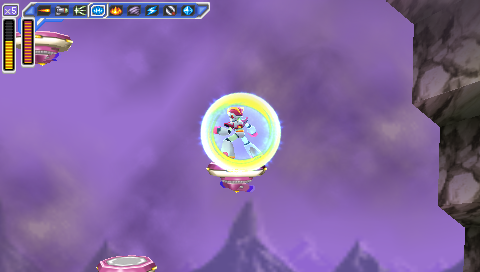
As I've indicated in the last two posts, Mega Man: Powered Up has a lot more changes from the original game than Mega Man: Maverick Hunter X. And the changes to Powered Up are usually for the better, while the ones to MHX are usually for the worse.

There's a pretty simple reason for that: Mega Man has a lot more to improve than Mega Man X.

Back in the first post, I described Maverick Hunter X as "a pretty solid remake of an excellent game." Powered Up is the reverse: an excellent remake of a pretty solid game.

The original Mega Man is a classic, but it's got rough edges; it's an amazing first effort but it's got its share of flaws. There's a reason Mega Man 2 is universally considered to be a much better game.

The original Mega Man X, on the other hand, is pretty much perfect. It's exquisitely designed and balanced.

So, rebalancing Mega Man resulted in a better-balanced game, while rebalancing Mega Man X resulted in a worse-balanced one.

Let's start with Mega Man.

Powered Up changes the original game so fundamentally that it actually changes the boss weaknesses.

In the original Mega Man, the order is:
Bomb Man Guts Man Cut Man Elec Man Ice Man Fire Man

In Powered Up, it's:
Cut Man Bomb Man Ice Man Fire Man Oil Man Elec Man Time Man Guts Man.

The change in order does more than just accommodate the two new bosses; it makes for a more natural stage order.

The original game has two logical starting points: Bomb Man's level and Cut Man's. The trouble is, if you follow the order of weapon weaknesses, starting with Bomb Man means you go to Guts Man's famously difficult level second. Starting with Cut Man means you take Elec Man's stage before Guts Man and have to go back later to get the Magnet Beam (though, granted, this wouldn't be an issue in Powered Up, which removes the Magnet Beam entirely).

The weakness order in Powered Up puts the two easiest stages right at the start, first Cut Man and then Bomb Man, and puts trickier levels like Elec Man, Guts Man, and the new Time Man near the end.

Mega Man: Maverick Hunter X doesn't change the Mavericks' weaknesses, but it does play musical chairs with the capsules. And that's enough to wreak havoc on the original game's finely-crafted balance.

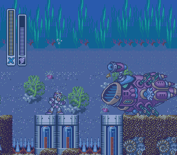
The most important of the four capsules, the one you need in order to get the other three, is the Leg Upgrade. Here's where it is in the original game:
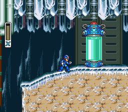
Chill Penguin Stage -- Mega Man X

It's about halfway through Chill Penguin's stage (the easiest in the game), smack dab in the middle of the path. You literally can't miss it.

Whereas in Maverick Hunter X, not only is it possible to miss it, it's likely. Here's where it is in that version:
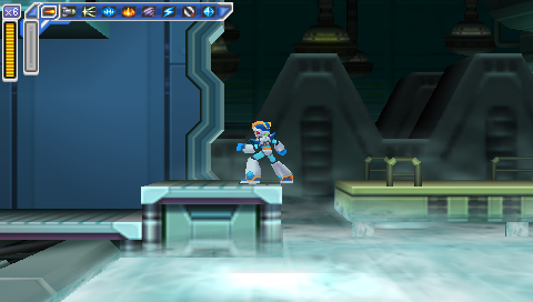
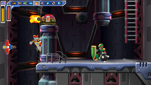
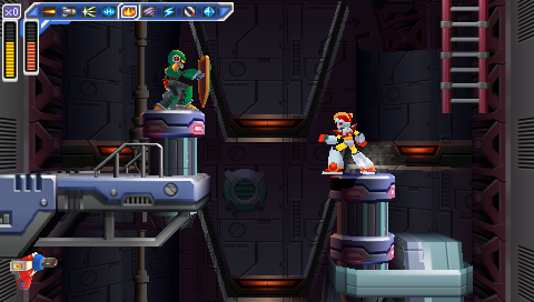
Flame Mammoth Stage -- Mega Man: Maverick Hunter X

Don't see it? Let's try that again.

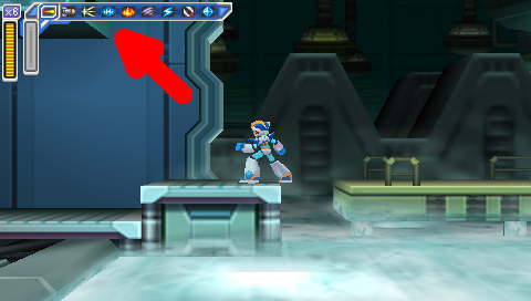
Flame Mammoth Stage -- Mega Man: Maverick Hunter X, with Giant Red Arrow

That's right: the ledge you grab onto to reach the Leg Parts is covered up by the fucking HUD. It's so hard to see that you can walk right past it even if you know it's there.

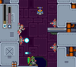
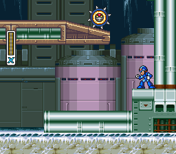
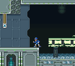
Contrast with the same location in the original Mega Man X (which, in that game, had the Arm Parts capsule):

  • Flame Mammoth Stage -- Mega Man X
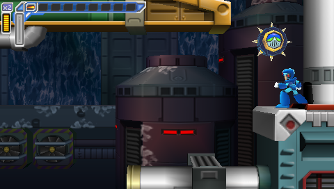
  • Flame Mammoth Stage -- Mega Man: Maverick Hunter X

The original game gives a very clear visual cue that there is something up there. Maverick Hunter X, on the other hand, once again fails to handle the conversion from 4:3 to 16:9, and makes the hanging section almost impossible to see. And if you don't find that tiny ledge, you can't get any of the other upgrade parts -- your mobility, offense, and defense are all severely limited, and the game is much harder. Not fun hard, unfair hard.

And if you do know the Leg Parts are on Flame Mammoth's stage, there's another problem: nobody in their right mind would pick Flame Mammoth's stage first.

It disrupts the entire stage order. Do you start with Chill Penguin and then end with Flame Mammoth? That makes the game a whole lot more difficult, going through seven stages with no capsule upgrades.

No, the best option here is to base the stage order around the capsules, not the bosses' weaknesses. Take out Chill Penguin first, then Flame Mammoth, with maybe a stop-over at Storm Eagle along the way (he's a relatively easy boss and Flame Mammoth is weak against his weapon, and it also makes Spark Mandrill's stage easier; on the other hand, it's got all the shitty vertical parts I mentioned in my previous post, and they're harder without the Leg Parts).

The other three capsules are rearranged too. Chill Penguin has the Head Parts instead of the Leg Parts, Sting Chameleon has the Arm Parts instead of the Body Parts, and Storm Eagle has the Body Parts instead of the Head Parts.

The Head Parts are damn near useless in the original game, and they're not any more useful in the remake. In the original game, they protect you from falling rocks in one section of Sting Chameleon's stage, and are also necessary to reach the Arm Parts capsule in Flame Mammoth's stage. Maverick Hunter X is much the same, except that in this case you need them to reach the Body Parts capsule in Storm Eagle's stage. Chill Penguin's stage -- which, again, is the easiest level and, in the original game, the best one to start with -- has gone from having the most useful of the four upgrades to the least useful. Storm Eagle's stage, on the other hand, ends up with a much more useful upgrade than it had in the original, and one more reason to hit that level earlier in this version of the game than in the SNES version.

The change to Sting Chaemeleon's stage probably makes the most sense of the four, though it removes the nice sense of symmetry the original game gives you of defeating a suit of robot armor to gain an armor upgrade.

If you follow the stage order implied by the capsule locations (ie fight Storm Eagle and Flame Mammoth early), then that means Sting Chameleon will be the last of the eight stages. Getting the Arm Parts right before the Sigma stages, or right at the beginning of the Sigma stages, matches the original game, where if you started with Chill Penguin you'd end with Flame Mammoth, and get a chance to get the Buster Upgrade -- and if you missed it, you'd get it on the very next level.

Which brings us to another change.

In Mega Man X, midway through the first Sigma stage, Zero confronts Vile, and sacrifices himself. If you didn't get the Buster Upgrade from the capsule, Zero will give it to you.

Maverick Hunter X changes this in two ways. First, it moves the battle to the third Sigma stage instead of the first. Second, instead of Zero giving you a Buster Upgrade that's identical to the one you would have gotten from the capsule, he gives you a different Buster Upgrade.

It's an interesting idea, but I don't think it's a very good one, for two reasons.

The first is that it messes up the narrative structure. There's a reason Zero dies, and passes the torch to X, in the first Sigma stage in the original game: it changes the atmosphere of the rest of the game. It establishes a sense of loneliness and isolation that lingers through the end. Nobody else is going to help you; you're humanity's last hope. And you've done what Zero said you'd do all the way back at the end of the first stage: you've become stronger. The student has become the master.

In Maverick Hunter X, on the other hand, you spend most of the Sigma stages playing catchup. Zero's gone on ahead. Even at full power, X is playing second fiddle, right up until the end.

Which brings us to the gameplay reason why it doesn't make sense to kill off Zero right before the end: it's right before the end. I understand the reasoning behind rewarding the player for getting almost to the end of the game without the Buster Upgrade with a cool, unique weapon -- but what the fuck good is it? You've got exactly half a level left in the game at that point, and then four bosses. (And I guess the caterpillar things in the last level, but they're pretty much just there to fill up your Sub Tanks.) The game rewards you by giving you a weapon you'll hardly get to use.

Aside from that, there are other weird little changes. The X-Buster takes longer to charge to its maximum level, and bosses are invulnerable for a longer period of time after you hit them.

And then there's stuff like this:

  • Spark Mandrill Stage -- Mega Man X
  • Spark Mandrill Stage -- Mega Man: Maverick Hunter X

In the original game, when Spark Mandrill's stage goes "dark", it's just a transparency effect; you can still see where you need to go.

In Maverick Hunter X, the lights cycle off and on; the platforms go from being completely illuminated to being completely invisible. This, combined with the reduction in height, makes the section a lot harder, the timing a lot trickier, and makes it damned difficult to get through this section without getting clipped by the fireflies that whiz through it.

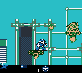
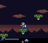
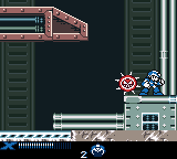
In fact, this section seems to be taking a cue from the Mega Man Xtreme version of the stage.
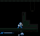
Spark Mandrill Stage -- Mega Man Xtreme

(It may look like the platforms are visible in that screenshot, but I assure you that if you play the game on authentic Game Boy Color hardware, you can't see shit.)

Basically, the game's full of changes, great and small. And most of them are for the worse.

All of this stuff, all of these changes, the reordering of the Capsules and the Sigma stages and Zero's death scene -- I think they actually could have made for an interesting game, if they were only on Hard Mode. The way I see it, Normal Mode should have kept everything where it was in the original game (with some changes, of course, to accommodate the screen height), while Hard Mode could have jumbled things around and created a legitimate challenge for experienced players. Think of it like the original Legend of Zelda: the Second Quest is neat, but it would have made a pretty crummy first quest.

Instead, Hard Mode gives the bosses some additional attacks (that's good!) and ups the amount of damage all the enemies do (that's cheap and lazy).

And then there's Vile Mode, which makes for a pretty great addition but can be overwhelming in the sheer number of options provided. Vile gets a total of 45 weapons, and while it's great to have that kind of versatility, it also means it takes a lot of time testing out all those choices and deciding which ones fit your play style -- and it also makes it a lot harder to figure out which weapons are effective against which bosses. If you're X, you can swap weapons on the fly and keep trying until you find one that works; if you're Vile, you can only equip three weapons at a time, and if none of them do the job, you have to start the level over if you want to try other options.

Plus, when you're Vile they move the Heart Tanks and Sub Tanks around, and while the save screen has a counter for how many you've got, it doesn't tell you which ones you've gotten. Okay, I've got seven out of the eight Heart Tanks; guess I get to figure out which one I'm missing.

(Also, I sincerely hope the decision to make every fucking stage use the same music when you play as Vile was an accident. Giving him is own theme music on the first stage is fine; reusing it on the next eight is not.)

To summarize three long posts, it's really easy to recommend Mega Man: Powered Up. It's thoughtfully and exquisitely redesigned, and good enough to be considered the definitive version of the game, even before you get into all the extras like the many playable characters and the level design toolkit.

Maverick Hunter X isn't bad but it's a much harder sell. Play the SNES game first; it's better; it's that simple.

But if you've played the SNES game already, forward and backward and side-to-side, and you're interested in trying out a new take? Then I'd recommend you take a crack at Maverick Hunter X. But remember going in that things are going to be different, and sometimes maddeningly so.


Mega Man ® 1989 Capcom Co, Ltd
Mega Man X ™ and © 1993 Capcom Co, Ltd
Mega Man Xtreme © 2001 Capcom Co, Ltd
Mega Man: Maverick Hunter X © 2006 Capcom Co, Ltd

I took all the screenshots myself, and tried to get them all at native resolution with no filters.
I used the following emulators:
SNES: Snes9x
Game Boy Color: Libretro with the Gambatte core
PSP: PPSSPP
Dueling Mega Men, Part 2: Verticality

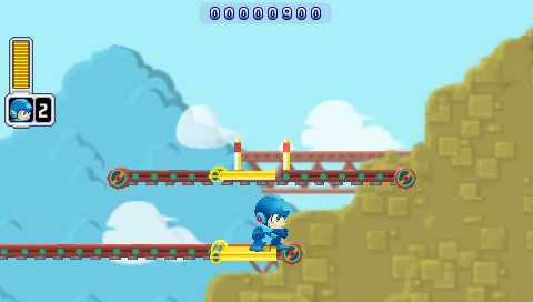
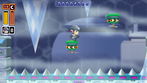
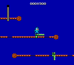
The original Mega Man has some tricky platforming sequences. Mega Man Powered Up actually does a pretty solid job of redesigning them to make them more fair. Here's one of the most infamous examples, the gauntlet at the beginning of Guts Man's stage:

  • Guts Man Stage -- Mega Man
  • Guts Man Stage -- Mega Man Powered Up

Mega Man drops you right into what may be the toughest sequence in the game, and it's right at the beginning of the level. Powered Up, by contrast, starts you off with some training wheels.

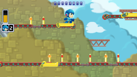
Lest you think it's going easy on you, though, what it actually does is move that bastard platform to the end of the level:

Guts Man Stage -- Mega Man Powered Up

On the one hand, that's a much better balance, putting the easy stuff at the beginning of the level and the tough stuff at the end. On the other, it's even more infuriating to repeatedly die right before the end of a level than right at the beginning. And it's actually even harder in Powered Up: note the spacing of the "safe" spots in the lower belt; there's much less time to land and jump than the original game.

There's another sequence, in Ice Man's stage, which is, for my money, the worst part of the original Mega Man.

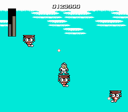
  • Ice Man Stage -- Mega Man
  • Ice Man Stage -- Mega Man Powered Up

In the original game, you have to jump from moving platform to moving platform over a vast empty pit. The platforms' movements are not predictable, they shoot at you while you're trying to time your jumps (and, not shown, penguin guys fly at you too), and sometimes just for the sheer fuck of it instead of landing on a platform you will fall right through it and die.

Powered Up reduces the number of platforms to two, makes them move in consistent zigzag patterns, and eliminates the additional obstacles that you have to avoid (not to mention fixes the collision detection). And greatly reduces the amount of space you have to pass over.

It's a pretty perfect example of Powered Up finding something that was wrong with the original game and fixing it.

Maverick Hunter X does not do that.

Here's an example from Storm Eagle's stage:

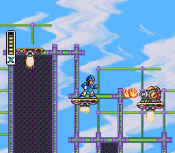
  • Storm Eagle Stage -- Mega Man X
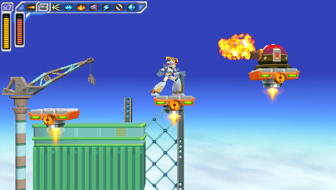
  • Storm Eagle Stage -- Mega Man: Maverick Hunter X

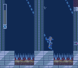
It's hard to tell from a static screenshot, but those three platforms all move up and down. And while it's easy to keep an eye on the next platform in the original Mega Man X, in Maverick Hunter X they move right off the screen.

It gets worse in Sigma's fortress.

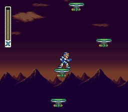
  • Sigma's Fortress -- Mega Man X
  • Sigma's Fortress -- Mega Man: Maverick Hunter X

Once again, Mega Man Xtreme actually does a better job than Maverick Hunter X; it reduces the number of platforms and their amount of vertical movement. It even turns the Sigma's Fortress sequence from a vertical section to a horizontal one.

  • Storm Eagle Stage -- Mega Man Xtreme
  • Sigma's Fortress -- Mega Man Xtreme

(Of course, don't let any of this faint praise give you the mistaken impression that Mega Man Xtreme is a good game. Its version of the Sigma Fortress platform sequence ends with a blind leap off into nowhere.)

The pattern here is that, while the Mega Man: Powered Up devs were more than happy to retool tricky platform sequences, the Maverick Hunter X team seems oddly reluctant to change them, even just to accommodate the different aspect ratio. ("Oddly" because they made plenty of other, and much worse, changes; we'll get to some of them in a little bit.)

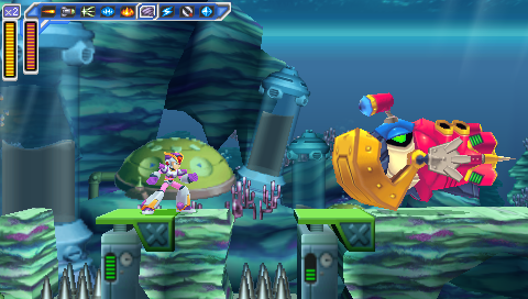
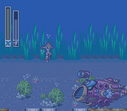
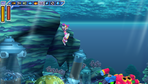
The other big problem is the underwater sequences, because of the increased height of your jump. In Maverick Hunter X, you jump so high that you can no longer see where you're going to land. Here's a miniboss from Launch Octopus's stage:

  • Launch Octopus Stage -- Mega Man X
  • Launch Octopus Stage -- Mega Man: Maverick Hunter X
  • Launch Octopus Stage -- Mega Man X
  • Launch Octopus Stage -- Mega Man: Maverick Hunter X

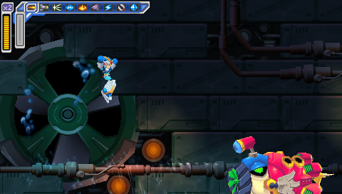
The enemy uses a weapon that pulls you towards the spikes; if you jump to get out of its range in the original Mega Man X, you'll still be able to see the platforms where it's safe to land, but in Maverick Hunter X, you'll scroll them right off the bottom of the screen.

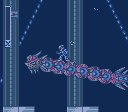
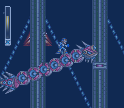
And here's another miniboss from Launch Octopus's stage, a serpent which you can ride:

  • Launch Octopus Stage -- Mega Man X
  • Launch Octopus Stage -- Mega Man: Maverick Hunter X
  • Launch Octopus Stage -- Mega Man X
  • Launch Octopus Stage -- Mega Man: Maverick Hunter X

While you can ride the serpent past the point where the spikes and platforms scroll off the bottom of the screen in the original Mega Man X, you go higher before that happens -- and it's still not too hard to land safely.

  • Launch Octopus Stage -- Mega Man X
  • Launch Octopus Stage -- Mega Man X

Riding the serpent and shooting it in the back of the head until it drops you is a viable strategy in the original game, but it's likely to get you killed in the remake.

Of course, for all the examples so far, there's at least an explanation for why these sequences are like that in Maverick Hunter X: because they were like that in the original. What's entirely baffling is when they add new vertical hazards, on purpose, and they have the same problems or worse.

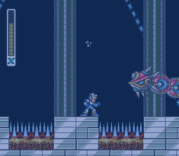
Maverick Hunter X significantly redesigns the Sigma's Fortress stages (which, again, makes it even stranger that it leaves the sequence with the floating platforms as-is, albeit in a later level than in the original game). Early on in the first fortress level, there's another fight with one of the giant fish minibosses from Launch Octopus's stage, which wasn't in the original game.

  • Sigma's Fortress -- Mega Man: Maverick Hunter X
  • Sigma's Fortress -- Mega Man: Maverick Hunter X

Let's compare that to the one on Launch Octopus's level again.

  • Launch Octopus Stage -- Mega Man: Maverick Hunter X
  • Sigma's Fortress -- Mega Man: Maverick Hunter X

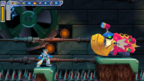
The one on the Sigma stage is definitely worse: the spike traps are twice as wide, there's only one place where you can stand and it's half as wide as the Launch Octopus version, and the platform is at the same height as the spikes, so if you miss it you're dead, instead of having a chance to grab onto the side and jump back out.

The underwater section is followed by a reworked version of the vertical section from the original game, and I'll actually give some props here: this is one of the few instances where I like the Maverick Hunter X version better.

  • Sigma's Fortress -- Mega Man X
  • Sigma's Fortress -- Mega Man: Maverick Hunter X
  • Sigma's Fortress -- Mega Man X
  • Sigma's Fortress -- Mega Man: Maverick Hunter X

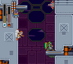
There are several reasons the Maverick Hunter X version is better: it's shorter, there are fewer enemies, and there are more places to stand. But most of all, this is an instance where the devs understand that they're working with a different aspect ratio, and make it work for them. They don't try to preserve the narrow shaft, or keep the Joes on tiny platforms backed right up against the wall where it's nearly impossible to get them to attack, then hit them while their shields are down, and then get onto the platform they were standing on. It's not perfect, but it's a thoughtfully-designed sequence that's a legitimate improvement on the original. And it's a frustrating example of how good this remake could have been if this same kind of care had been applied to other vertical sequences.

And then it passes, and you're in another vexing vertical sequence that wasn't in the original game. It isn't as likely to cause cheap instant deaths as the aquatic sequence at the beginning of the level, but it is incredibly awkward and annoying because of the screen's limited height and your inability to see where you're going:

Sigma's Fortress -- Mega Man: Maverick Hunter X

But the worst new sequence of all is the end of Armored Armadillo's stage when you play as Vile:

Armored Armadillo Stage -- Mega Man: Maverick Hunter X

It's similar to the sequence in Sigma's Fortress, with platforms at multiple heights and those same helicopter dudes coming at you. But there are more of them, they're harder to hit when you're playing as Vile (and you can't just use a powered-up Rolling Shield to protect yourself like when you play as X), and you have to jump to platforms below you, not just ones above you. And of course when you jump, you may very well scroll your destination platform right off the bottom of the screen and have to guess where it's going to be by the time you land. It's a friggin' nightmare, and a great justification for savestate-scumming.

All in all, Maverick Hunter X does a terrible job with pretty much any sequence that deals with vertical scrolling.

Powered Up doesn't have that problem -- but the comparison's not entirely fair, because Powered Up has an advantage: it's a remake of a game that has no vertical scrolling.

There are lots of vertical sequences in Mega Man, but the screen never scrolls. When you have to traverse a section that's taller than a single screen, that means climbing from the bottom of the screen to the top and then climbing a ladder up to the next screen, where you end up back at the bottom. The screen doesn't move up and down as Mega Man does, only left and right.

  • Elec Man Stage -- Mega Man
  • Elec Man Stage -- Mega Man Powered Up
  • Elec Man Stage -- Mega Man
  • Elec Man Stage -- Mega Man Powered Up

So it was easy for Powered Up to follow that pattern. As substantially as it changes some segments of the game (and adds two entirely new levels), it keeps that rule. No room is ever taller than one screen high; the screen doesn't scroll vertically -- and so the game never has to deal with the challenge of how to handle vertically-scrolling sequences.

Maverick Hunter X does. And it proves, time and again, that it's not up to the challenge. And then, bafflingly, it doubles down on this flaw and adds entirely new vertically-scrolling sequences. And they're even worse.

That's a major reason why, despite all its polish, despite all the effort that clearly went into it, and despite the many things it does right, Maverick Hunter X is an inferior game, both to the original Mega Man X and to Mega Man: Powered Up.

Another major reason is that it completely fucks up the balance of the original Mega Man X. And that's the topic of my next post.


Mega Man ® 1989 and © 1987 Capcom Co, Ltd
Mega Man X ™ and © 1993 Capcom Co, Ltd
Mega Man Xtreme © 2001 Capcom Co, Ltd
Mega Man Powered Up and Mega Man: Maverick Hunter X © 2006 Capcom Co, Ltd

I took all the screenshots myself, and tried to get them all at native resolution with no filters.
I used the following emulators:
NES: FCEUX
SNES: Snes9x
Game Boy Color: Libretro with the Gambatte core
PSP: PPSSPP
What Mega Man Powered Up Does Right and Mega Man: Maverick Hunter X Does Wrong, Part 1: Aspect Ratio

So the other day, I got to listening to OCRemix's Mega Man X: Maverick Hunter Rising album, and it got me jonesing to replay some Mega Man X.

I decided to take another crack at the 2006 PSP remake, Mega Man: Maverick Hunter X; it had disappointed me on my first playthrough, but I thought maybe I'd give it another chance.

And on a second playthrough, now that I'm familiar with its changes and idiosyncrasies, it went a lot smoother. Those changes and idiosyncrasies are glaring -- and they're what this series of posts is about -- but underneath them, it's a pretty solid remake of an excellent game.

But it's no substitute for the original.

And it's interesting to look at its immediate contemporary, Mega Man Powered Up, and see how much better Powered Up is than Maverick Hunter X.

There are a couple of reasons. One seems obvious -- in fact, it's the very first thing you notice:

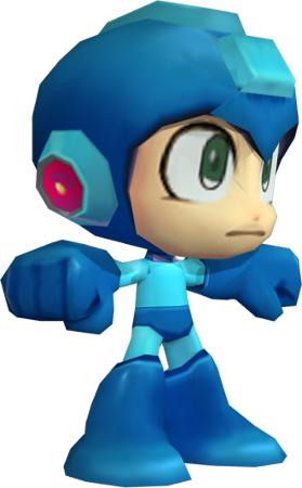
  • Mega Man model
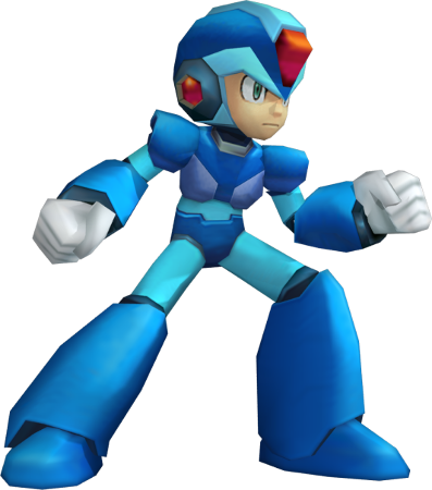
  • X model

Mega Man is short and squat, while X is tall and thin.

Now, these graphics tell you one thing right off the bat, and it's tone. Mega Man is fun and lighthearted; X takes himself seriously.

But the thing is, those designs affect every aspect of the game's design. And what you're looking at, in both cases, is a game that was originally designed for a 4:3 screen ratio, remade for a 16:9 one.

And which one of these guys do you suppose makes the transition better from 4:3 to 16:9 -- the one who's short and squat, or the one who's tall and thin?

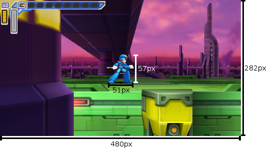
At least, that's how it looks. But it's an illusion. Let's take a look at their actual dimensions, in-game:

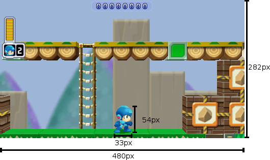
  • Mega Man is 33x54px
  • X is 51x57px

Those are back-of-the-napkin measurements; I haven't taken the models through their full range of motion, and I'm not sure what the exact dimensions of their hitboxes are. But it's enough to see that Mega Man only looks shorter and squatter -- in terms of the dimensions rendered in-game, X isn't significantly taller than Mega Man, and he is significantly wider.

But it's not really just about the ratio of the character models -- it's about the design of the worlds they inhabit.

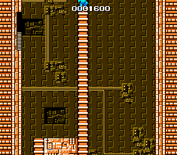
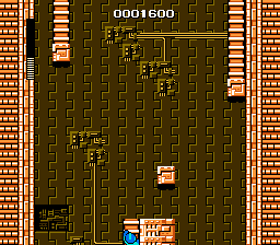
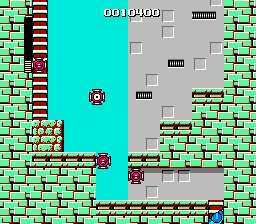
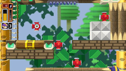
Both games face the same challenge: they have to substantially rework stage designs to fit a different screen ratio, while still making them feel like they play the same. Take a look at this screen from Cut Man's stage:

  • Cut Man Stage -- Mega Man
  • Cut Man Stage -- Mega Man Powered Up

It's pretty close.

In fact, it just hacks out the brick below the ladder, and the (inconsequential) top section of the ladder, above the range of the enemies.

It's got the same number of little eye-lantern guys, and nearly the same width to move around in. (The movable width of the screen in the original Mega Man is 12 "blocks", where in Powered Up it's a very close 11. And the height from the floor to the topmost enemy is 9 blocks in the original and 6 in Powered Up.)

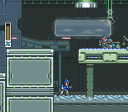
There are places where Maverick Hunter X does a similarly good job, like here in Flame Mammoth's stage (after defeating Chill Penguin and freezing the lava):

  • Flame Mammoth Stage -- Mega Man X
  • Flame Mammoth Stage -- Mega Man: Maverick Hunter X

There's a lot less vertical space to move under that platform, but it's not important; it's still enough to fit, and still keep the entire room onscreen.

But other sections don't always fare as well. Look at the beginning of Spark Mandrill's stage:

  • Spark Mandrill Stage -- Mega Man X
  • Spark Mandrill Stage -- Mega Man Xtreme
  • Spark Mandrill Stage -- Mega Man: Maverick Hunter X

In the original SNES version of Spark Mandrill's stage, the sparks that run along the floor and ceiling are half X's height and half his width, and the gap between them gives you plenty of room to dodge them. In the Maverick Hunter X version, they're as big as X, and there's very little room in between them. Even the Game Boy Color Mega Man Xtreme, with its severely compromised screen size, didn't have that problem.

(On the plus side, this does mean that defeating Storm Eagle before Spark Mandrill (and thereby disabling the sparks in the floors) makes a much more significant difference in how the level plays than it does in the original game.)

Chill Penguin's stage has problems too:

  • Chill Penguin Stage -- Mega Man X
  • Chill Penguin Stage -- Mega Man Xtreme
  • Chill Penguin Stage -- Mega Man: Maverick Hunter X

In the original, you can see the wheel coming and have time to get out of the way; in Maverick Hunter X, you can't and you don't. Though in this case, at least it's not being shown up by Xtreme, which has the same issue.

In a nutshell, Powered Up does a really good job of redesigning its vertical segments to fit a 16:9 screen, while Maverick Hunter X doesn't. And this really sticks out, because like Powered Up, MHX is a really polished remake. It shouldn't have these kinds of glaring issues with cropping; they're the hallmark of much lazier ports, like Mega Man for Game Gear, Mega Man and Bass for GBA, and, yes, Mega Man Xtreme.

But it's not just a few sucker punches by enemies that are too big, or that come out of nowhere. No, worst of all are the tricky platform segments where your limited field of vision can result in cheap, instant deaths. And I'll get to those in my next post.


Mega Man ® 1989 and © 1987 Capcom Co, Ltd
Mega Man X ™ and © 1993 Capcom Co, Ltd
Mega Man Xtreme © 2001 Capcom Co, Ltd
Mega Man Powered Up and Mega Man: Maverick Hunter X © 2006 Capcom Co, Ltd

Character models supplied by Models Resource

I took all the screenshots myself, and tried to get them all at native resolution with no filters.
I used the following emulators:
NES: FCEUX
SNES: Snes9x
Game Boy Color: Libretro with the Gambatte core
PSP: PPSSPP
Mmm, Forbidden Comics

Modified from a post on Brontoforumus, 2015-09-23.


In honor of Banned Books Week, the latest Humble Books Bundle is made up of banned and challenged comic books.

It's not just a good theme, it is, in terms of quality content for your money, the single best collection of comics I have ever seen. I've got a couple caveats about the presentation, which I'll get to in a minute, but it's well worth the price of admission, whatever tier you choose to donate at.

Pay more than the average and you get Heartbreak Soup.

Heartbreak Soup is my all-time favorite comic. Your mileage may vary, but as far as I'm concerned, the list of Greatest Comics of All Time goes Heartbreak Soup, then Maus, then that Spider-Man arc where he has to lift the rubble off him as Doc Ock's underwater base collapses. (No, Watchmen is not in my top three.)

The bundle also has the first volume of Bone. Bone is phenomenal; it's an all-ages adventure story in the classic mold, with influences from Walt Kelly to Carl Barks to Don Martin; it's funny and it's gorgeously drawn. You should definitely get it if you haven't read it yet; it's at the first tier so it can be yours for a penny.

The bottom tier's also got Maggie the Mechanic, which is the other Love and Rockets vol 1. (Heartbreak Soup is the first volume of Gilbert Hernandez's Palomar stories; Maggie the Mechanic is the first volume of Jaime Hernandez's Locas stories.) Maggie the Mechanic is great too, but for my money it's not as great as Heartbreak Soup, or as the other Locas stories that followed. (The Death of Speedy is widely regarded as the best Love and Rockets story; it's in vol 2 of Locas, which is not included in this bundle.)

Bottom tier also has The Frank Book. Jim Woodring's work is beautiful, surreal, wordless, and incredibly detailed. I have six pieces of comic book art hanging on my walls. One is a Quantum and Woody poster signed by Christopher Priest; one is an Uncle Scrooge print signed by Don Rosa. The other four are Jim Woodring prints that my uncle gave me for my birthday after using them in a museum exhibit.

There's some other stuff in there that I don't know as much about. I like Chester Brown but I haven't read The Little Man; I like Jeff Lemire but I haven't read Essex County. I suppose they're probably both pretty great based on their respective cartoonists' other work, but I don't know them.

And The Boys is in there. The Boys is not for me; I'm not a Garth Ennis fan. But if you like the sound of a bunch of asshole superheroes being taken down by a group of regular guys led by somebody who looks exactly like Simon Pegg, you'll probably dig it.

To summarize: it's a great bundle. It's worth buying for Heartbreak Soup, Bone, and Frank alone; I bought it mostly because I'd been wanting to pick up Frank, Essex County, and Information Doesn't Want to be Free by Cory Doctorow (available as an audiobook in this bundle; the only item that isn't a comic book).

So. Great bundle. But. As I said, there are some caveats with the format.

The first of which is, you're probably going to be reading these on a tablet. And some of these comics just don't look as good on a 10" screen.

I was especially worried about The Frank Book given the detail of Woodring's work; this stuff's meant to be read at 8.5"x11" size. But I was surprised to find it actually looks great on my tablet. The full-size book would be better, but it also costs $35 and weighs 3 pounds. And that's the paperback version.

Bone looks fantastic on my screen too.

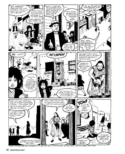
Surprisingly, of the books I've thumbed through, the one that suffered most was Heartbreak Soup.

Part of that's to do with the ratio. The pages of Love and Rockets are shorter and wider than standard comic book pages.

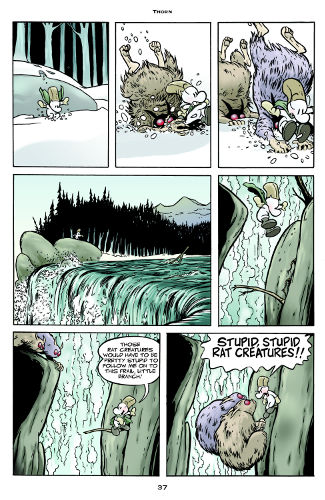
  • Bone page
    Bone
    Scaled to 325x500
  • Heartbreak Soup page
    Heartbreak Soup
    Scaled to 405x500

So on a 6:10 screen like my tablet's, you're left with some major letterboxing and a picture that is uncomfortably small and looks a little jaggy, and text that can be hard to read. (If, on the other hand, you have a tablet with a 4:3 screen, like an iPad, I imagine the Love and Rockets -- and the other more square-ish comics in the collection -- will look a lot better, and you'll have the opposite problem with the more traditionally-sized comics in the set.)

Perfect Viewer also seemed to choke on the file a bit; after the first few pages, it started pausing for long periods of time on each page turn. At first I thought it was due to the file size (the CBZ version is 675MB), but The Frank Book is even bigger and Perfect Viewer didn't give me any trouble with it. So I don't know why it doesn't like Heartbreak Soup, but it doesn't.

In short, Heartbreak Soup is my favorite comic, but my 10" tablet is most definitely not the best way to read it. Again, your mileage may vary; you may have better luck on an iPad, as noted, or if you're cool with just reading it on a desktop computer monitor, it looks great on my 27" 2560x1440 screen. But if you're looking for comics to read on a widescreen tablet, well, there are still a lot of great books in this set that totally justify the purchase, but don't buy it just for Heartbreak Soup. All that said, though? It's still a great damn comic, it doesn't look that bad on my tablet, and if you don't want to look for it at your local library or pay full price for the paperback version, well, it's still worth a read.

There's another one I looked through that I have a visual complaint about, and unfortunately, it's an important one and the granddaddy of all challenged comics: Crime Does Not Pay.

Crime Does Not Pay is a classic. It's the first and most successful of the 1940's-'50's-era crime comics that led to Senate hearings and, eventually, the Comics Code and most of the industry going out of business. But, aside from simply being popular, controversial, and lurid, it's just plain good, with superlative work from the likes of Charles Biro, Bob Montana, and George Tuska.

It's also public domain. You can find most of the series for free on Digital Comic Museum (though if you can spare a donation to keep the site up and running, that would be swell too).

Given that, it's damned disappointing that Dark Horse did such a shoddy job on the colors.

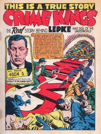
  • Crime Kings splash page
    Digital Comic Museum
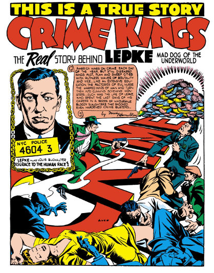
  • Crime Kings splash page
    Dark Horse

The first image is a scan from one of the original 1950's printings of the comic. It's not pristine; the colors bleed, and if you look closely you can see right through the page to the panel grid from the opposite side. And there are marks on the left side of the page where the staples were.

But despite those flaws, it looks better than the second image, from Dark Horse's restoration. The colors in Dark Horse's version look garish.

And it's down to the paper stock. The scan looks the way it's supposed to, because those colors are supposed to be printed on newsprint. The background is supposed to look a little gray or tan, and the colors are supposed to soak in and blend together.

Dark Horse's version looks garish because they kept the original four-color printing process but put it on high-quality, glossy paper (or the digital equivalent of same). The colors look wrong.

But, in Dark Horse's defense, it could have been worse -- at least they didn't re-color it. Have you seen what they've done to their Conan reprints? Photoshop gradients everywhere. The horror. The horror.

"It could have been worse" isn't a great defense, though. When it comes right down to it, I'd rather read the Digital Comic Museum version, even if I can see the grid lines from the other side of the page.

The only problem is, the Dark Horse collection contains issues #22-#25 (don't let the numbering fool you; #22 is the first issue -- in those days it was common, when a publisher canceled a comic and started a new one, for the new series to continue the old series' numbering with a new title), and Digital Comic Museum doesn't have #23-#25. So while you can download DCM's superior version of issue #22 (and #26, and #27, and lots more, on up through #147), if you want to read #23-25 then you're stuck with the Dark Horse version, and you'd better be prepared for a hell of a lot of eye-searing bright yellow.

There are plenty of instances of publishers doing reprints of old comics right -- either by using newsprint or by scanning or photographing the original printed pages -- but this isn't one of 'em, and that's a shame.

But, all that grousing aside, this bundle? If you have never read a comic book in your life, this has three that I would rank as Absolute Must-Read, in Heartbreak Soup, Bone, and Frank. It's got one of the legitimate most important comics of all time in Crime Does Not Pay, even if I've got some gripes about the presentation and you might be better off grabbing a scanned version from Digital Comic Museum. And aside from those, it's got several more that may not be quite so high on the must-read list but still rank as Great.

If you like good comics, you should get it. And if you don't like good comics, you should get it anyway, because maybe you just haven't ready any comics this good yet.

The bundle runs for five more days.

E-Mails and Passwords

So the other day I decided it was past time to reset all my passwords.

I'm pretty good about password hygiene. I've been using a password locker for years, with a unique, randomly-generated* password for every account I use. But I'll admit that, like most of us, I don't do as good a job of password rotation as I might. That's probably because I've managed to amass over 150 different accounts across different sites, and resetting 150 different passwords is a giant pain in the ass.

(I'm thinking that, from here on in, I should pick a subset of passwords to reset every month, so I never wind up having to reset all 150 at once again. It would also help me to clear out the cruft and not keep logins for sites that no longer exist, or which I'm never going to use again, or where I can't even find the damn login page anymore.)

There was one more reason I decided now was a good time to do a mass update: I've got two E-Mail addresses that have turned into spam holes. As I've mentioned previously, I'm currently looking for work and getting inundated with job spam; unfortunately I went and put my primary E-Mail address at the top of my resume, which in hindsight was a mistake. Never post your personal E-Mail in any public place; always use a throwaway.

Which I do, most of the time -- and that's created a second problem: I've been signing up for websites with the same E-Mail address for 15 years, and also used to use it in my whois information. (I've since switched to dedicated E-Mail addresses that I use only for domain registration.) So now, that E-Mail has turned into a huge spam hole; it's currently got over 500 messages in its Junk folder, and that's with a filter that deletes anything that's been in there longer than a week. My spam filters are well-trained, but unfortunately they only run on the client side, not the server side, so any time Thunderbird isn't running on my desktop, my spam doesn't get filtered. (If I'm out of the house, I can tell if the network's gone down, because I start getting a bunch of spam in my inbox on my phone.)

So now I've gone and created two new E-Mail addresses: one that's just for E-Mails about jobs, and another as my new all-purpose signing-up-for-things address.

My hope is that the companies hammering my primary E-Mail address with job notifications will eventually switch to the new, jobs-only E-Mail address, and I'll get my personal E-Mail address back to normal. And that I can quit using the Spam Hole address entirely and switch all my accounts over to the new address. Which hopefully shouldn't get as spam-filled as the old one since I haven't published it in a publicly-accessible place like whois.

Anyway, some things to take into account with E-Mail and passwords:

  • Don't use your personal E-Mail address for anything but personal communication. Don't give it to anyone you don't know.
  • Keep at least one secondary E-Mail address that you can abandon if it gets compromised or filled up with spam. It's not necessarily a bad idea to have several -- in my case, I've got one for accounts at various sites, several that I use as contacts for web domains, and one that's just for communication about jobs.
  • Use a password locker. 1Password, Keepass, and Lastpass are all pretty highly-regarded, but they're just three of the many available options.
  • Remember all the different devices you'll be using these passwords on.
    • I'm using a Linux desktop, an OSX desktop, a Windows desktop, and an Android phone; that means I need to pick a password locker that will run on all those different OS's.
    • And have some way of keeping the data synced across them.
    • And don't forget that, even with a password locker, chances are that at some point you'll end up having to type some of these passwords manually, on a screen keyboard. Adding brackets and carets and other symbols to your password will make it more secure, but you're going to want to weigh that against the hassle of having to dive three levels deep into your screen keyboard just to type those symbols. It may be worth it if it's the password for, say, your bank account, but it's definitely not worth it for your Gmail login.
  • Of course, you need a master password to access all those other passwords, and you should choose a good one. There's no point in picking a bunch of unique, strong passwords if you protect them with a shitty unsecure password. There are ways to come up with a password that's secure but easy to remember:
    • The "correct horse battery staple" method of creating a passphrase of four random words is a good one, but there are caveats:
      • You have to make sure they're actually random words, words that don't have anything to do with each other. Edward Snowden's example, "MargaretThatcheris110%SEXY.", is not actually very secure; it follows correct English sentence structure, "MargaretThatcher" and "110%" are each effectively one word since they're commonly-used phrases, the word "SEXY" is common as fuck in passwords, and mixed case and punctuation don't really make your password significantly more secure if, for example, you capitalize the beginnings of words or entire words and end sentences with periods, question marks, or exclamation points. Basically, if you pick the words in your passphrase yourself, they're not random enough; use a computer to pick the words for you.
      • And this method unfortunately doesn't work very well on a screen keyboard. Unless you know of a screen keyboard that autocompletes words inside a password prompt but won't remember those words or their sequence. I think this would be a very good idea for screen keyboards to implement, but I don't know of any that do it.
    • There are programs and sites that generate pronounceable passwords -- something like "ahx2Boh8" or "ireeQuaico". Sequences of letters (and possibly numbers) that are gibberish but can be pronounced, which makes them easy to remember -- a little less secure than a password that doesn't follow such a rule, but a lot more secure than a dictionary word. But read reviews before you use one of these services -- you want to make sure that the passwords it generates are sufficiently random to be secure, and that it's reputable and can be trusted not to snoop on you and send that master password off to some third party. It's best to pick one that generates multiple passwords at once; if you pick one from a list it's harder for a third party to know which one you chose.
  • Of course, any password is memorable if you type it enough times.
  • And no password is going to protect you from a targeted attack by a sufficiently dedicated and resourceful attacker -- if somebody's after something you've got, he can probably find somebody in tech support for your ISP, or your registrar, or your hosting provider, or your phone company, or some company you've bought something from, somewhere, who can be tricked into giving him access to your account. Or maybe he'll exploit a zero-day vulnerability. Or maybe one of the sites you've got an account with will be compromised and they'll get everybody's account information. Password security isn't about protecting yourself against a targeted attack. It's about making yourself a bigger hassle to go after than the guy sitting next to you, like the old joke about "I don't have to outrun the tiger, I just have to outrun you." And it's about minimizing the amount of damage somebody can do if he does compromise one of your accounts.
  • And speaking of social engineering, security questions are deliberate vulnerabilities, and they are bullshit. Never answer a security question truthfully. If security questions are optional, do not fill them out. If they are not optional and a site forces you to add a security question, your best bet is to generate a pseudorandom answer (remember you may have to read it over the phone, so a pronounceable password or "correct horse battery staple"-style phrase would be a good idea here, though you could always just use letters and numbers too -- knowing the phonetic alphabet helps) and store it in your password locker alongside your username and password.
  • You know what else is stupid? Password strength indicators. I once used one (it was Plesk's) that rejected K"Nb\:uO`) as weak but accepted P@55w0rd as strong. You can generally ignore password strength indicators, unless they reject your password outright and make you come up with a new one.

* For the purposes of this discussion, I will be using the words "random" and "pseudorandom" interchangeably, because the difference between the two things is beyond the scope of this post.