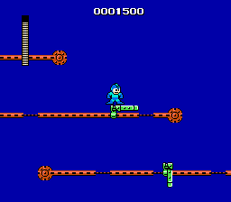
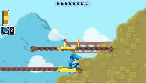
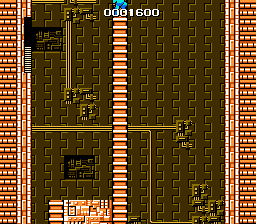
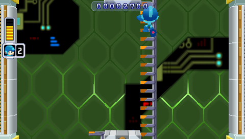
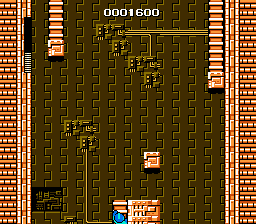
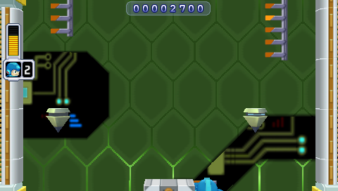
The original Mega Man has some tricky platforming sequences. Mega Man Powered Up actually does a pretty solid job of redesigning them to make them more fair. Here's one of the most infamous examples, the gauntlet at the beginning of Guts Man's stage:
Mega Man drops you right into what may be the toughest sequence in the game, and it's right at the beginning of the level. Powered Up, by contrast, starts you off with some training wheels.
Lest you think it's going easy on you, though, what it actually does is move that bastard platform to the end of the level:
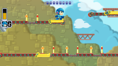
On the one hand, that's a much better balance, putting the easy stuff at the beginning of the level and the tough stuff at the end. On the other, it's even more infuriating to repeatedly die right before the end of a level than right at the beginning. And it's actually even harder in Powered Up: note the spacing of the "safe" spots in the lower belt; there's much less time to land and jump than the original game.
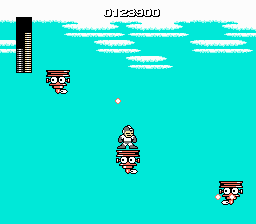
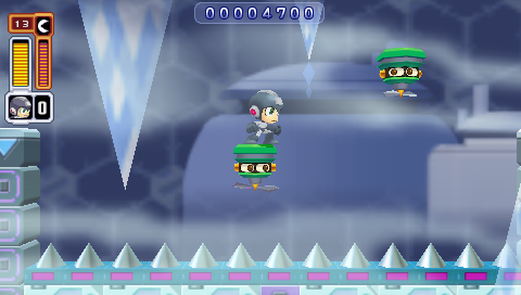
There's another sequence, in Ice Man's stage, which is, for my money, the worst part of the original Mega Man.
In the original game, you have to jump from moving platform to moving platform over a vast empty pit. The platforms' movements are not predictable, they shoot at you while you're trying to time your jumps (and, not shown, penguin guys fly at you too), and sometimes just for the sheer fuck of it instead of landing on a platform you will fall right through it and die.
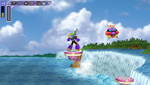
Powered Up reduces the number of platforms to two, makes them move in consistent zigzag patterns, and eliminates the additional obstacles that you have to avoid (not to mention fixes the collision detection). And greatly reduces the amount of space you have to pass over.
It's a pretty perfect example of Powered Up finding something that was wrong with the original game and fixing it.
Maverick Hunter X does not do that.
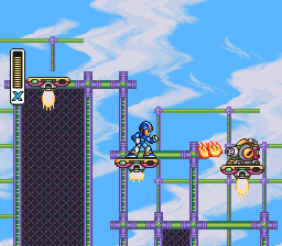
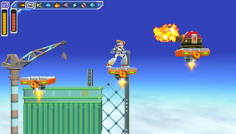
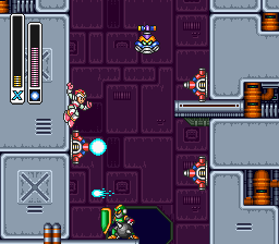
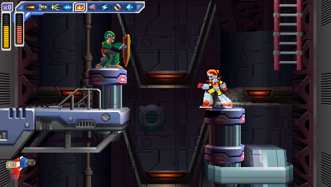
Here's an example from Storm Eagle's stage:
It's hard to tell from a static screenshot, but those three platforms all move up and down. And while it's easy to keep an eye on the next platform in the original Mega Man X, in Maverick Hunter X they move right off the screen.
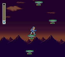
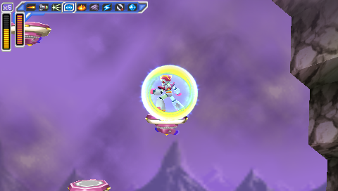
It gets worse in Sigma's fortress.
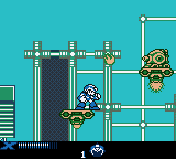
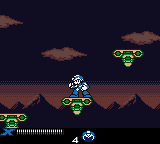
Once again, Mega Man Xtreme actually does a better job than Maverick Hunter X; it reduces the number of platforms and their amount of vertical movement. It even turns the Sigma's Fortress sequence from a vertical section to a horizontal one.
(Of course, don't let any of this faint praise give you the mistaken impression that Mega Man Xtreme is a good game. Its version of the Sigma Fortress platform sequence ends with a blind leap off into nowhere.)
The pattern here is that, while the Mega Man: Powered Up devs were more than happy to retool tricky platform sequences, the Maverick Hunter X team seems oddly reluctant to change them, even just to accommodate the different aspect ratio. ("Oddly" because they made plenty of other, and much worse, changes; we'll get to some of them in a little bit.)
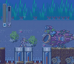
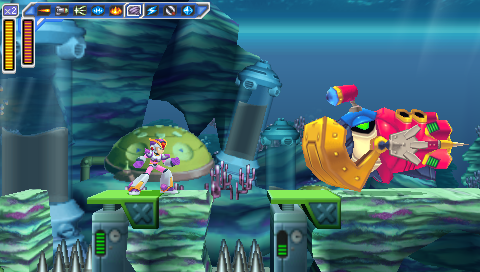
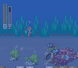
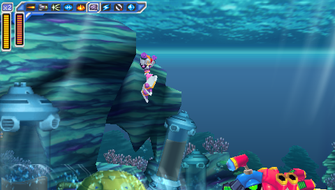
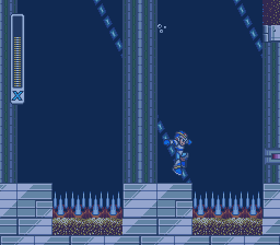
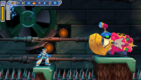
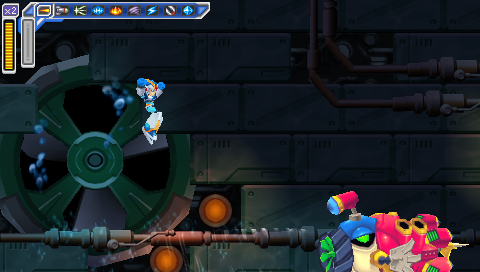
The other big problem is the underwater sequences, because of the increased height of your jump. In Maverick Hunter X, you jump so high that you can no longer see where you're going to land. Here's a miniboss from Launch Octopus's stage:
The enemy uses a weapon that pulls you towards the spikes; if you jump to get out of its range in the original Mega Man X, you'll still be able to see the platforms where it's safe to land, but in Maverick Hunter X, you'll scroll them right off the bottom of the screen.
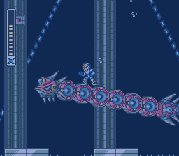
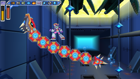
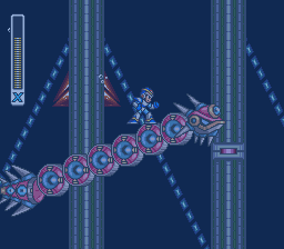
And here's another miniboss from Launch Octopus's stage, a serpent which you can ride:
While you can ride the serpent past the point where the spikes and platforms scroll off the bottom of the screen in the original Mega Man X, you go higher before that happens -- and it's still not too hard to land safely.
Riding the serpent and shooting it in the back of the head until it drops you is a viable strategy in the original game, but it's likely to get you killed in the remake.
Of course, for all the examples so far, there's at least an explanation for why these sequences are like that in Maverick Hunter X: because they were like that in the original. What's entirely baffling is when they add new vertical hazards, on purpose, and they have the same problems or worse.
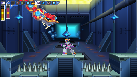
Maverick Hunter X significantly redesigns the Sigma's Fortress stages (which, again, makes it even stranger that it leaves the sequence with the floating platforms as-is, albeit in a later level than in the original game). Early on in the first fortress level, there's another fight with one of the giant fish minibosses from Launch Octopus's stage, which wasn't in the original game.
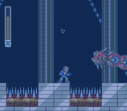
Let's compare that to the one on Launch Octopus's level again.
The one on the Sigma stage is definitely worse: the spike traps are twice as wide, there's only one place where you can stand and it's half as wide as the Launch Octopus version, and the platform is at the same height as the spikes, so if you miss it you're dead, instead of having a chance to grab onto the side and jump back out.
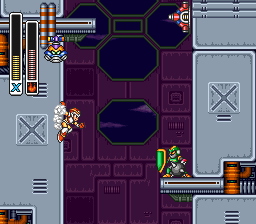
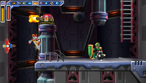
The underwater section is followed by a reworked version of the vertical section from the original game, and I'll actually give some props here: this is one of the few instances where I like the Maverick Hunter X version better.
There are several reasons the Maverick Hunter X version is better: it's shorter, there are fewer enemies, and there are more places to stand. But most of all, this is an instance where the devs understand that they're working with a different aspect ratio, and make it work for them. They don't try to preserve the narrow shaft, or keep the Joes on tiny platforms backed right up against the wall where it's nearly impossible to get them to attack, then hit them while their shields are down, and then get onto the platform they were standing on. It's not perfect, but it's a thoughtfully-designed sequence that's a legitimate improvement on the original. And it's a frustrating example of how good this remake could have been if this same kind of care had been applied to other vertical sequences.
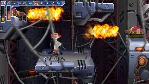
And then it passes, and you're in another vexing vertical sequence that wasn't in the original game. It isn't as likely to cause cheap instant deaths as the aquatic sequence at the beginning of the level, but it is incredibly awkward and annoying because of the screen's limited height and your inability to see where you're going:
But the worst new sequence of all is the end of Armored Armadillo's stage when you play as Vile:
It's similar to the sequence in Sigma's Fortress, with platforms at multiple heights and those same helicopter dudes coming at you. But there are more of them, they're harder to hit when you're playing as Vile (and you can't just use a powered-up Rolling Shield to protect yourself like when you play as X), and you have to jump to platforms below you, not just ones above you. And of course when you jump, you may very well scroll your destination platform right off the bottom of the screen and have to guess where it's going to be by the time you land. It's a friggin' nightmare, and a great justification for savestate-scumming.
All in all, Maverick Hunter X does a terrible job with pretty much any sequence that deals with vertical scrolling.
Powered Up doesn't have that problem -- but the comparison's not entirely fair, because Powered Up has an advantage: it's a remake of a game that has no vertical scrolling.
There are lots of vertical sequences in Mega Man, but the screen never scrolls. When you have to traverse a section that's taller than a single screen, that means climbing from the bottom of the screen to the top and then climbing a ladder up to the next screen, where you end up back at the bottom. The screen doesn't move up and down as Mega Man does, only left and right.
So it was easy for Powered Up to follow that pattern. As substantially as it changes some segments of the game (and adds two entirely new levels), it keeps that rule. No room is ever taller than one screen high; the screen doesn't scroll vertically -- and so the game never has to deal with the challenge of how to handle vertically-scrolling sequences.
Maverick Hunter X does. And it proves, time and again, that it's not up to the challenge. And then, bafflingly, it doubles down on this flaw and adds entirely new vertically-scrolling sequences. And they're even worse.
That's a major reason why, despite all its polish, despite all the effort that clearly went into it, and despite the many things it does right, Maverick Hunter X is an inferior game, both to the original Mega Man X and to Mega Man: Powered Up.
Another major reason is that it completely fucks up the balance of the original Mega Man X. And that's the topic of my next post.
Mega Man ® 1989 and © 1987 Capcom Co, Ltd
Mega Man X ™ and © 1993 Capcom Co, Ltd
Mega Man Xtreme © 2001 Capcom Co, Ltd
Mega Man Powered Up and Mega Man: Maverick Hunter X © 2006 Capcom Co, Ltd
I took all the screenshots myself, and tried to get them all at native resolution with no filters.
I used the following emulators:
NES: FCEUX
SNES: Snes9x
Game Boy Color: Libretro with the Gambatte core
PSP: PPSSPP
