So the other day, I got to listening to OCRemix's Mega Man X: Maverick Hunter Rising album, and it got me jonesing to replay some Mega Man X.
I decided to take another crack at the 2006 PSP remake, Mega Man: Maverick Hunter X; it had disappointed me on my first playthrough, but I thought maybe I'd give it another chance.
And on a second playthrough, now that I'm familiar with its changes and idiosyncrasies, it went a lot smoother. Those changes and idiosyncrasies are glaring -- and they're what this series of posts is about -- but underneath them, it's a pretty solid remake of an excellent game.
But it's no substitute for the original.
And it's interesting to look at its immediate contemporary, Mega Man Powered Up, and see how much better Powered Up is than Maverick Hunter X.
There are a couple of reasons. One seems obvious -- in fact, it's the very first thing you notice:
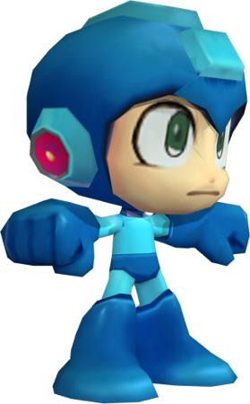
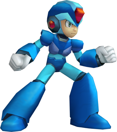
Mega Man is short and squat, while X is tall and thin.
Now, these graphics tell you one thing right off the bat, and it's tone. Mega Man is fun and lighthearted; X takes himself seriously.
But the thing is, those designs affect every aspect of the game's design. And what you're looking at, in both cases, is a game that was originally designed for a 4:3 screen ratio, remade for a 16:9 one.
And which one of these guys do you suppose makes the transition better from 4:3 to 16:9 -- the one who's short and squat, or the one who's tall and thin?
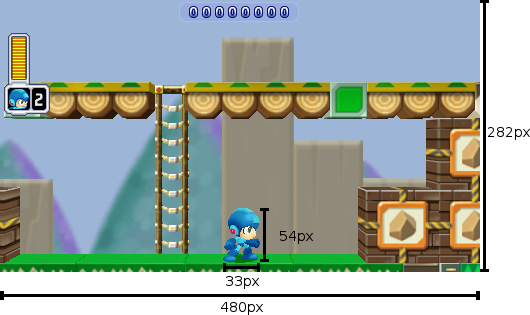
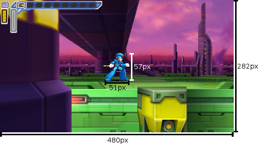
At least, that's how it looks. But it's an illusion. Let's take a look at their actual dimensions, in-game:
Those are back-of-the-napkin measurements; I haven't taken the models through their full range of motion, and I'm not sure what the exact dimensions of their hitboxes are. But it's enough to see that Mega Man only looks shorter and squatter -- in terms of the dimensions rendered in-game, X isn't significantly taller than Mega Man, and he is significantly wider.
But it's not really just about the ratio of the character models -- it's about the design of the worlds they inhabit.
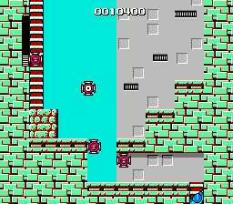
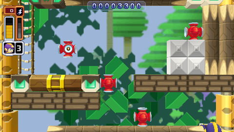
Both games face the same challenge: they have to substantially rework stage designs to fit a different screen ratio, while still making them feel like they play the same. Take a look at this screen from Cut Man's stage:
It's pretty close.
In fact, it just hacks out the brick below the ladder, and the (inconsequential) top section of the ladder, above the range of the enemies.
It's got the same number of little eye-lantern guys, and nearly the same width to move around in. (The movable width of the screen in the original Mega Man is 12 "blocks", where in Powered Up it's a very close 11. And the height from the floor to the topmost enemy is 9 blocks in the original and 6 in Powered Up.)
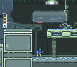
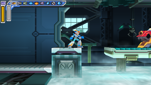
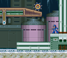
There are places where Maverick Hunter X does a similarly good job, like here in Flame Mammoth's stage (after defeating Chill Penguin and freezing the lava):
There's a lot less vertical space to move under that platform, but it's not important; it's still enough to fit, and still keep the entire room onscreen.
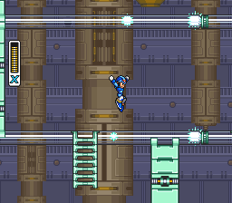
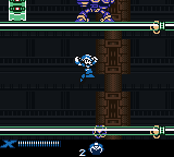
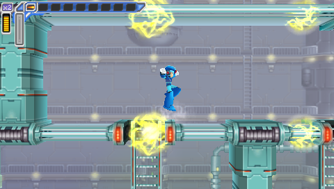
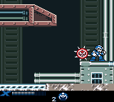
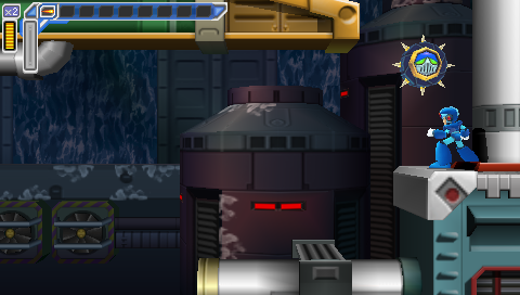
But other sections don't always fare as well. Look at the beginning of Spark Mandrill's stage:
In the original SNES version of Spark Mandrill's stage, the sparks that run along the floor and ceiling are half X's height and half his width, and the gap between them gives you plenty of room to dodge them. In the Maverick Hunter X version, they're as big as X, and there's very little room in between them. Even the Game Boy Color Mega Man Xtreme, with its severely compromised screen size, didn't have that problem.
(On the plus side, this does mean that defeating Storm Eagle before Spark Mandrill (and thereby disabling the sparks in the floors) makes a much more significant difference in how the level plays than it does in the original game.)
Chill Penguin's stage has problems too:
In the original, you can see the wheel coming and have time to get out of the way; in Maverick Hunter X, you can't and you don't. Though in this case, at least it's not being shown up by Xtreme, which has the same issue.
In a nutshell, Powered Up does a really good job of redesigning its vertical segments to fit a 16:9 screen, while Maverick Hunter X doesn't. And this really sticks out, because like Powered Up, MHX is a really polished remake. It shouldn't have these kinds of glaring issues with cropping; they're the hallmark of much lazier ports, like Mega Man for Game Gear, Mega Man and Bass for GBA, and, yes, Mega Man Xtreme.
But it's not just a few sucker punches by enemies that are too big, or that come out of nowhere. No, worst of all are the tricky platform segments where your limited field of vision can result in cheap, instant deaths. And I'll get to those in my next post.
Mega Man ® 1989 and © 1987 Capcom Co, Ltd
Mega Man X ™ and © 1993 Capcom Co, Ltd
Mega Man Xtreme © 2001 Capcom Co, Ltd
Mega Man Powered Up and Mega Man: Maverick Hunter X © 2006 Capcom Co, Ltd
Character models supplied by Models Resource
I took all the screenshots myself, and tried to get them all at native resolution with no filters.
I used the following emulators:
NES: FCEUX
SNES: Snes9x
Game Boy Color: Libretro with the Gambatte core
PSP: PPSSPP
